Over the past several years, both our home and style have evolved. Home isn’t always before and after, the process is just as important.
Last year our home was recently featured in the St. Louis Post Dispatch and through the years spaces have been included in Real Simple, Oprah, Better Homes and Gardens, HGTV, Traditional Home and so many more.
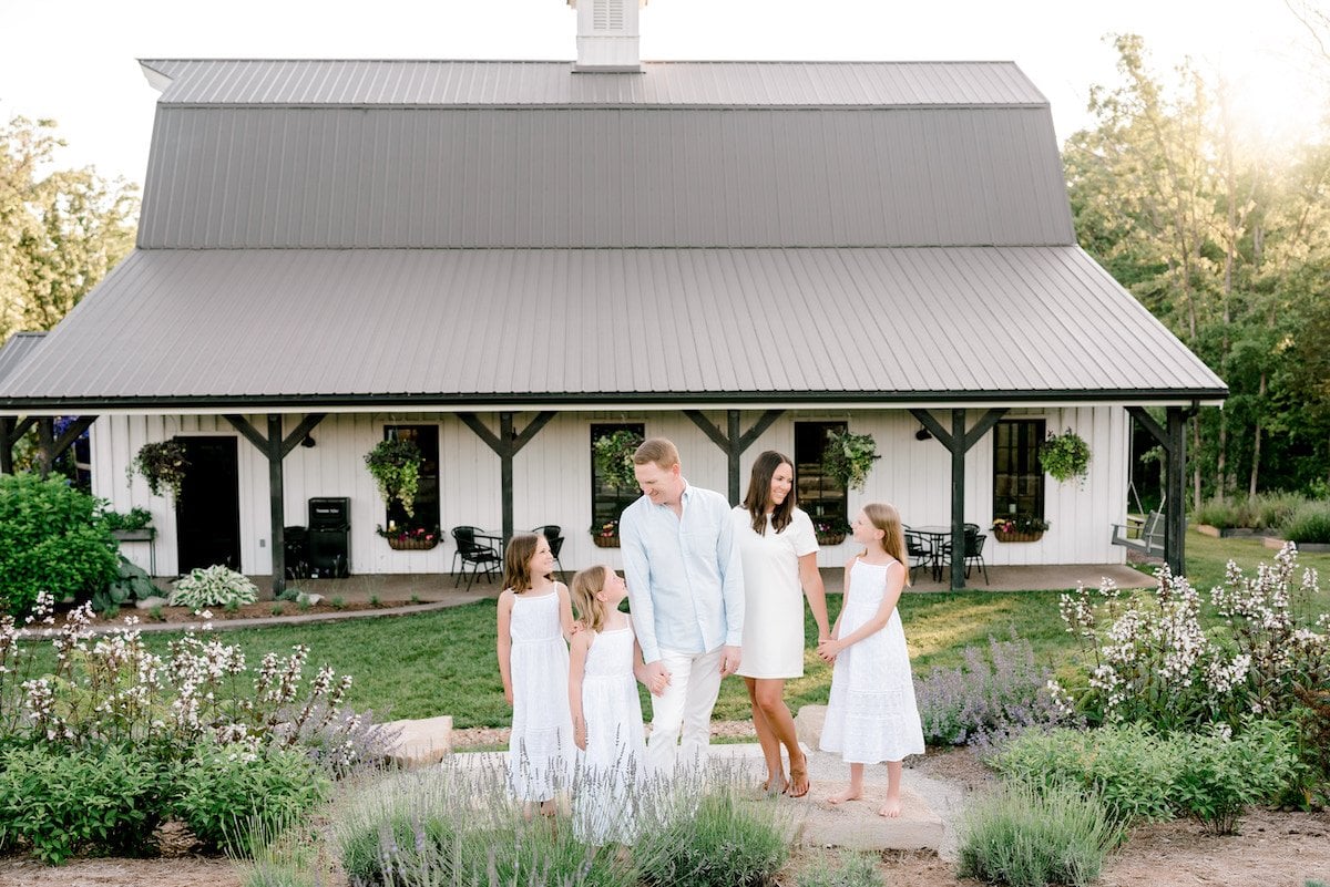
This year, I was ready for a refresh. While there’s still work to do, I can’t help but feel cheerful with the fresh feel.
Before and After
Today, you’ll find some new, never-before-seen photos and angles of our home, and an updated family photo so you can see how the girls have grown!
Can you believe the difference in the photo above, compared to the original one below? It’s such a thrill to watch them grow and change.
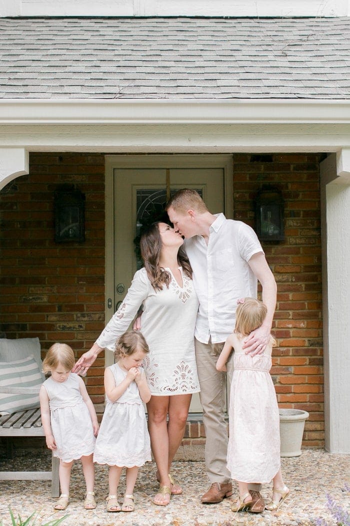
9 years ago, we moved into our Tudor style home in St. Louis… I cannot believe how quickly time has passed! While I never loved the style of our home, I’ve embraced it, making it feel a little more like us along the way.
Exterior Curb Appeal
When we purchased our home, the exterior left a lot to be desired. It felt drab.
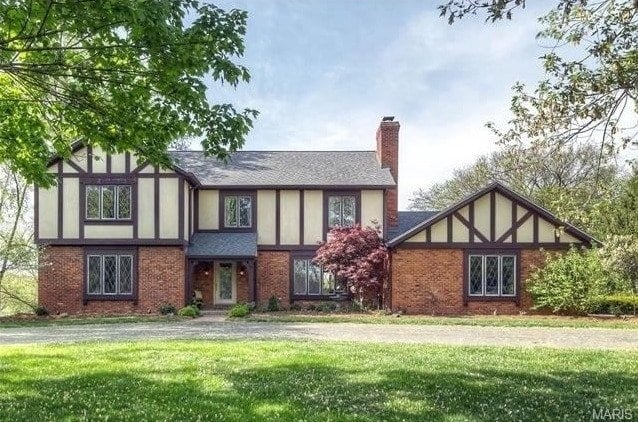
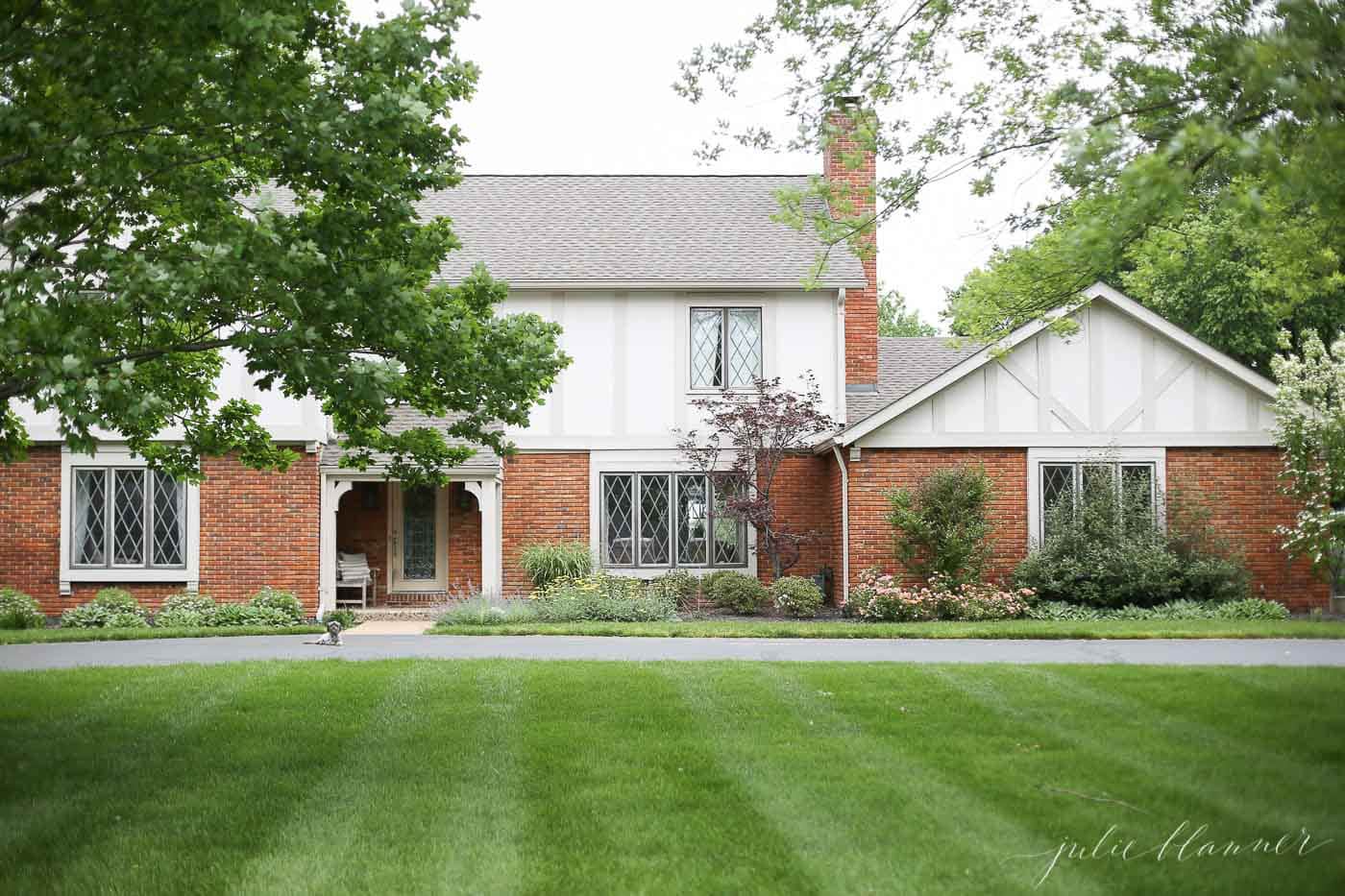
We almost immediately painted it in light, but traditional Tudor Paint Colors, added new roof and landscaping to transform the exterior.
The spring blooms just might be my favorite, though the fall colors are difficult to beat through the diamond paned windows.
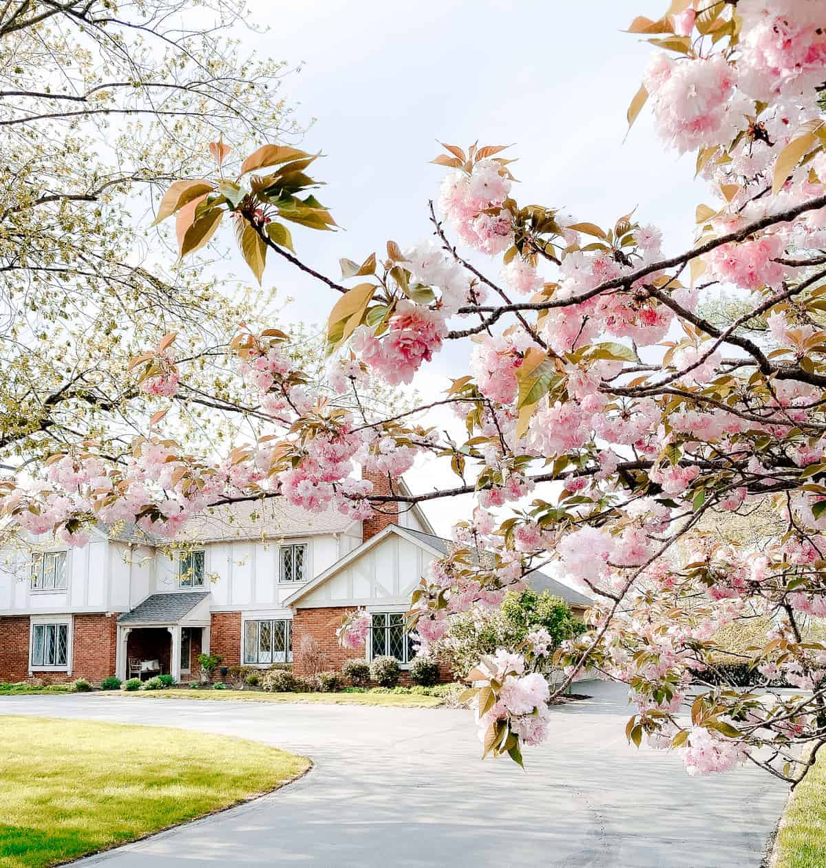
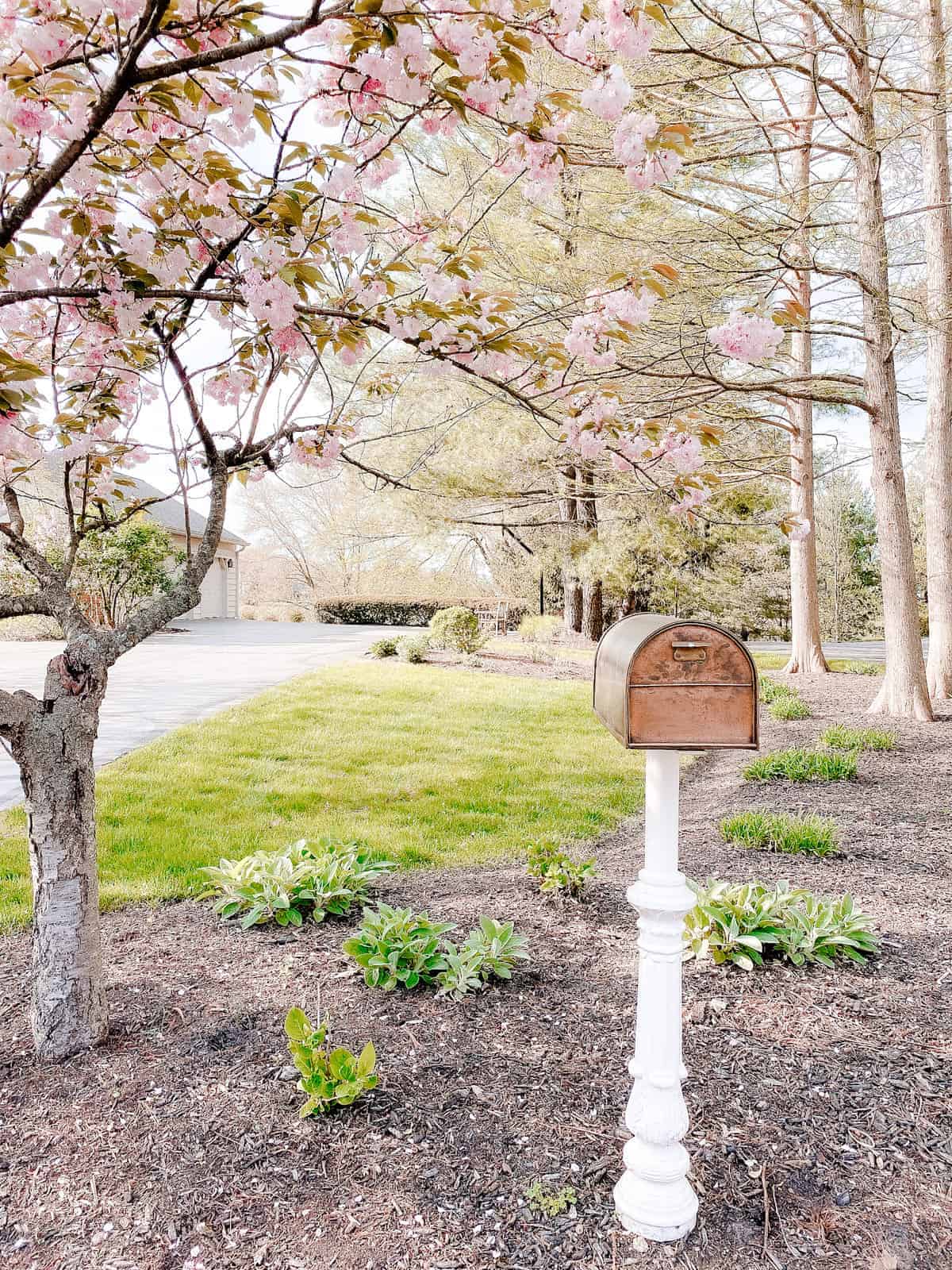
They gracefully frame our copper mailbox on an iron post (find the mailbox in my shop). The post was painted to match our exterior paint colors in Sherwin Williams Everyday White.
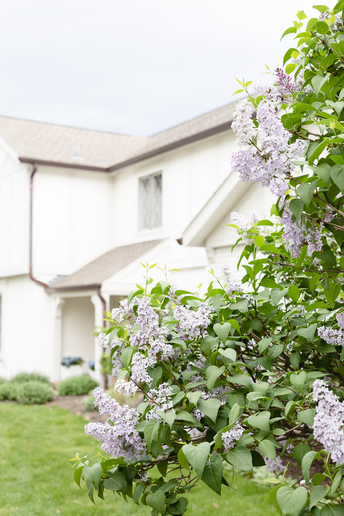
We framed the home with trees, bushes and plants that would bloom each season. The lilacs are always a highlight!
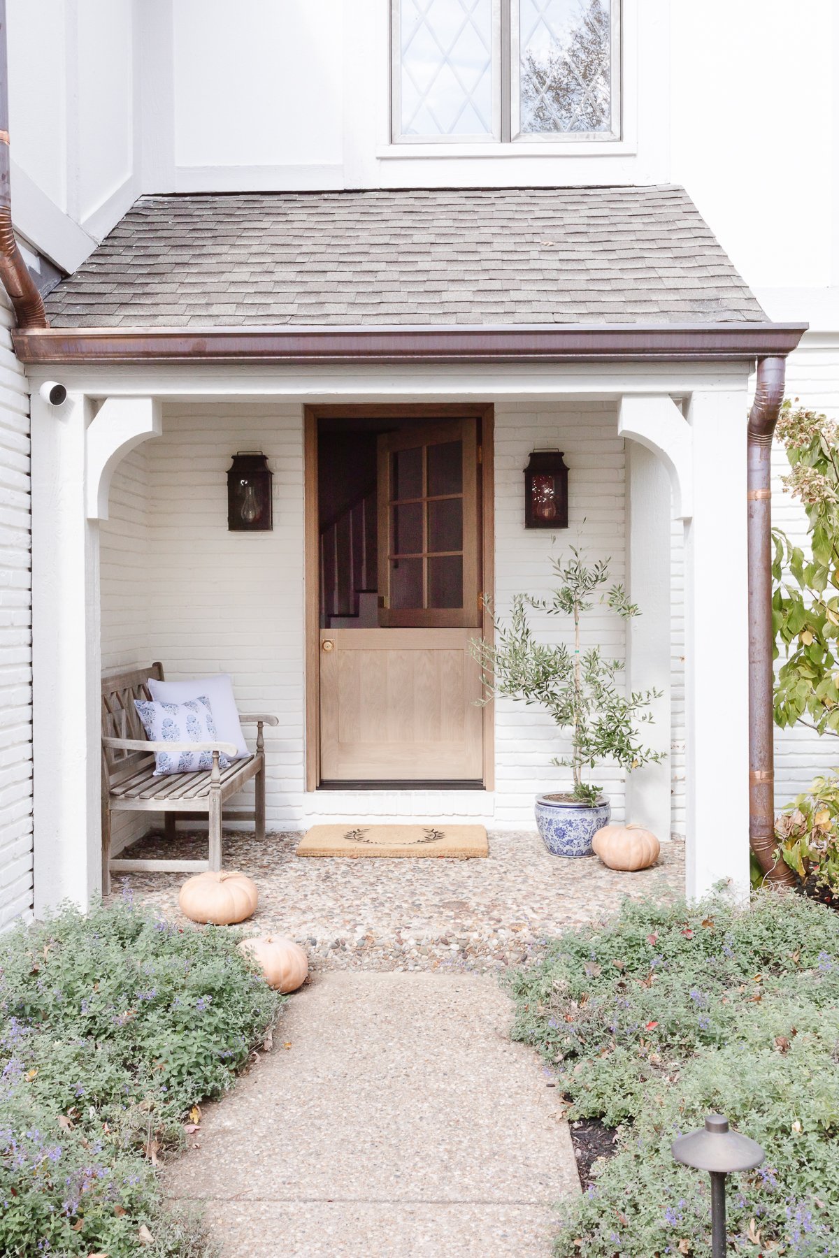
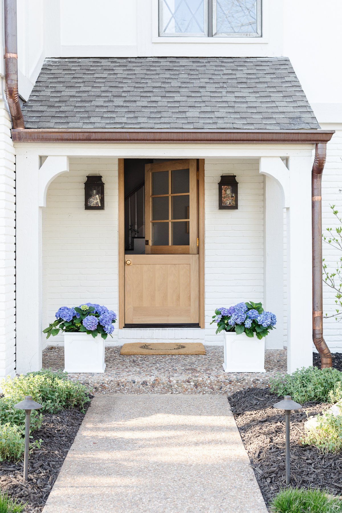
Driving past a friend and neighbor’s White Brick House nudged me to take the leap and paint the brick Benjamin Moore Swiss Coffee. The Tudor trim is painted in Benjamin Moore Pale Oak to add a slight contrast.
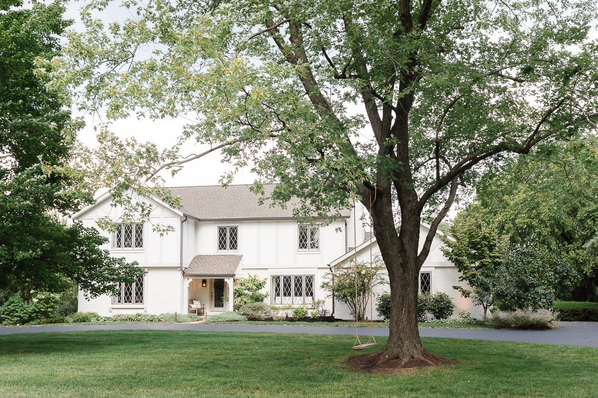
We accented it with copper gutters and traditional copper lanterns which have started to show verdigris.
As you know, one of my favorite things about a neutral home (indoors and out) is that it transitions with ease from one season to the next. Spring, Summer, or Fall, I love it all (except winter!)
Entryway
Step inside and you’ll see one of my favorite transformations! The entryway / foyer!
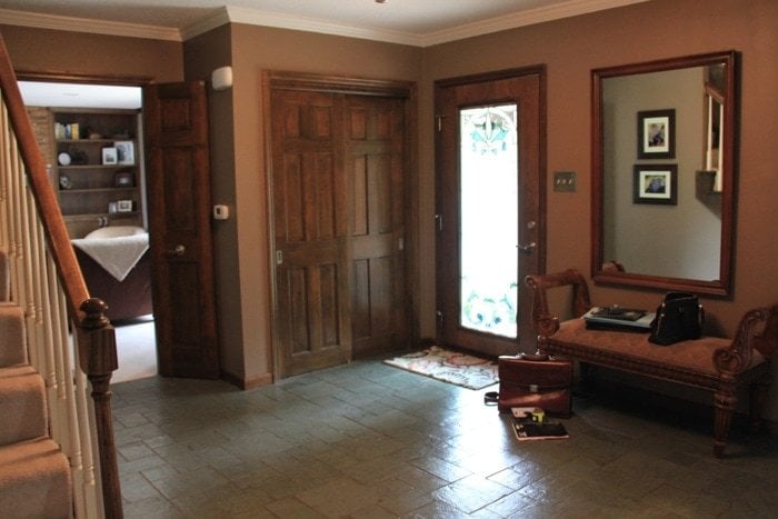
The stained glass door obstructed natural light. Adding a white oak Dutch door made it feel more inviting, adding light and charm! Of course I had to add a little unlacquered brass door knobs for timeless warmth.
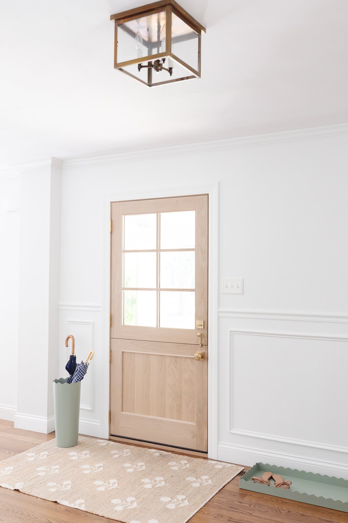
We removed the closet between the entryway and living room. It was a substantial size, but didn’t add a lot of function. It not only blocked much needed light from both the living room and entry, but it also interrupted traffic flow to and from the living room and connecting kitchen. Now, both spaces appear larger and light shines through.
We replaced the slate floors with sand and stain hardwood floors which made the rooms feel like one. Picture frame moulding, or wainscoting, added some much needed detail. We painted it Sherwin Williams Extra White to make the space feel even brighter.
I added functional scallop decor – a boot tray and umbrella stand and am seeking the perfect piece of art to hang just above.
Directly across from the door is our stairwell.
Stairs
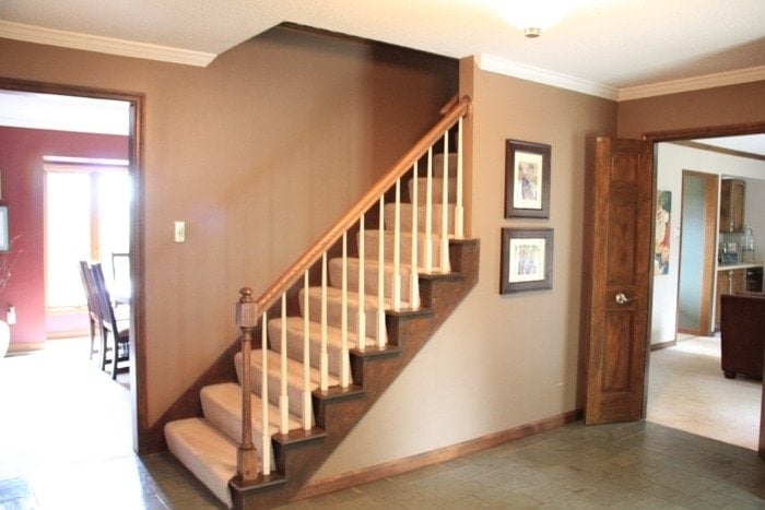
We removed the carpet, sanded and stained the stairs, painted the risers and finally have the stair runner scheduled for installation! I’m even more excited to hang silhouettes of our girls just above.
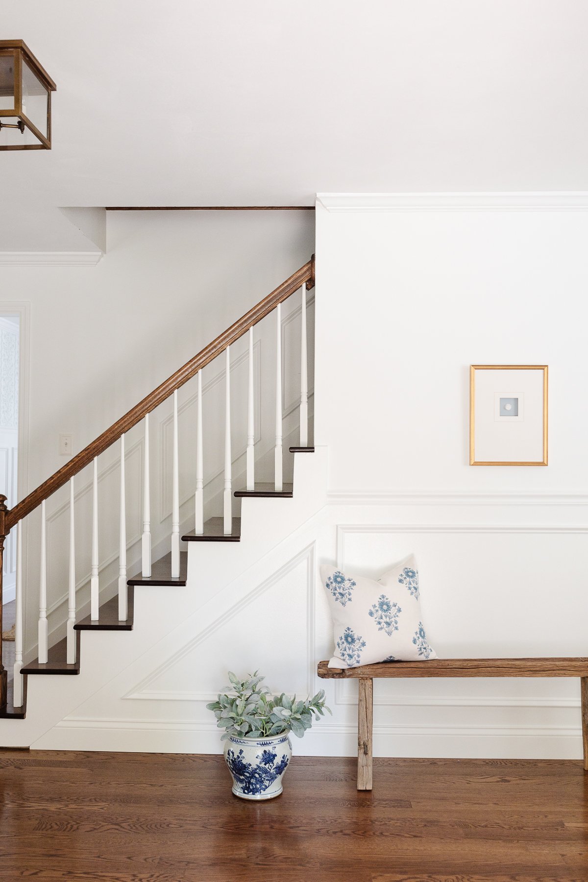
The entryway is now a wide open space, with views into the living room, dining room, family room, office and powder room.
Entryway Bath
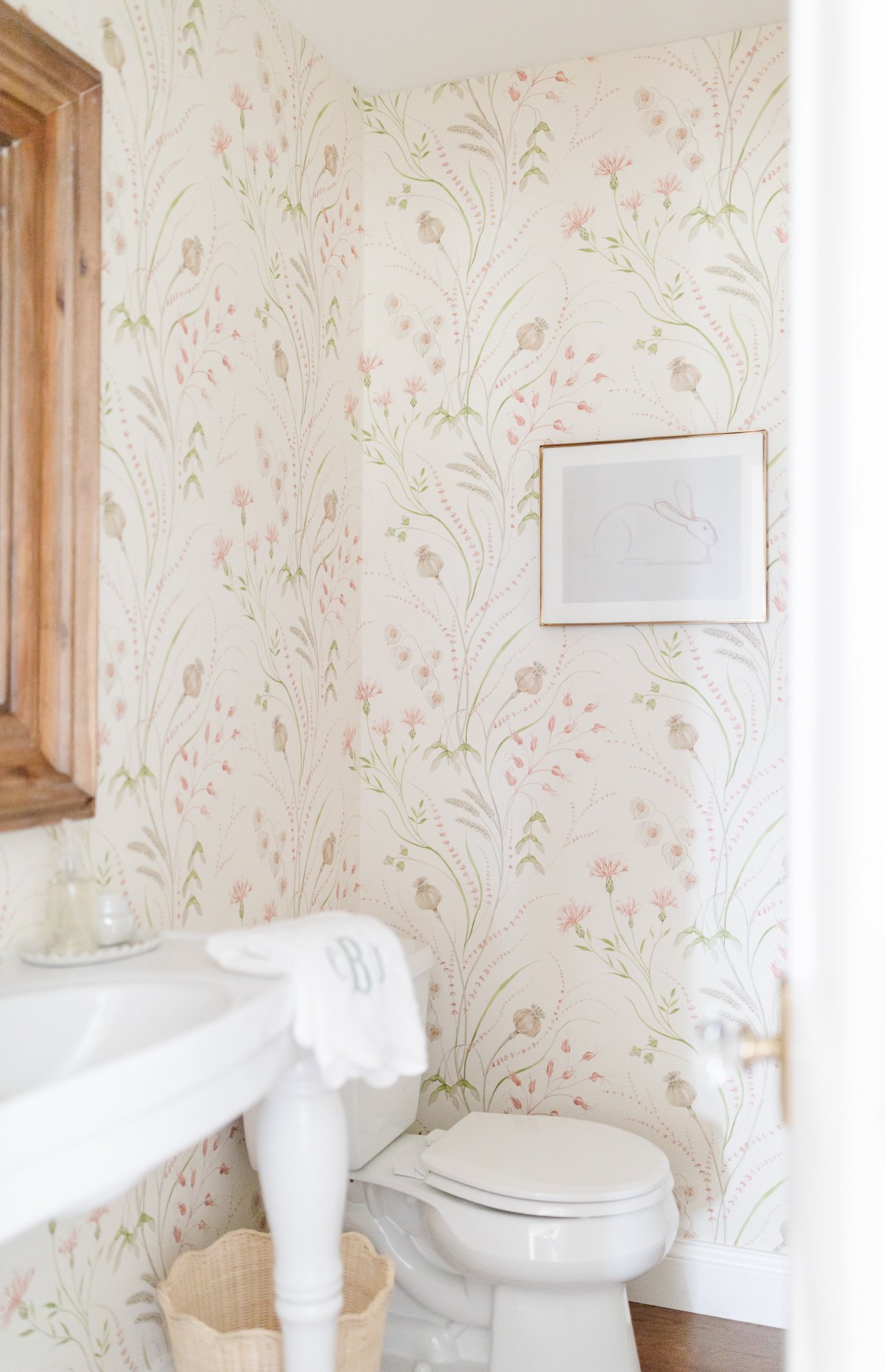
The half bath initially felt cramped and the toilet position felt more like a throne.
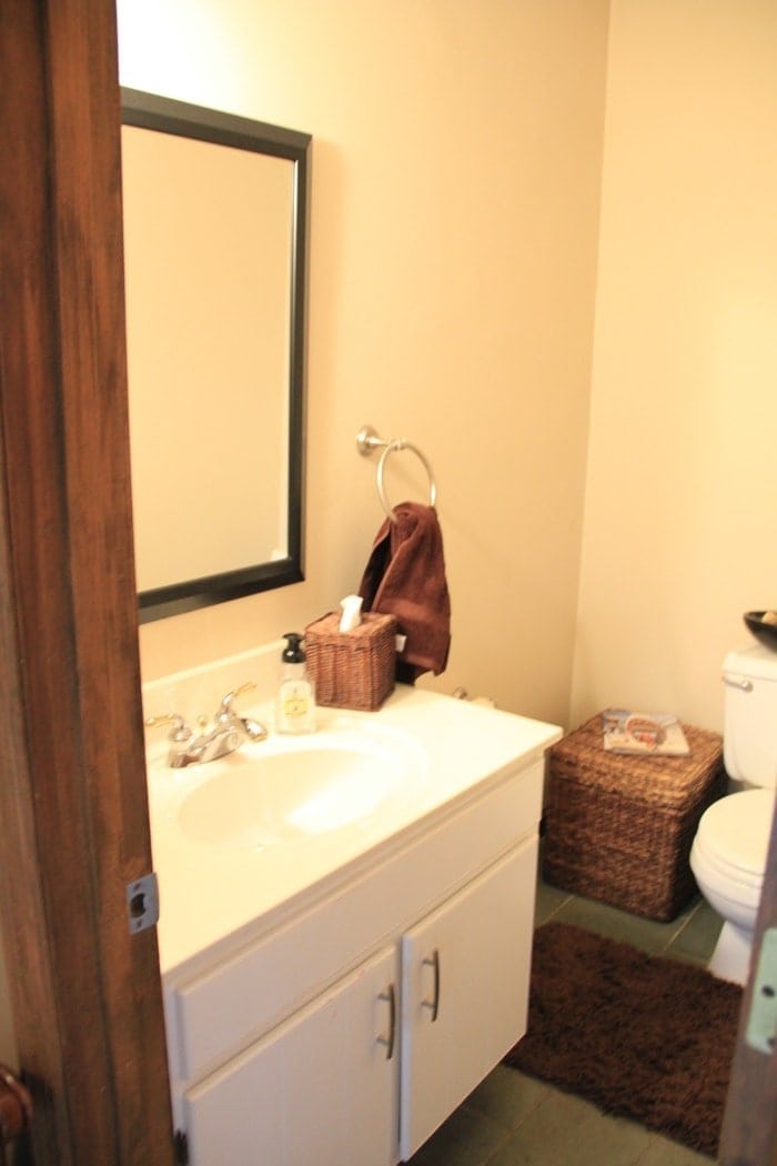
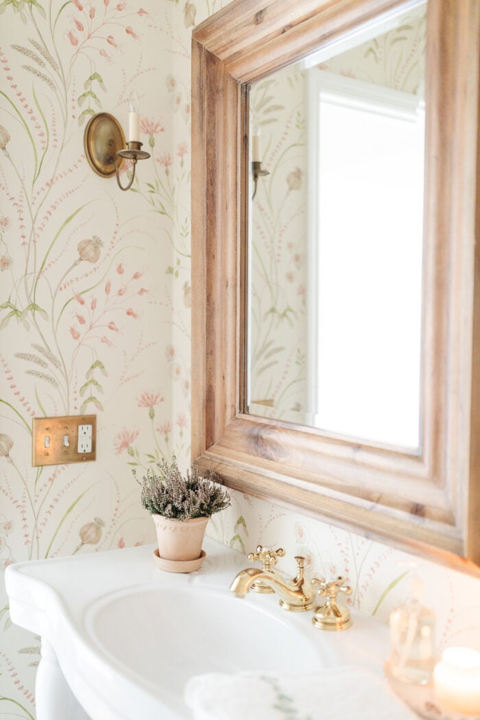
We relocated the toilet, integrated floral wallpaper, art, hardwood floors and a Parisian sink to give the illusion of more space. You can learn more about our powder room here!
Office
The office is the first space you see off our entryway. This may surprise you, but an orange room with a chalkboard mounted taxidermy isn’t really my thing.
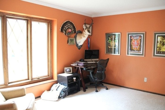
We discovered parquet wood floors underneath (find out if you have wood floors) but they were damaged when carpet was installed so we opted to continue our hardwoods into the office as well.
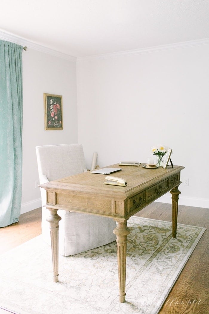
The office is now a calm, functional space filled with traditional decor…and anxiously waiting for an overhaul! I have some exciting plans for it that will make it more functional and can’t wait to get started.
Family Room
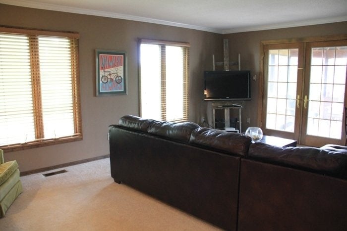
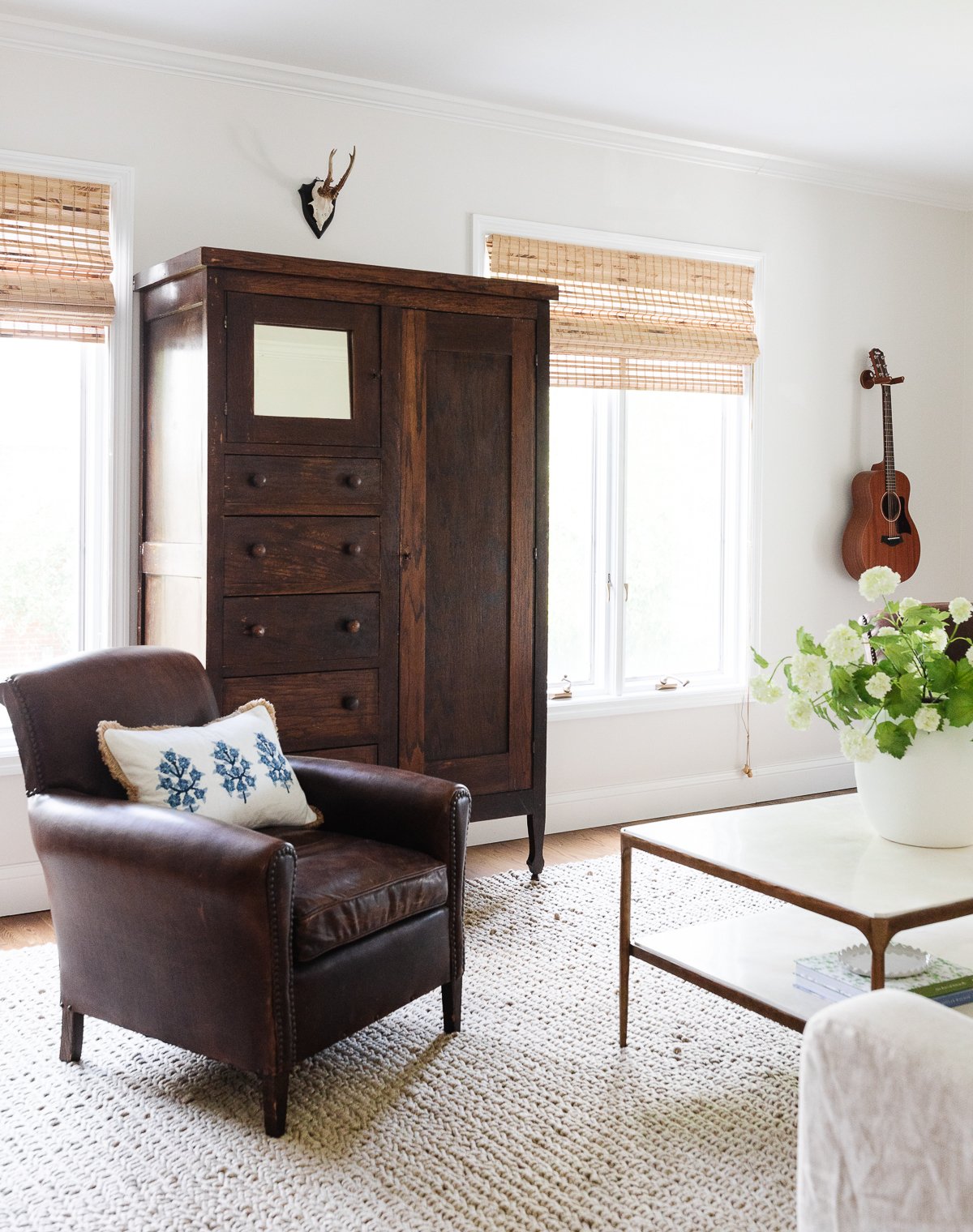
The family room is the most infrequently used room of our home. We replaced the blinds with bamboo shades, the grates in the doors were removed, painted and replaced carpet with hardwood.
The popcorn ceiling was scraped and we kept it pretty minimal. You’ll often find Chris strumming his guitar. I also incorporated my Grandmother’s Linen Cabinet that had been passed down multiple generations.
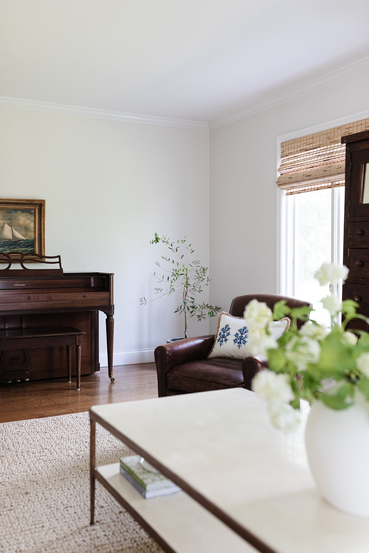
I’m looking forward to continuing a little refresh here as well…
Screened in Porch
The Screened in Porch once felt fit for a Girl Scout camp…
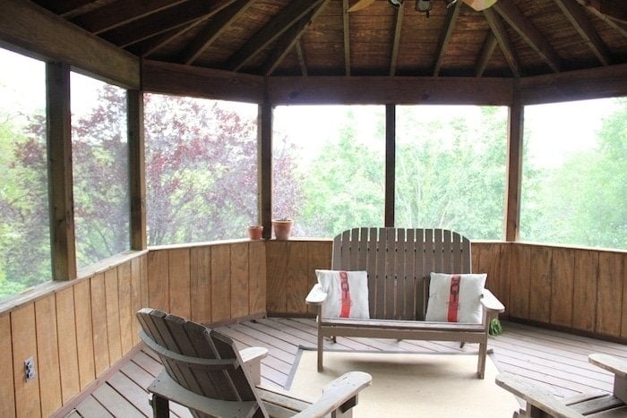
We painted the interior, added curtains by making Custom Copper Curtain Rods for the Bay Windows and redefined it as an outdoor dining room.
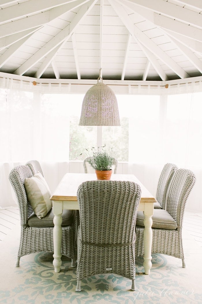
Over time, our needs have changed and it’s now a relaxing patio where we play games and watch movies – especially in spring and fall! We used a screen porch kit to for durable panels that are easy to replace due to storms, if needed.
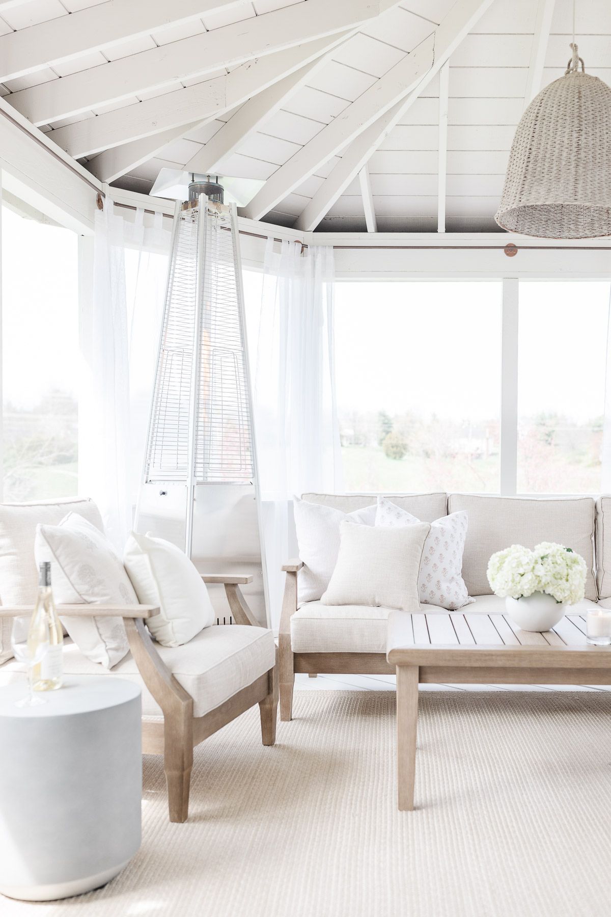
I decorated it with all the comforts of a living room – comfortable sofa and chairs, outdoor rug, and of course, ever changing pillow covers (I think I have a problem)!
Deck
The deck is nestled between the screened in porch and breakfast room, just outside our kitchen and dining room. With high visibility, it was one of the first spaces we focused on after moving in.
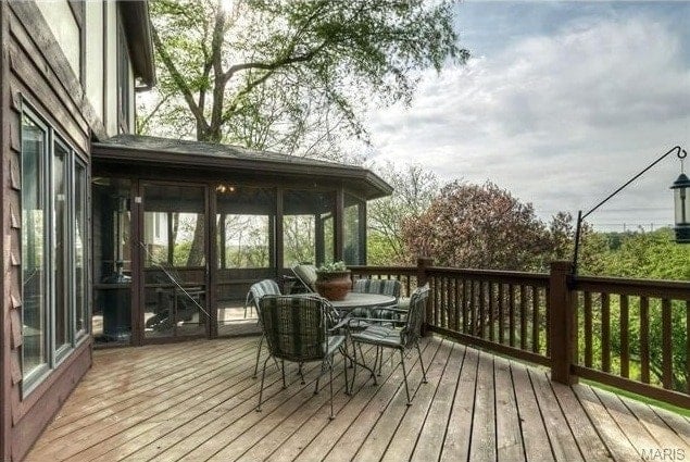
It was so tired and worn, so we stained it with a solid color.
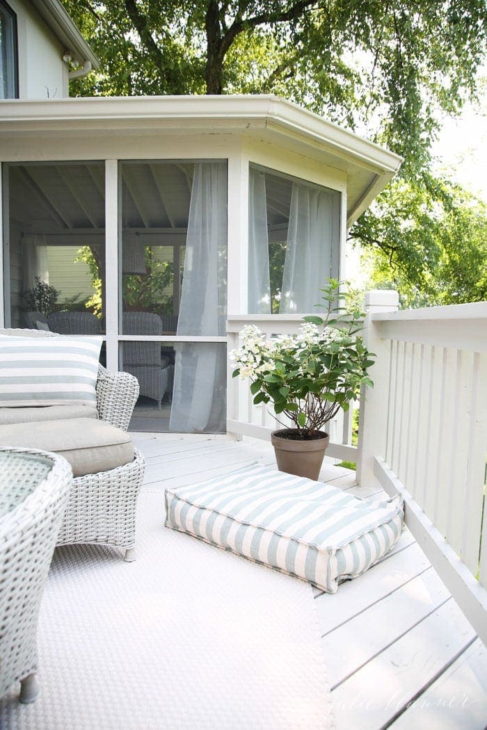
We added outdoor lighting and furnished the space.
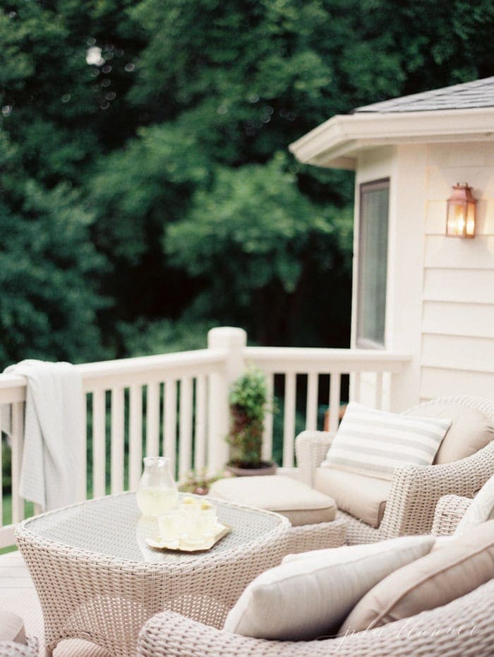
This past year, we replaced the deck, but retained the railing. We plan to add stairs and a glass deck railing – it was one of our favorite lake house updates and we can’t wait to enjoy it here, too!
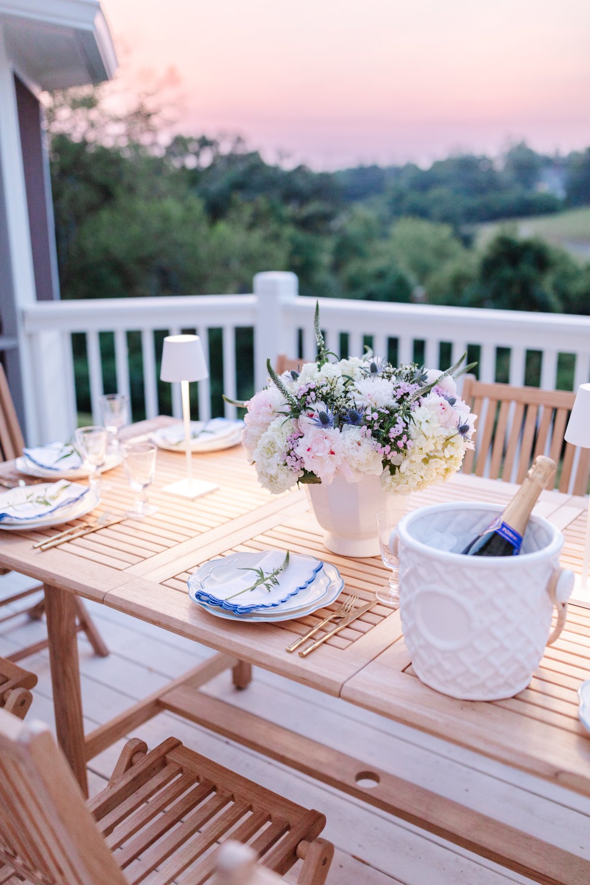
We transitioned our deck to an outdoor dining space. The teak table seats 10 guests. French doors open to the adjacent breakfast room which seats 14, making it versatile for entertaining family and friends.
Dining Room
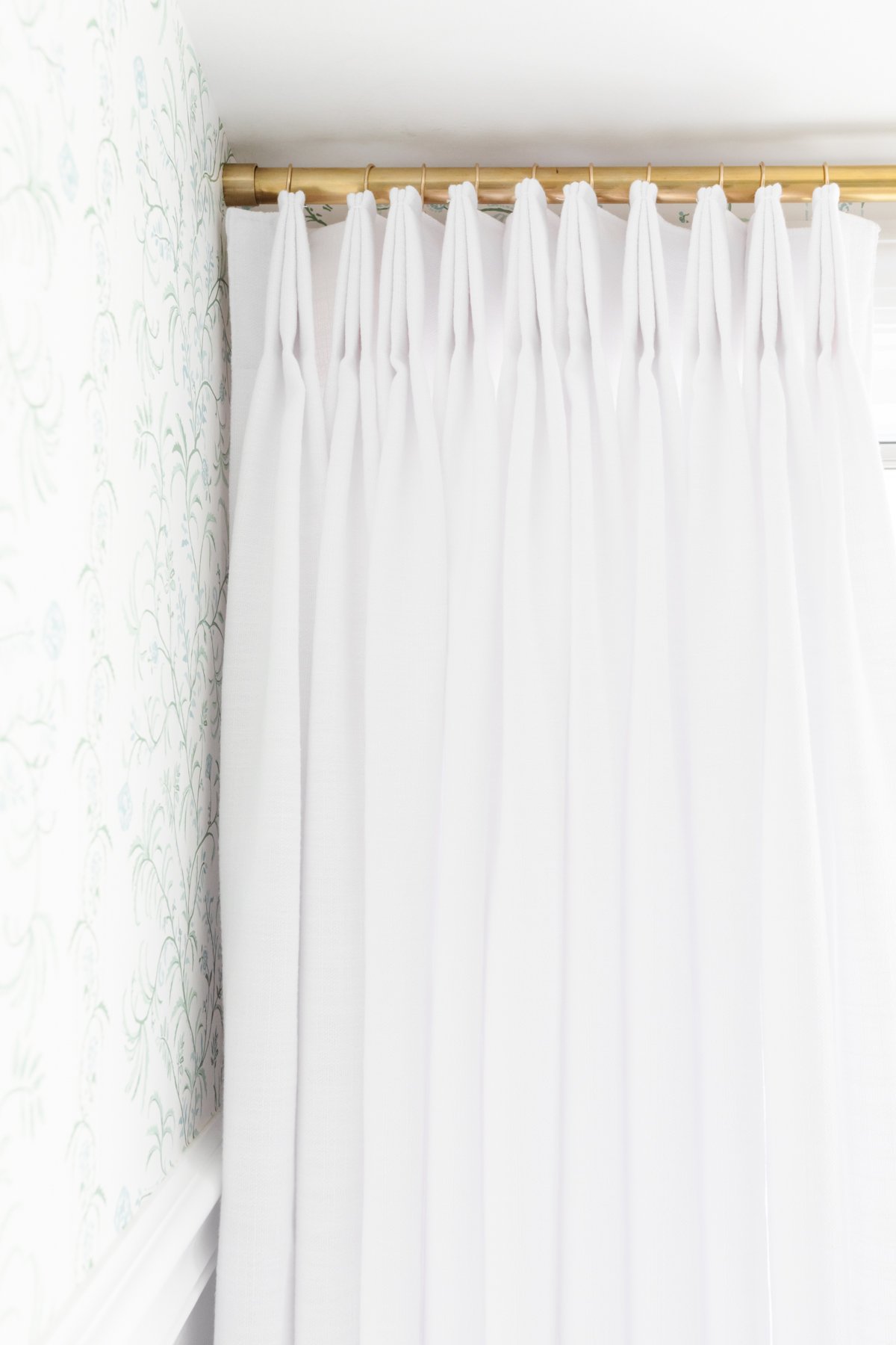
Our Dining Room had an awkward 60’s window – I wasn’t sure how to make it work. Ultimately I repurposed existing linen panels using a custom brass curtain rod to define the window.
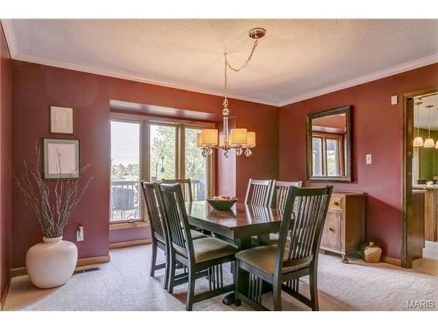
Fresh paint, a beautiful brass light fixture, wood floors and my Grandma’s dining room furniture still felt underwhelming. It has always been under-utilized and neglected.
The addition of wallpaper and pinch pleat drapes makes it feel cheerful.
Breakfast Nook
This room is directly off of the kitchen, and while there is an air vent, otherwise was a classic sunroom that became hot in the afternoon and cold in the winter.
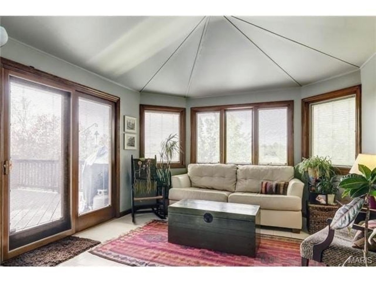
We redefined the space as a breakfast room by adding a brass pendant as the centerpiece of the room, adding picture frame moulding and painting both the walls and trim the same color, Benjamin Moore Navajo White. The linoleum floors were replaced with sand and stain hardwood that we carried throughout the entire first level.
Insulation blown into the walls and floor has made the space usable, regardless of season.
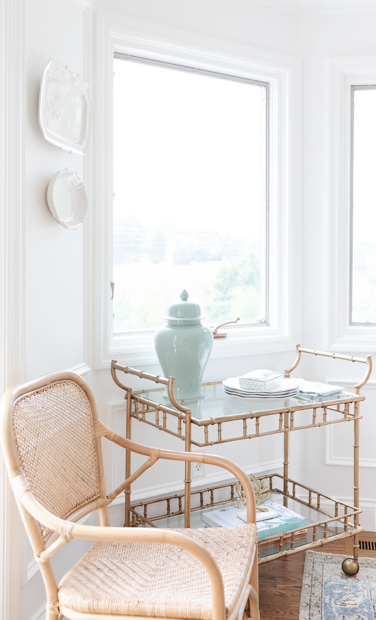
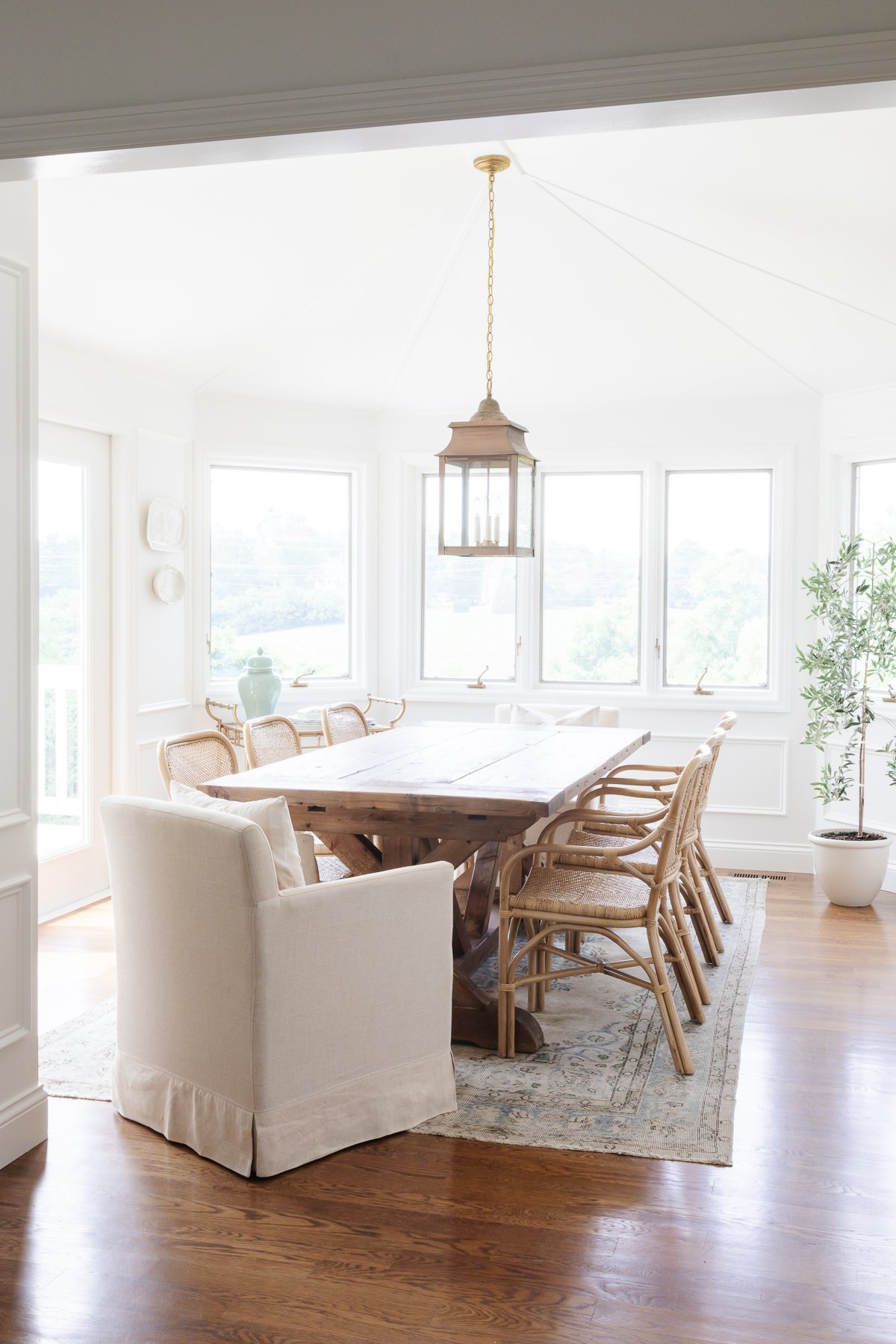
I recently repainted it with one of my favorite cream paint colors, Benjamin Moore Simply White.
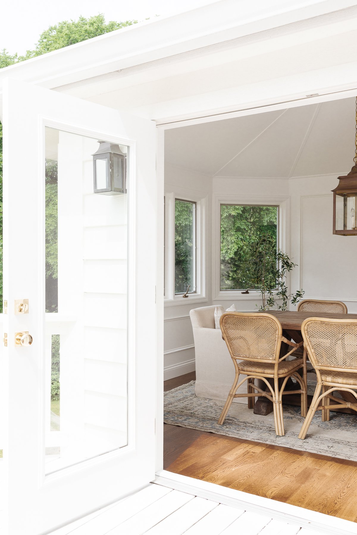
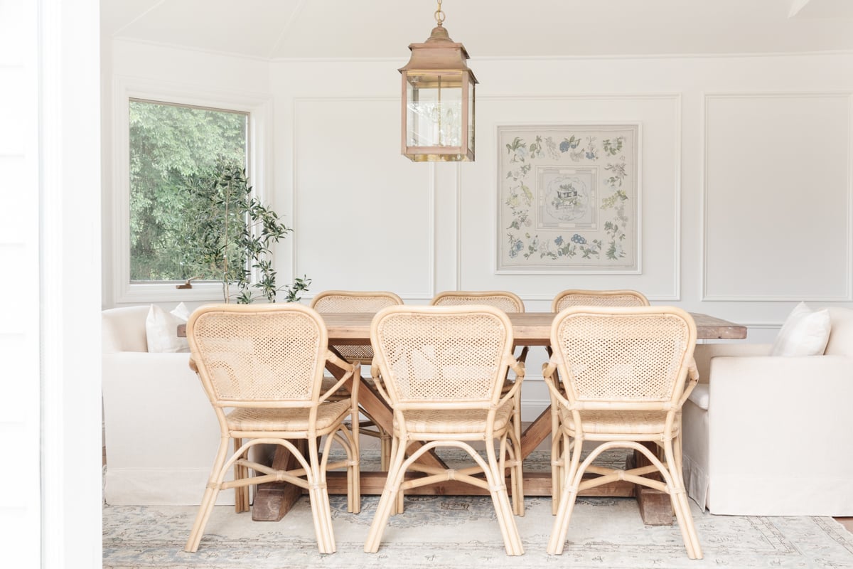
I flanked the Restoration Hardware dining table with slipcovered chairs for comfort and interest. Rattan chairs add texture and make the space feel a little breezier.
The room features and olive tree, hanging platters (that can be removed for use when entertaining) and a brass bar cart filled with entertaining essentials.
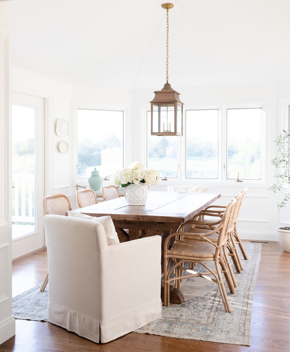
The new French doors open to the deck for the indoor/outdoor feel I crave, while living in the Midwest.
A framed Hermès scarf in a soft palette of blues, greens and yellows is featured above the dining table.
Kitchen
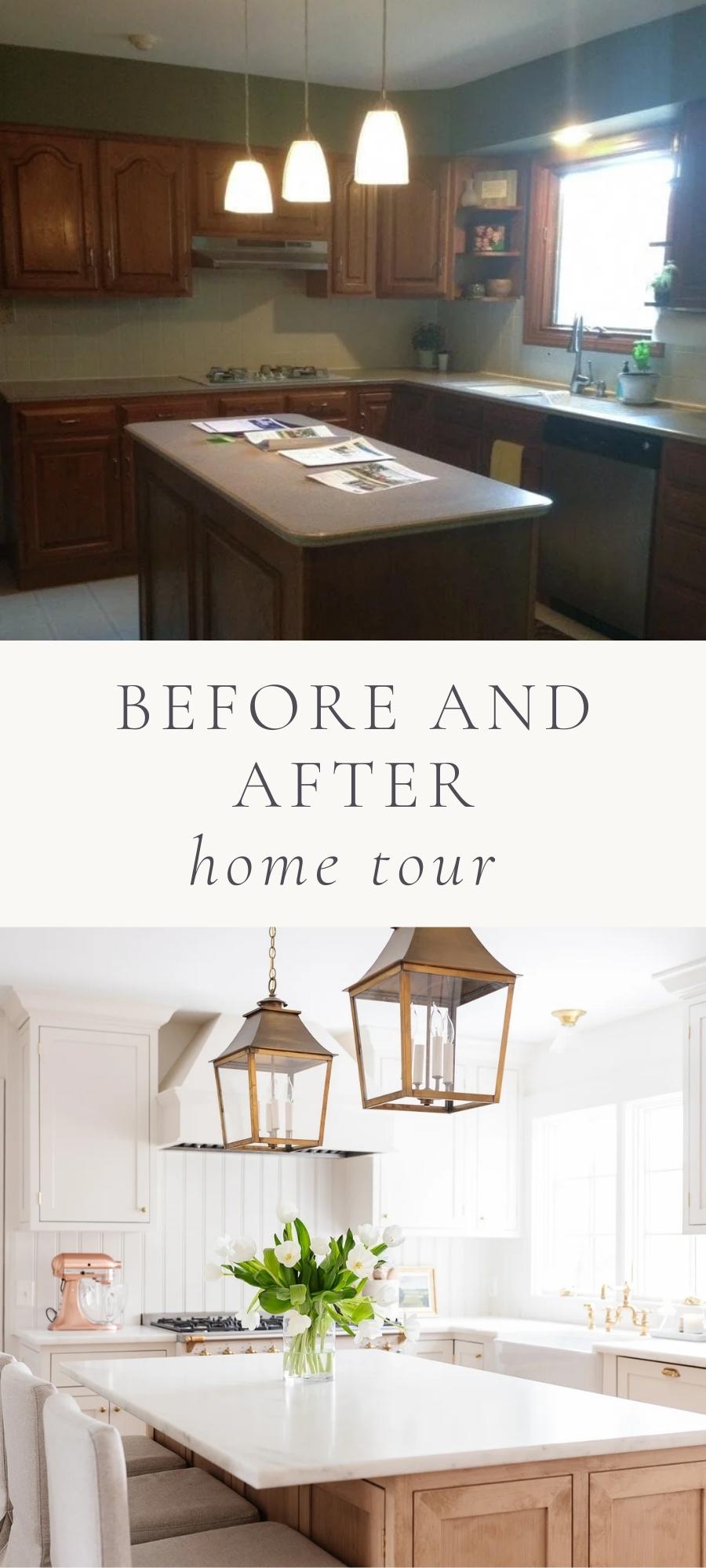
When we purchased our home, the kitchen was almost completely blocked in by walls. A small window over the sink was the only natural light source. Just behind where this photo was taken was a 3′ door to the mudroom and adjacent, a 3′ opening to the living room.
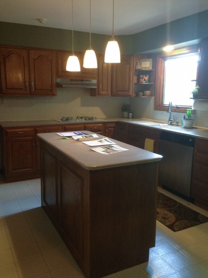
When we moved in, we refreshed the kitchen retaining the oak cabinets adding light with paint and playing with accents.
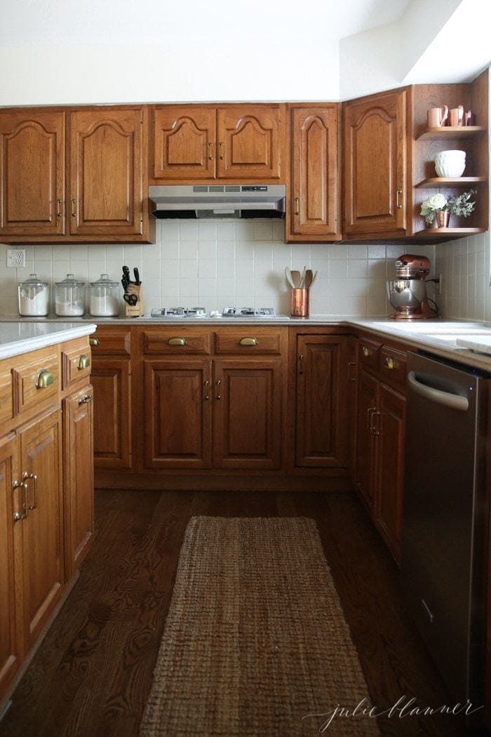
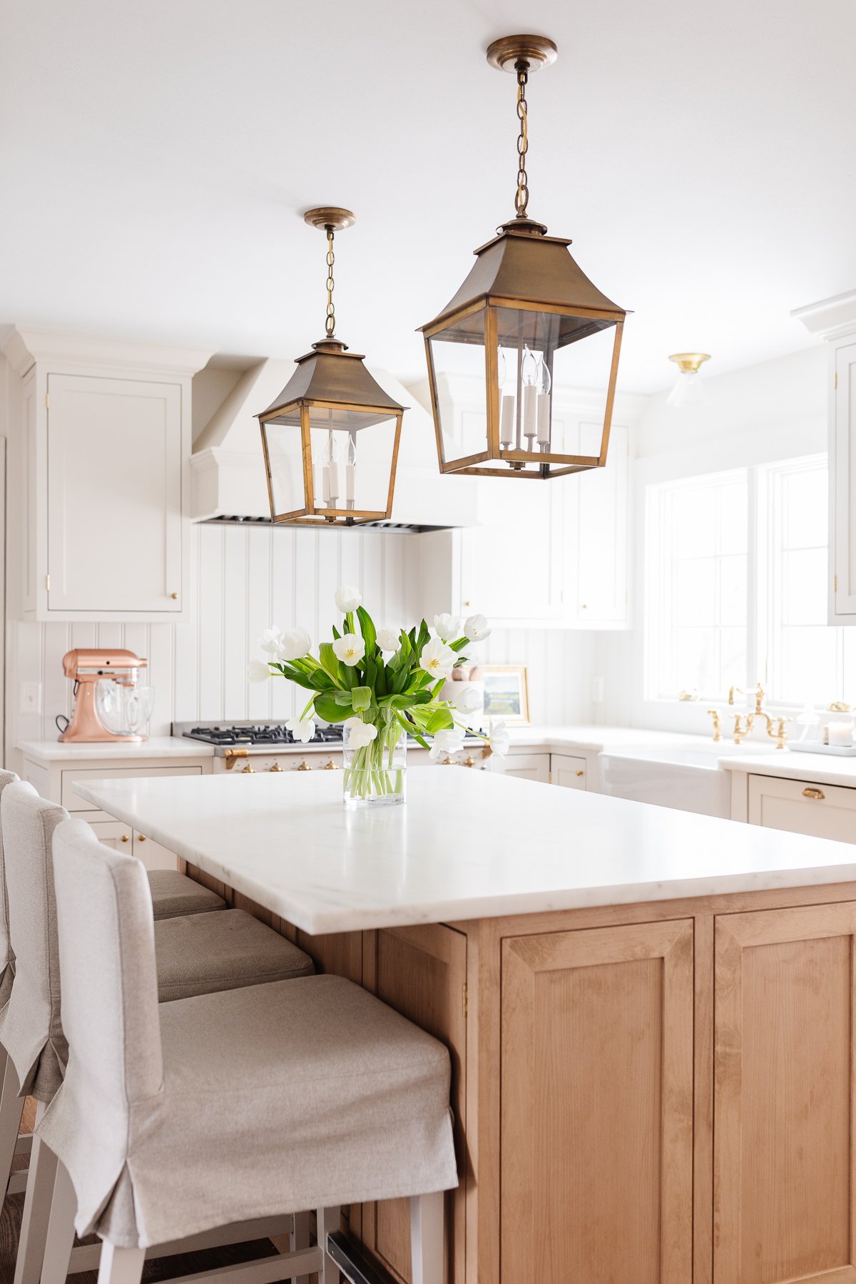
We were able to slightly expand the window, allowing more natural light to pour in. As I mentioned before, painting the deck in a solid stain also reflected more light into the kitchen.
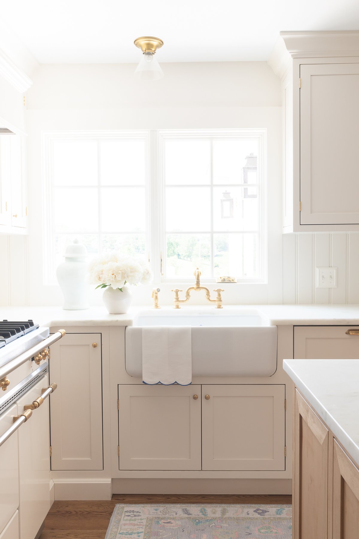
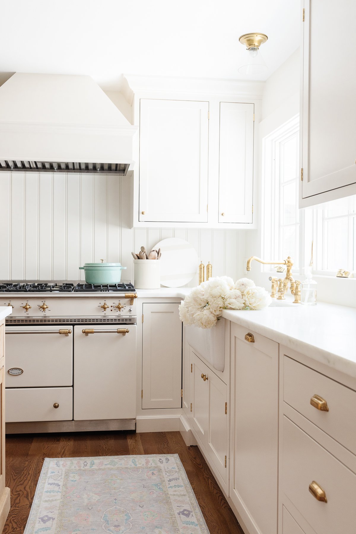
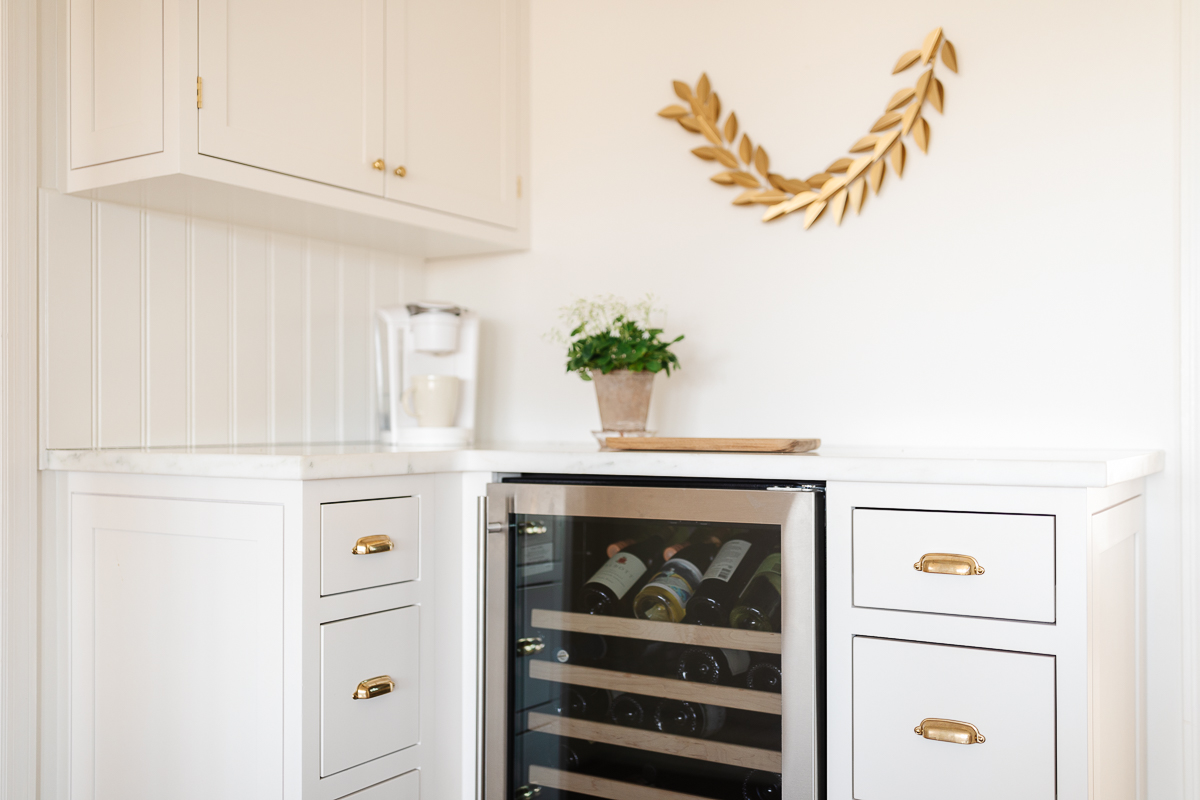
I had our cream kitchen cabinets custom matched to our Lacanche Range and integrated a panel ready dishwasher, which allows the eye to continue, giving the illusion of more space. Painting the walls, trim and cabinetry the same color brightens the space and draws the eye up, disguising 8′ ceilings.
Inset Cabinets and thoughtful kitchen organization solutions maximize space.
The kitchen features marble countertops, a beadboard backsplash, brass lanterns, farmhouse sink unlacquered brass bridge faucet and unlacquered brass hardware for timeless warmth.
Powder Room
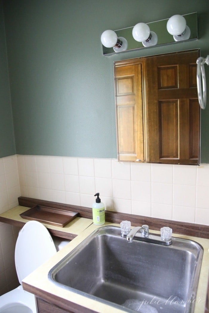
The small Powder Room felt tight with a deep garage style sink and counters that extended over the sink and the toilet.
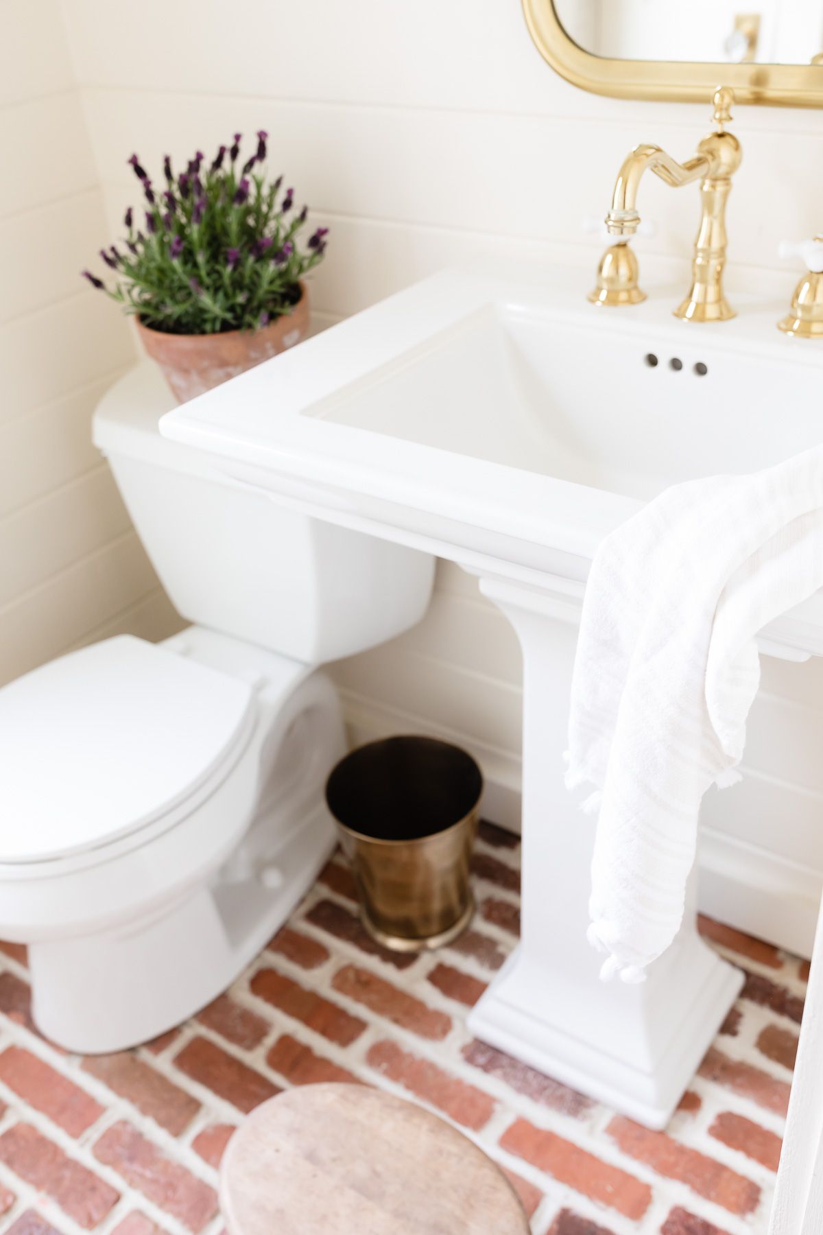
I implemented several tricks to make the space look and appear larger through lighting, a pedestal sink and a tall mirror.
Since it is primarily used by the girls, I wanted to make it easy-to-maintain. The walls were painted Benjamin Moore Navajo White in semi-gloss so they reflect maximum light and wipe clean. This small space adds a lot of function, especially during snow storms when messes are abundant.
Mudroom
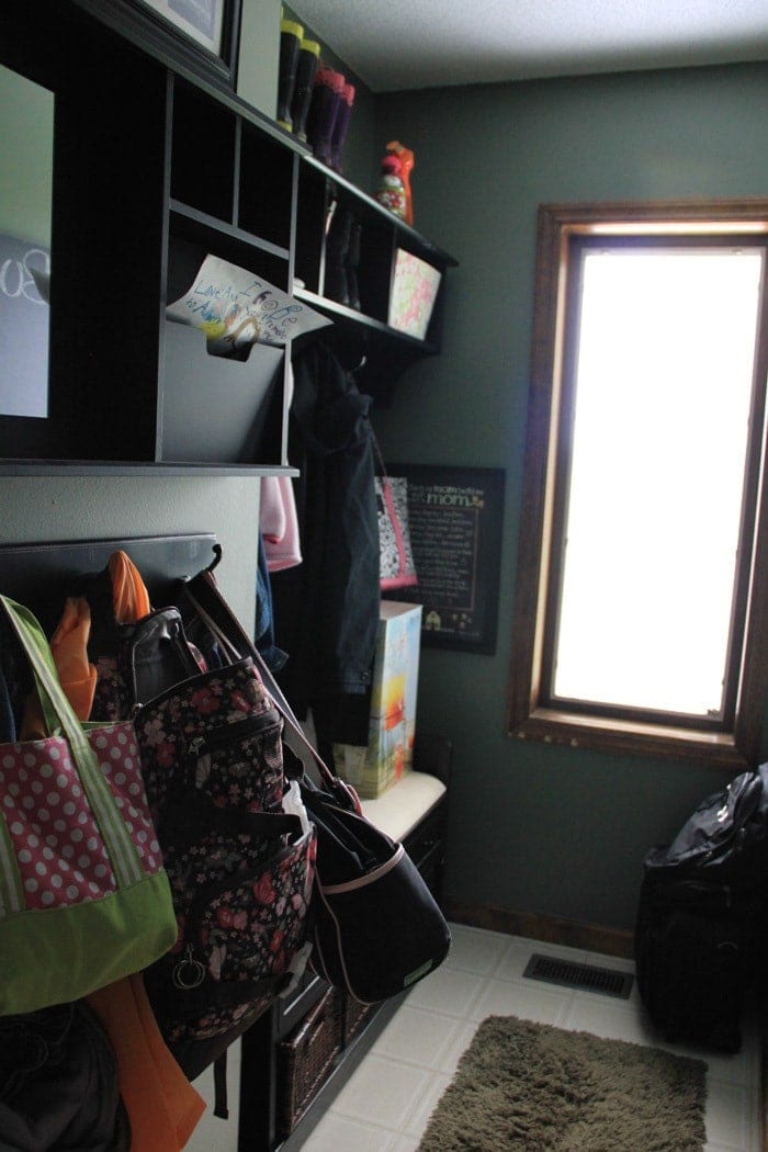
The mudroom felt very cramped. The closet and shelves block the little light coming in from the mudroom bath and mudroom window.
We opened it up by removing the shelves, bench and tiny closet that consumed valuable space. Hooks, a bench and baskets stored beneath make it both functional and more spacious.
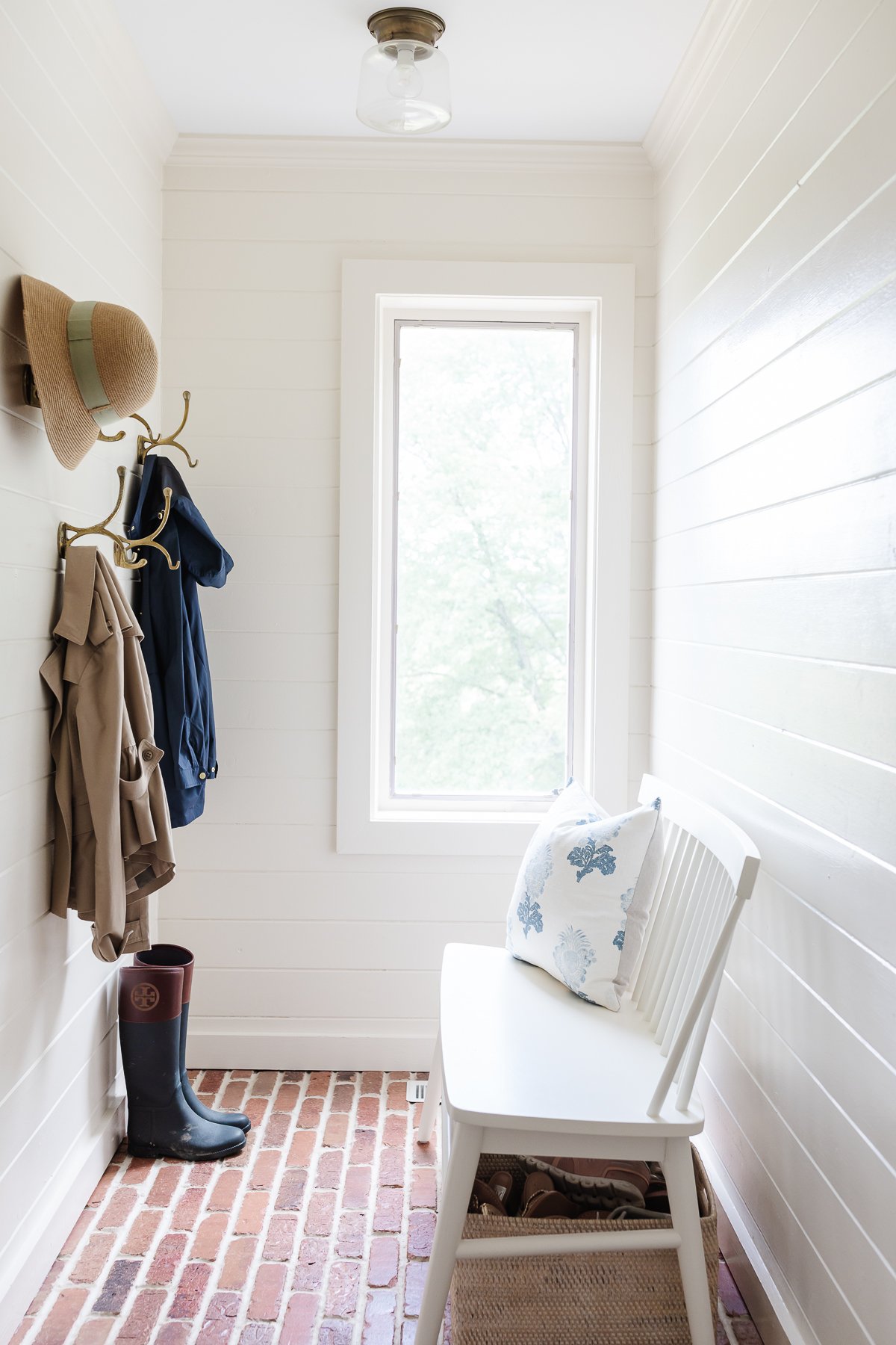
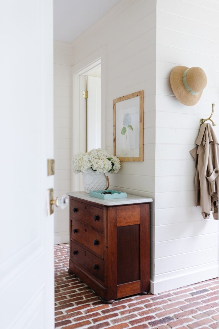
Brick floors collect the dirt and don’t require mopping, just vacuuming. Painted cedar walls wipe clean with ease. It’s the best space for collecting snow gear, muddy boots and so much more, without the stress.
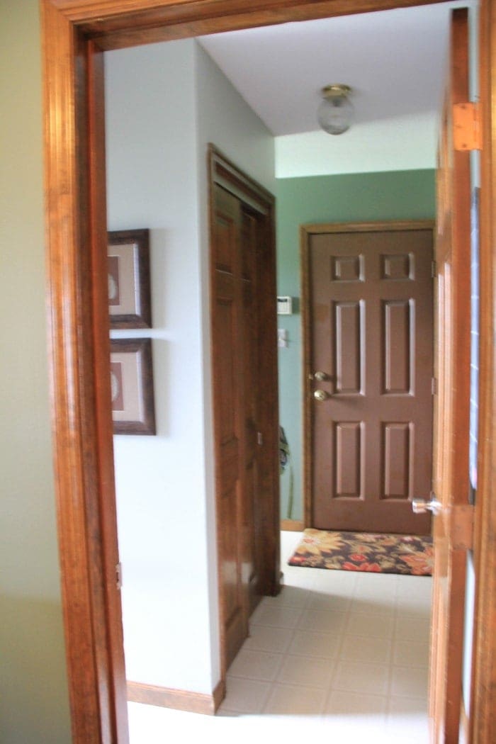
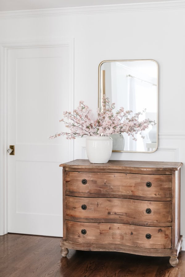
Almost the same view…where the closet once was, I added an antique chest to store sunglasses, sunscreen, hats, gloves and so much more. We also removed the door, leaving just the door frame, which really made it feel more open and inviting. Every inch counts in small spaces.
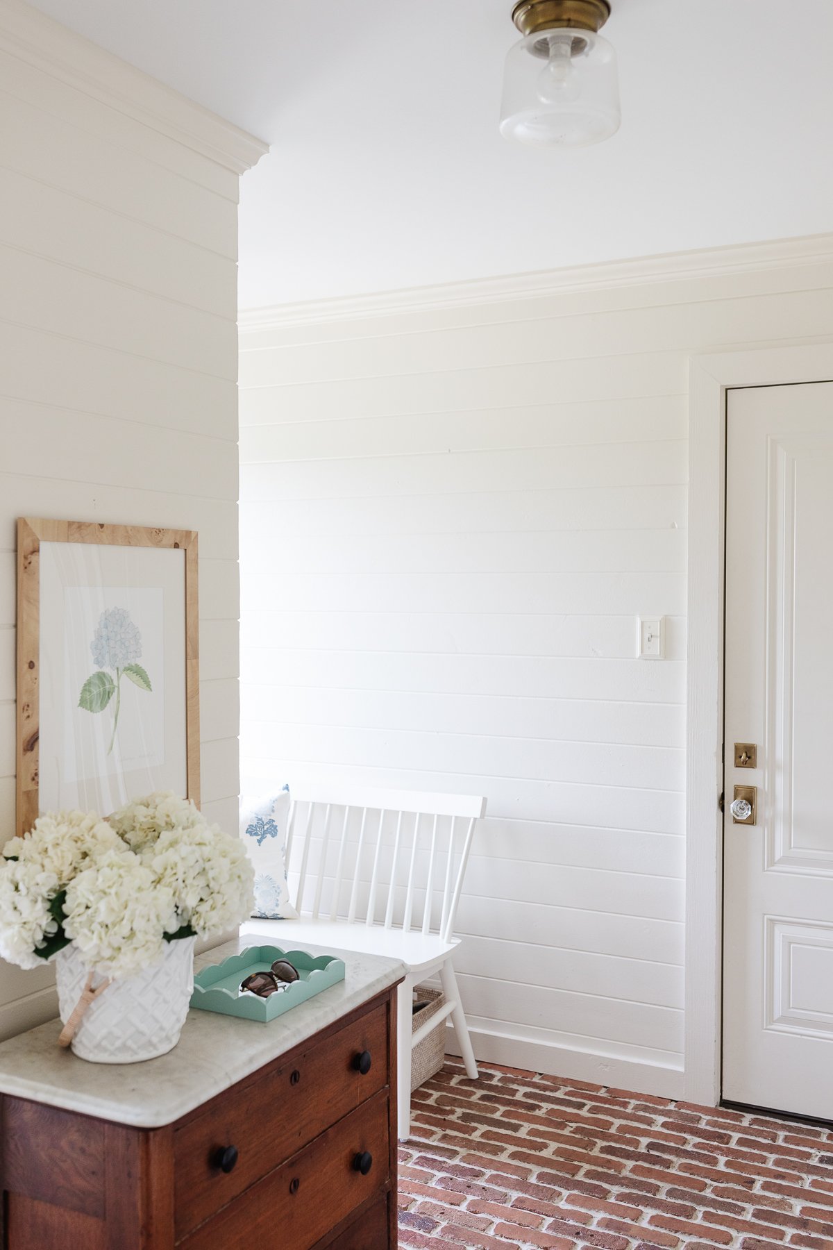
The view when entering from the garage…the chest stands were the closet was.
Garage
The garage reeked of smoke and when we moved in. After weeks of airing it out, we still struggled to get rid of the smell. You can learn How to Get Smoke Smell Out of a House here if you’ve struggled with the same.
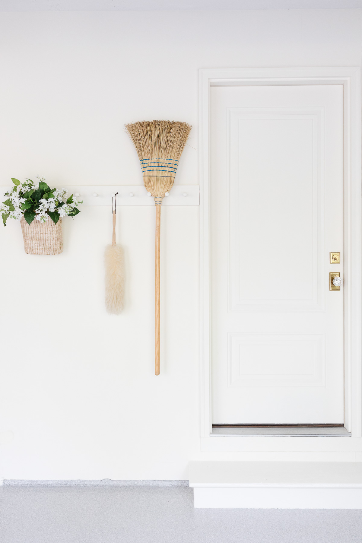
We painted the garage Farrow & Ball White Tie and added a brass and crystal door knob to make it feel like an extension of our home. Peg rail is an easy way to add function to the garage, but while maintaining an indoor feel.
Last Spring I talked Chris into building a Potting Bench for me! We added Beadboard, Unlacquered Brass Hardware and painted it in Sherwin Williams Evergreen Fog. I love pulling my car in now! It gives me a great space to work and store all of my pots, tools and more.
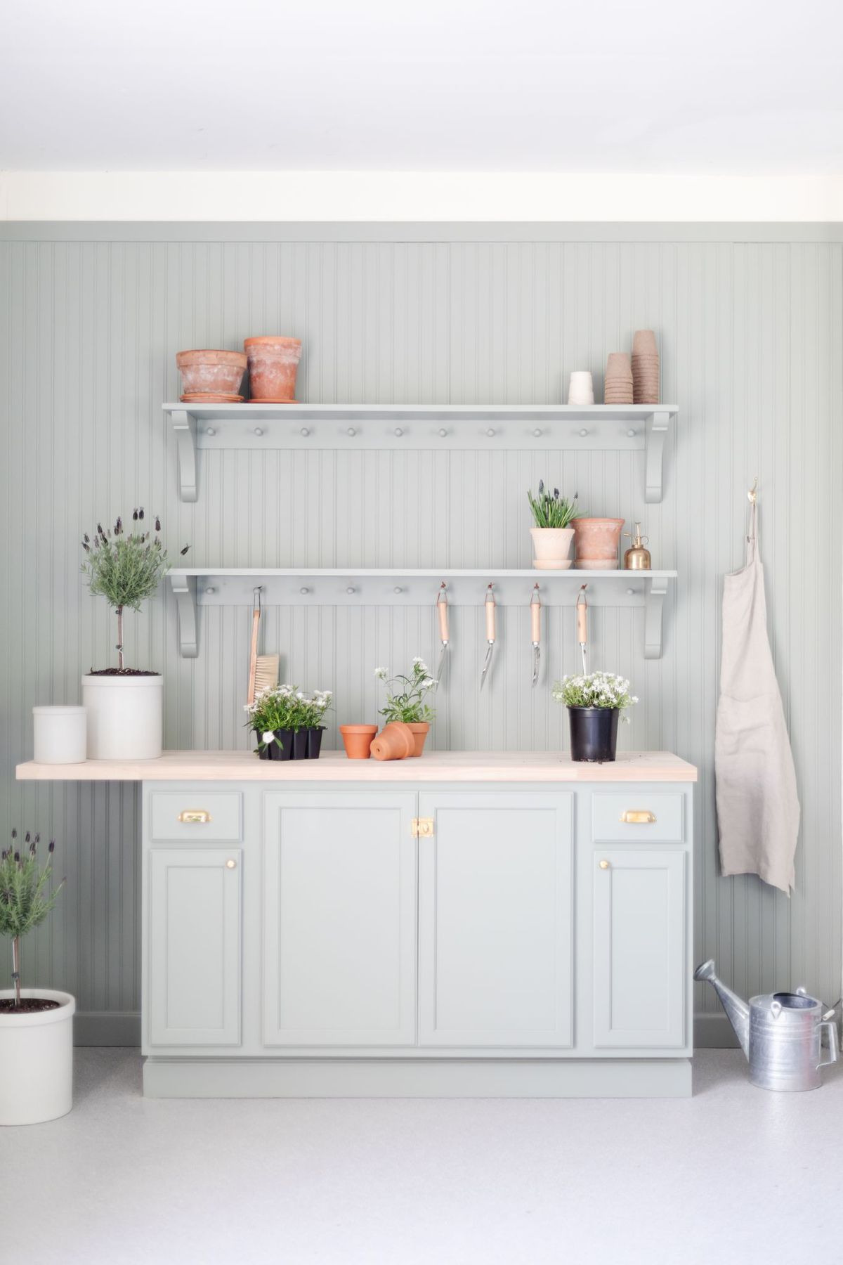
We had a Garage Floor Coating painted on to give it a clean slate. It makes it easy to clean and prevents us from slipping when it’s wet.
Side Entry
I failed to capture a before photo, but you can see the back of the home below for an idea…
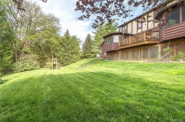
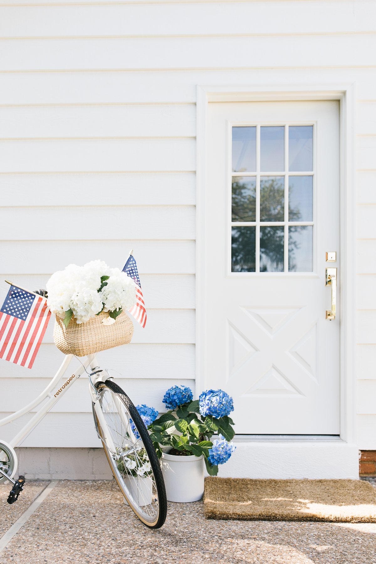
Fresh exterior door handles and paint go a long way!
Fire Pit
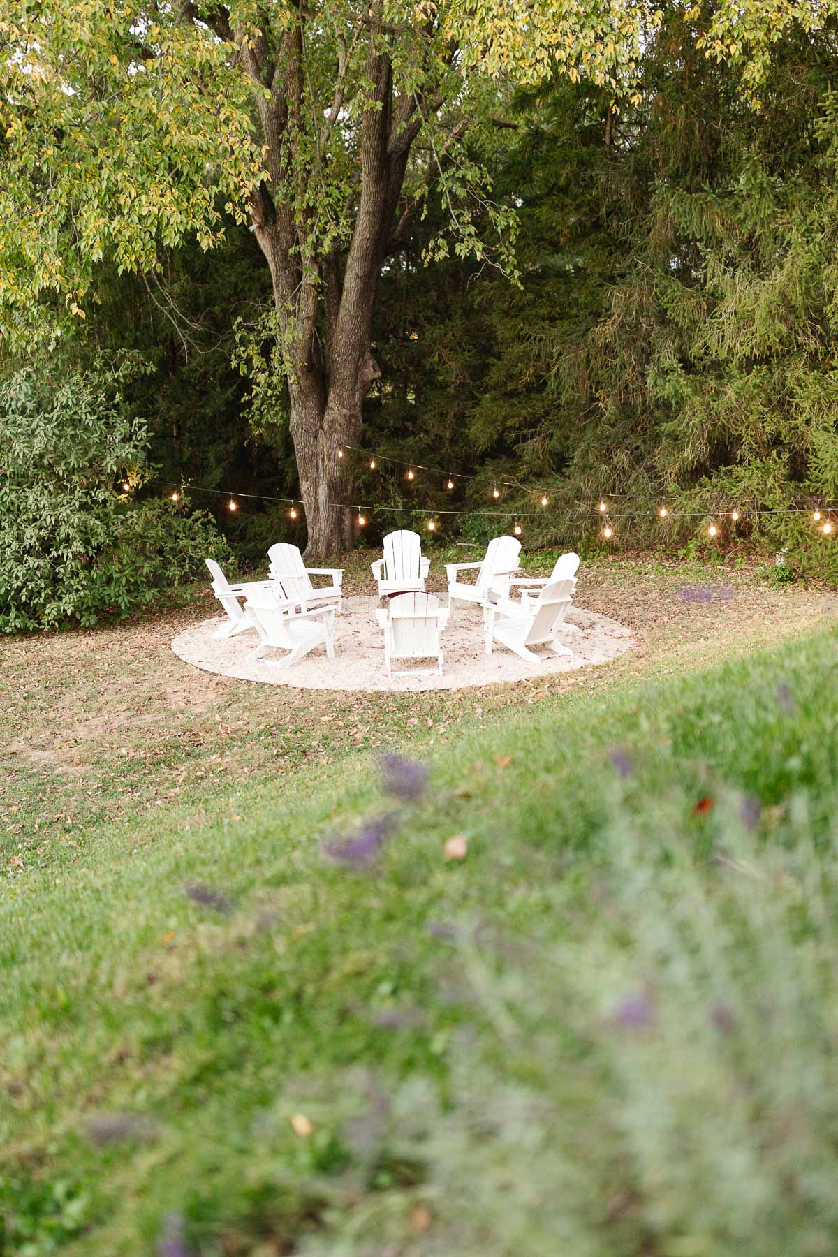
Last fall, Chris created a pea gravel fire pit area. It’s a great place to entertain, watch the sunset, outdoor movie or enjoy a s’mores charcuterie board. I can’t wait to share the rest of the back of our home when the landscaping goes in later this month!
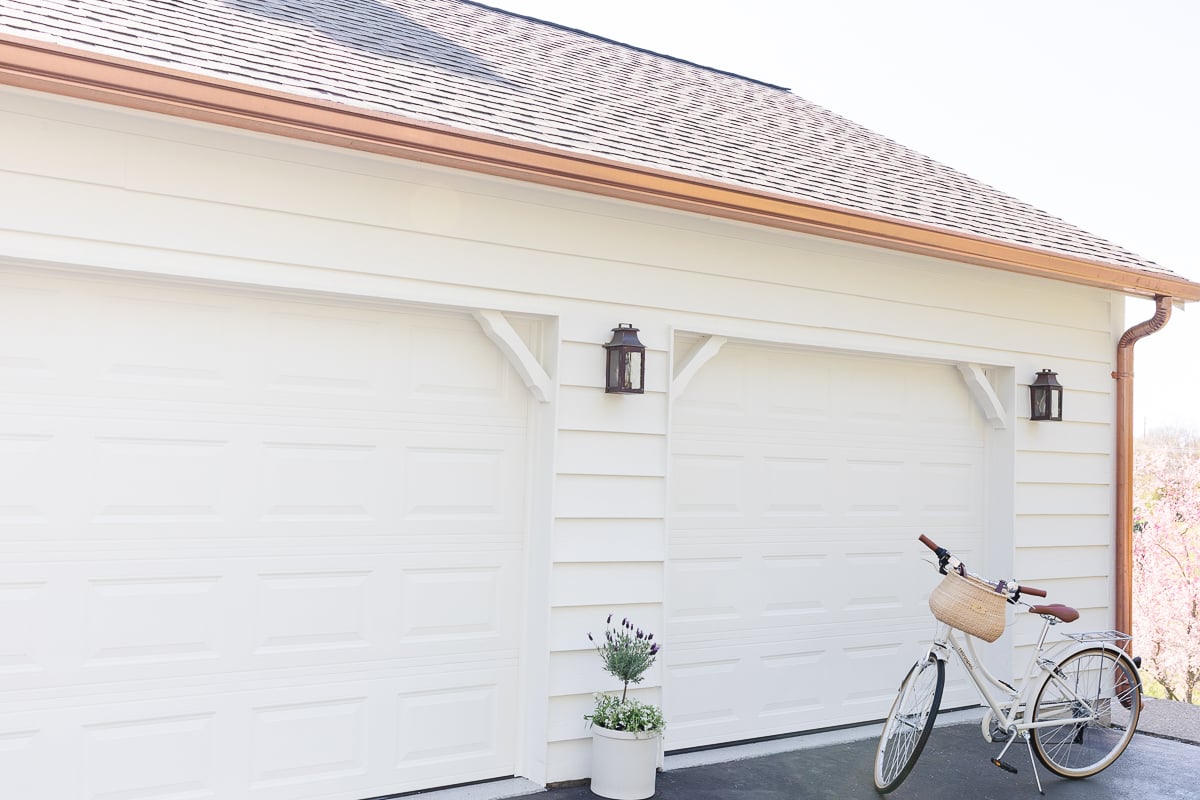
Garage Exterior
As you come around the bend on our street, the garage is the first thing you see.
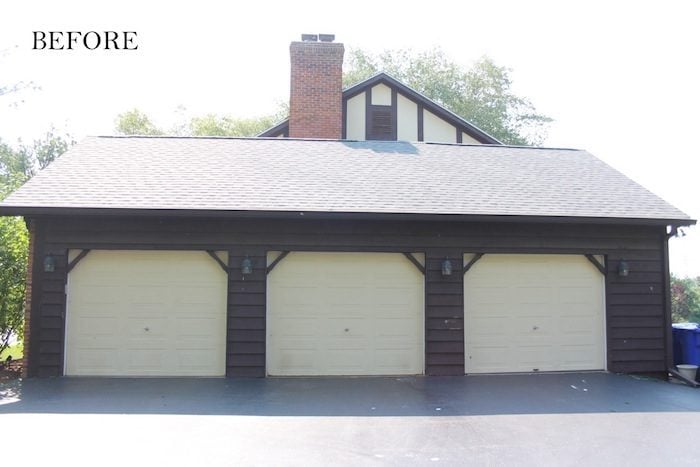
We opted to make it monotone and paired it with a muted roof. For true tudor style, we incorporated copper lanterns and copper gutters.

Living Room
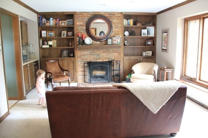
The living room is small, which presented a number of challenges. The fireplace felt dated and the wet bar was an unnecessary use of space. Even Ani was unsure.
We opened up the wall where the bar once stood, used paint, hardwood floors and molding to create a timeless space. Over the past few months I have been updating this room and can’t wait to share with you!
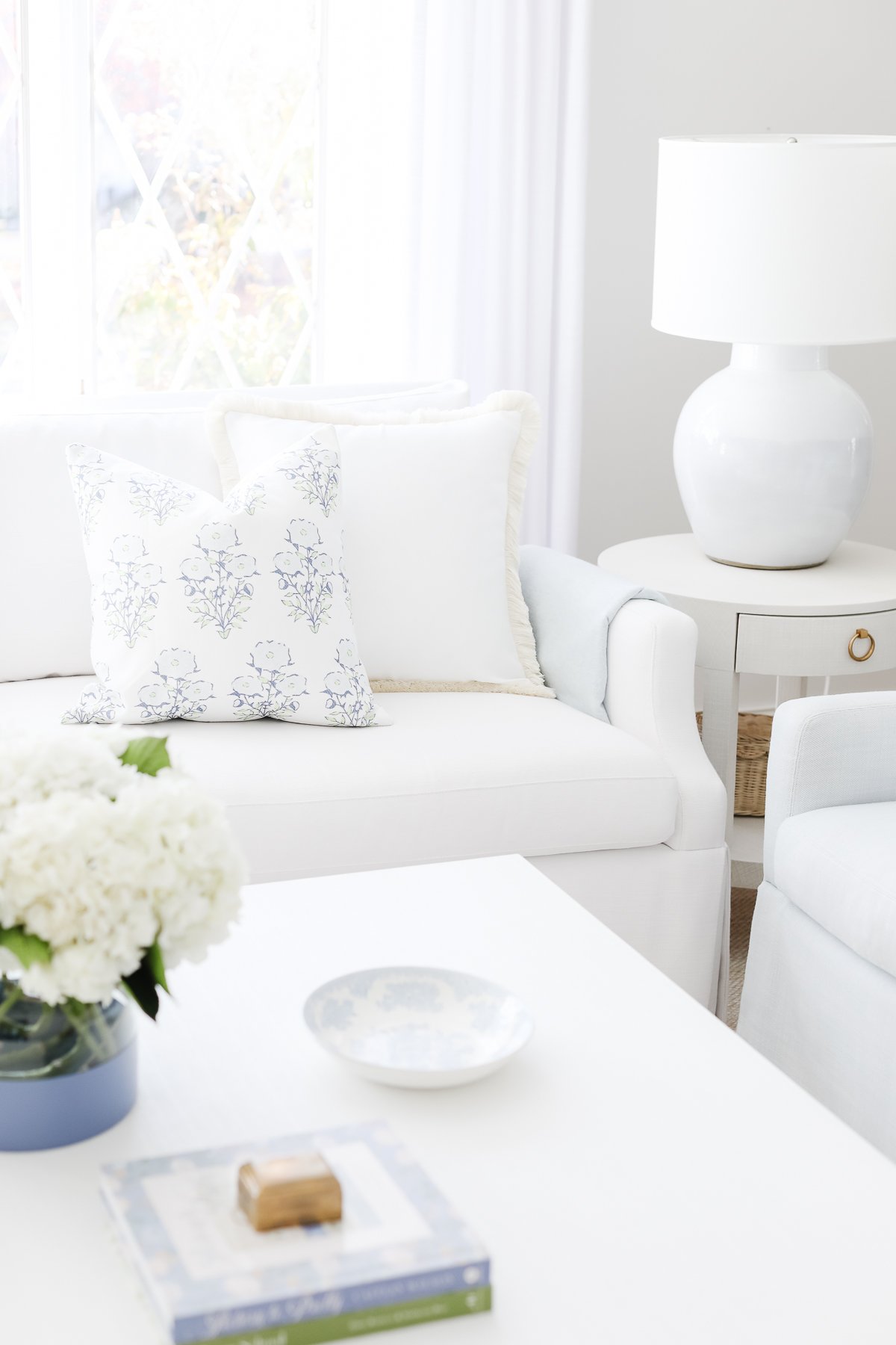
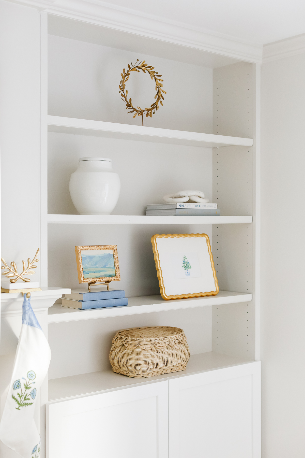
I have SOOOOOOO many more updates to share that deserve new images in the basement and upstairs, but for now…
Basement
The basement bar, basement bathroom and basement stairs projects were all a long time coming! Many of our choices were both functional and inexpensive.
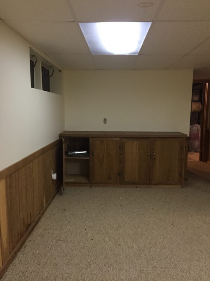
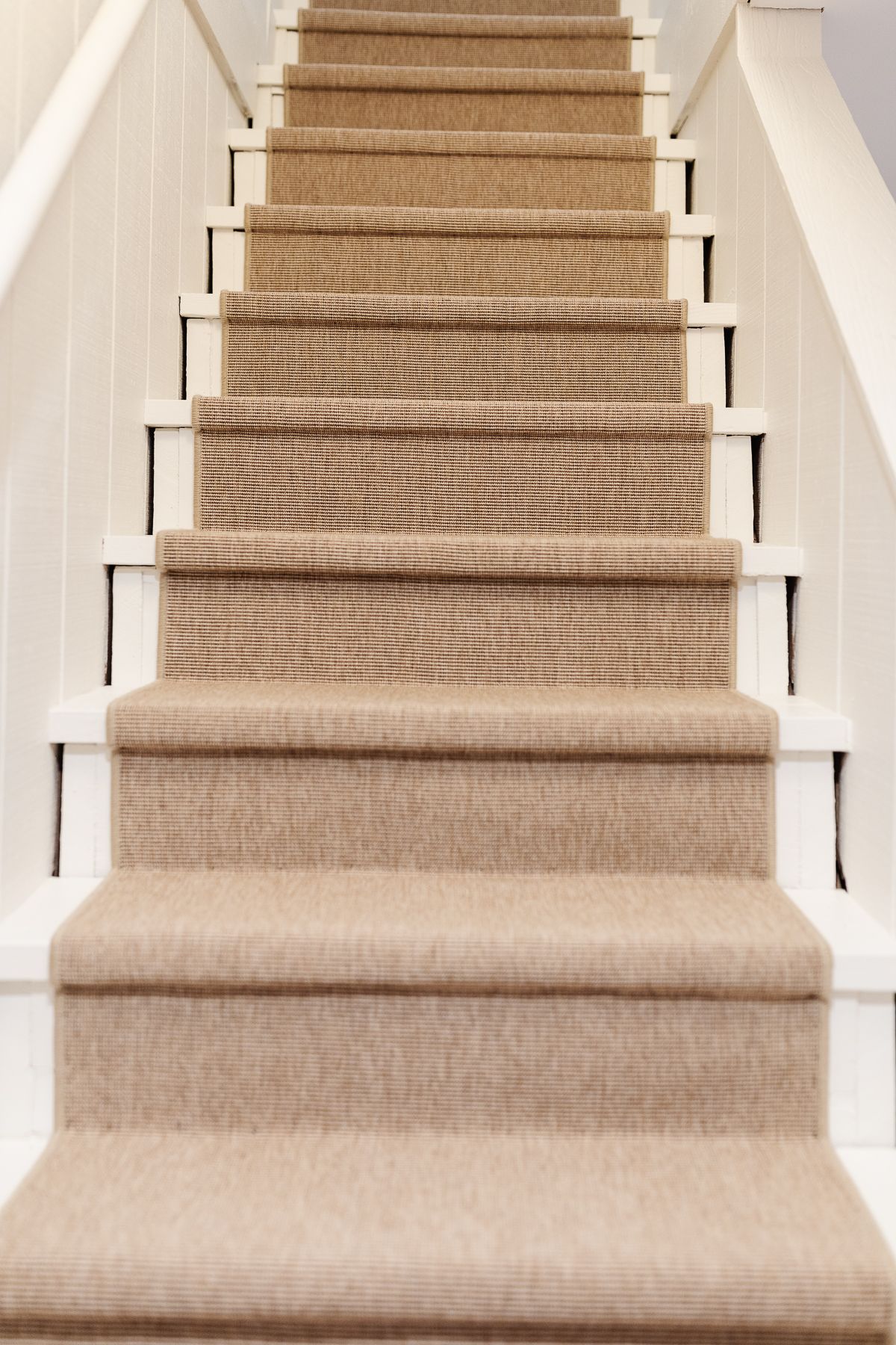
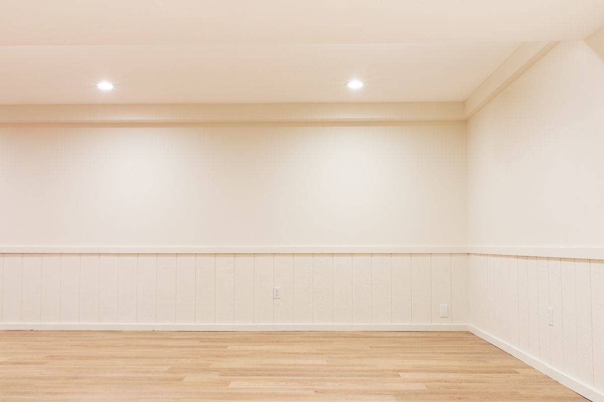
After our basement flooded last year, we did another update with a little paint and easy to clean LVP floors it felt like a new space! We painted the walls in Benjamin Moore Swiss Coffee and it’s feeling like a fresh and fun clean slate.
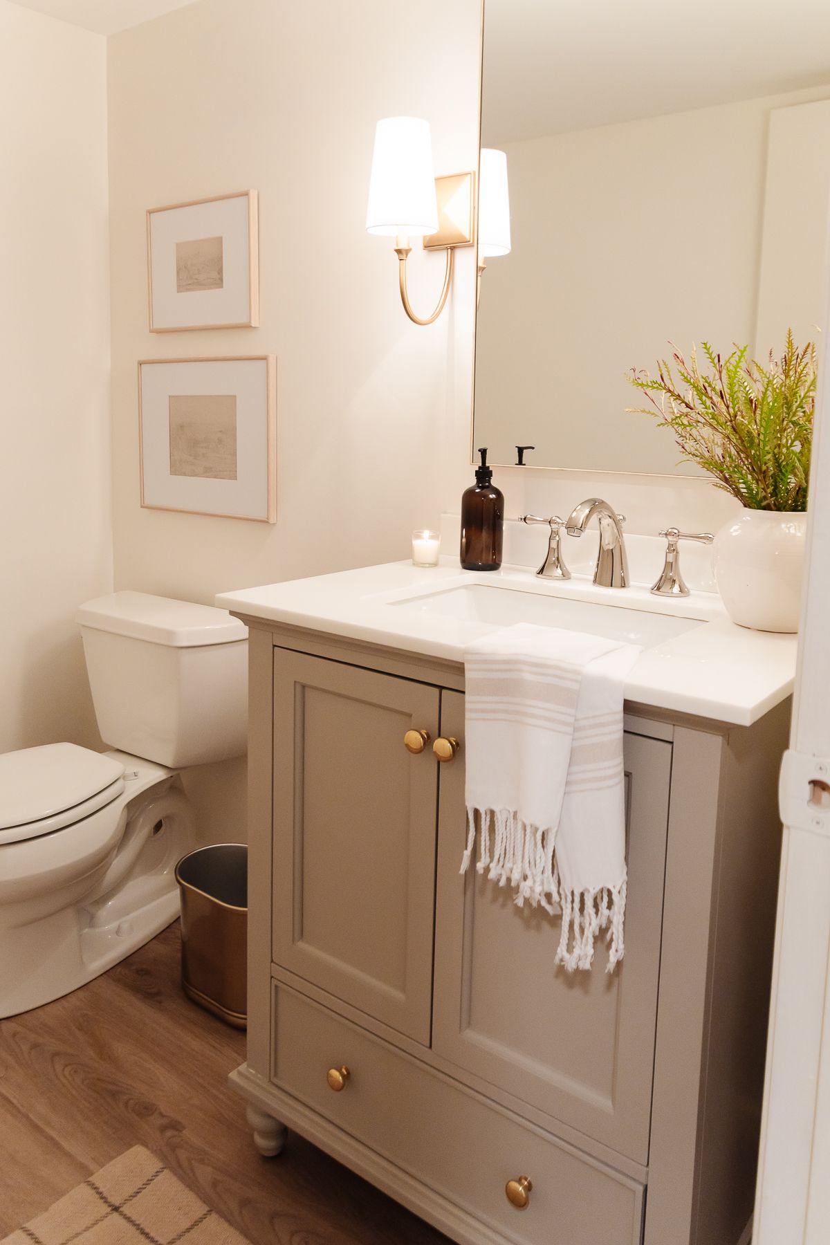
We overhauled the entire basement with a drywall ceiling, can lights, new windows and lvp floors (we ripped out cabinets and bars) and a new bath.
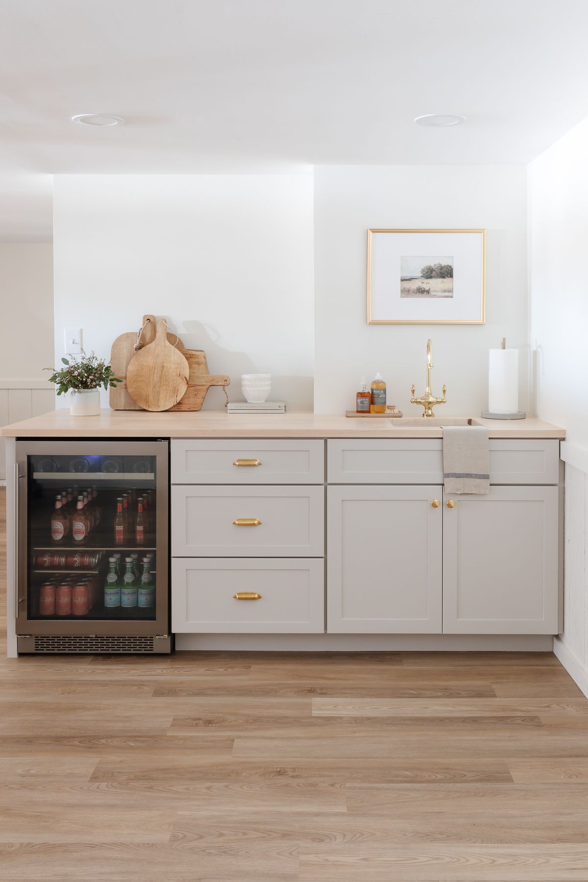
I can’t wait to show you the next update with pretty new furnishings down here – it’s coming together slowly but surely.
Upstairs Hallway
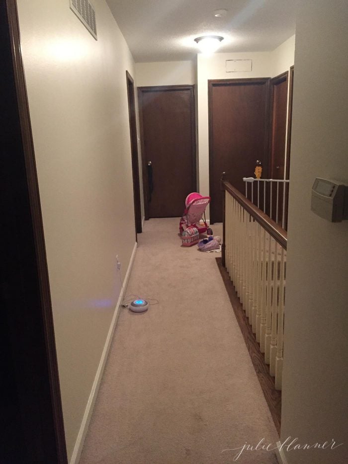
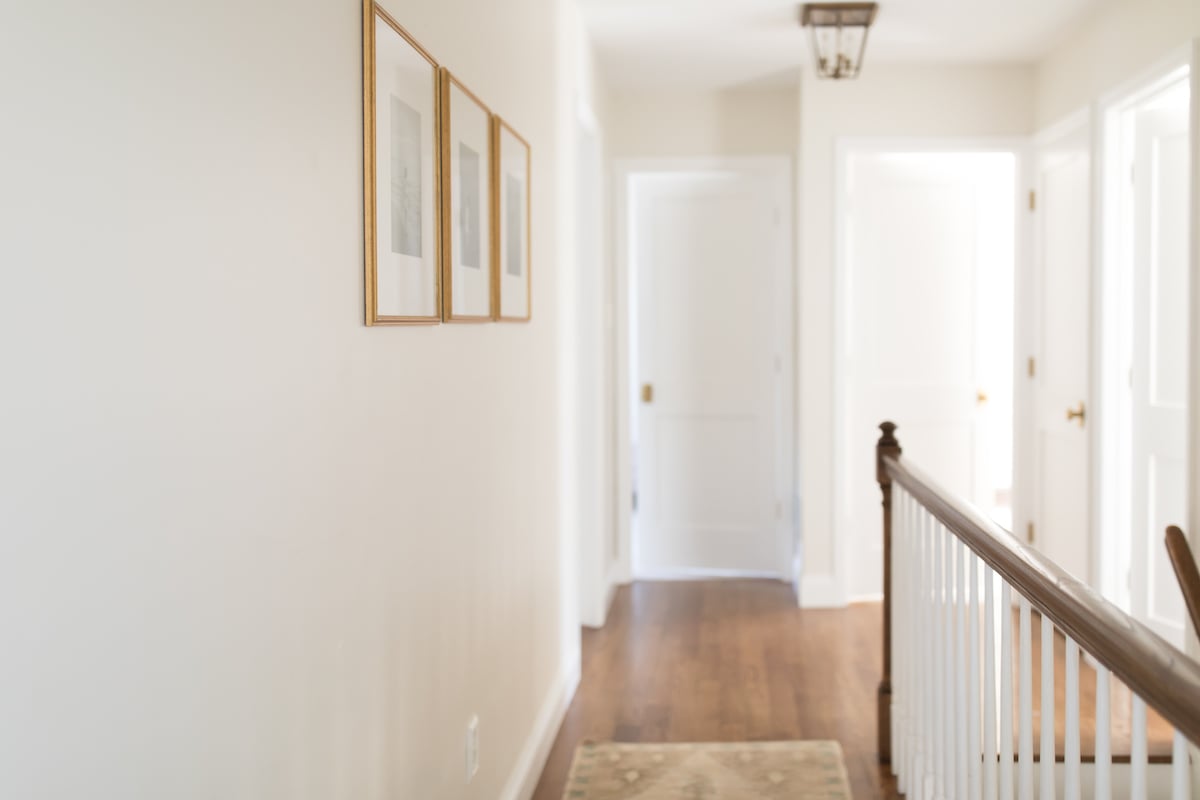
The hallway was so dark! It boasts 8 doors which makes it feel really small. We replaced the carpet with hardwood floors, added new lights, new doors, brass door knobs and more.
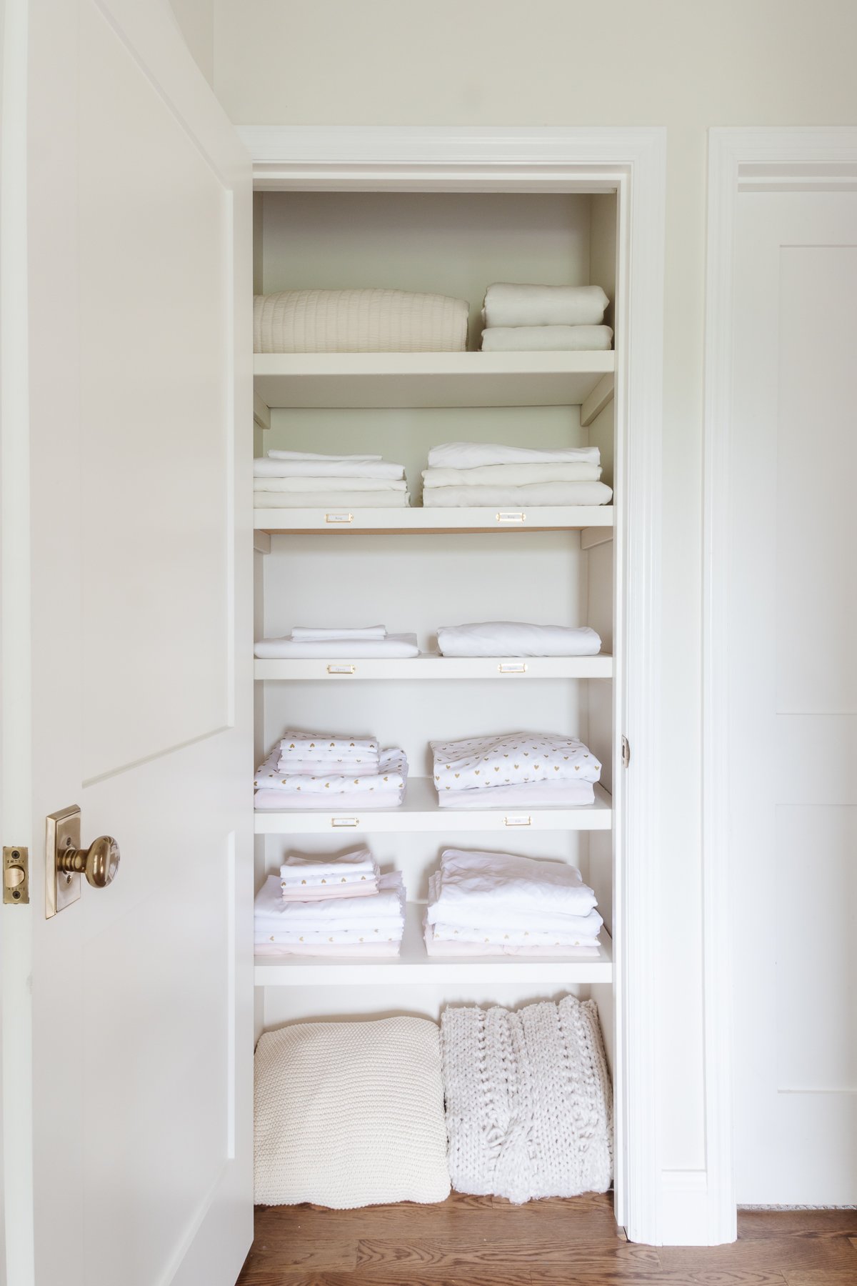
The Linen Closet was a quick and easy update that maximized function. You can get all the details of how I pare down, what I store in there and the inexpensive labels used by visiting the post.
Shared Bathroom
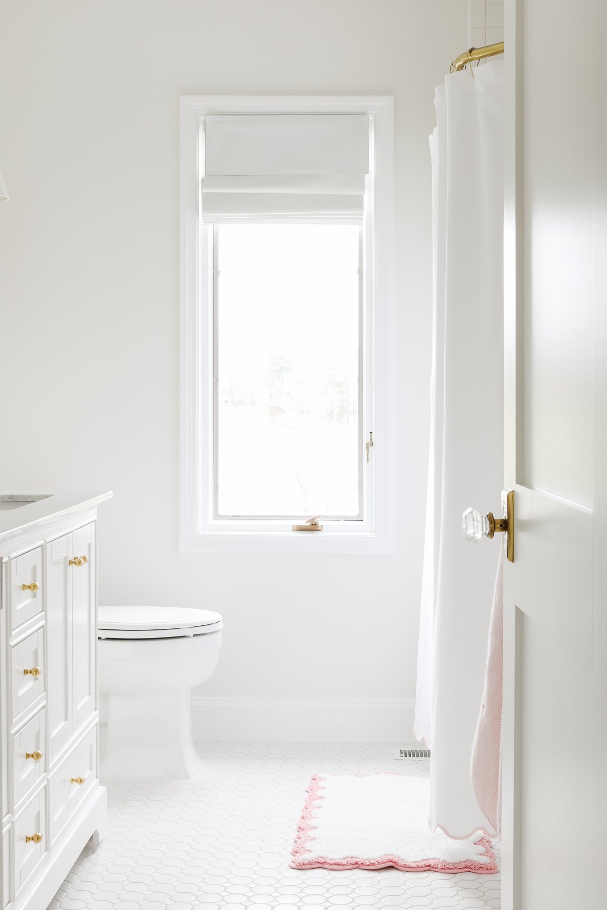
The hall bath (which the girls share) needed a lot of help! It wasn’t even close to code, soffits made it feel small and had two showers!
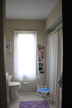
We turned it into a Spa Bath – the girls use it daily and it doubles as a guest bath!
Girls’ Bedrooms
The girls have now switched rooms and each have been redecorated to suit their age. I’m long overdue in sharing them! This is Ani’s previous room before and after.
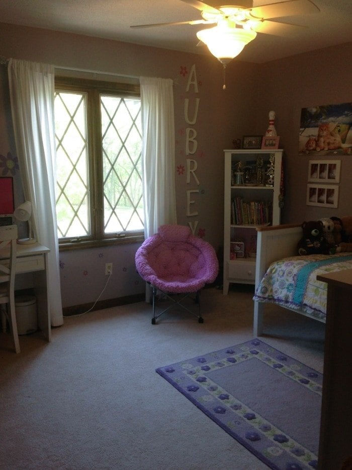
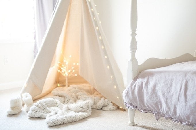
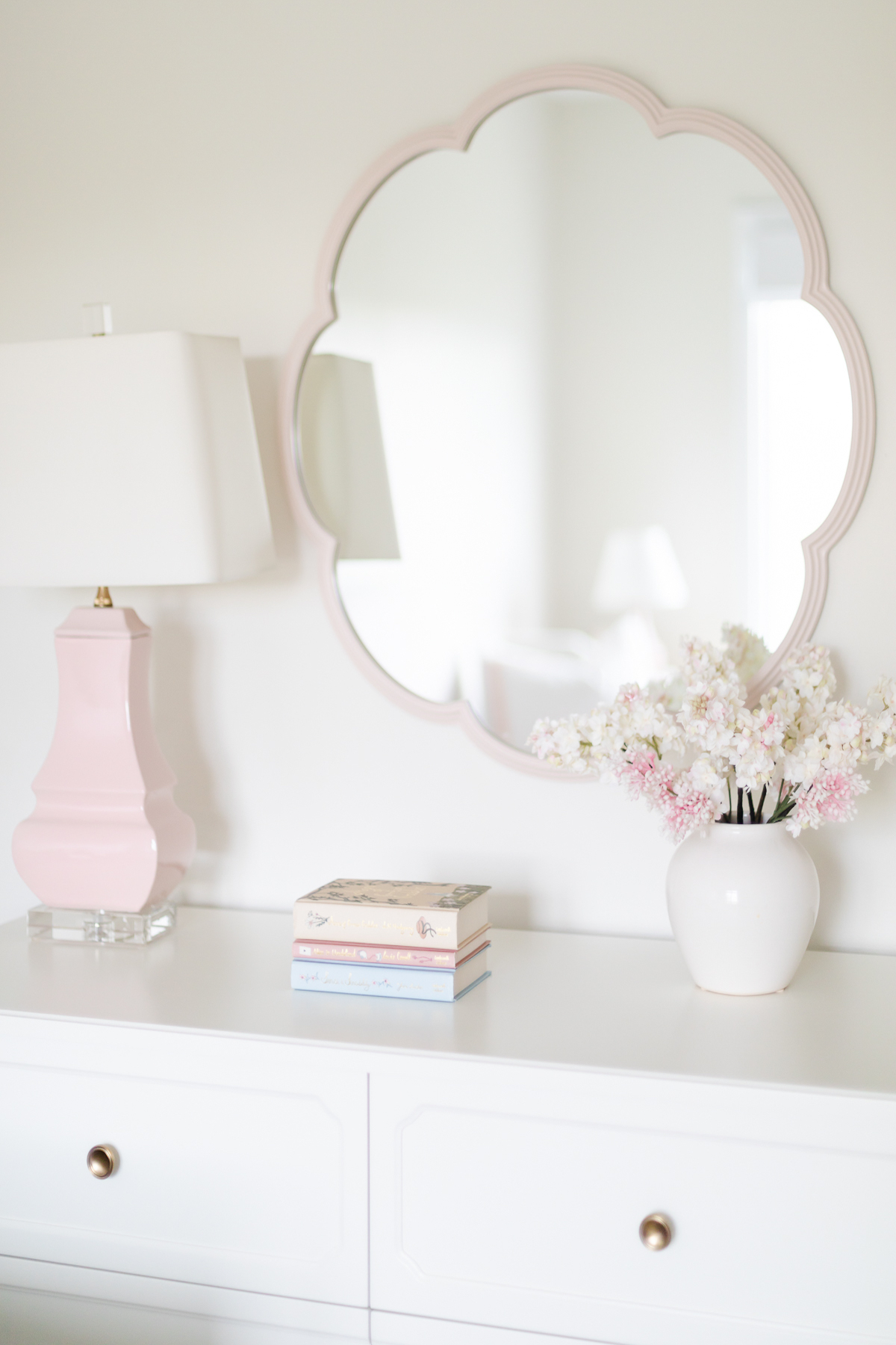
Here’s a sneak peek of her new room:
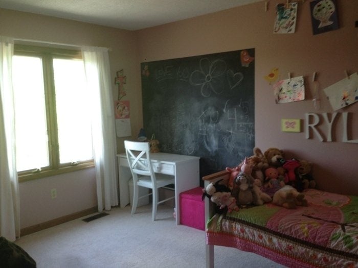
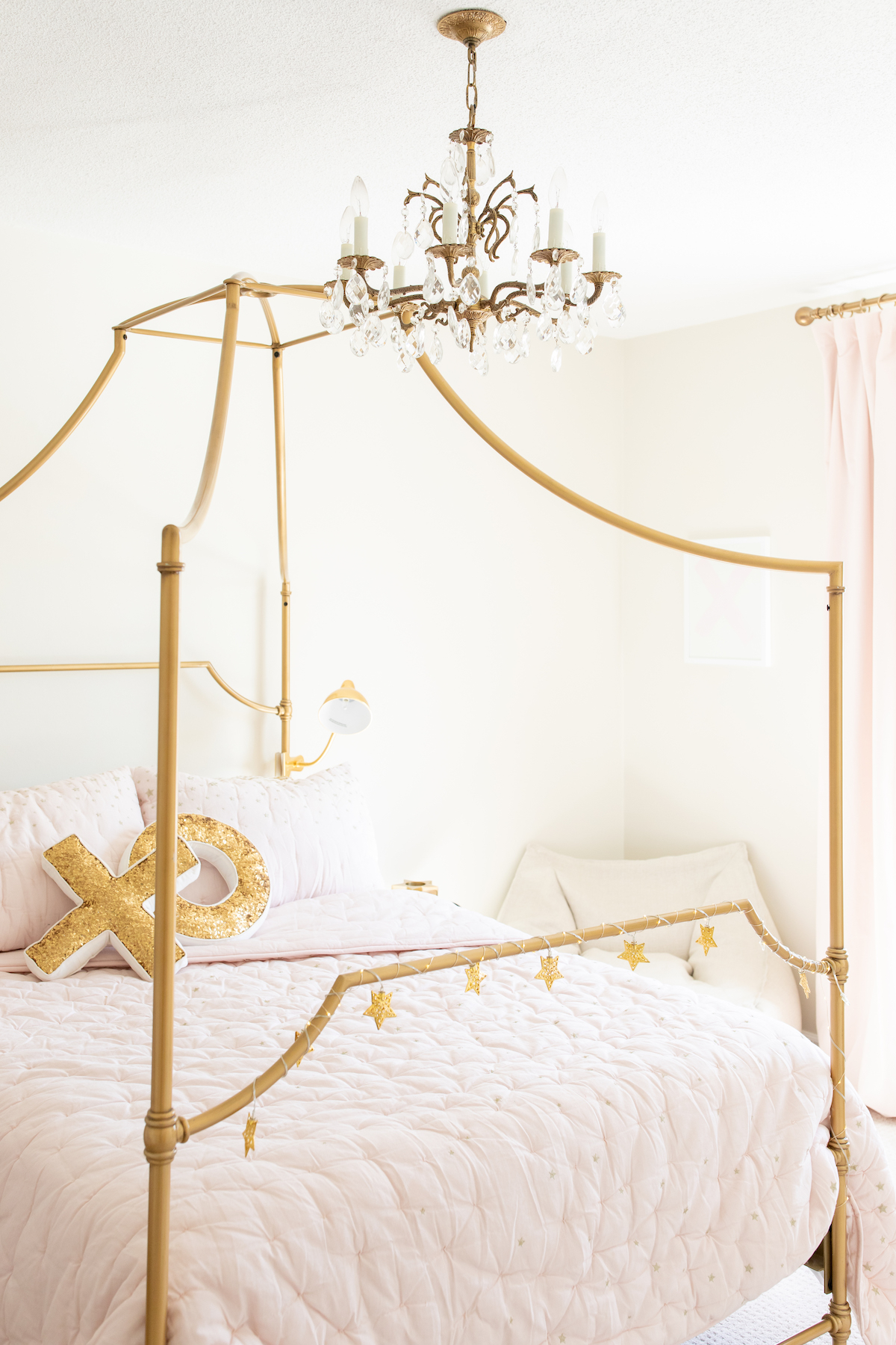
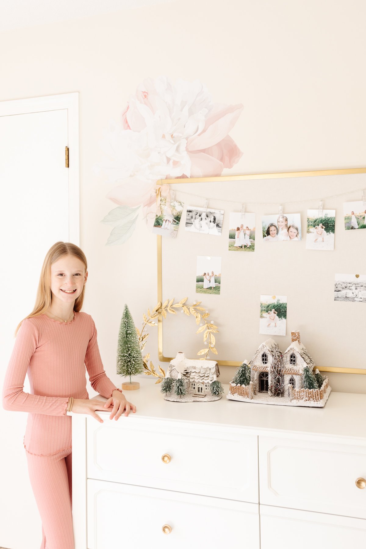
Adalyn’s Room has undergone a major transformation this year. She’s growing up before our eyes and deserved a new Tween Bedroom!
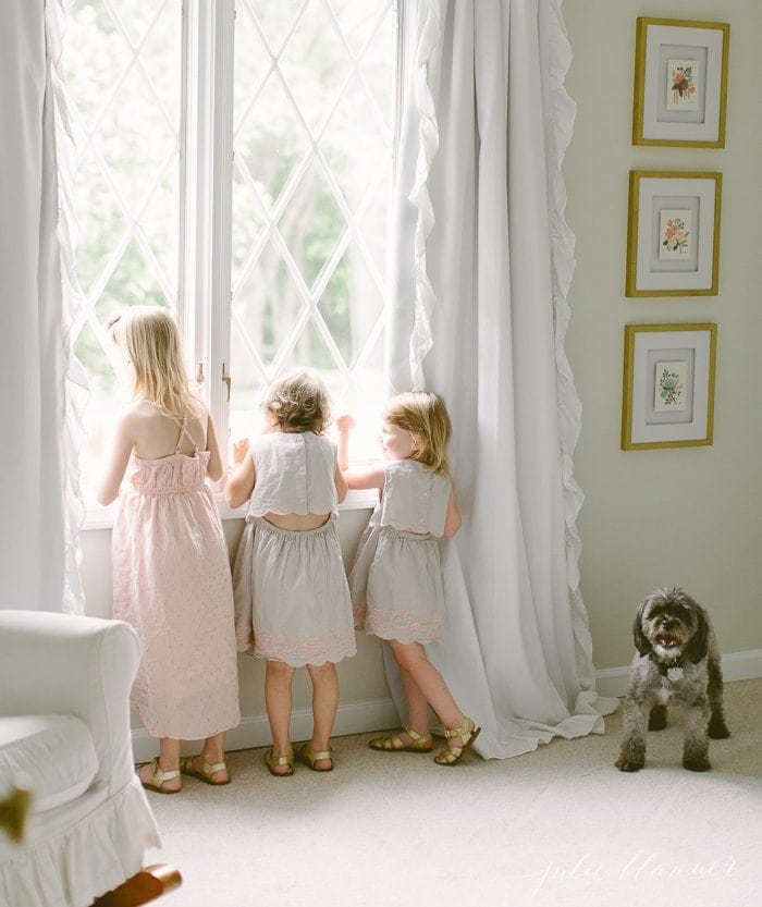
Below, you can see the space before we bought the house and a glimpse of her six years ago when we first redid this space.
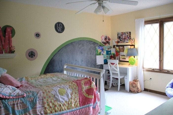
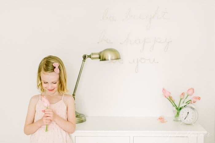
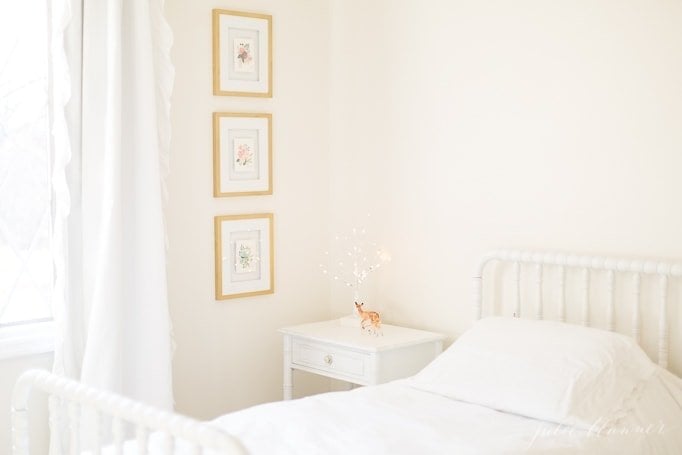
When we changed it into a sweet pale pink little girl’s room, I cut down a console table to make a desk that doubles as a side table. Just above it I added a little custom wire wall art.
Now she has a beautiful gold canopy bed, glitzy gold touches and a splash of big pink peonies on one wall. It’s a fun, grown up space for her!
The now replaced fabric pinboard was perfect for displaying artwork and precious photographs.
Isla’s Room was small, but functional. She has since moved to a larger room and her former room was converted into the guest bedroom.
Modern Laundry
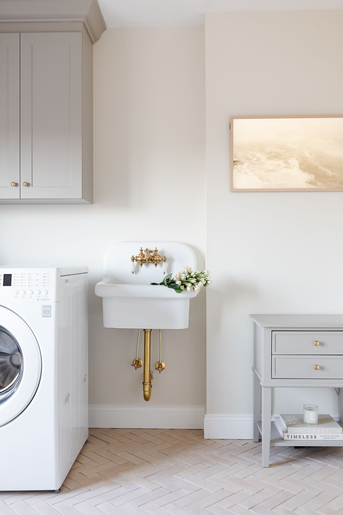
We are fortunate to have a Second Level Laundry Room adjacent to our master bedroom. It is incredibly convenient. As you can see, we initially gave this room a light refresh with a sink skirt, new faucet, hardware, light fixture, paint and accessories.
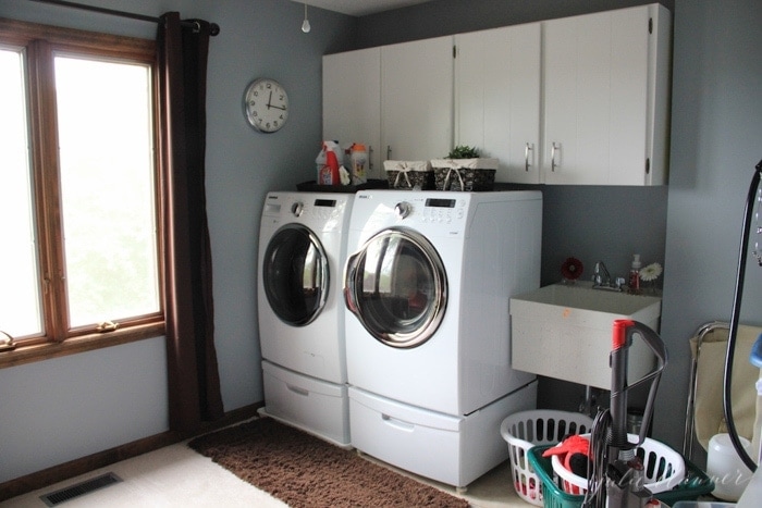
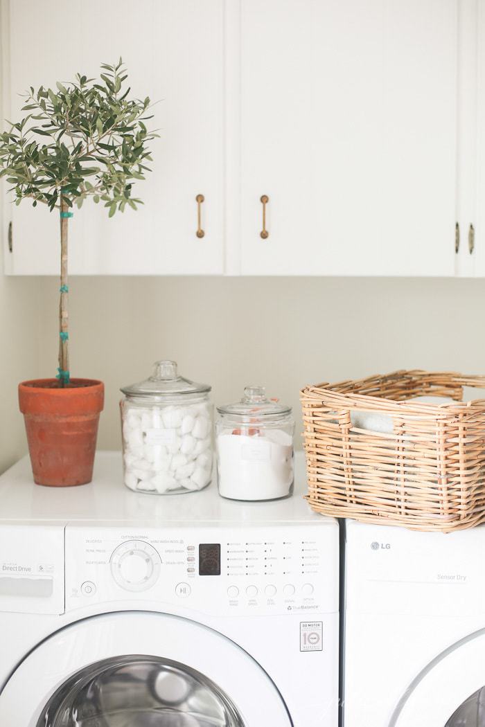
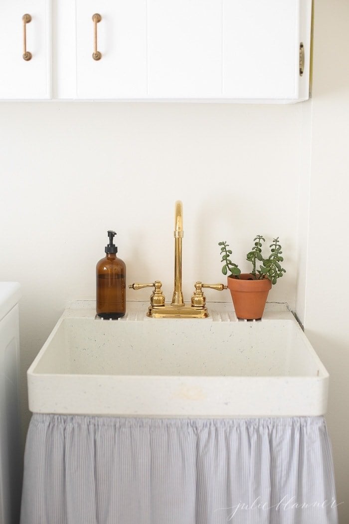
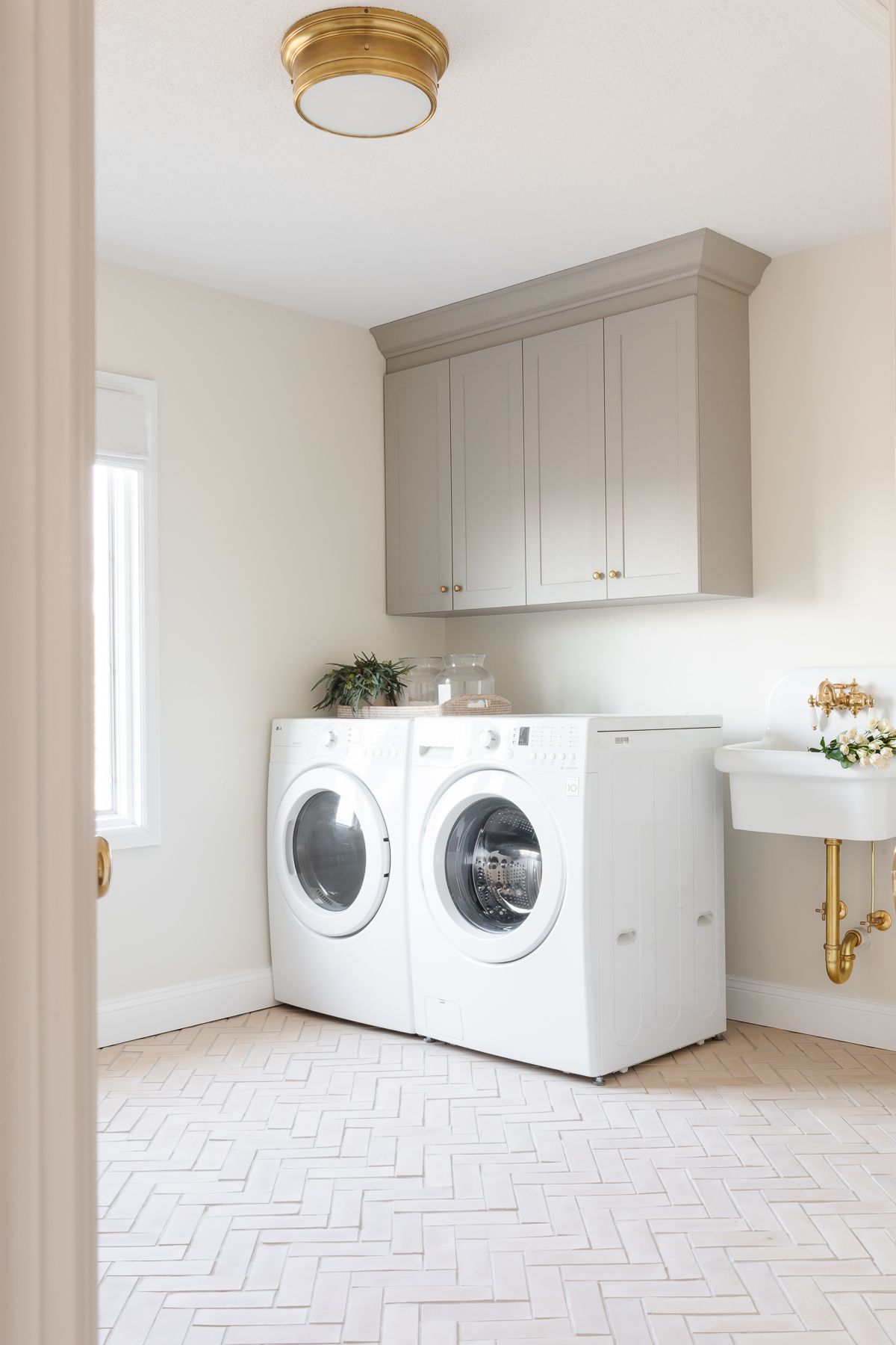
Now we’ve done a full refresh, with new cabinets, peg rail, a custom built closet to add function and feel more intentional and a new wall sink.
Want to see all the photos of this pretty laundry room? Check out our Modern Laundry Room update! I’m in love with our herringbone floors.
Primary Bedroom
The Primary Bedroom has two large windows but still somehow felt dark.
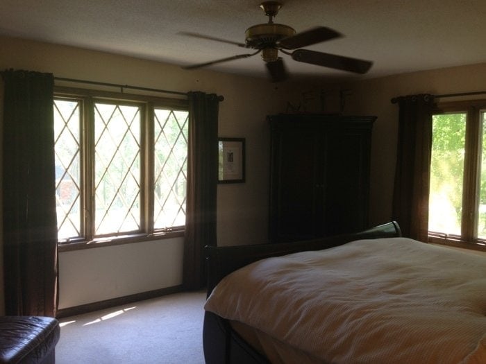
It, too, received a little refresh with a larger project to come!
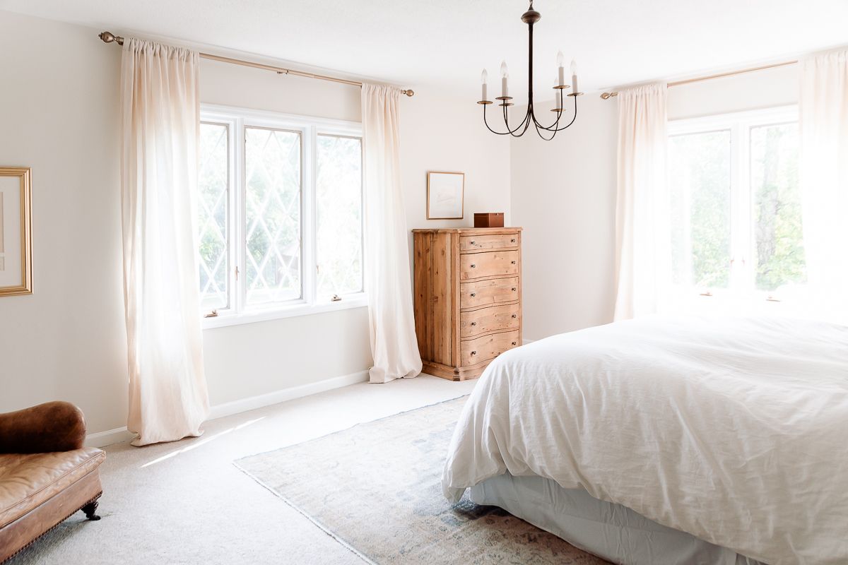
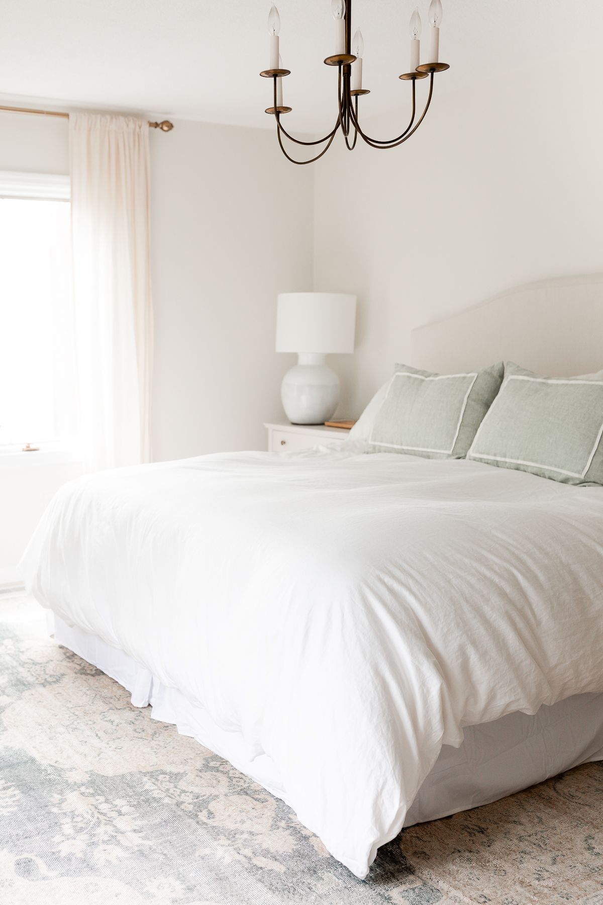
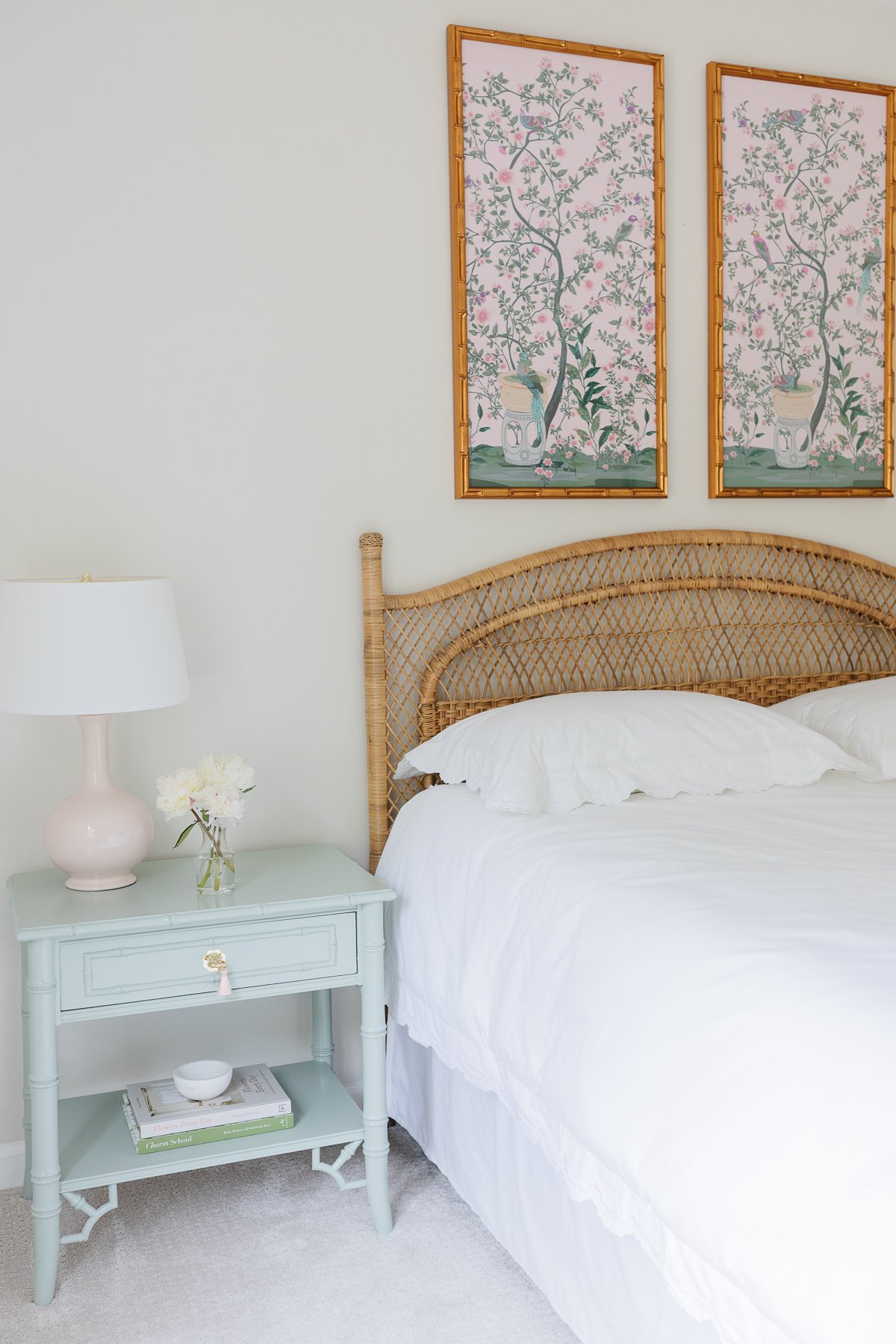
I’d like to update our primary bedroom bedding this year! Any ideas or thoughts on what would look good in this space? We just added new bedside tables and painted them for a soft, pretty look.
Primary Bathroom
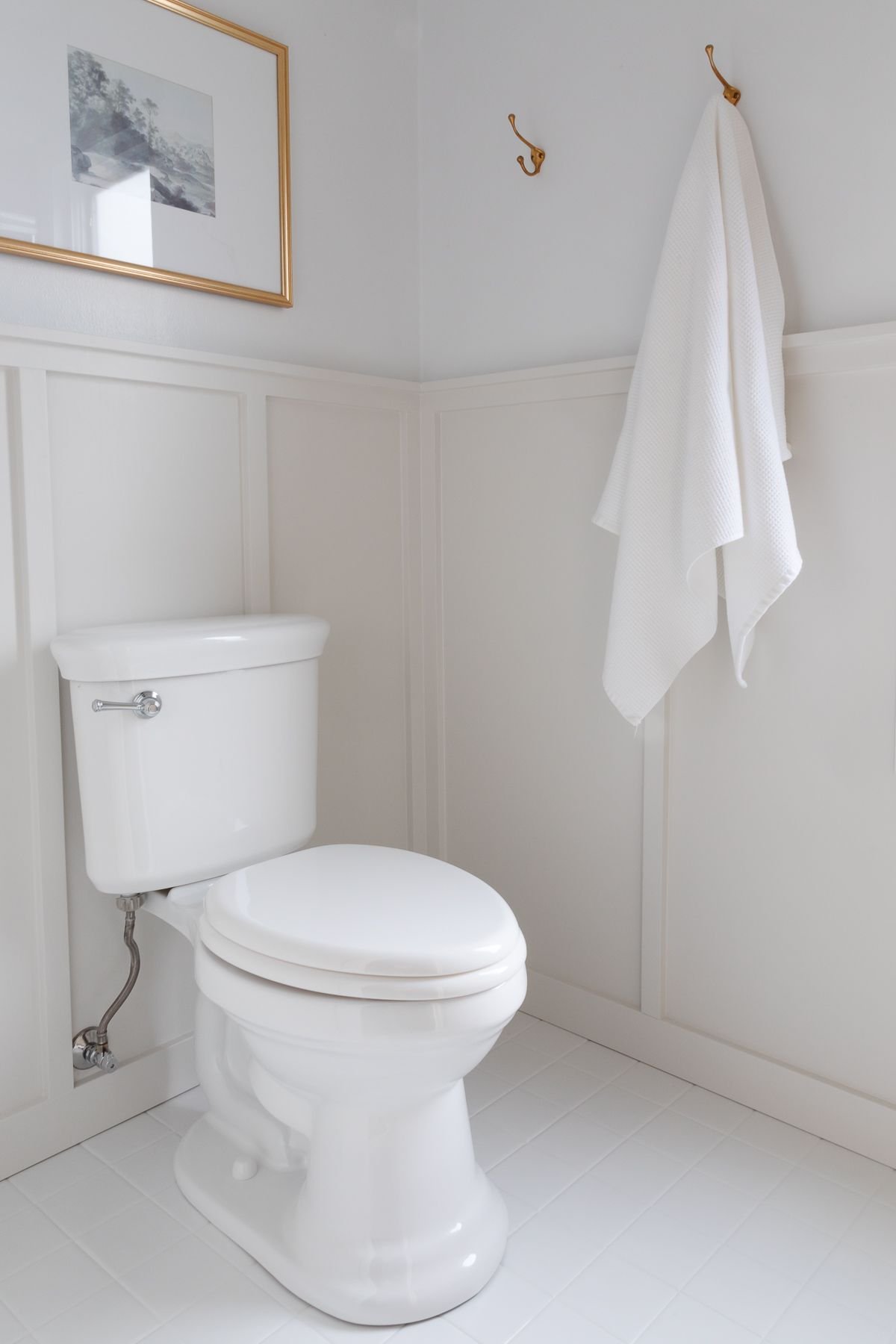
While we haven’t found the time or budget to take on a full renovation of our primary bath, we did upgrade it this year! These simple cosmetic changes made a world of difference.
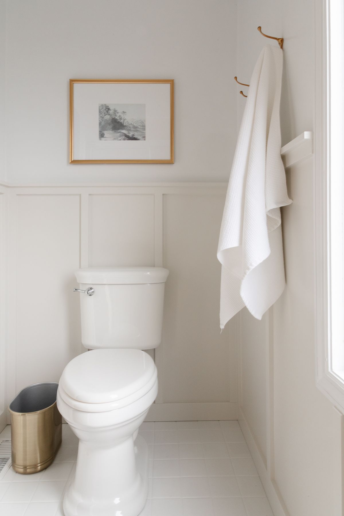
See the full update about our board and batten here, and learn how to paint ceramic tile here!
Guest Bedroom
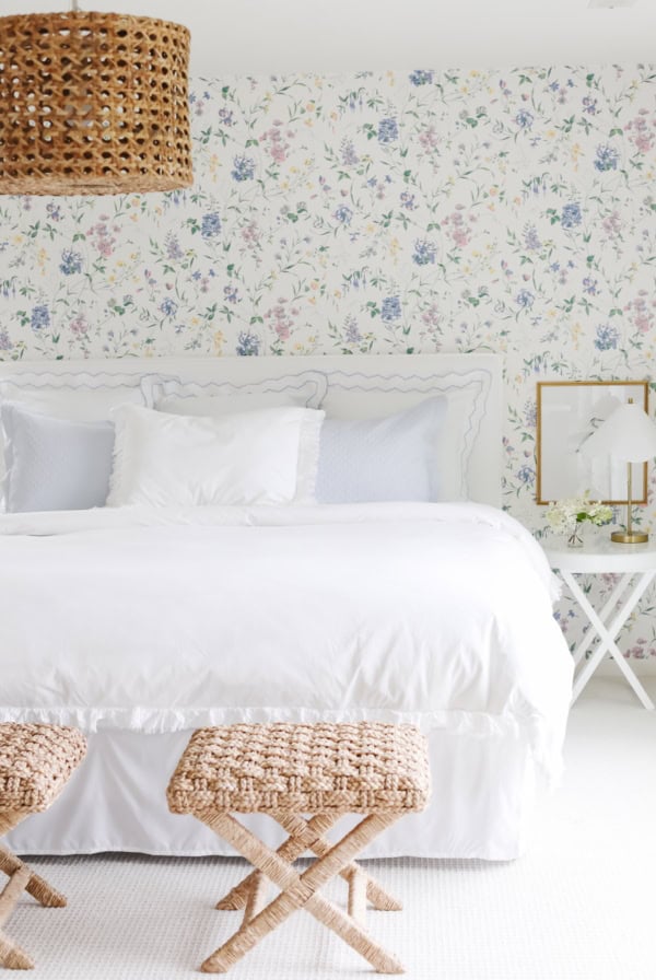
The guest bedroom is simple, yet fitted with everything a guest needs for a relaxing stay. It’s decorated with inexpensive block print sheets, Craigslist furniture like this Rattan Bed and a sailboat painting.
We had custom peel and stick wallpaper made to create an accent wall, but it ended up bubbling and sadly had to be removed. Fortunately, I love the space just as much with our simple cream walls.
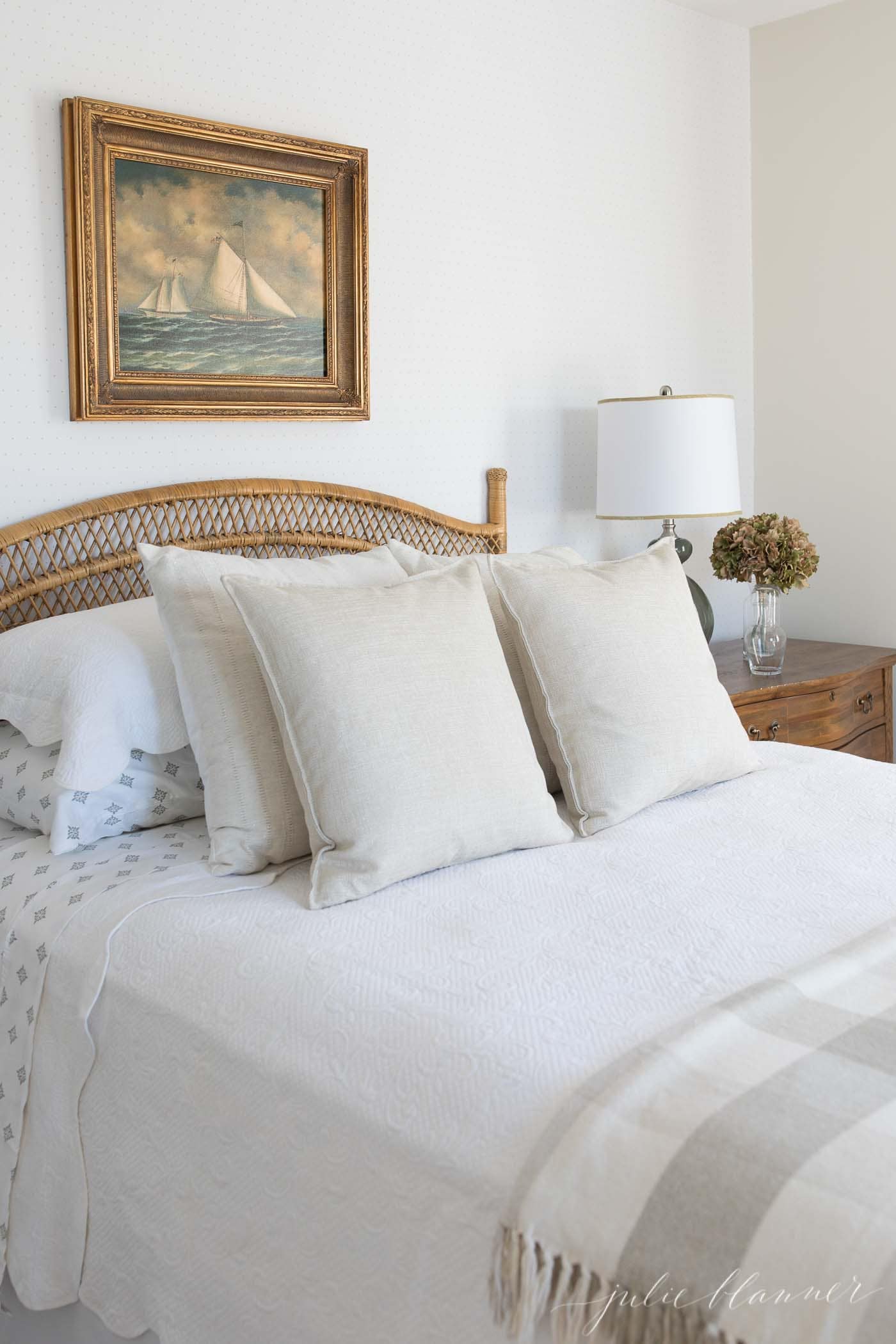
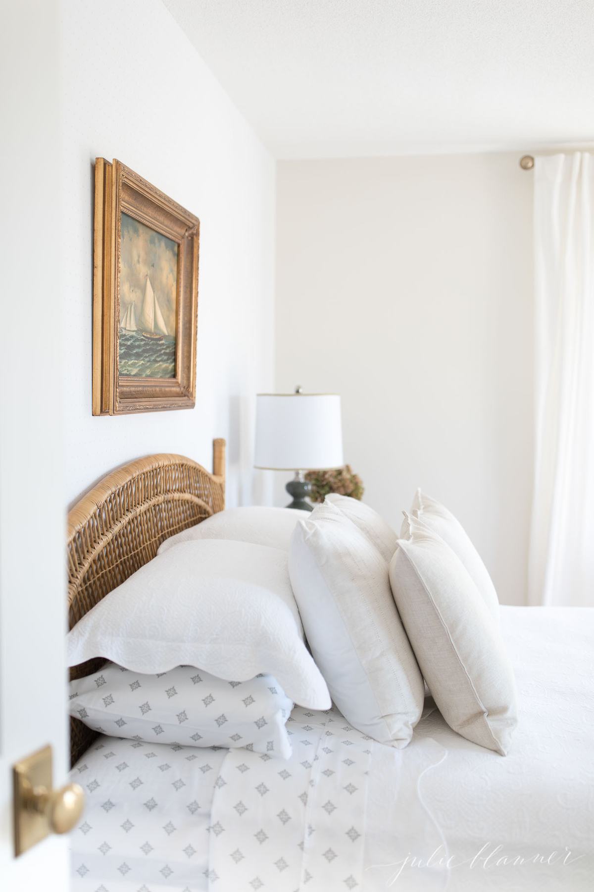
Below is what the space looks like in 2024. More to do, but simple and lovely for now!
Thanks for taking time to reflect with me on a before and after look of our home. Truly, it’s a before and during, but it’s always nice to take a moment and appreciate what you have done when you feel overwhelmed about your to do list.
I often remind myself that it’s more important to enjoy our home than to decorate it. Think about all the things you love about your home rather than the things you don’t. It will not only bring you peace, but will also help better define your next project.
Right now my favorite room is our breakfast room. What’s your favorite room in your home and why?



Beautiful, classic choices! Do you mind sharing the neutral paint color you decided on for the walls?
Of course not! https://julieblanner.com/favorite-cream-paint-colors/
Hi what’s the paint color on the walls? Love it!!
No problem https://julieblanner.com/favorite-cream-paint-colors/
Julie these are stunning transformations. You have a beautiful family and home. You inspire me!!
Thank you! Have a beautiful weekend!
Wonderful tour!
Thank you! Have a great weekend!
Julie – I LOVE what you have done with your home. I recently moved into a home that looks extremely similar to your before photos. I was feeling pretty hopeless that I would be able to convert it to my style but after seeing your photos I am very optimistic. Besides the kitchen, did you paint the existing doors and trim or did you replace it all? Are the walls the same color as the trim or different? Would you mind sharing the colors? Thank you so much!
I would have just painted the existing doors and trim, but they were in pretty bad shape due to damage from dogs on the main level and upstairs they were cheap hollow core doors, so we opted to replace. When we had new hardwoods installed, we went with a more substantial trim as well since we had to replace anyways. In some rooms I painted the same color, but trim in a higher sheen and others a white trim. All of my colors can be found in the side bar. Enjoy!
Gorgeous afters! Thank you for sharing these beautiful glimpses into your home. 🙂