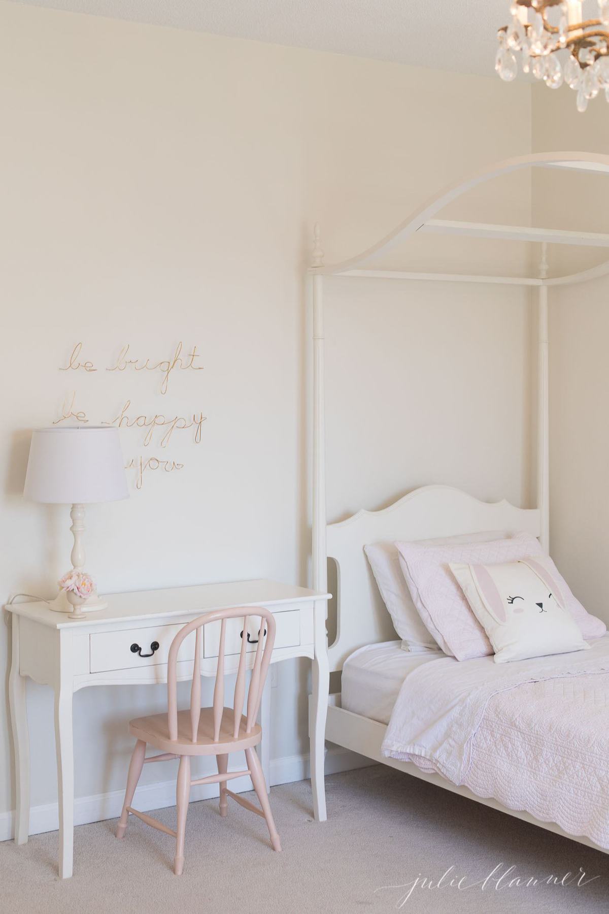
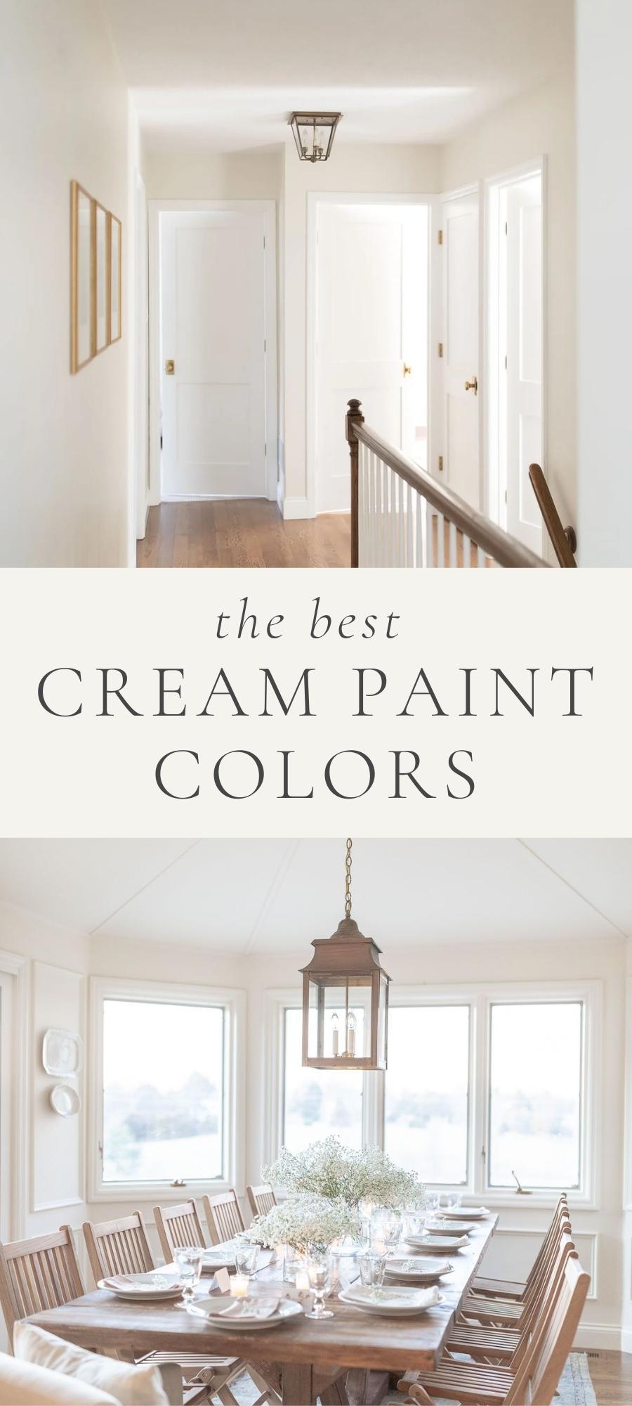
Cream color paint gives you a warm neutral wall color that fits just about every home and every room. This is a round-up of the best cream paint colors for walls!
These cream paint colors are easy to use, easy to decorate with, and will create the warm and cozy home of your dreams.

You’ve seen many of these pretty cream paint colors before in our home over the years. However, given that it’s one of the most frequently asked questions I receive, I wanted to share more about them. I know how agonizing selecting a color can be!
Furthermore, I don’t take paint color decisions lightly. Fortunately for you, you can! I am taking the guesswork out of selecting paint colors for you. I love chatting paint with you!
By detailing pros, cons, features, styles, where to use it, colors to pair them with, sheens and more, I hope to eliminate the guesswork. All you’ll need to do is sample to confirm.
Why Should You Choose a Cream Paint Color?
My reasoning for choosing these warm cream colors for the walls of our home? I want a space that reflects the love of our family and friends.
Choosing a soft, neutral tone for a backdrop allows the people and love inside the home to really stand out. It gives us a soothing, calm interior that can help create a sanctuary in the craziness of our lives!
Moreover, I just love that I can change my decor accents throughout the seasons. I never have to worry that a new pillow, artwork or rug will clash with my walls! In short, it’s the best way to simplify your decorating process.
I’m going to walk you through TEN of my very favorite cream colors. You don’t even have to choose a favorite, as they coordinate beautifully throughout various spaces of a home.
You can see even more in this YouTube video!
Cream paint colors offer the perfect amount of “light and bright” without feeling cold or clinical. They allow a space to reflect light with a high LRV (learn more about the importance of LRV here) while still bringing all the cozy vibes!

Tips
- Keep in mind that if a paint color is “cream” it will always have some yellow in the background. This is beautiful in so many spaces, but can be complicated!
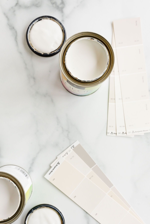
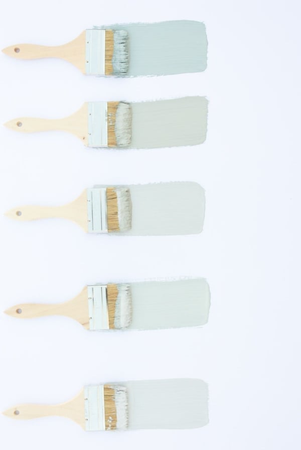
- Get a sample, or even 5-6 samples if that’s what it takes. Learn more about Paint Samples here!
- Try the various cream colors you sample on two walls in the room, or exterior that face different directions.
- Look at the paint at various times during the day to see how it reads in various lighting situations.
- Test it with your trim color.
- Creamy paint colors will have a high light reflectance value, picking up the reflection of the colors around them.
- Be sure to read each individual cream color post, to learn the ins and outs of each color you’re considering.
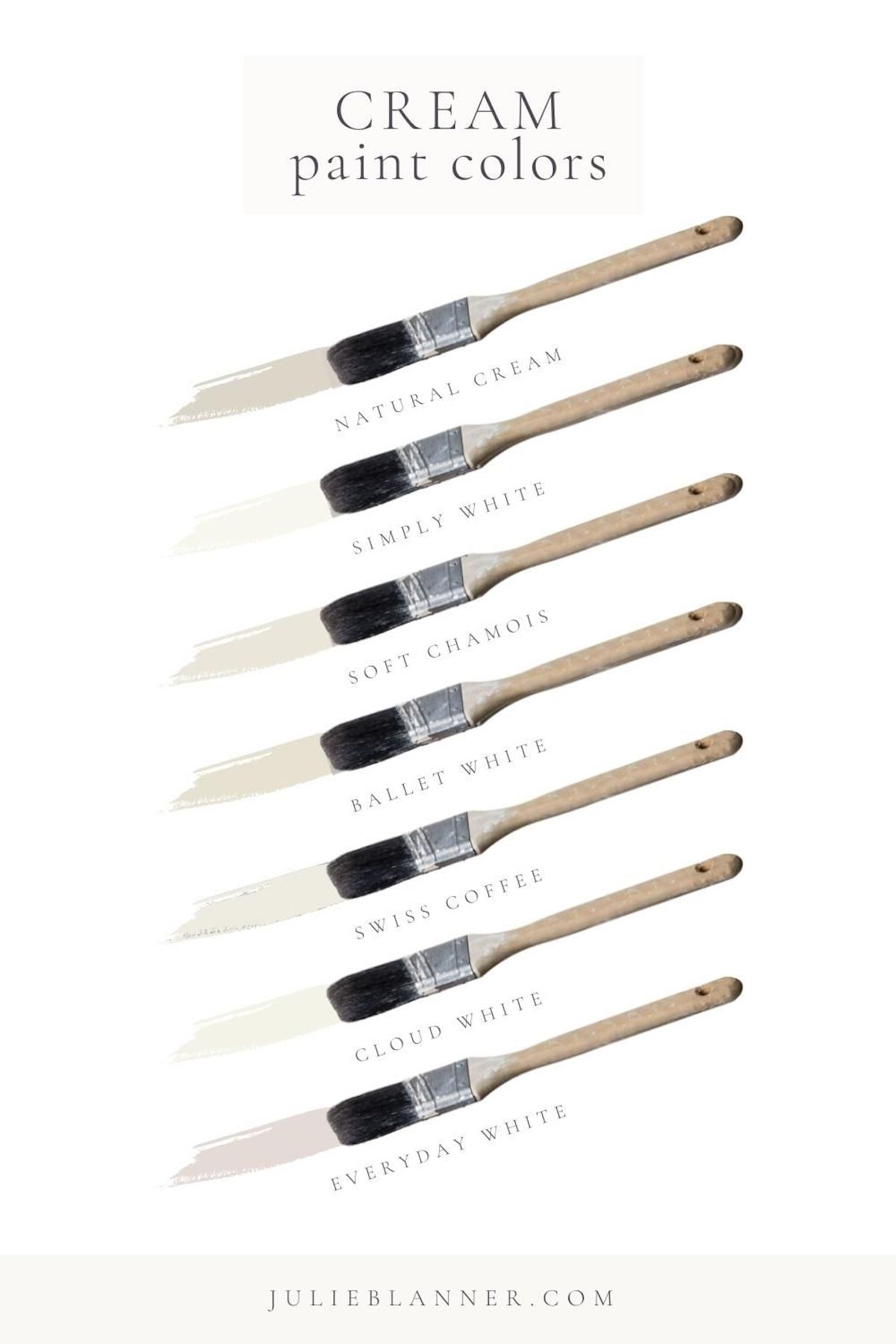
Top 10 Cream Paint Colors
Cream painted walls make your home feel warm and inviting. Most importantly, the color you choose needs to work for the feeling you want to create in your home. Subsequently, paint is not a one-size-fits-all decision.
While I have narrowed it down to some wonderful options, every home is different. The windows, trim and floor colors, and layout of your home can impact your wall colors. Let’s get started!
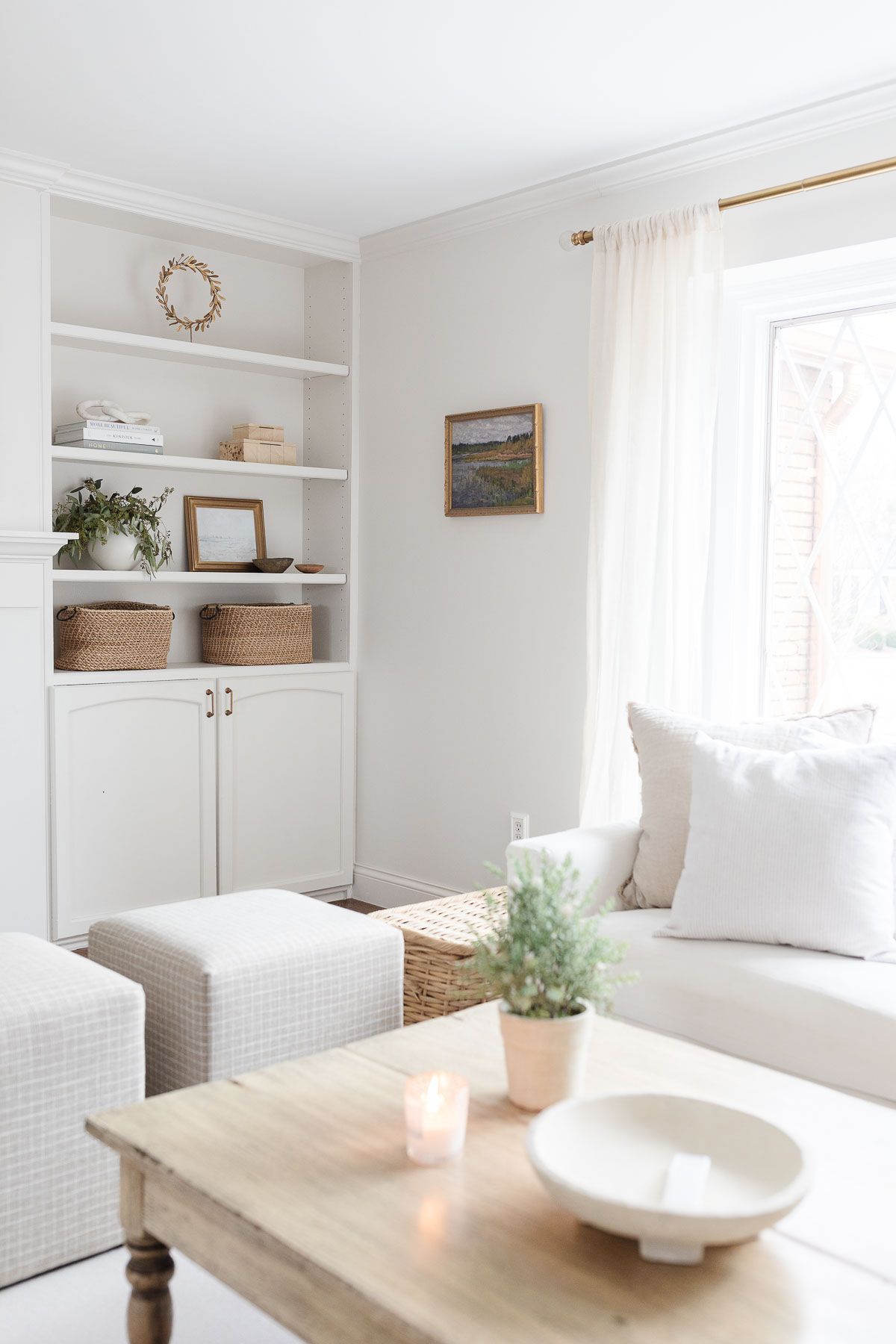
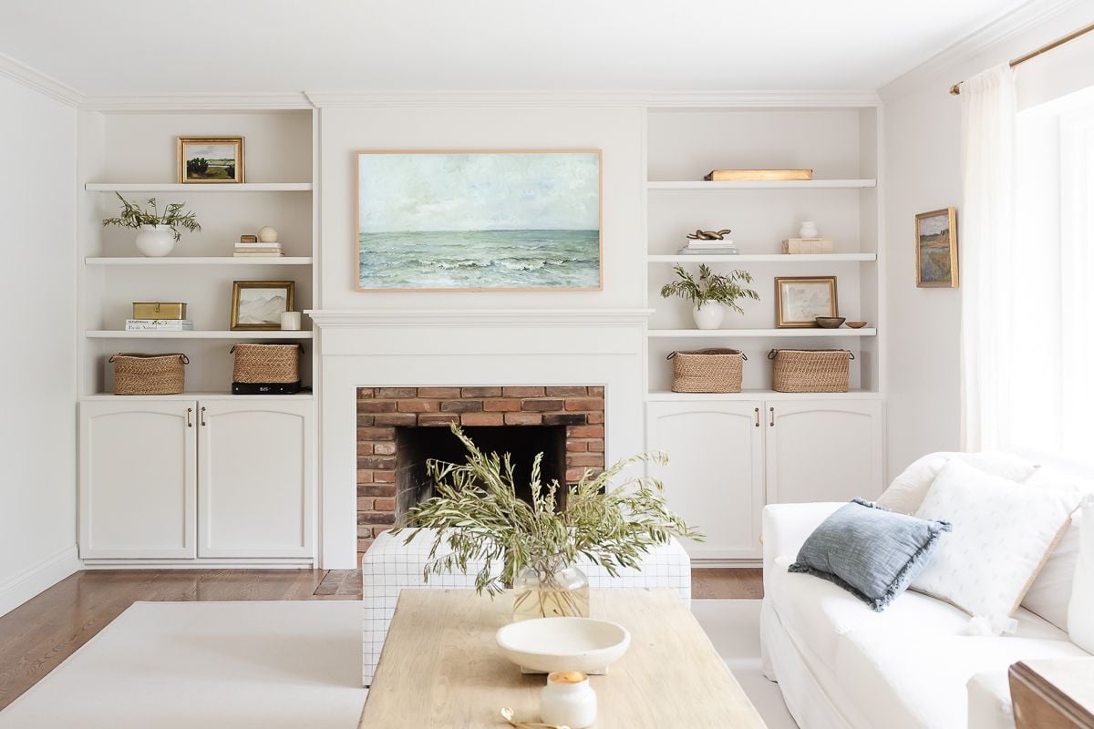
Benjamin Moore Soft Chamois OC-13 | LRV: 78.94
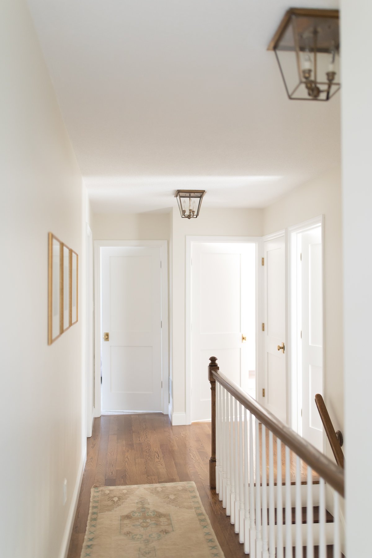
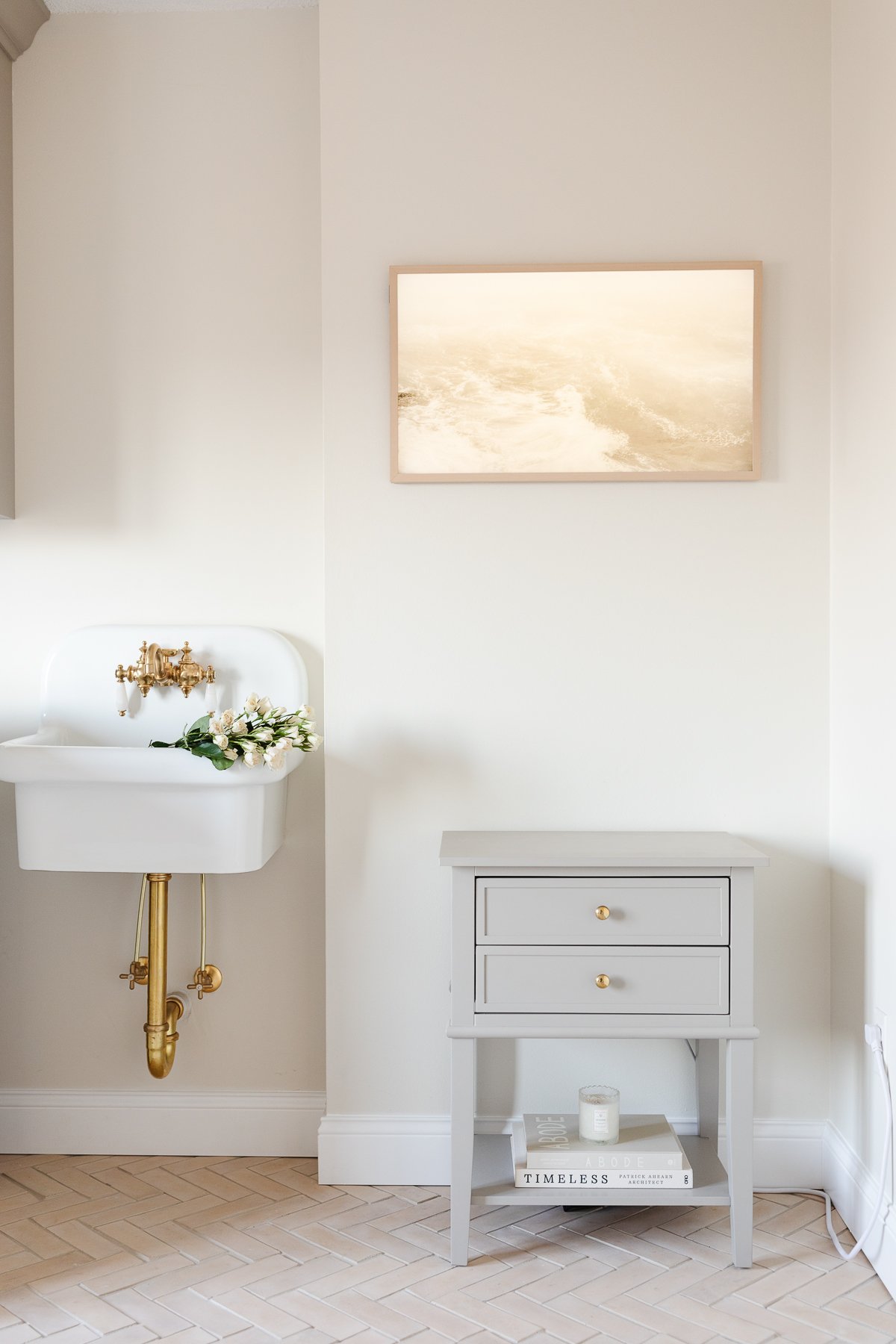
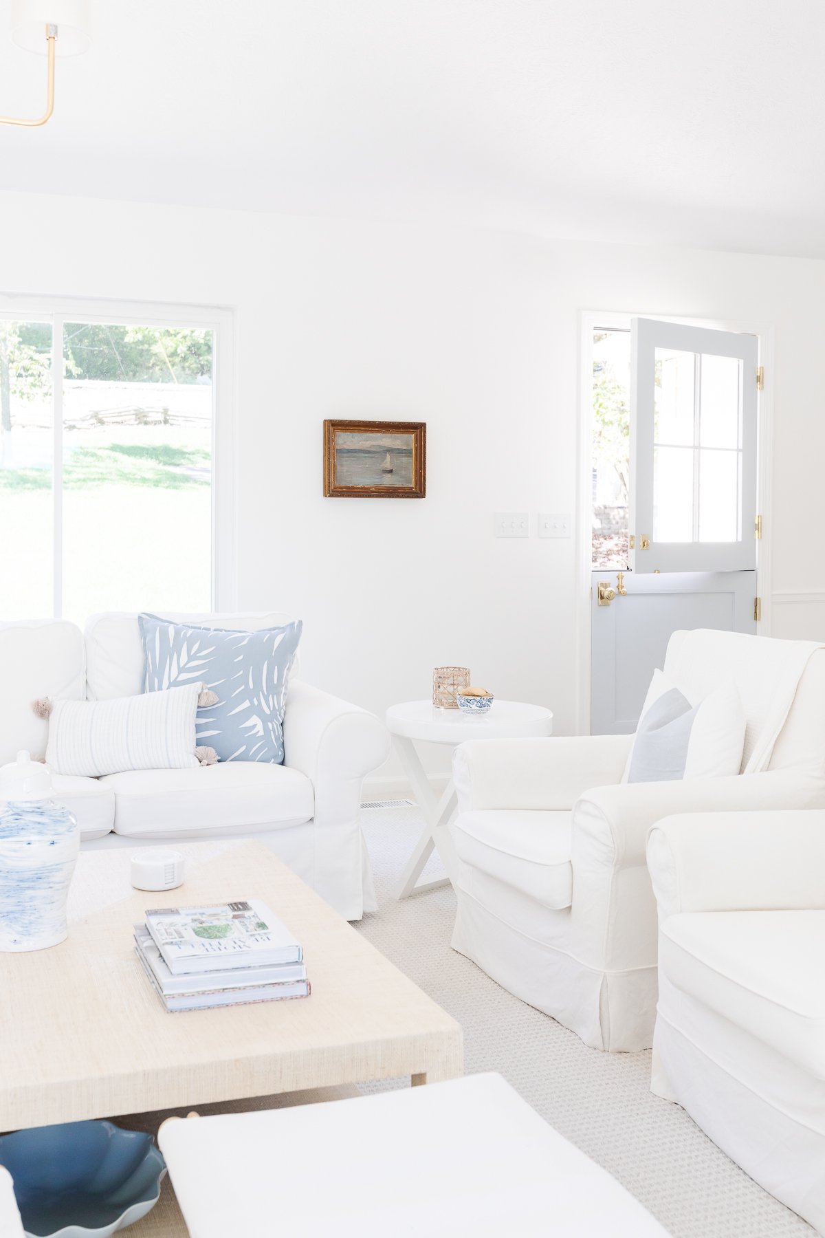
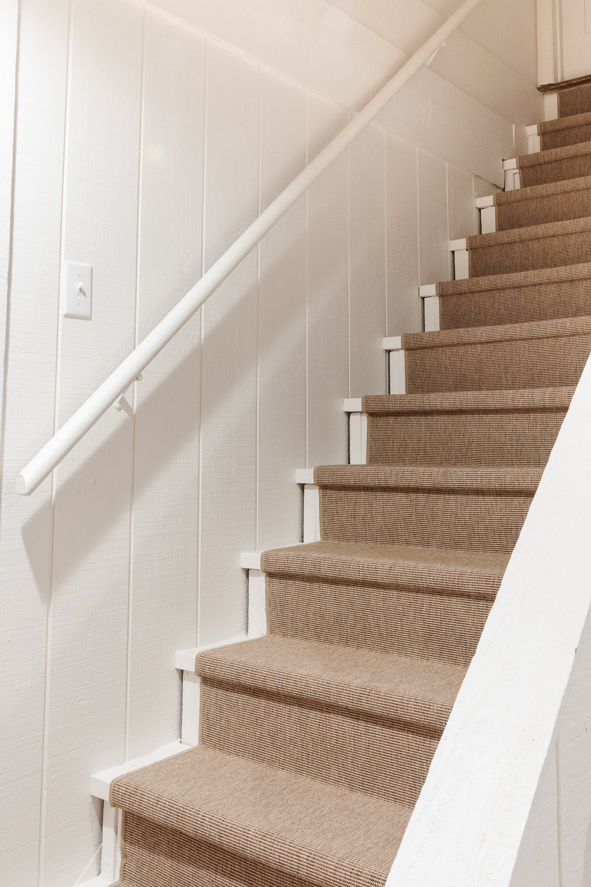
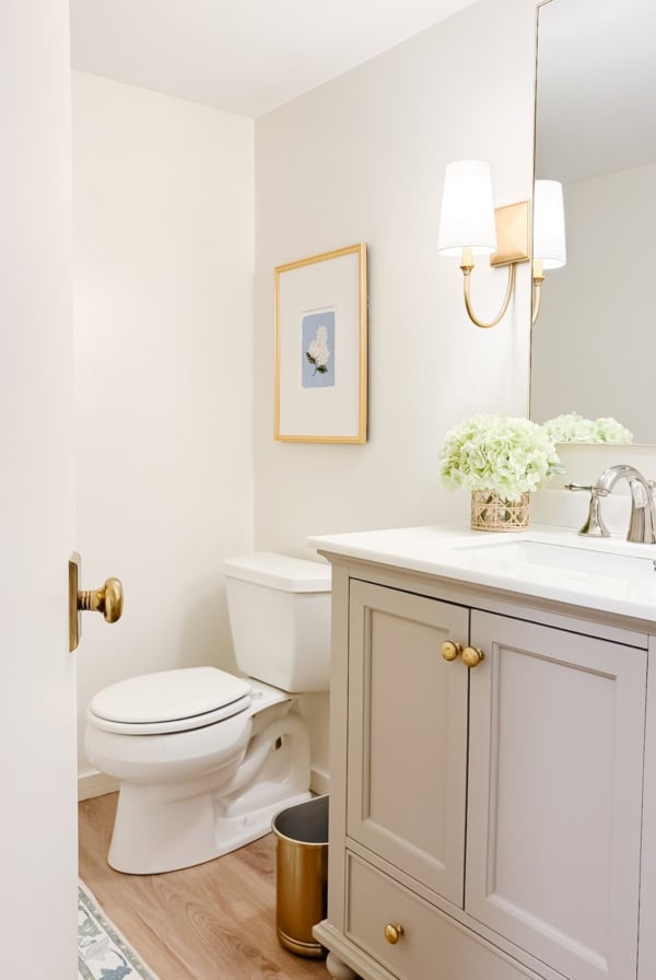
All of our upstairs, including bathrooms, laundry room, hallway and bedrooms are painted Benjamin Moore Soft Chamois. This is one of the most versatile paint colors I’ve used to date. It’s a great fit for a lot of spaces and it’s so soft.
Paint Colors, Tutorials & Tips
Benjamin Moore Soft Chamois
Get all the details about one of my favorite cream paint colors, Benjamin Moore Soft Chamois. Read More
This color is a foolproof choice. It’s not too yellow even though it has that tone in the background, and in fact it never reads yellow even at night. You can read more in detail about this lovely paint color in the link above.
The LRV (Light Reflectance Value) of Soft Chamois is 78.94, making it very similar to Creamy, which you’ll also see on this list.
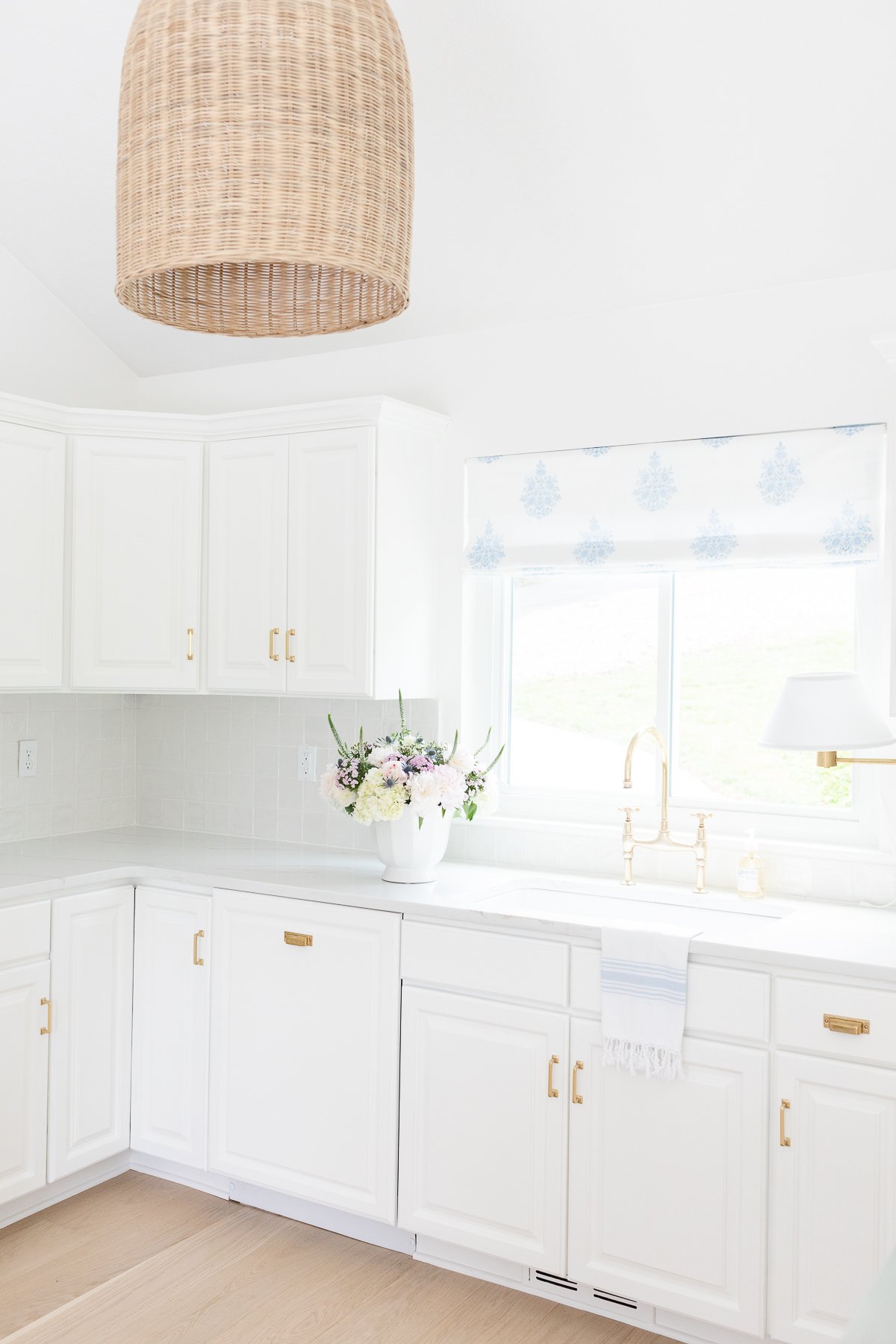
Benjamin Moore Natural Cream OC-14 | LRV: 66.26
Natural Cream is exactly how it sounds – a warm, deep cream. In fact, it’s the deepest cream on this list. It’s versatile and sophisticated, and I can’t wait to find a place for it!
Paint Colors, Tutorials & Tips
Benjamin Moore Natural Cream
Benjamin Moore Natural Cream is a fabulous greige paint color that is warm, cozy and full of charm. It’s a soft, pretty neutral that might work in any space of your home! Read More
I love how the example below pairs it with Swiss Coffee on the walls, with Natural Cream on the cabinetry.
Benjamin Moore Simply White OC-117 | LRV: 91.7
Simply White is a crisp, clean, warm white that is *barely* cream. In fact, unless paired with a true white trim, it’s hard to tell that it’s cream at all! I’m including it in this list because that might be exactly what you’re looking for… it has become the PERFECT color for me, in fact!
Paint Colors, Tutorials & Tips
Benjamin Moore Simply White
Searching for the perfect shade of white? Benjamin Moore Simply White OC-117 might be just the ticket! This is a warm, pretty off-white color you’re going to love. Read More
This cream color’s undertones are very slightly yellow with the slightest touch of green and blue for balance. The LRV quite high – making it the lightest and brightest of cream colors in this round-up.
You can see more of this color on the exterior of my neighbor’s White Brick House! I’ve recently used it throughout our main level at the lake, as you can see here.
Benjamin Moore Cloud White OC-130 | LRV: 85
Cloud White is a classic, timeless color that has been popular for many years. Read on to find out why with this photo tour of our new basement bathroom painted in Cloud White.
Paint Colors, Tutorials & Tips
Benjamin Moore Cloud White
Come see what there is to love about Benjamin Moore Cloud White. Thanks to its creamy undertones, it is a warm and cozy white color with a classic feel. Read More
Benjamin Moore Cloud White is a great mid-range shade, for a perfectly warm look of cream.
Benjamin Moore Ballet White OC-9 | LRV: 73.54
Ballet White is another warm creamy paint that I’m eager to experiment with soon! I love that it’s not a super yellowy cream color, just a warm, barely cream tone.
This color is comparable to Zurich White, in that it has a little gray to mediate the yellow background. They have a comparable LRV too.
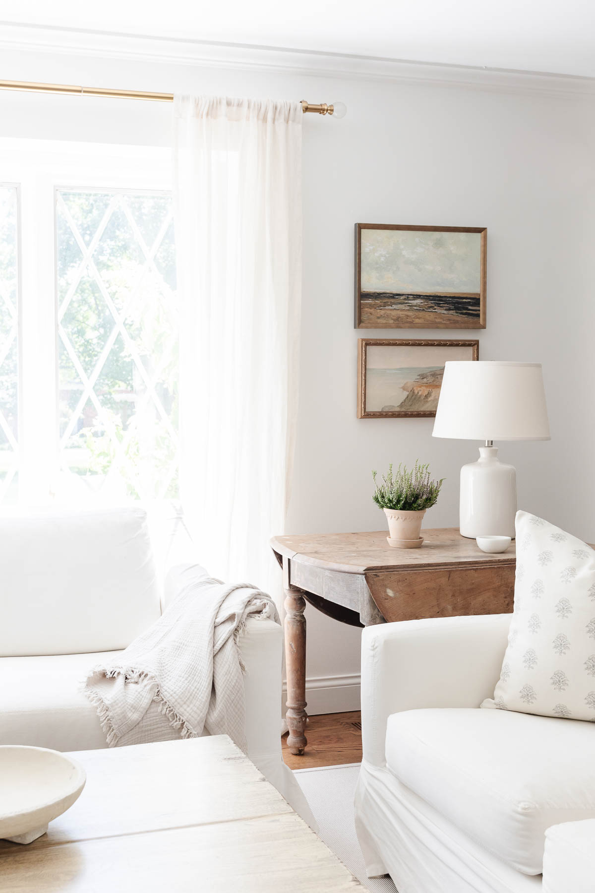
Sherwin Williams Zurich White SW 7626 | LRV: 76
We originally painted our St. Louis living room Sherwin Williams Zurich White in an eggshell sheen. Zurich White has just a touch of greige without being too much.
Paint Colors, Tutorials & Tips
Sherwin Williams Zurich White
Get all the details about one of my favorite warm and cozy paint colors, Sherwin Williams Zurich White. It’s a little creamy, a touch greige, and it might just be the perfect soft neutral color for your home! Read More
It’s a wonderful option for those who love gray, but would like something a touch warmer or a slightly greige tone or if you’re transitioning from a gray room.
Sherwin Williams Creamy SW 7012 | LRV: 81
Another go-to cream paint color I love is Sherwin Williams 7012 Creamy. It’s a soft, warm white that is classic, but not stark.
Not dirty, not too yellow, and certainly not blue, it’s a great in-between for any lighting situation! This is a warm cream that also works beautifully for trim, cabinets and furniture (in this photo, the desk is painted in Creamy).
Paint Colors, Tutorials & Tips
Sherwin Williams Creamy
Sherwin Williams Creamy is exactly what it sounds like… a delightful, warm, rich cream paint color that works beautifully in a variety of spaces in your home. Get all the details in this deep dive into SW 7012! Read More
This photograph of Adalyn’s old dresser was painted in this color, and I still love it. The wall behind is also Zurich White.
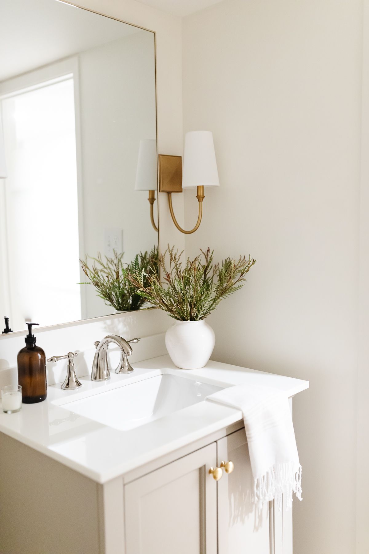
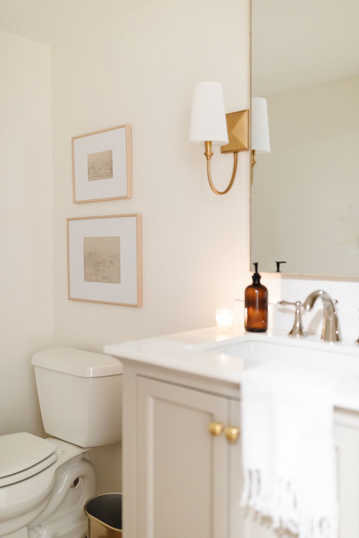
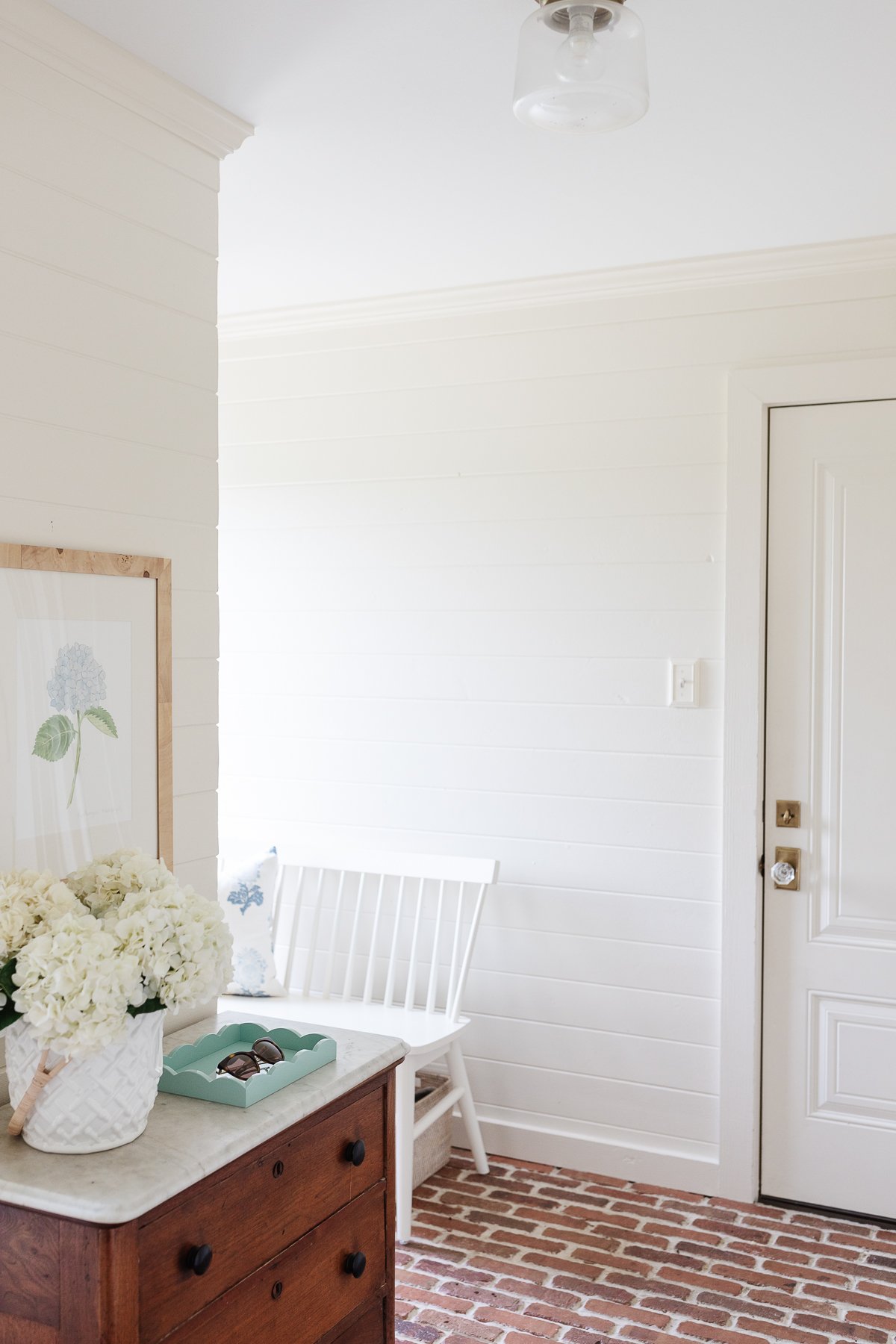
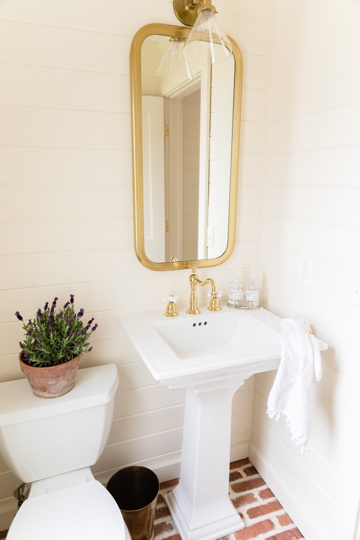
Benjamin Moore Navajo White OC-95 | LRV: 78.26
Click through for all the details about one of my favorite cream paint colors, Benjamin Moore Navajo White (not to be confused with Sherwin Williams color of the same name).
Paint Colors, Tutorials & Tips
Benjamin Moore Navajo White
All the details about one of my favorite paint colors, Benjamin Moore Navajo White (not to be confused with Sherwin Williams color of the same name). Read More
This is a rich, sophisticated cream color. In some lights it reads as a more antique white (our mudroom in the morning, above) and in other lighting you’ll see more yellow undertones (our mudroom powder room, below).
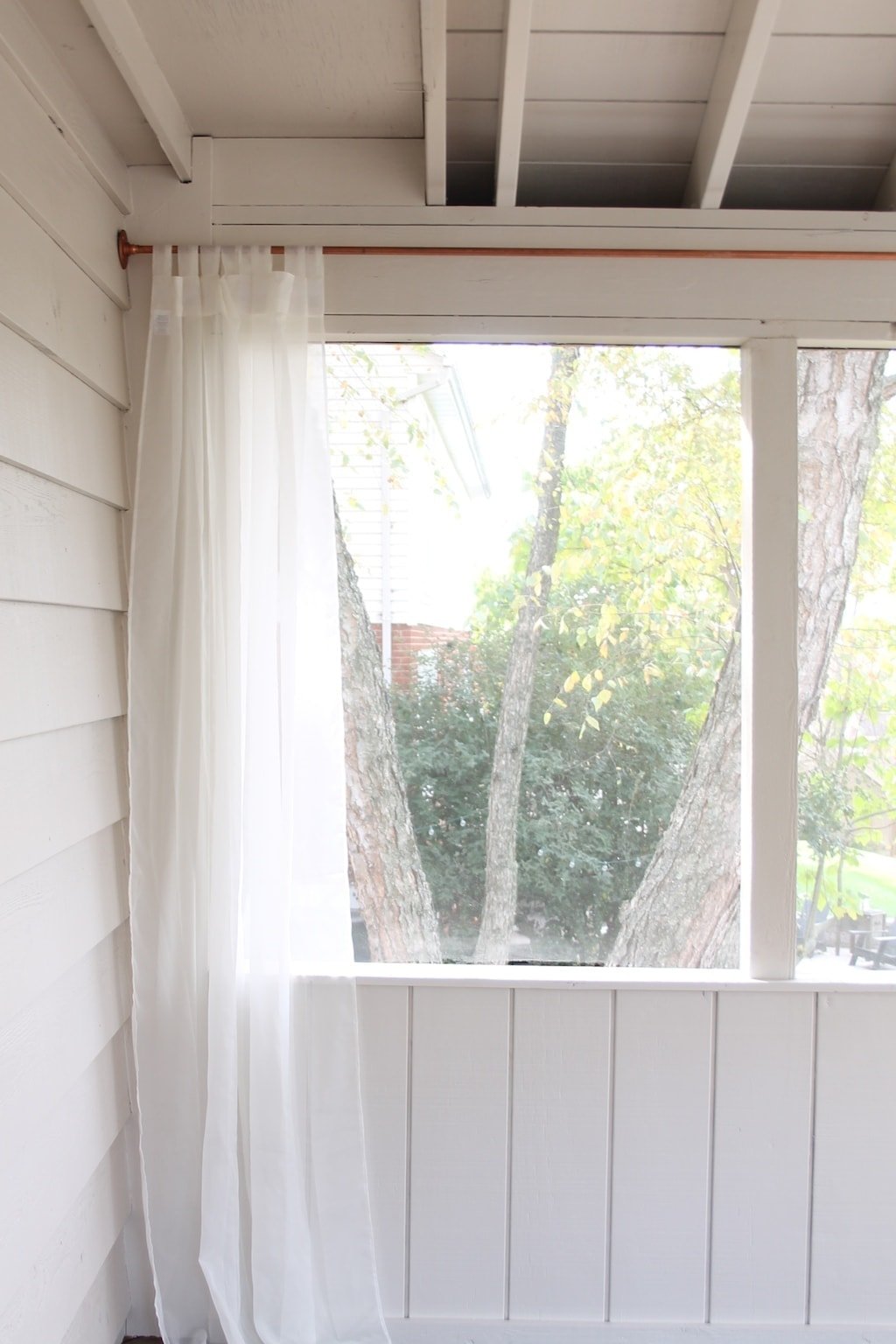
Sherwin Williams Everyday White SW 6077 | LRV: 72
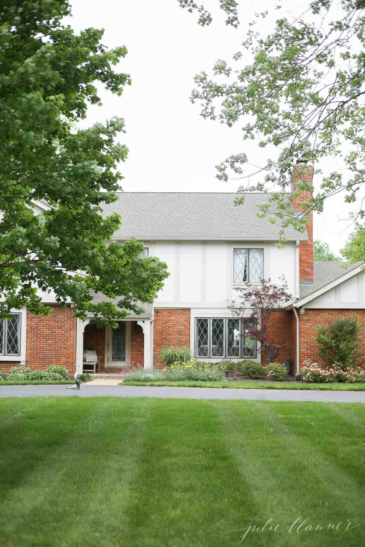
This color was used in our screened porch and also on the exterior of our home – see more in our Tudor Paint post. Everyday White has a hint of beige and yet reads in the perfect creamy white tone.
Paint Colors, Tutorials & Tips
Sherwin Williams Everyday White
Get all the details about Sherwin Williams Everyday White. You’ll find information about the spaces it can be used in,… Read More
It’s wonderful for any exterior projects or any rooms in your home that might receive a little lower light. For instance, this photograph of our screened porch shows you just how warm and soft it is.
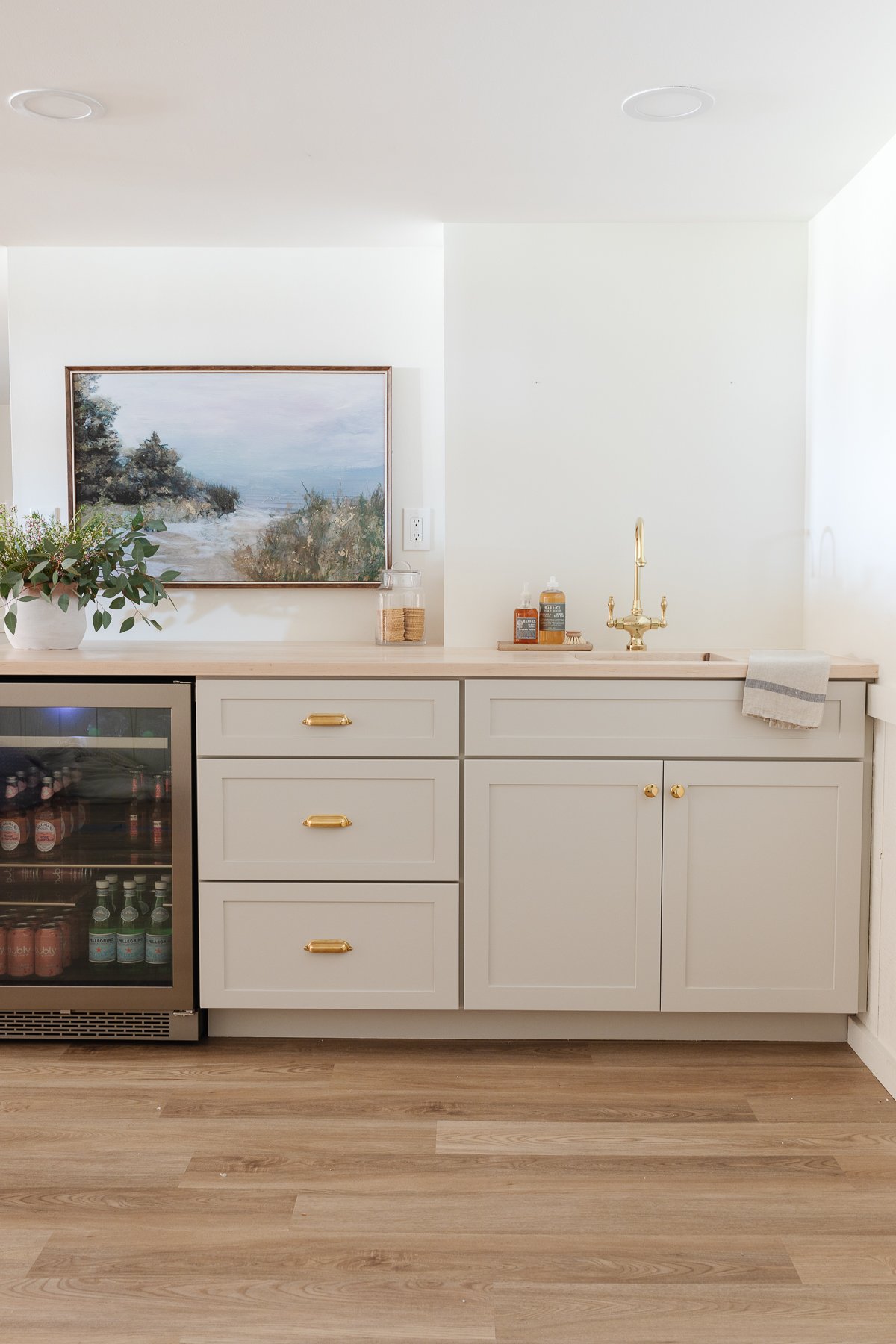
Benjamin Moore Swiss Coffee OC-45 | LRV: 81.91
Warm, welcoming, and yet still light and bright, this color is popular for a reason! Learn how this color could work in your home with all the details and specifics. Swiss Coffee is a warm cream, and interior designers often lighten it a touch (using just 50% or 75% of the saturation) for the perfect shade.
Paint Colors, Tutorials & Tips
Benjamin Moore Swiss Coffee
For a sophisticated, warm off white color, Benjamin Moore Swiss Coffee is a great choice! It’s a warm, welcoming, light and bright cream. Read More
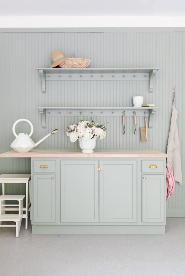
Come on over and see Benjamin Moore Swiss Coffee in the freshly painted basement of our home, and take a tour of our favorite Basement Bar Ideas!
Frequently Asked Questions
Yes. In my humble opinion, it’s the best neutral paint color because it’s warm and cozy. While a clear white can often feel a little cold, warm creams are a perfect compromise between whites and deeper gray/brown neutrals.
That’s the beauty of this beautiful neutral color! You can accent cream paint colors with gray, brown, blues or pinks. It’s completely up to you – cream paint offers the flexibility of white, with a little more warmth and depth.
That’s such a subjective question and answer! A color that works best in one home won’t necessarily be perfect in the next. Be sure to check out our tips for choosing the perfect cream color for your home.
I like to pair these colors with a true, clear white trim color. Consider our longtime favorite, Valspar Paint + Primer Ultra White Base 221395.
What do you think? Are you ready to take the leap and paint your interior or exterior in a pretty warm cream paint color? I’d love to hear from you!


I am interested in your curtains on your screened in porch. Where did you purchase them if you don’t mind sharing!!!
Of course not, Sue! Wayfair! You can find specifics here: https://julieblanner.com/screened-porch-art-mini-makeover/
Love your paint colors! I have a question–when you wrote about BM Soft Chamois in Valspar Signature, do you mean you had that BM hue color matched and mixed at Lowe’s in their Valspar Signature paint?
Yes! I almost always do to save a little money. I also love that paint – it goes on really well.
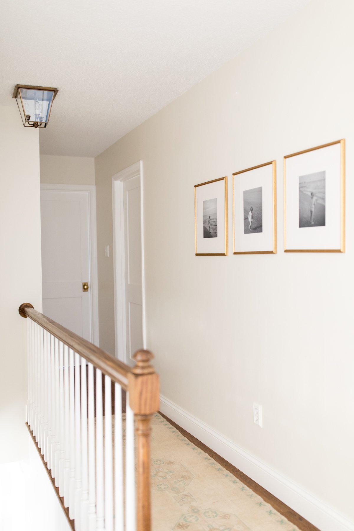
I LOVE the trio of pictures in the nursery – details, please (where to purchase them, framed yourself, etc.)!
Thank you, Wendy! I painted Hobby Lobby frames & used Rifle Paper Co cards. https://julieblanner.com/islas-coral-mint-nursery/
I thought they might be DIY treasures! Thank you for the inspiration!
Of course! So easy to create, Wendy!
Hi Julie, What are your thoughts about alabaster for my kitchen cabinets in our farmhouse? Thanks, Gina
Hi! It is a beautiful color with a lot of depth. I highly recommend trying peel and stick paint samples and looking at it morning, afternoon and evening on various walls. This is my process for selecting a paint color and why. I hope it helps.
Julie – My daughter is expecting our first grandchild this August. I love your nursery, but especially the little riding lamb. Would you be able to share where you purchased it?? She’s actually doing her nursery in a lamb theme, so it would be perfect! Many thanks, Diana Seeley
Of course, congratulations! RH Baby and Child.
I’m in love with your porch color! I assumed it was Valspar, but they don’t show an Everyday White. Is it another brand?
I just updated it, Patty! It’s SW.