Home isn’t always before and afters, but even progress feels oh so good! Step inside our lake cottage for a before + after photo tour! Learn how we turned this 90s home into a family friendly modern lake house!
In the summer of 2016, we purchased a small home we have lovingly named, the lake cottage, nestled on Table Rock Lake near Branson, Missouri.
We enjoy spending our weekends and summers boating, hiking, relaxing and visiting nearby attractions. In fact, I’ve written about all the things to do at Table Rock Lake, as well as enjoying Christmas at Silver Dollar City.
Our little lake cottage was built by Marlin Constance (a (now) dear friend) in 1996. The home was filled to the brim with potential and character. He included charming features and decorated each home he built as if he would live there himself.
The reverse ranch home was just the right size for our family without feeling too overwhelming to maintain.
Thoughtful design has allowed us to maximize space and light so we can comfortably entertain family and friends. Over the past 7 years, we have hosted so many friends, family and influencers.
I’m so grateful for the opportunity to live the lake dream! You can read the story behind the purchase of the lake cottage here. While you’re at it, check out my collection of the best Boat Snacks to take for a day on the water!
Modern Lake House Before and After
Despite inspections, heavy rain offered the toughest inspection of all. We had leaks through the chimney, in the girls’ room, guest bedroom, lower living room and more. We even had a septic backup.
Far less stressful, we also struggled with stale smell of smoke, presumably from 20 years ago. Every time we returned home our bags and clothing permeated with it.
You can learn how to get rid of smoke smell here, in fact, this trick works with musty smells and pet odors as well. Though not visible, it has been one of the biggest transformations in our home!
Modern Lake House Exterior
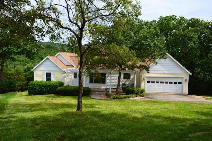
I was never a fan of the orange roof, so when we had leaks in the kitchen and around the chimney, I was more than happy to replace. To embrace the cottage feel, I really wanted to incorporate a metal roof, but as we began researching, we feared leaks and fading.
Time was of the essence so we ultimately decided to replace it with more neutral roof (weathered wood shingles), which toned down the yellow siding – a lot! Wood shingles would have been charming, but they’re no longer insurable with most agencies in Missouri and don’t stand up as well to the extreme weather we sometimes receive.
The new roof instantly transformed the exterior!
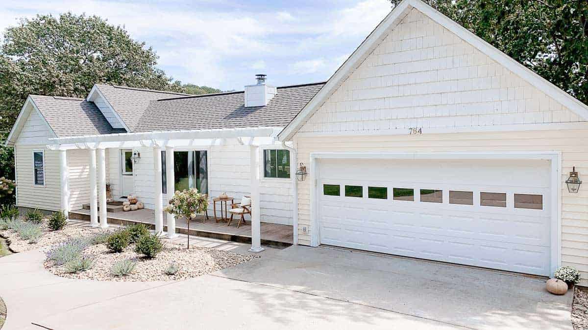
A fresh coat of paint brought the pergola back to life temporarily, but we did eventually remove it. We haven’t decided on our plans to replace it yet.
Given that the home is on a slope, we also had water during heavy storms entering the home. We removed all of the overgrown bushes, added a drain that went around it and another where water gathered near the porch.
Next, we added a retaining wall to the left of the home to keep water away from the lower level, as well as new landscaping. There are so many kind neighbors to thank for helping with this project!
Landscaping and Exterior Details
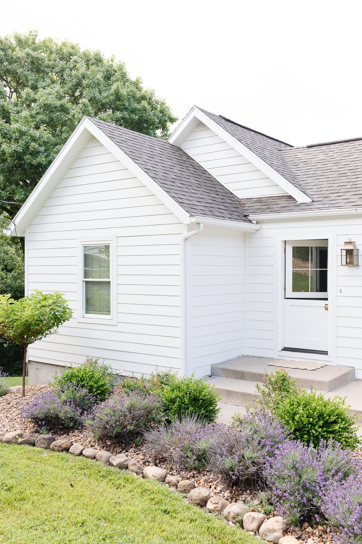
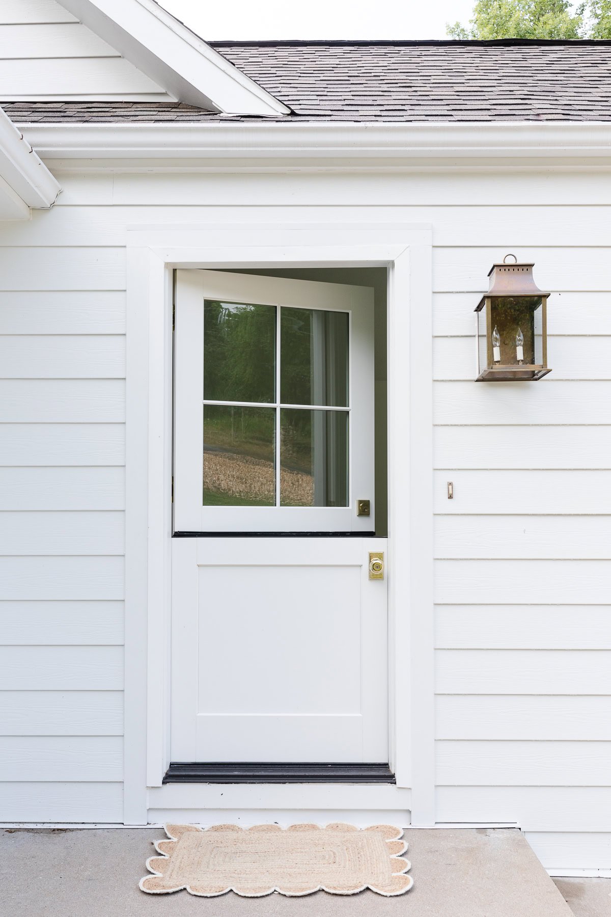
Next, we replaced the door with a dutch door and dutch door hardware to add character along with fresh brass hardware. This door was custom made with an aluminum exterior and wood interior, for both practicality and a look we love.
We removed the tree and incorporated river stone, and we added limelight hydrangea trees to give it some height and prevent deer from eating the blooms. A layer of boxwood adds some green throughout the year and then we softened it with lavender to line the edges.
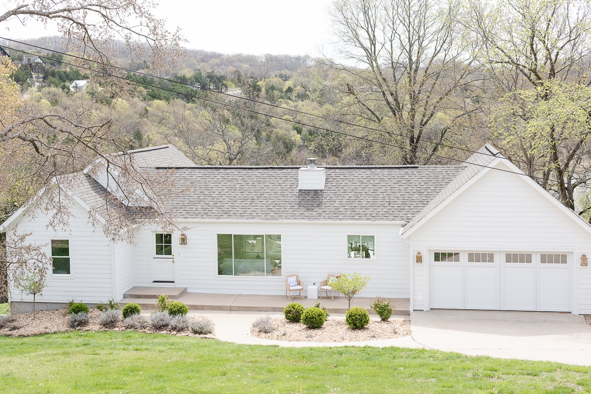
This spring, we had new James Hardie Arctic White siding, soffits, fascia, and gutters. We also added new carriage garage doors and had pretty lighting installed.
I plan to add soft blue shutters that open and close for a dose of charm and freshen up the landscaping.
Modern Lake House Interior
Entryway
Pardon our realtor (who we love) in this before photo, as we were in a hurry to leave. It’s the only before photo I snapped of this area.
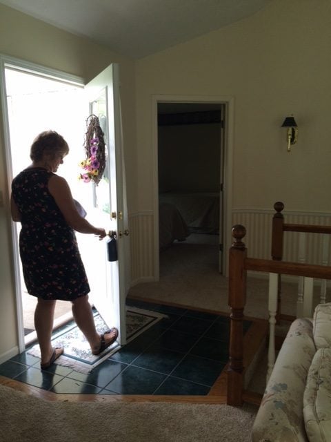
Lake house hunting is time consuming in our area as many are more than 30 minutes apart and while we had a feeling this was the one, we had a number still to see that day.
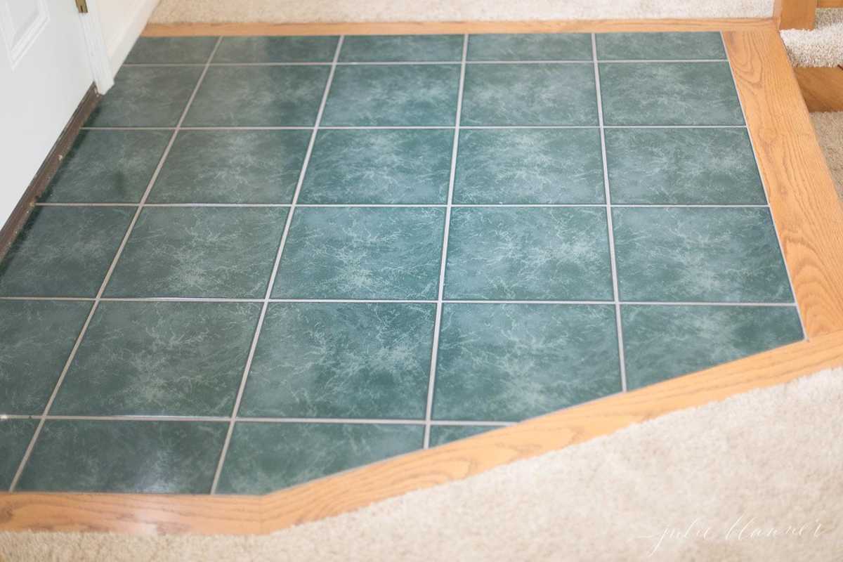
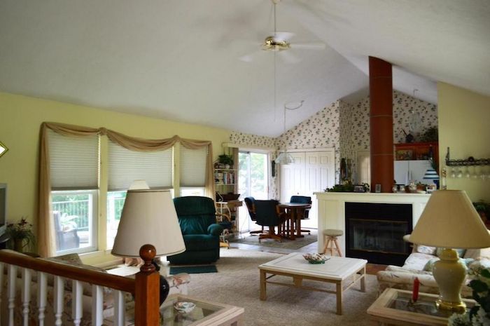
To update the entry, we painted the tile floor, removed the wallpaper below the chair rail, painted it a soft cream, and added new sconces.
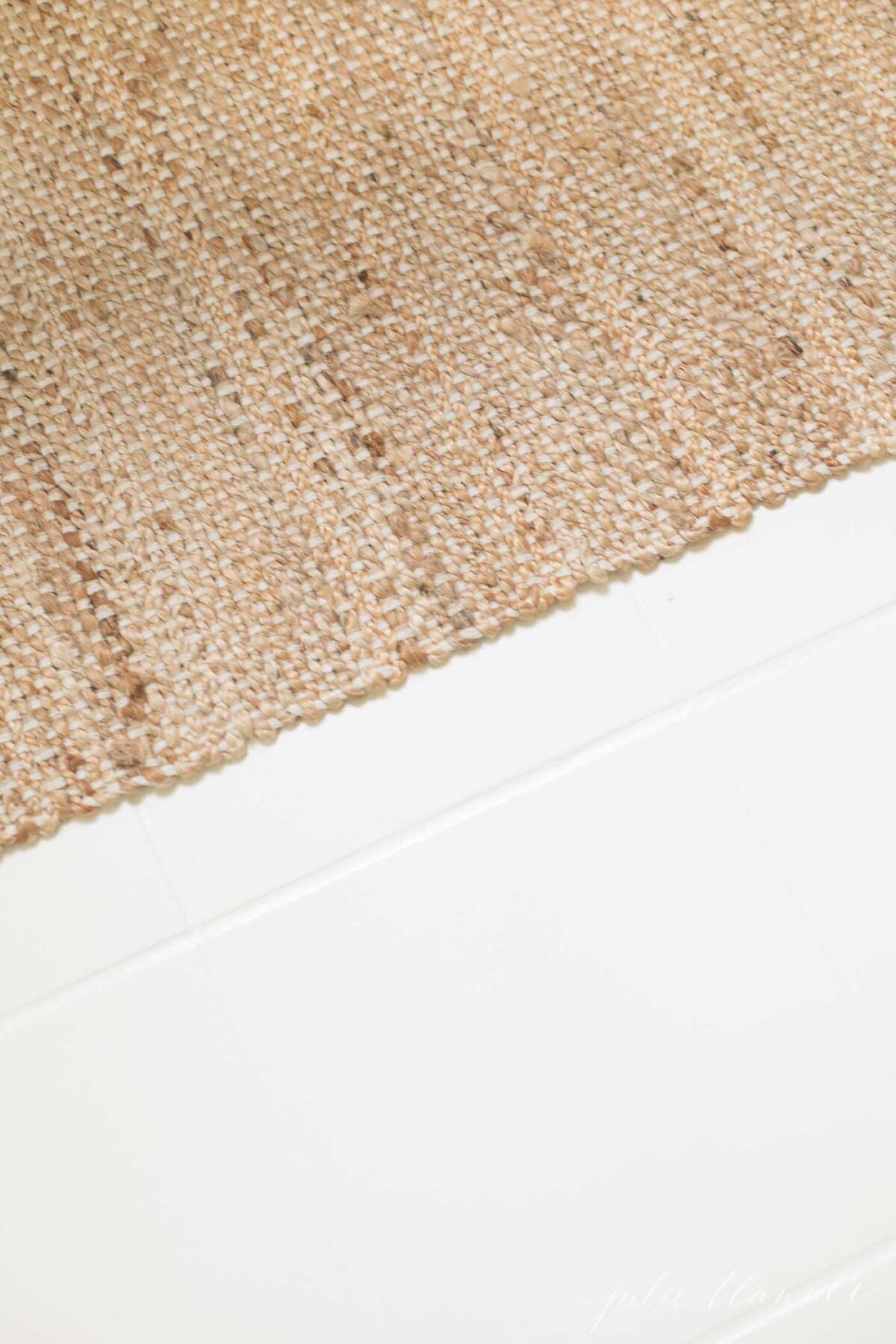
While it looked so much better, we decided to remove the tile altogether in late August when we with patterned carpet. We did the tear out ourselves and I’m excited to share that the paint didn’t chip or scratch when being hit with a hammer and removed with a crowbar if you decide to paint tile in your home!
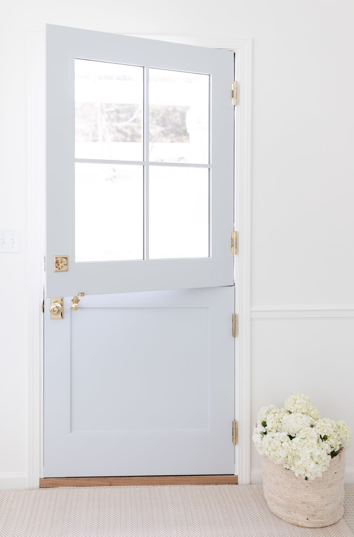
The tile previously broke up the hall, entryway, stairwell and living room. Now it feels like one continuous room, giving the illusion of more space. We use an indoor outdoor area rug that can be hosed down to protect the area.
Upstairs Guest Room
Just beyond the front door is the smaller guest room. It was yellow with a border and fitted with two twin beds.
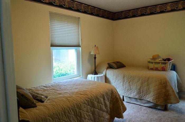
When we considered who / how we typically entertain, we opted for a single queen bed to maximize the space and allow for another couple to stay or a couple with a small child who could sleep in a portable crib or sleeping bag.
We removed the border, painted the wall in Benjamin Moore Simply White to brighten the space and make it appear larger. We added new bamboo blinds for a little texture and an inexpensive pendant light using a drum shade and light kit.
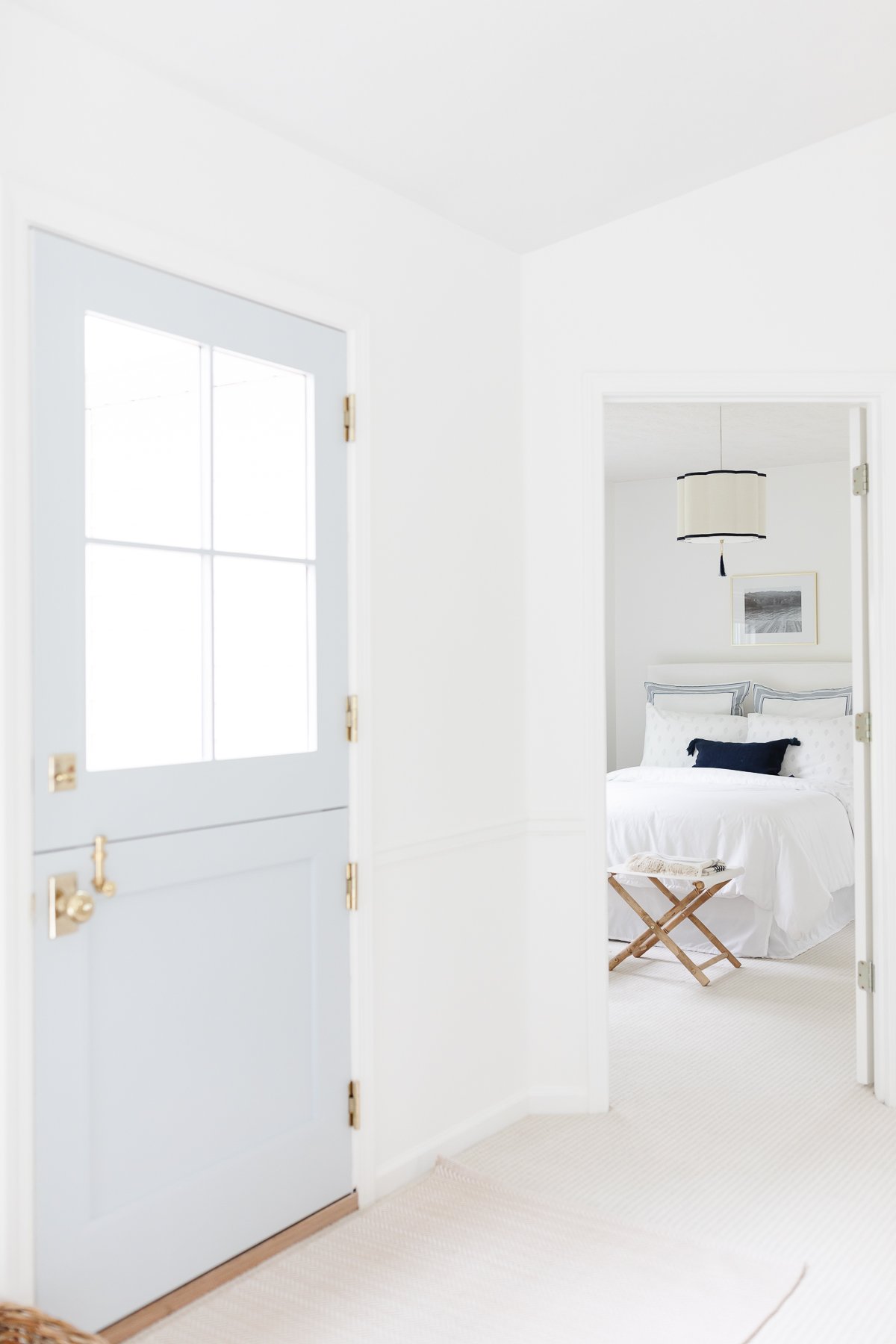
You can read more about this small bedroom used for guests here and learn how to make the most of a small space.
I framed an iPhone photo I took off our dock at the lake cottage for inexpensive art that personalizes the space.
When we replaced the carpet, we were able to eliminate the area rug, making it easier to maintain, which is always the goal at the lake cottage!
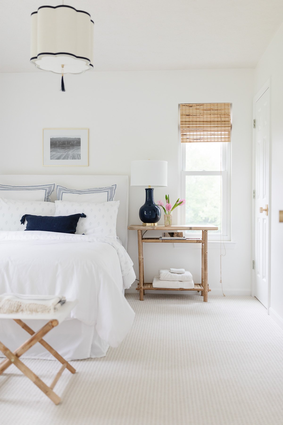
To blend function and design, I added stools that double as a luggage rack for out of town guests. They’re an indoor outdoor fabric which makes them easy to wipe clean with water. You can find similar here. The bedside table hosts a carafe for water, local reading materials and towels for guest convenience.
Hall Bath
The hall bath is seen from the entryway as well as the living room and kitchen, so it was especially rewarding to update this little space.
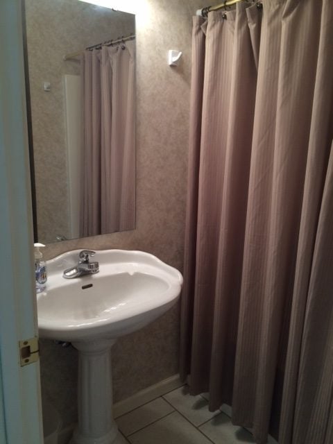
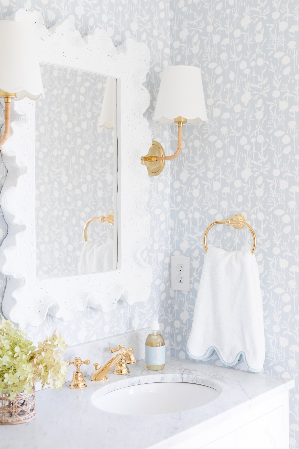
The hall bath was dark and honestly a little lackluster, style-wise. We added a grasscloth wallpaper with a little sheen to reflect light, new mirror, toilet, pedestal sink, light, modern faucet and fixtures, art and tassel shower curtain to make it feel fresh.
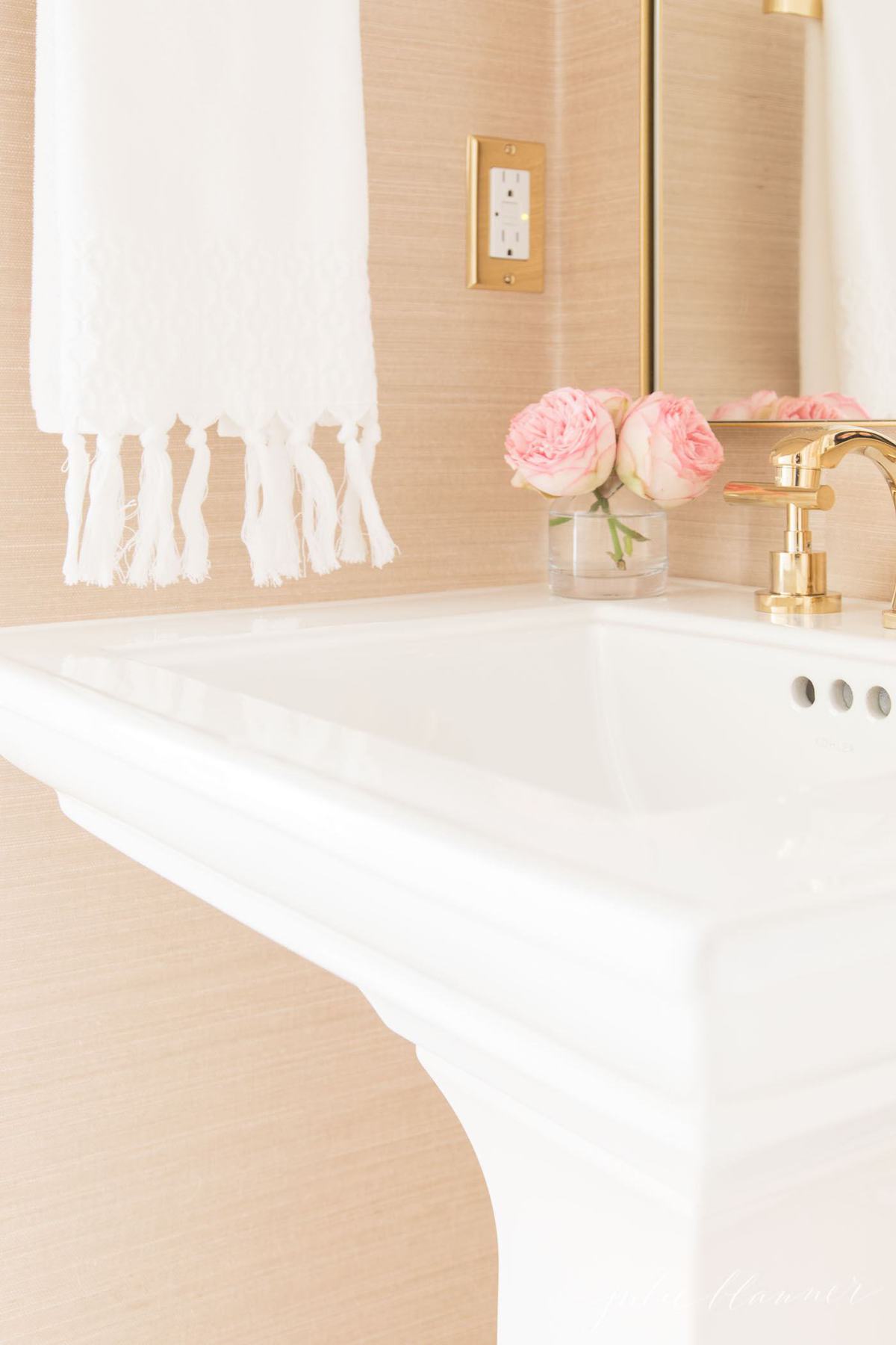
Unfortunately, the wallpaper install was a chop job. A reminder that nothing is easy – or perfect, so don’t let pretty photos make you or your home feel less than what they are!
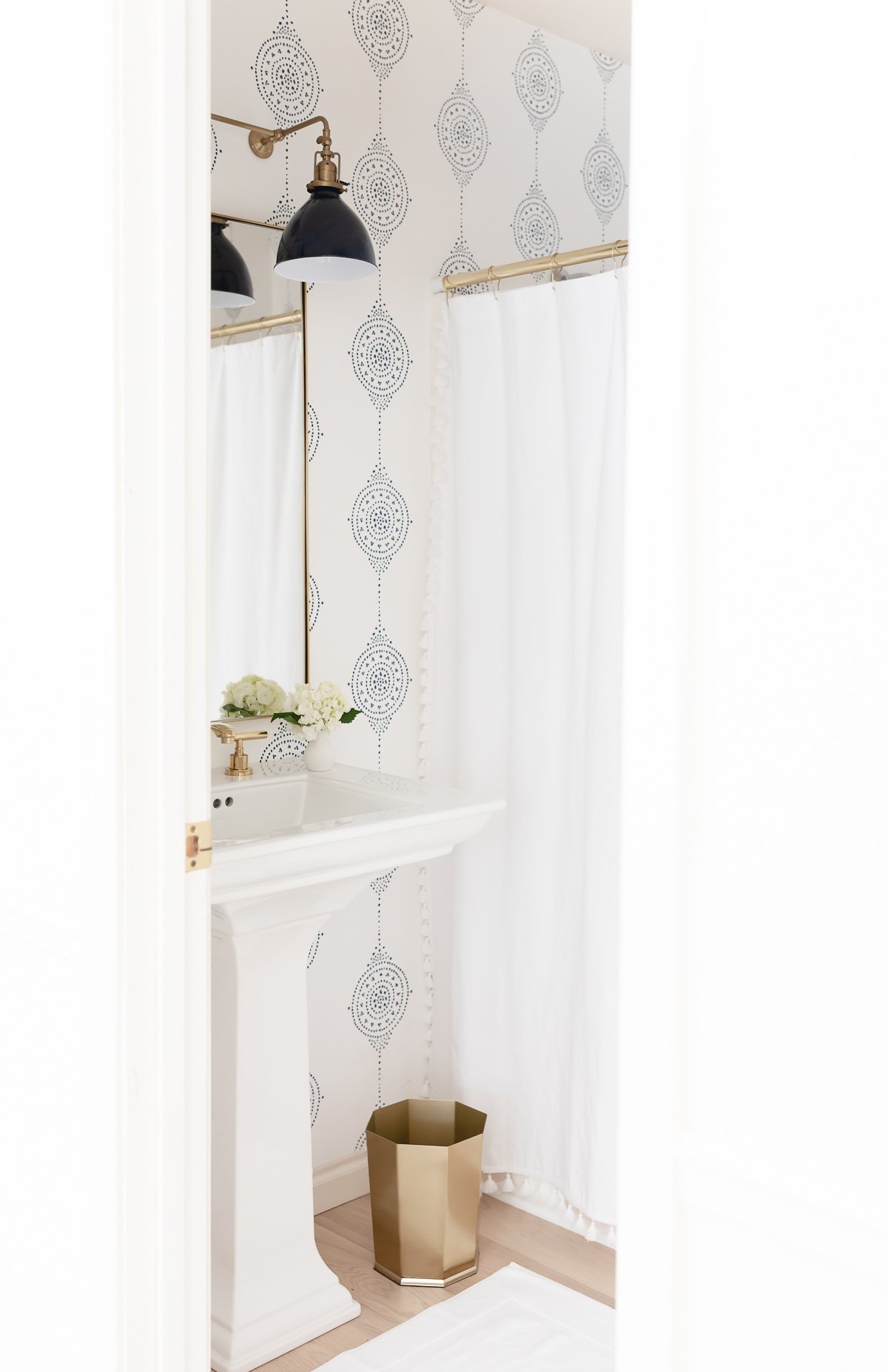
I decided I may as well try a little something different, so I had a patterned wallpaper installed and paired it with a navy sconce to make a dramatic statement.
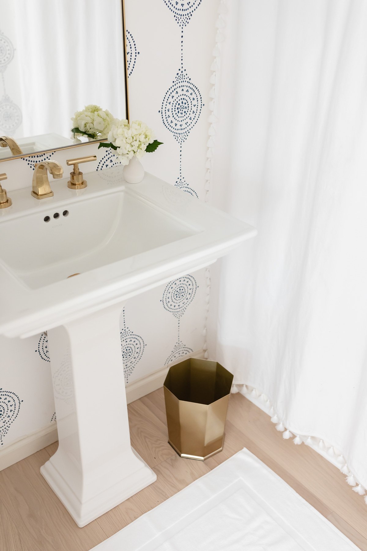
You can read more about this modern bathroom here, including all the reasons we love this Serena and Lily Wallpaper.
A Modern Primary
When we purchased the lake cottage, I was drawn to the vaulted ceilings and incredible lake view from the primary bedroom.
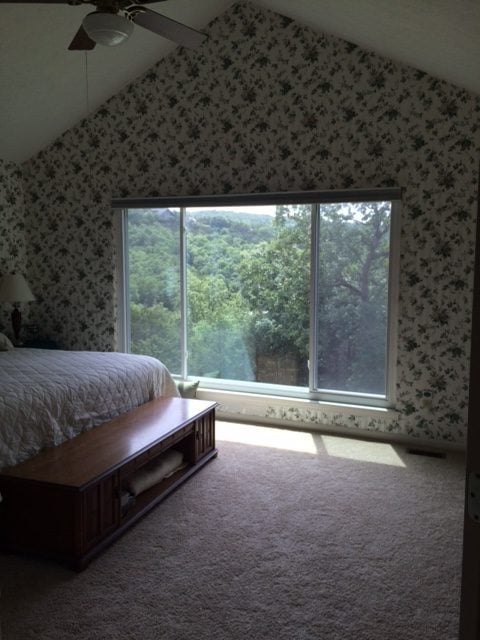
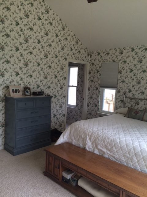
We positioned the bed to take advantage of the amazing lake views. It’s so refreshing to wake to!
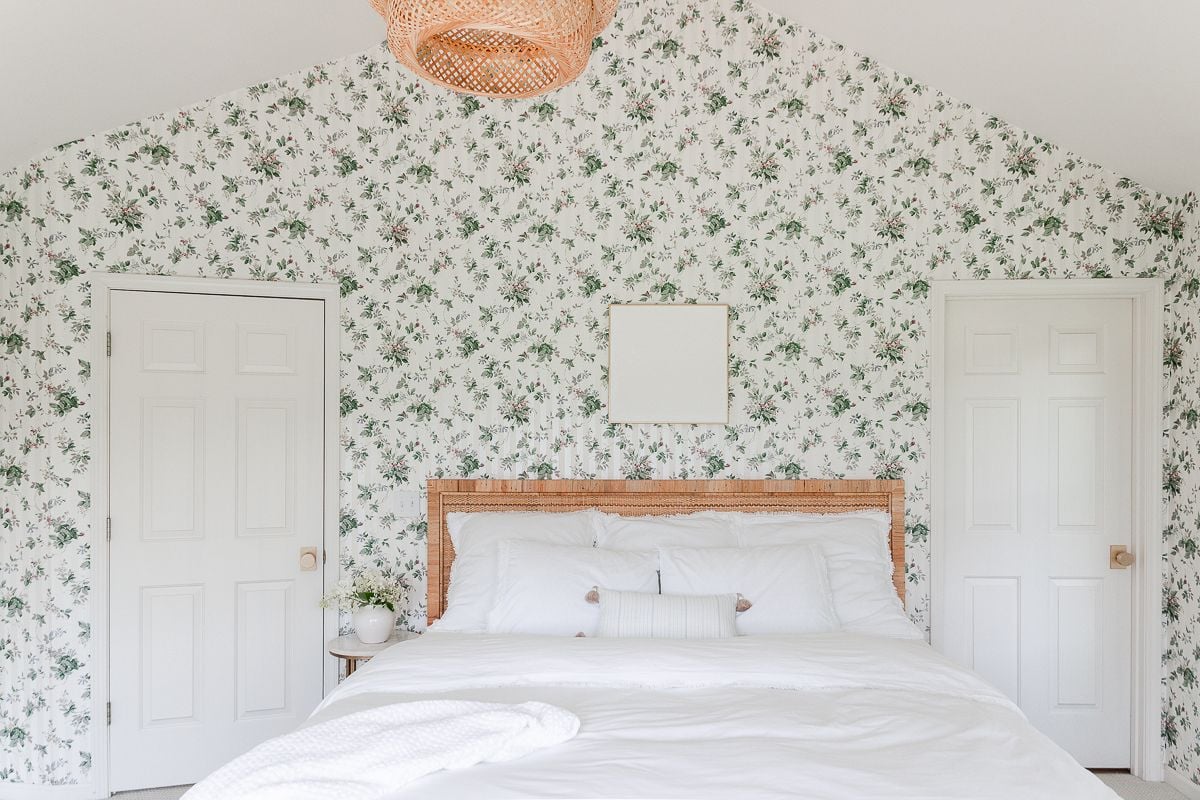
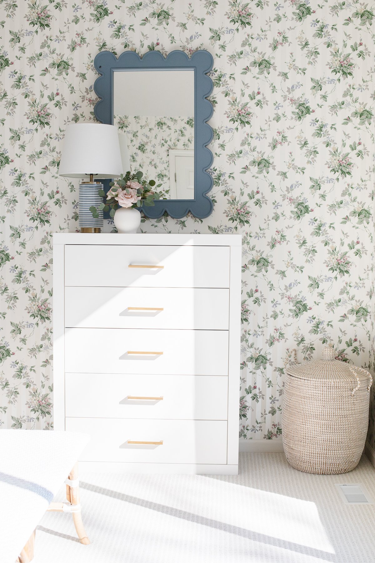
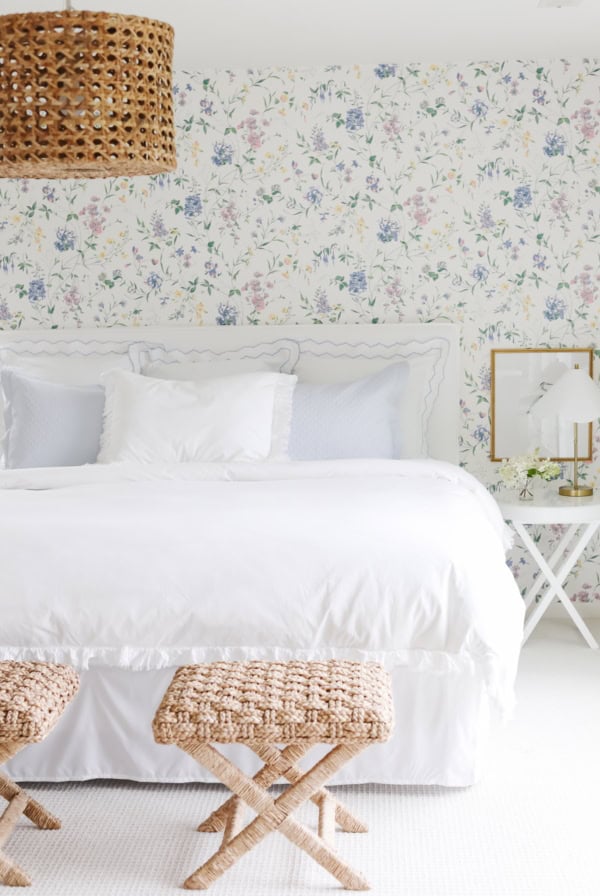
I embraced the original wallpaper by simply refreshing the decor surrounding it. A rattan headboard and inexpensive pendant light instantly made it feel fresh.
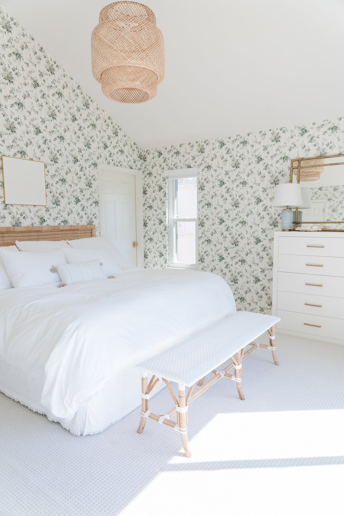
Fresh white bedding, tassel pillow, DIY art and a white woven bench contrast the busy wallpaper pattern. We added modern satin brass door knobs and levers as well.
To elevate an inexpensive white chest of drawers, I added beautiful brass dresser pulls (set of 5 for just $18!). It is accented with a mirror, lamp and a woven laundry hamper nestled in the corner.
I recently decided to mix it up with a scallop mirror. I cannot get enough scallop decor! It’s lighthearted and fun.
We framed the oversized window with minimal blackout shades. They offer an amazing night’s rest and don’t obstruct the view. They are remote (or phone) controlled for convenience.
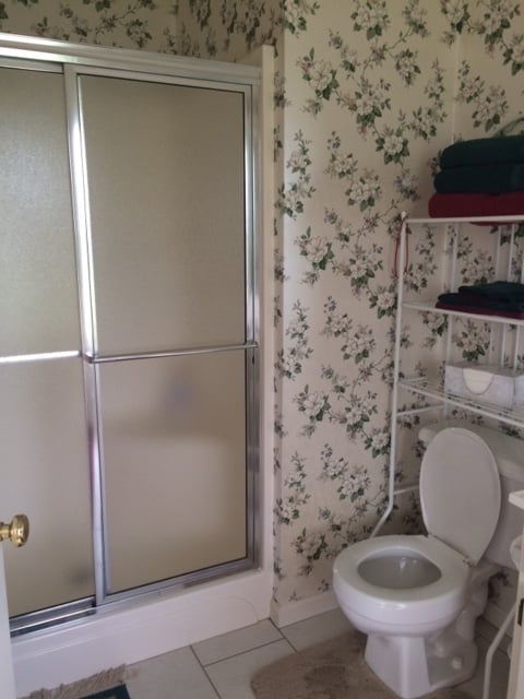
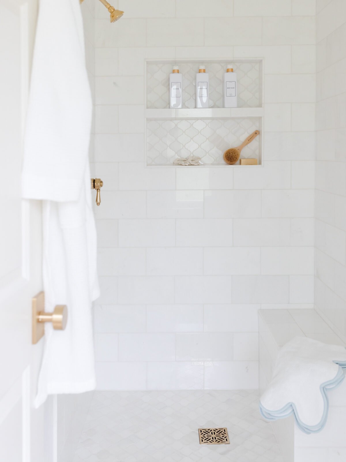
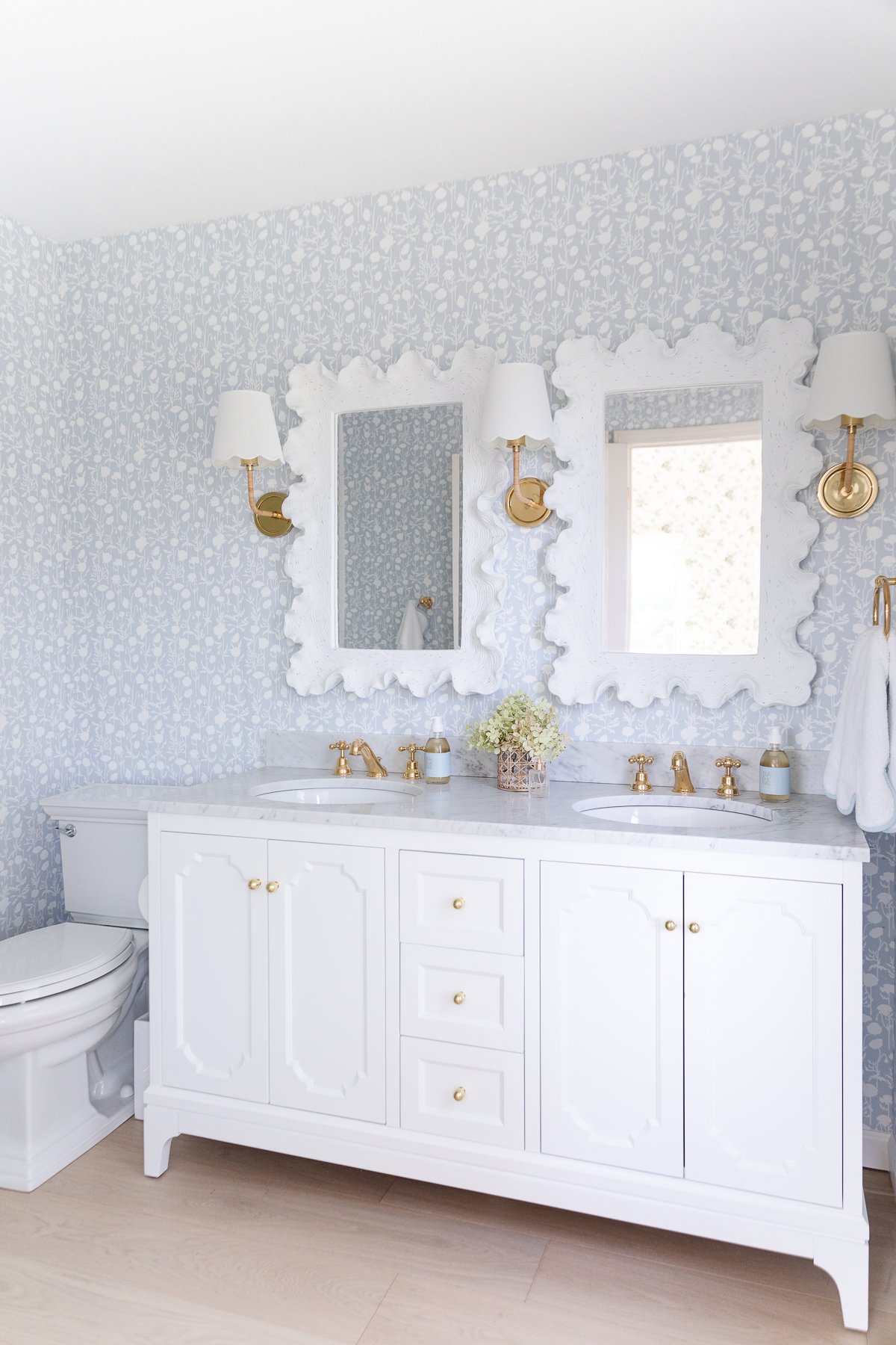
Primary Bath
We just finished renovating the primary bath and it’s so cheerful!
The Living Room
We were drawn to the open living space so we could maintain a smaller home without it feeling small. If you’ve been following along for a while, you know I take a less is more approach!
We removed the curtains, blinds, the wine storage fixture, etc. Eliminating the excess made the home feel brighter and larger.

We painted the walls and trim the same color (Benjamin Moore Simply White) to give the illusion of more space. We painted the interior of the dutch door in a in one of our favorite Coastal Blues – Benjamin Moore Silver Gray.
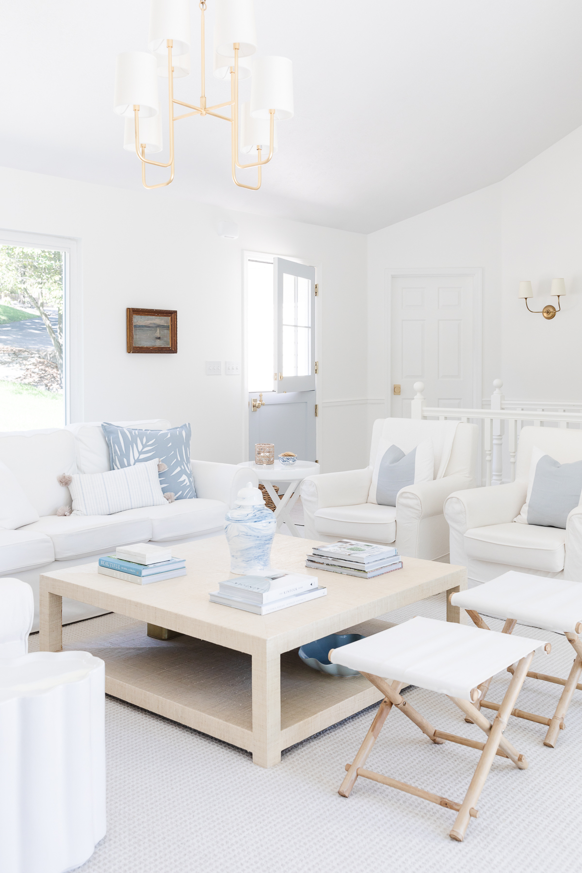
Given we use the home to entertain, we require plenty of seating. To make it feel intimate, we created a seating area in the center of the room.
An Ikea Ektorp sofa, slipcovered chairs and two folding stools are positioned around an oversized coffee table. The flexible seating allows us to accommodate nine.
A large gilded chandelier provides additional light and makes the space feel more intimate.
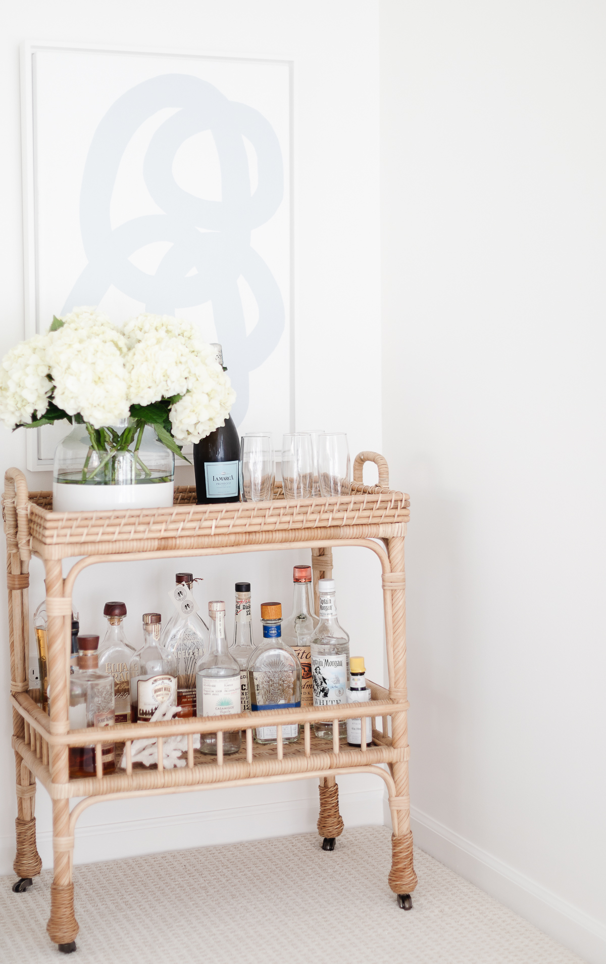
There’s a little nook that extends the space in the small yet open living room. It makes the perfect location for a bar cart stocked and ready to entertain guests.
The Kitchen
I initially thought the oak cabinets were original to the home, but learned the original cabinetry was white!
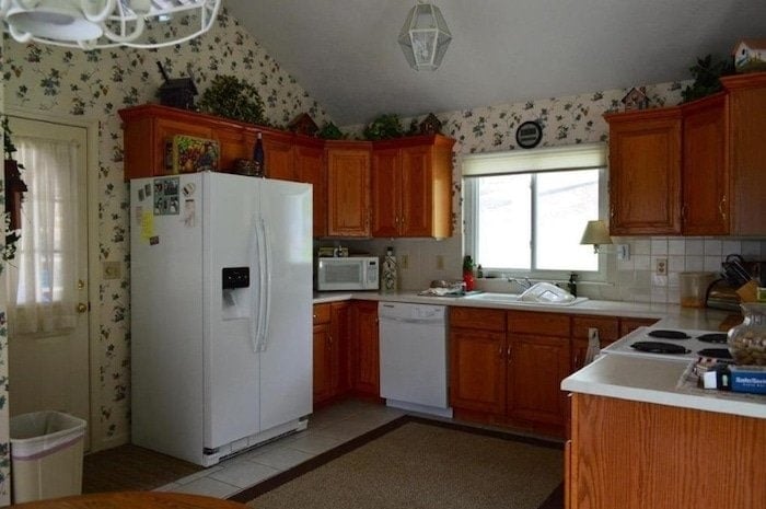
This kitchen is the perfect example that you don’t have to spend a lot of money to make a significant difference. (You can find paint colors that go with oak cabinets here if you want to avoid painting cabinets).
Removing the blinds, curtains, wallpaper, and accessories allowed the light to pour into this room!
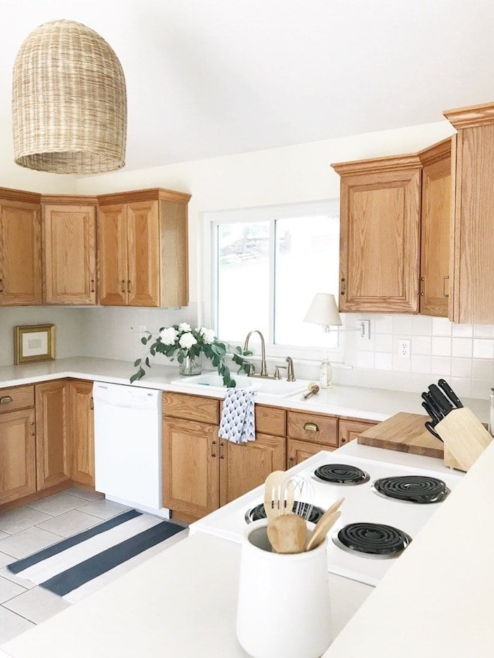
We painted the full overlay cabinets in Simply White (the same color as the walls), in a higher sheen. Doing so allows the eye to continue across the room from the entryway giving the illusion of more space. Brass hardware a quartz counter and tile made them feel new.
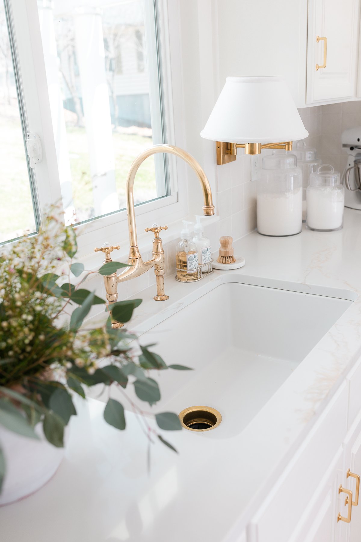
The unlacquered brass faucet adds character and can be polished or allowed to patina over time. The ILVE Range blends function and design fitting into the existing space while offering elevated style. It cooks and bakes like a dream.
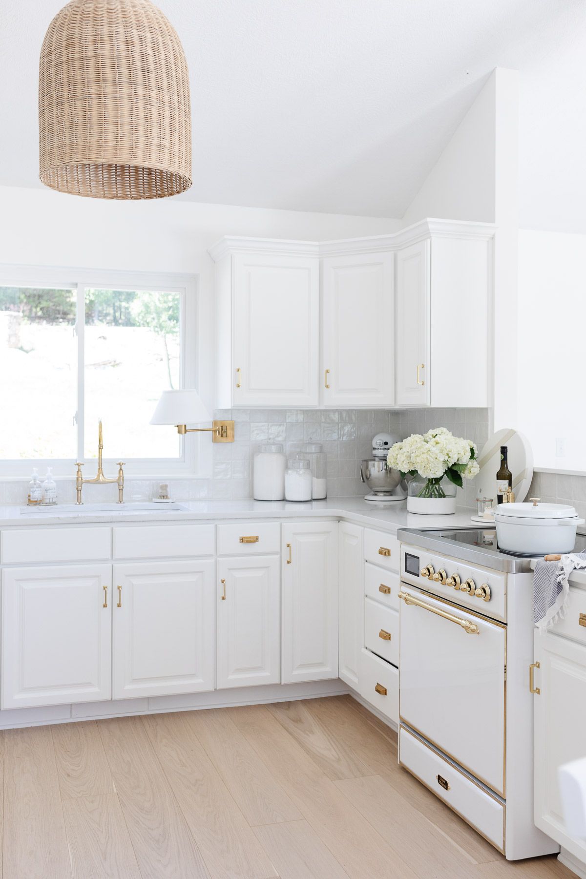
We replaced white tile with white oak floors adding visual and physical warmth!
Eat In Kitchen
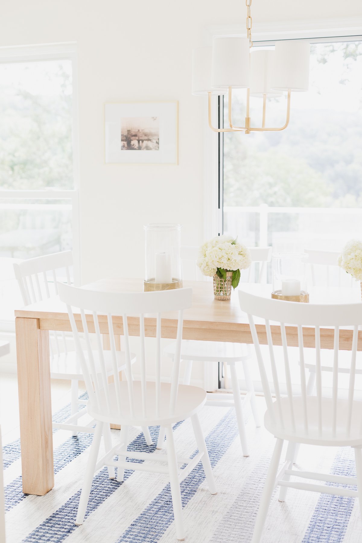
The eat in kitchen is small, but functional, seating up to eight guests.
A small gilded chandelier coordinates with the adjacent living room fixture over a teak table paired with inexpensive white windsor chairs. It is layered with a soft blue stripe rug to add texture and warmth (an indoor outdoor rug, which offers versatility and function – it wipes clean with water and can be hosed off when needed).
An old photograph of the nearby original and “new” Kimberling City bridges – before the lake filled adds a little history. A brass bell by the door is a nautical nod that alerts Chris and the girls when dinner is ready.
Hidden behind the doors is a convenient laundry closet fitted with a stacking washer and dryer.
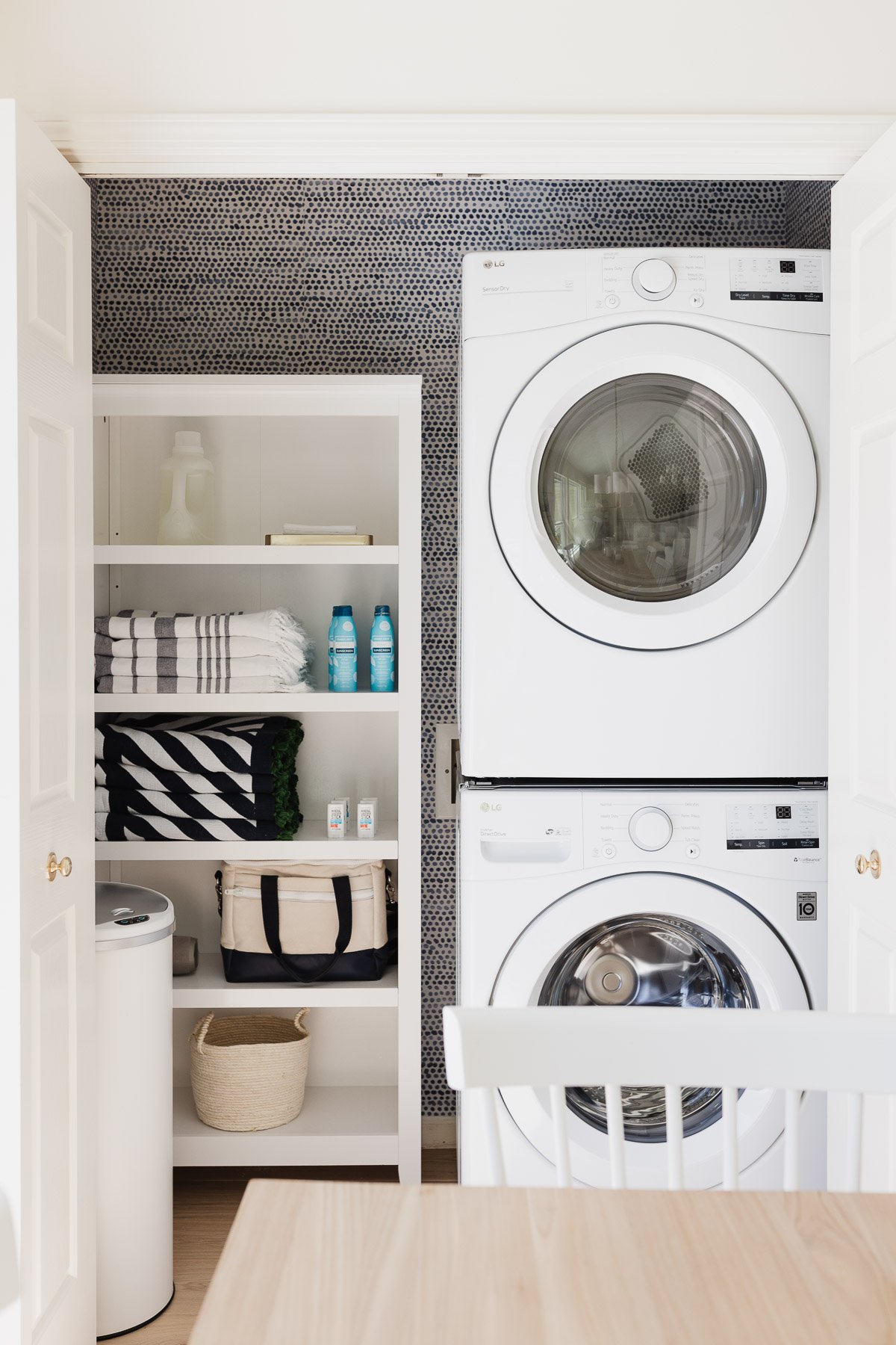
Peel and stick wallpaper adds an unexpected dose of fun. The pull chain light was replaced with one of my favorite Amazon Gadgets that allows you to use your favorite light fixture and a remote control that doubles as a wall switch. The wireless fix takes just 3 minutes to install – and anyone can do it!
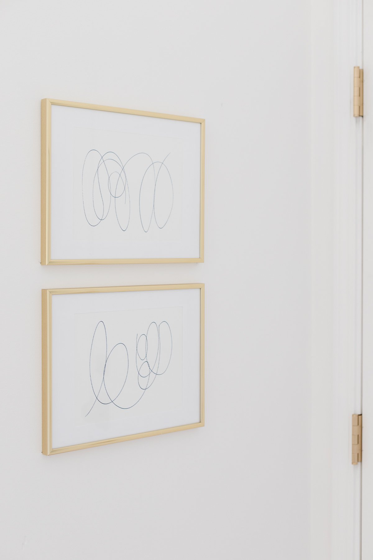
Leading to the garage I added a couple of pieces of diy art using inexpensive gold frames, a blue marker, and artist paper.
Mudroom
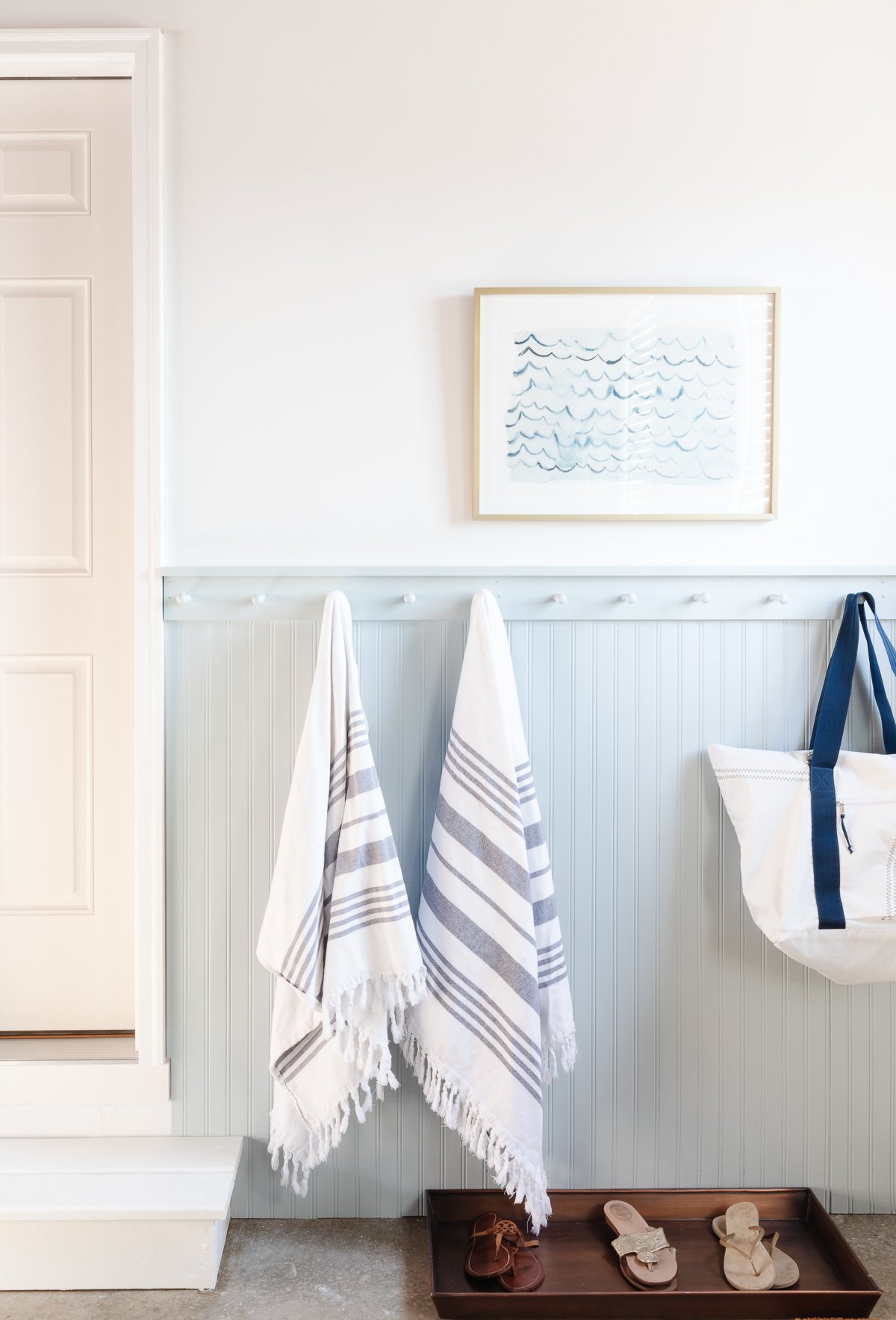
Just outside the kitchen door in the garage, we created a mudroom. It’s a great place to hang towels, life jackets, coats and store flip flops and shoes. It was a quick and easy project that made the garage feel like an extension of our home.
Stairwell
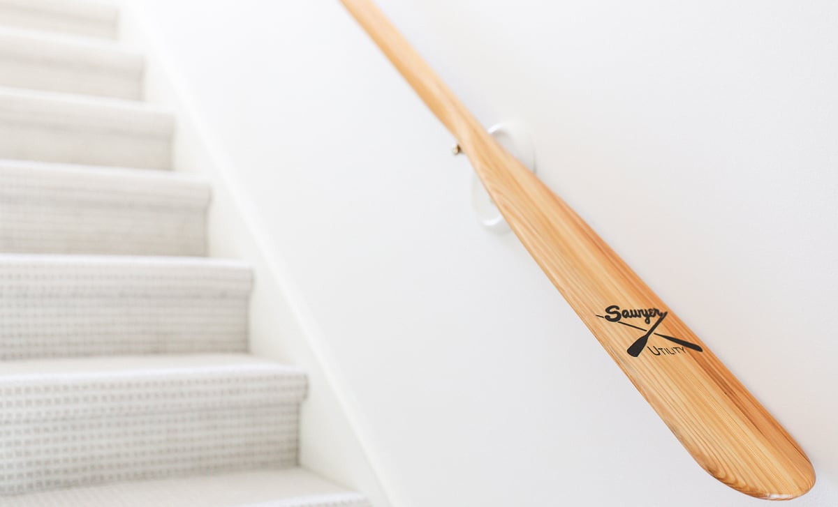
Stepping downstairs we replaced a classic banister with a beautiful oar in the same tone.
Modern Lake House Guest Suite
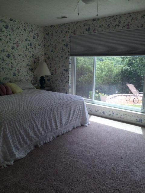
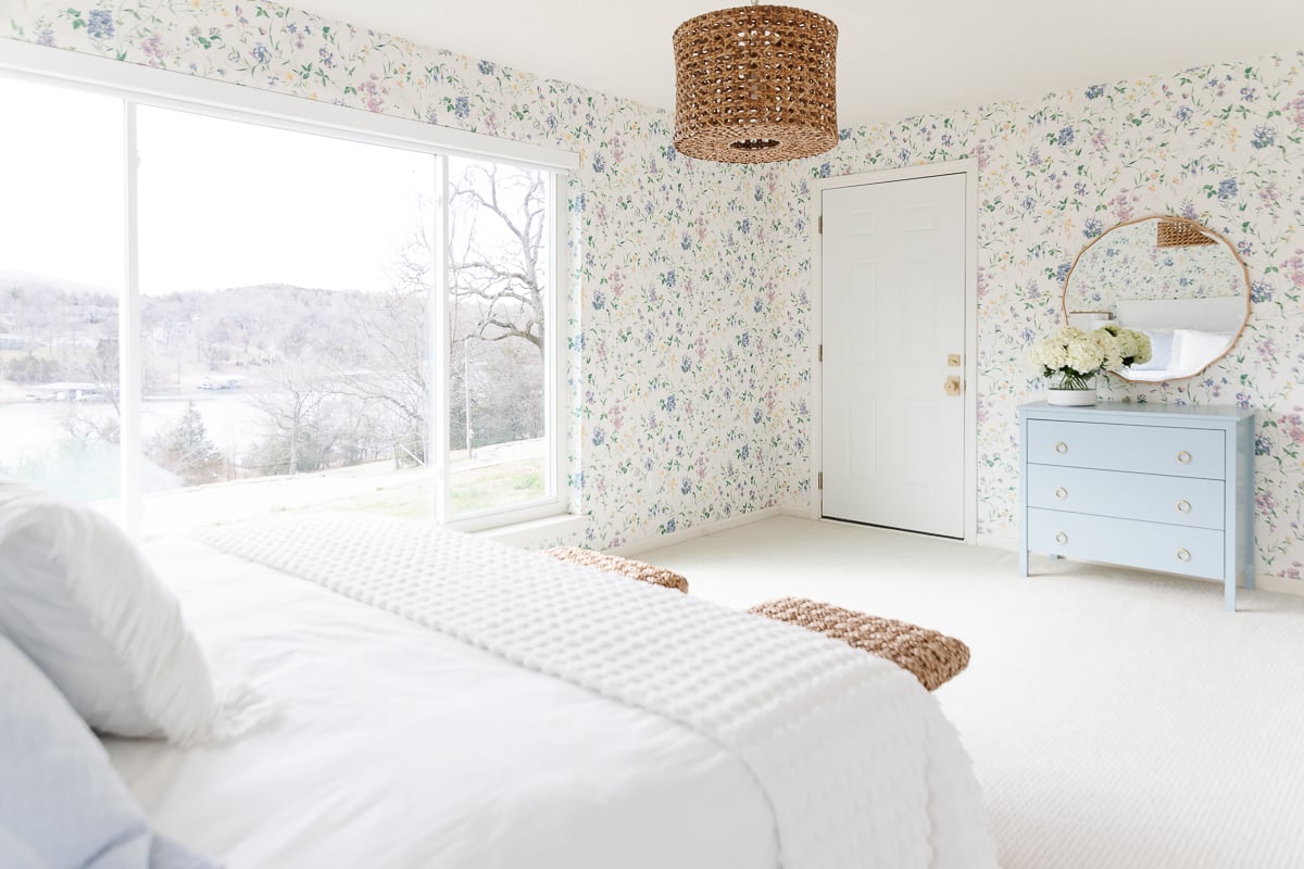
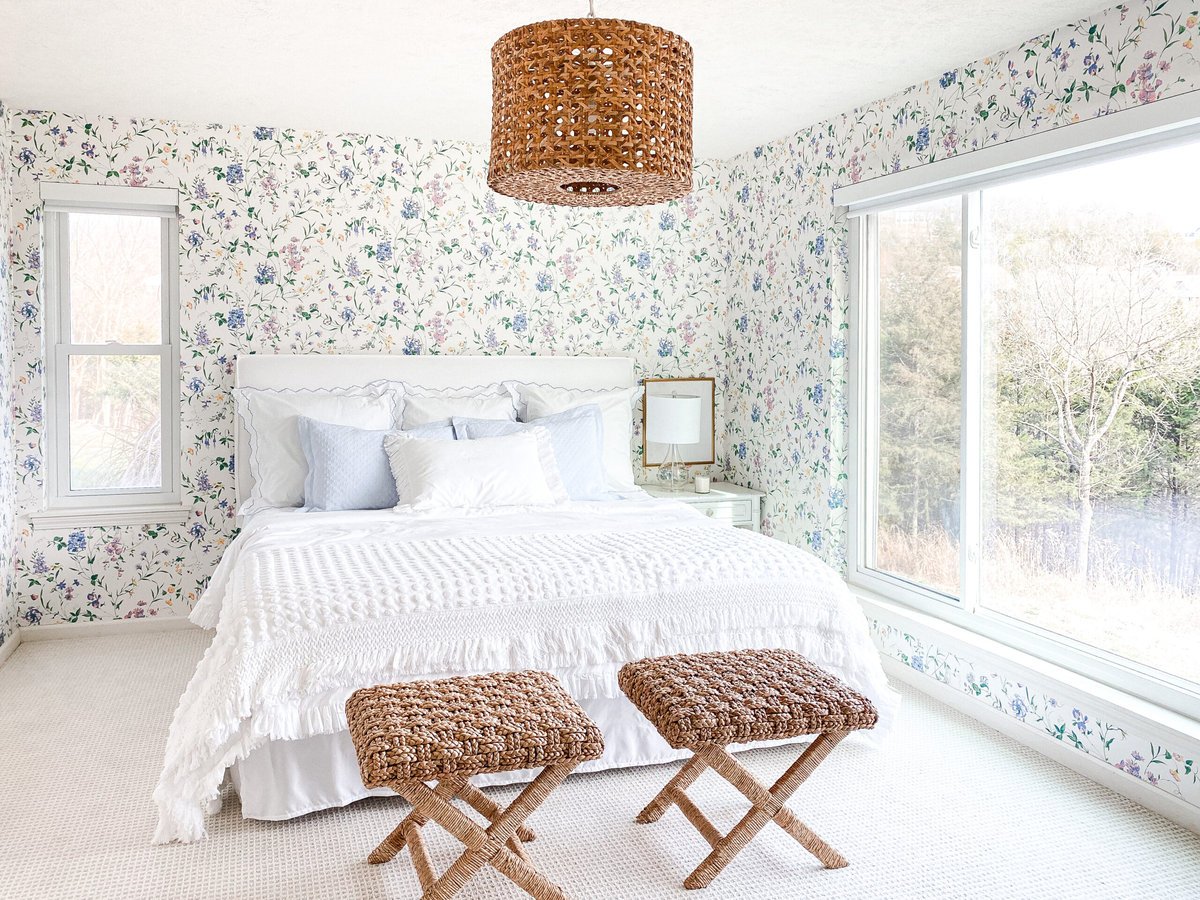
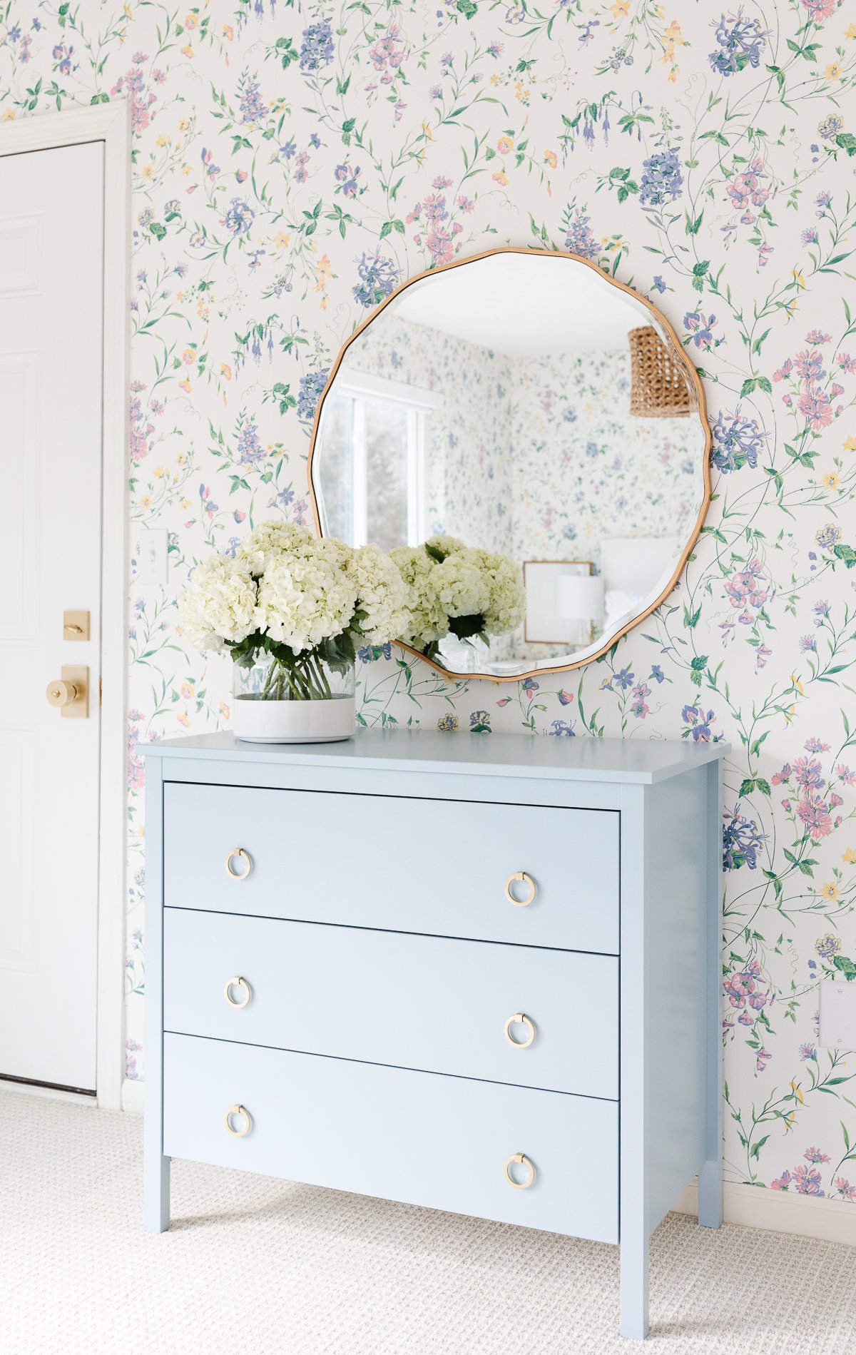
The second, larger guest bedroom is another example that you don’t have to make big changes to make a significant difference. This space was originally updated by embracing the lake view, updating the light, adding art and classic bedding to tie in the wallpaper.
Now it’s light and bright…
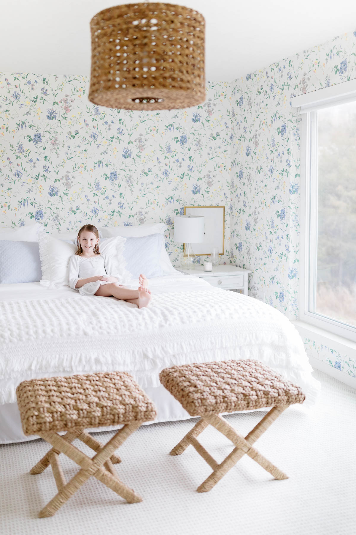
Detailed Shams | Matelasse Shams | Vintage Blanket similar
The cheerful pattern is mixed with texture. A rattan pendant and stools that double as luggage racks warm the space. This room also received remote shades to embrace the lake view and maximize sleep!
After faking a headboard for a couple years with pillows, we finally added one. The slipcovered headboard really finished the room.
Nautical Bathroom
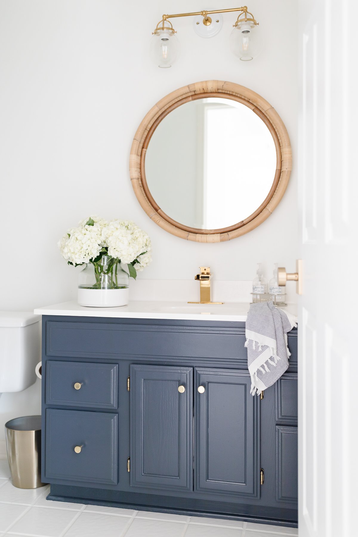
Nestled between the two bedrooms is what now we refer to as the Nautical Bathroom. The jack and jill bathroom was once plaid…
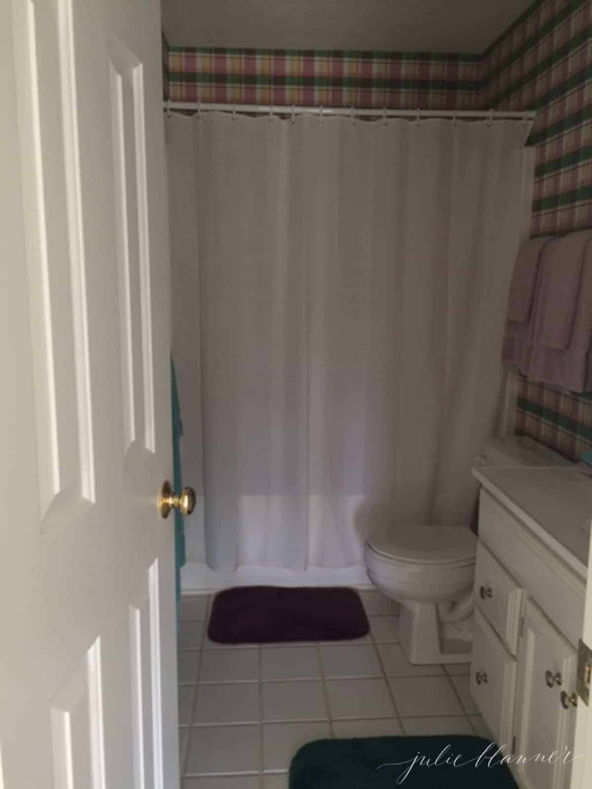
It is now bright white and hale navy! After removing the wallpaper, we painted the space a crisp white and the builder’s grade vanity blue. We added new hardware, a mirror, faucet and double sconce to transform the space.
The floor received a Tile Grout Refresh making it bright white and modern, without having to replace the floor!
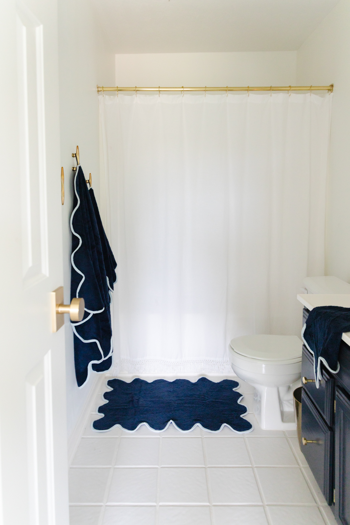
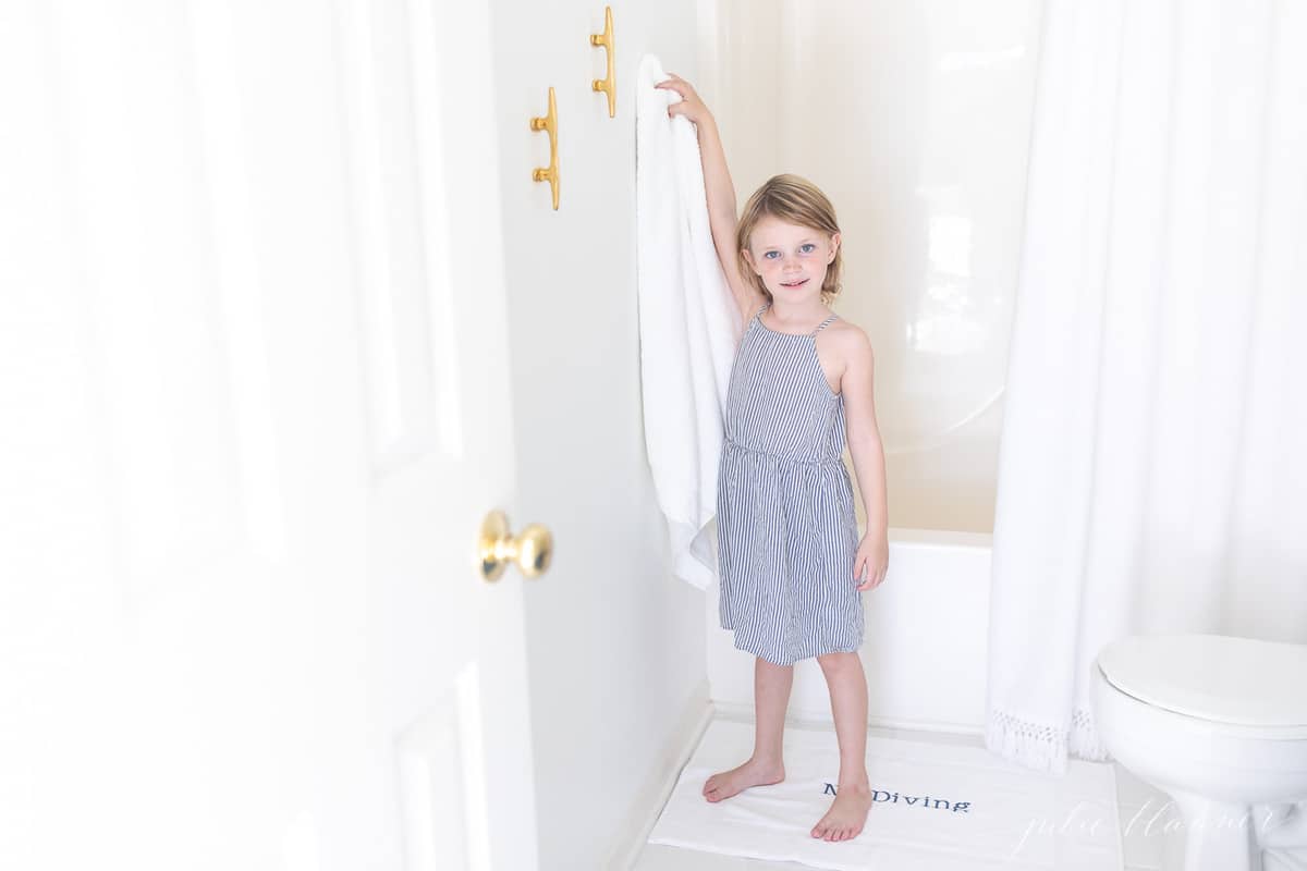
The tassel shower curtain hangs from a bright brass shower curtain rod to break up the white. Of course no lake cottage would be complete without boat cleats!
Hall
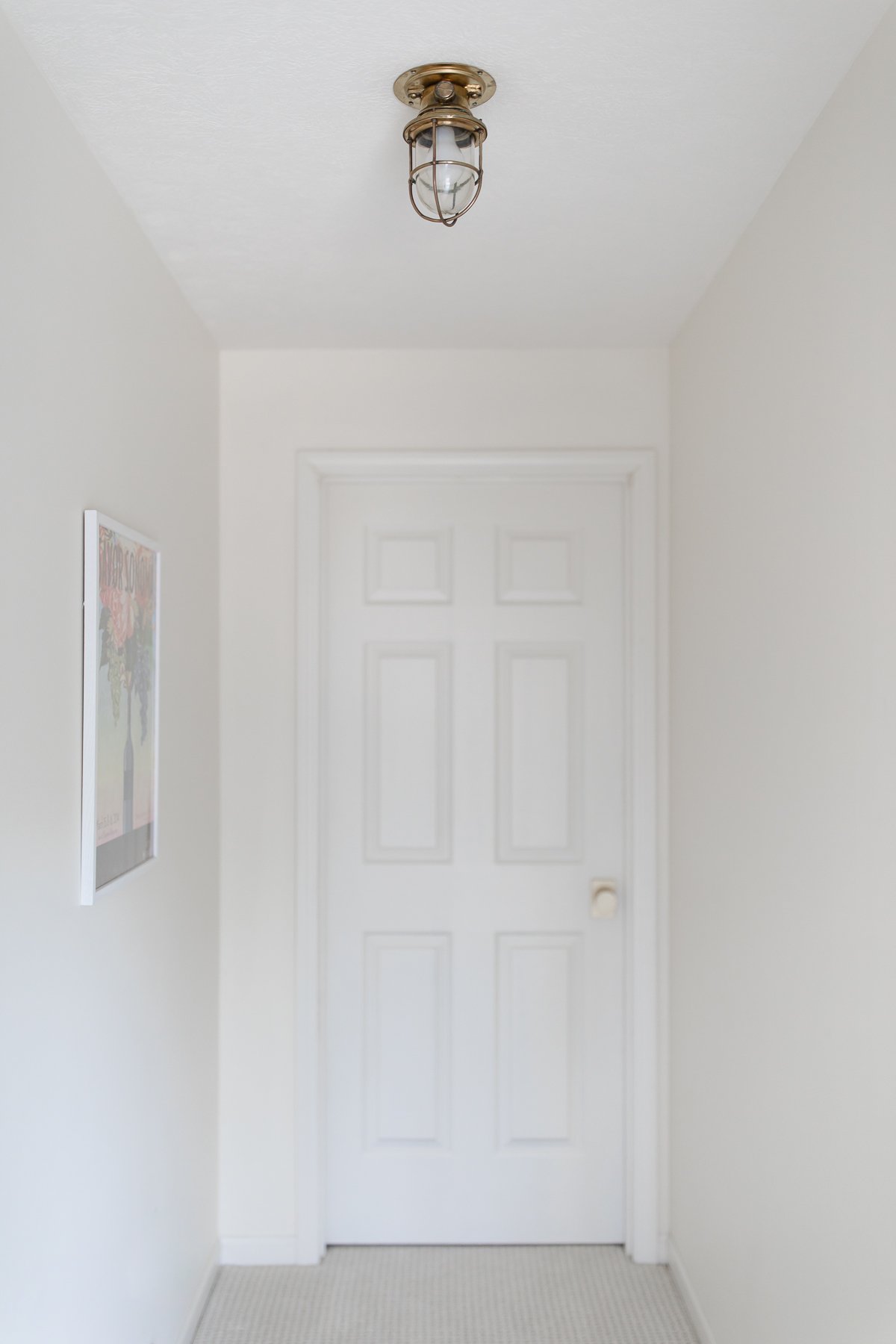
The hall between the guest room and the girls’ room didn’t need much…
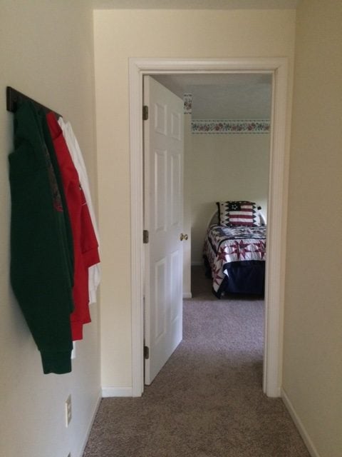
A little brass light sure brightens the space and adds nautical charm. It’s been recovered (rewired and cleaned) from a sunken ship.
Bunk Bed Room
The girls’ bunk bed room is my absolute favorite! I love hearing the giggles that come from this room each morning and nightfall.
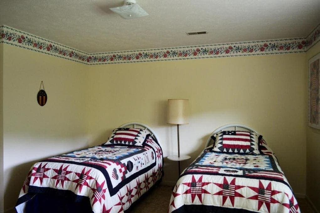
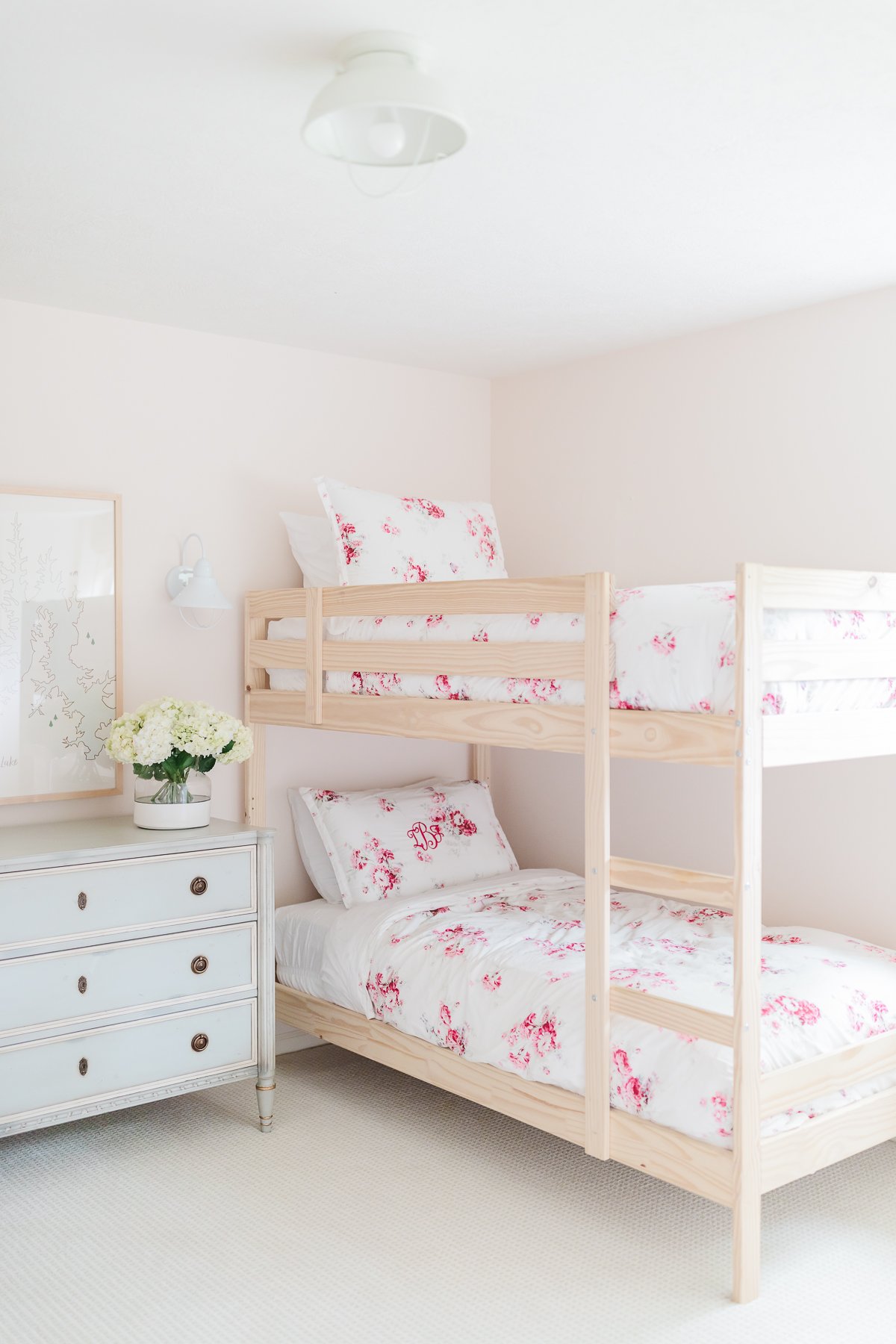
We removed the border and painted it a soft pink girly hue (Benjamin Moore Bliss Pink). It plays well with the natural bunk beds (from IKEA). A blue chest of drawers doubles as a side table.
I like keep furnishings to a minimum to maximize space and prevent clutter from building up at the lake cottage.
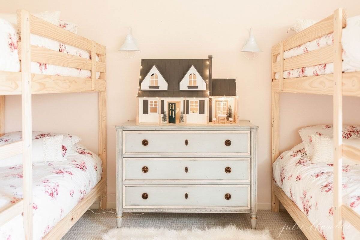
I had an artist create a beautiful map of a portion of Table Rock Lake and framed it to coordinate with the bunk beds.
You can read about it here and find sources here.
Lower Living Room
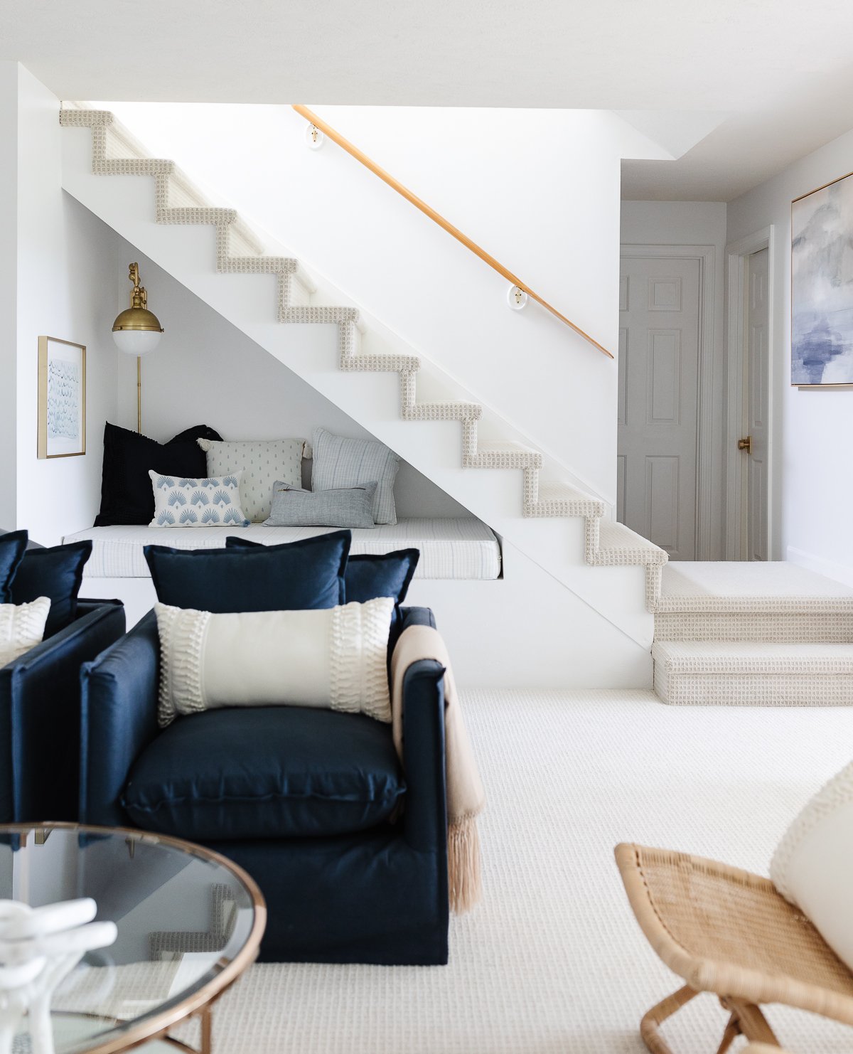
On the other side of the stairwell is a second, lower living room.
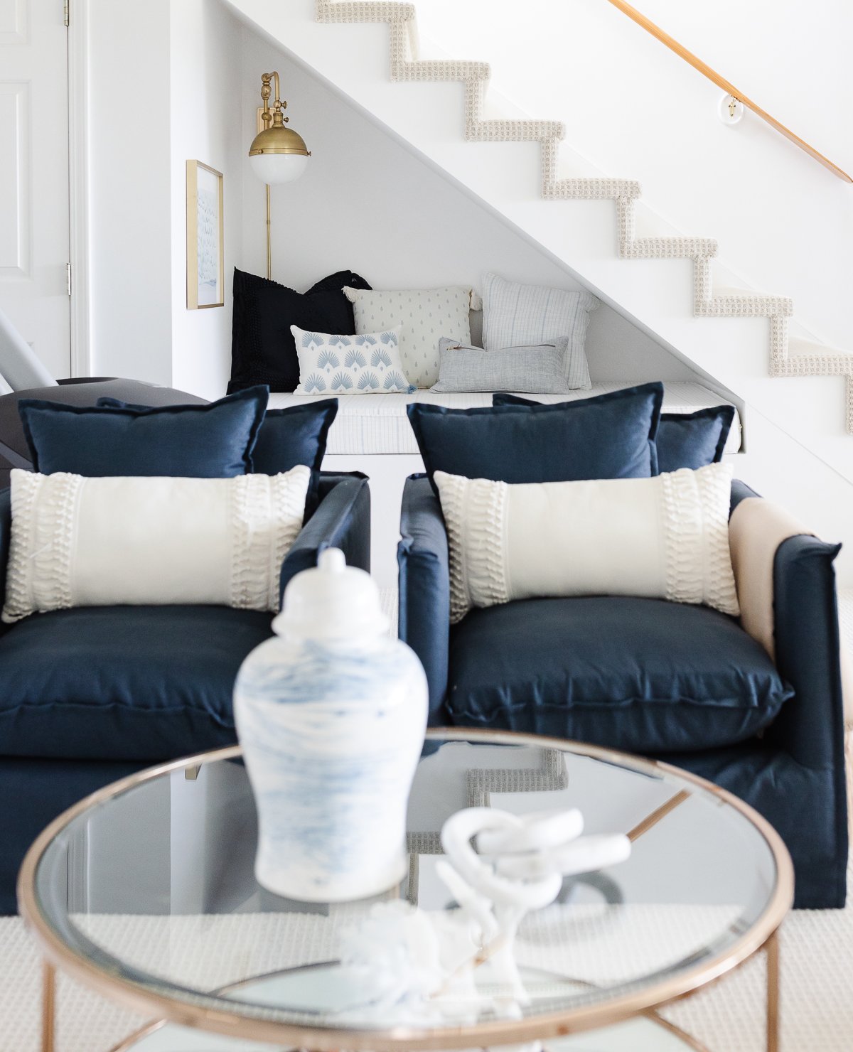
Originally, there was a single step beneath the stairs. We found that it was a collector of “stuff”.
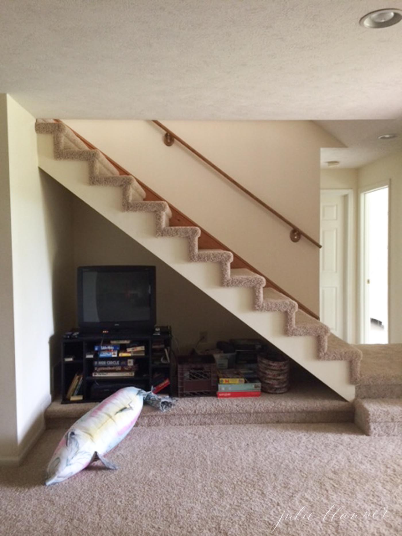
We redefined the Open Staircase as a Kids Reading Nook. This not only gives the girls a fun place to hang out, but sleeps an additional guest when we have a full house. Believe it or not – it’s actually the same length as a twin bed, yet wider. Perfect for a kiddo to rest after a long day of boating.
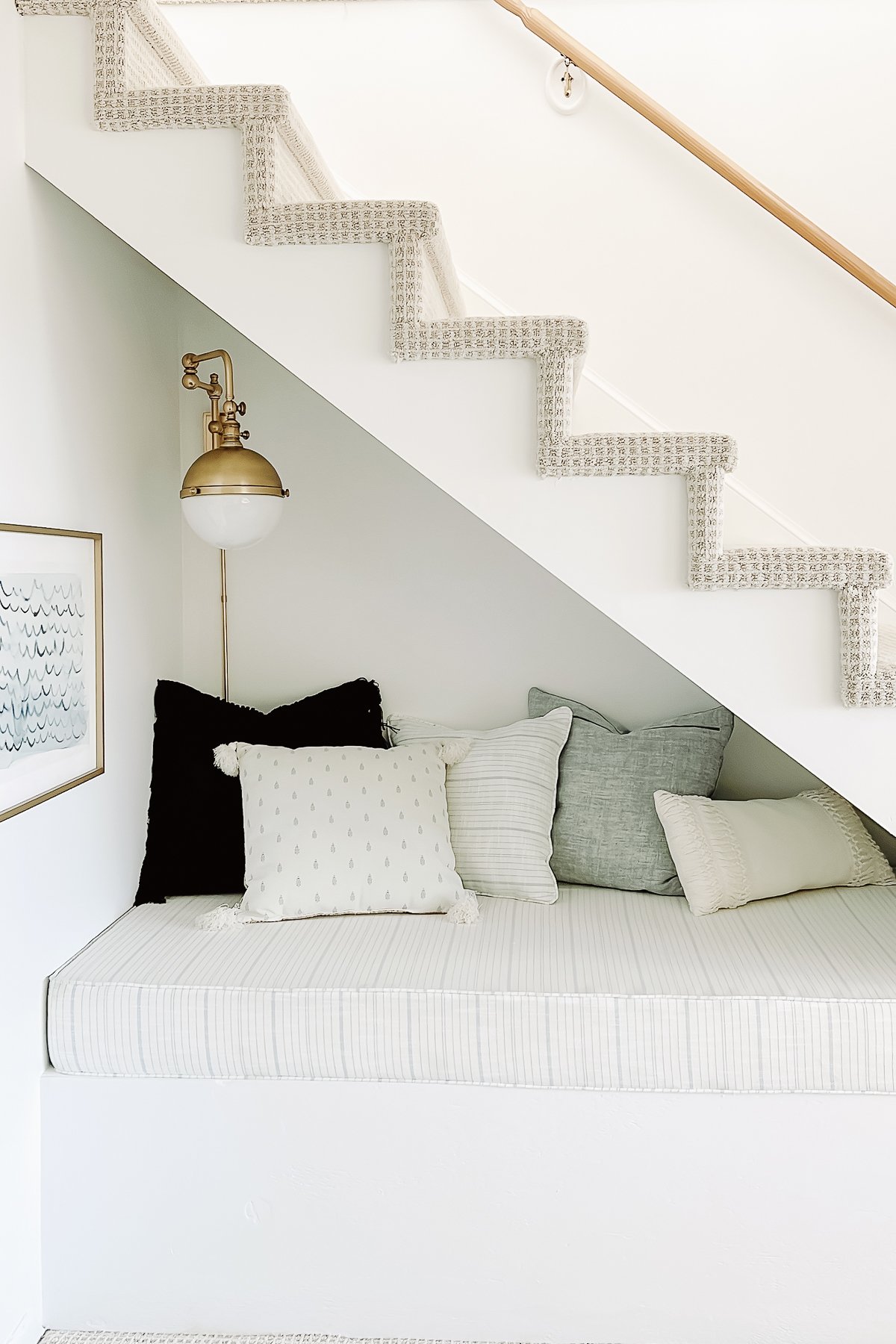
I had a custom mattress and cover made and filled with it pillows (available in my shop) so the girls could kick back, relax and read. If you haven’t noticed yet, I’m addicted to stools! They’re just so versatile and provide extra seating in a pinch. The waves print is a fun nod to the lake that lies just outside.
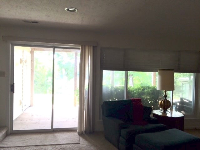
The lower living room was dark, so we implemented 7 Ways to Add Light to a Room.
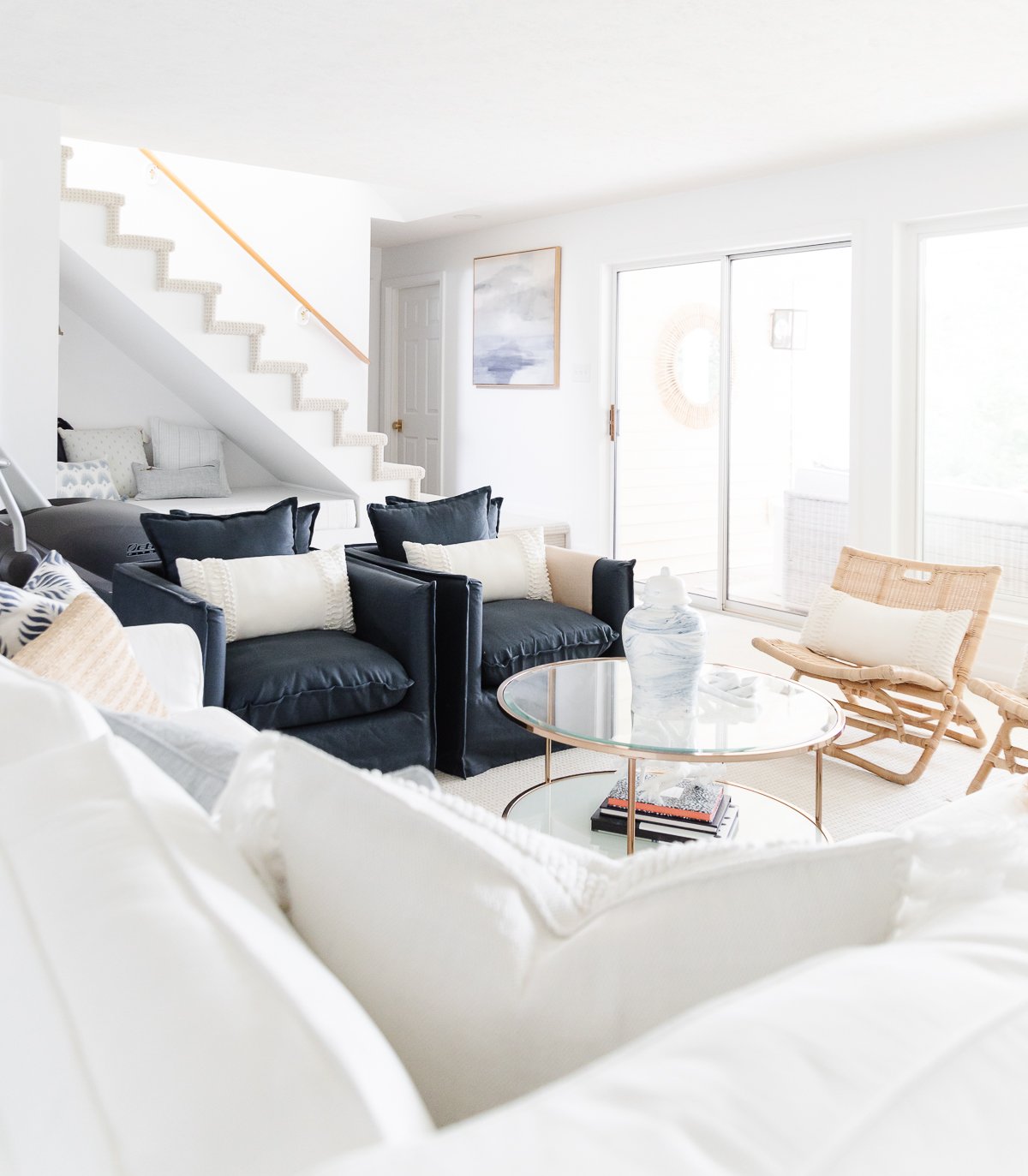
We added budget friendly seating including these rattan chairs, cozy blue chairs and an Ektorp Sofa along with options that easily fold to stow away or roll out of the way to accommodate an air mattress or two in a pinch.
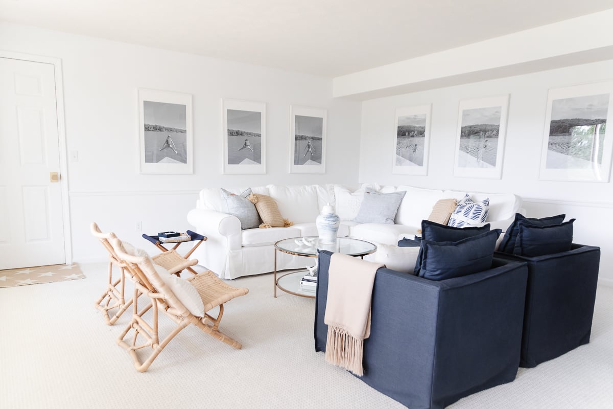
This budget friendly modern living room easily seats 12 – not including the nook!
With flexible furniture (the blue chairs are on rollers and the woven fold and stow away) It’s a great place to play games on a rainy day!
Deck
Last, but not least, the deck. It was rotting out and we’ve been strategically placing rocks where boards have given way. It was also causing water damage to the lower living room and guest suite.
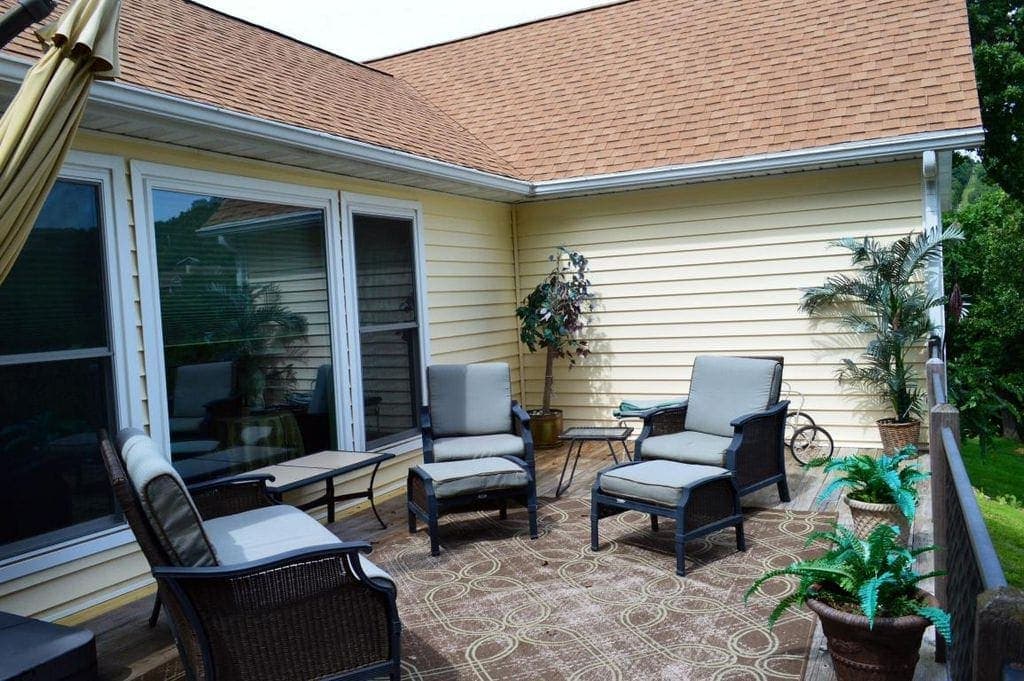
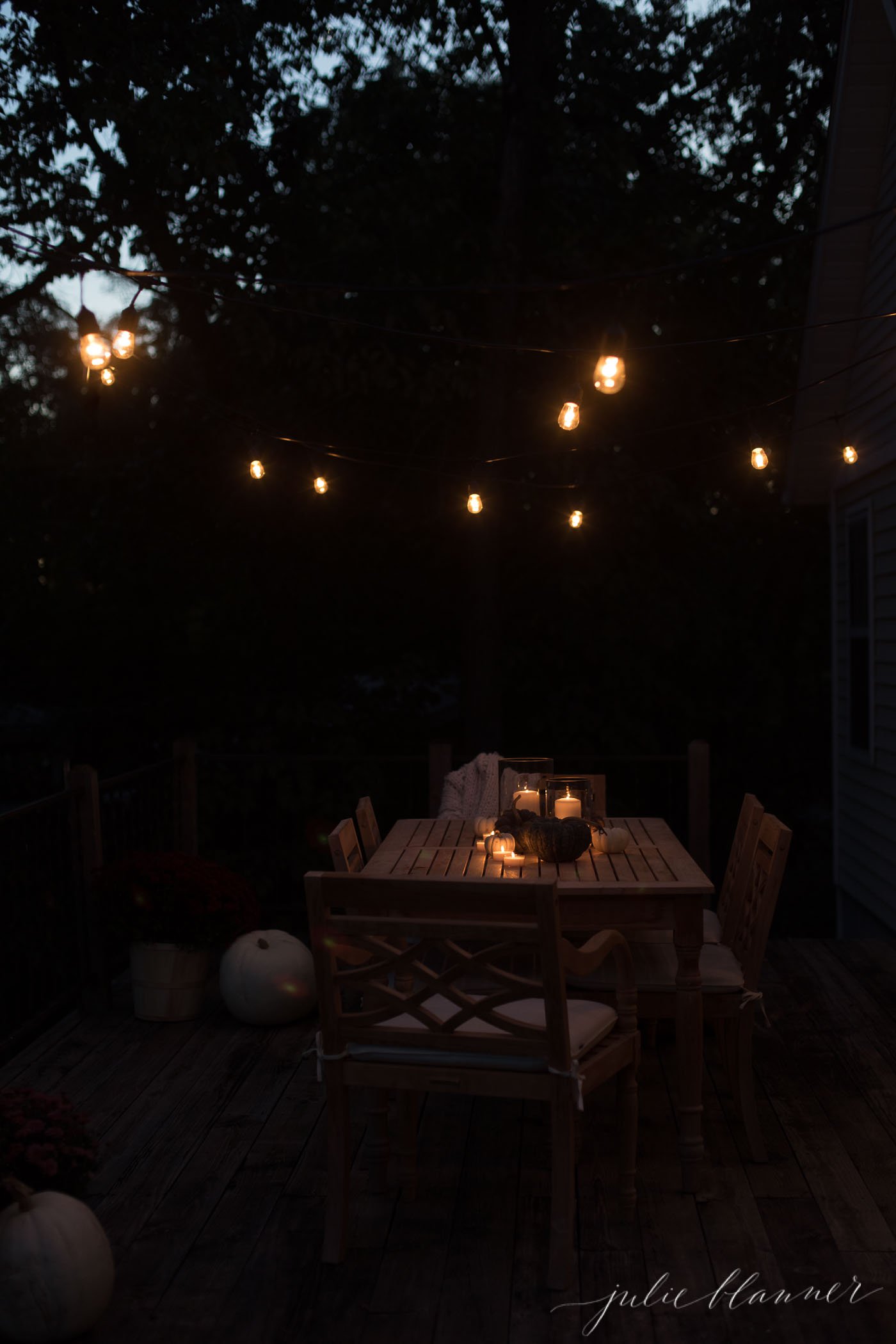
The deck was removed and replaced with vinyl decking which is virtually maintenance free and a Glass Deck Railing! The white decking reflects light indoors and helps mitigate the yellow siding.
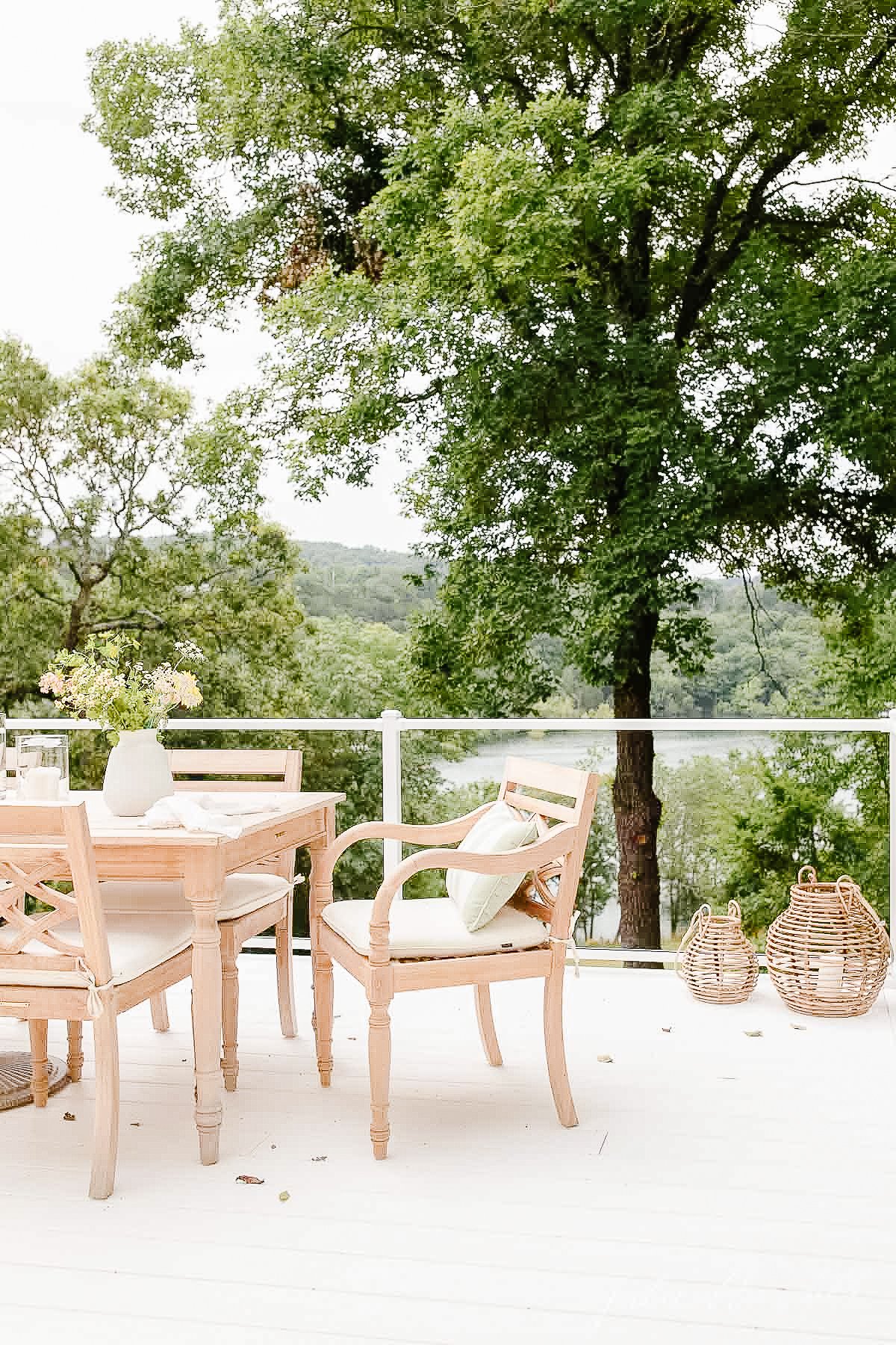
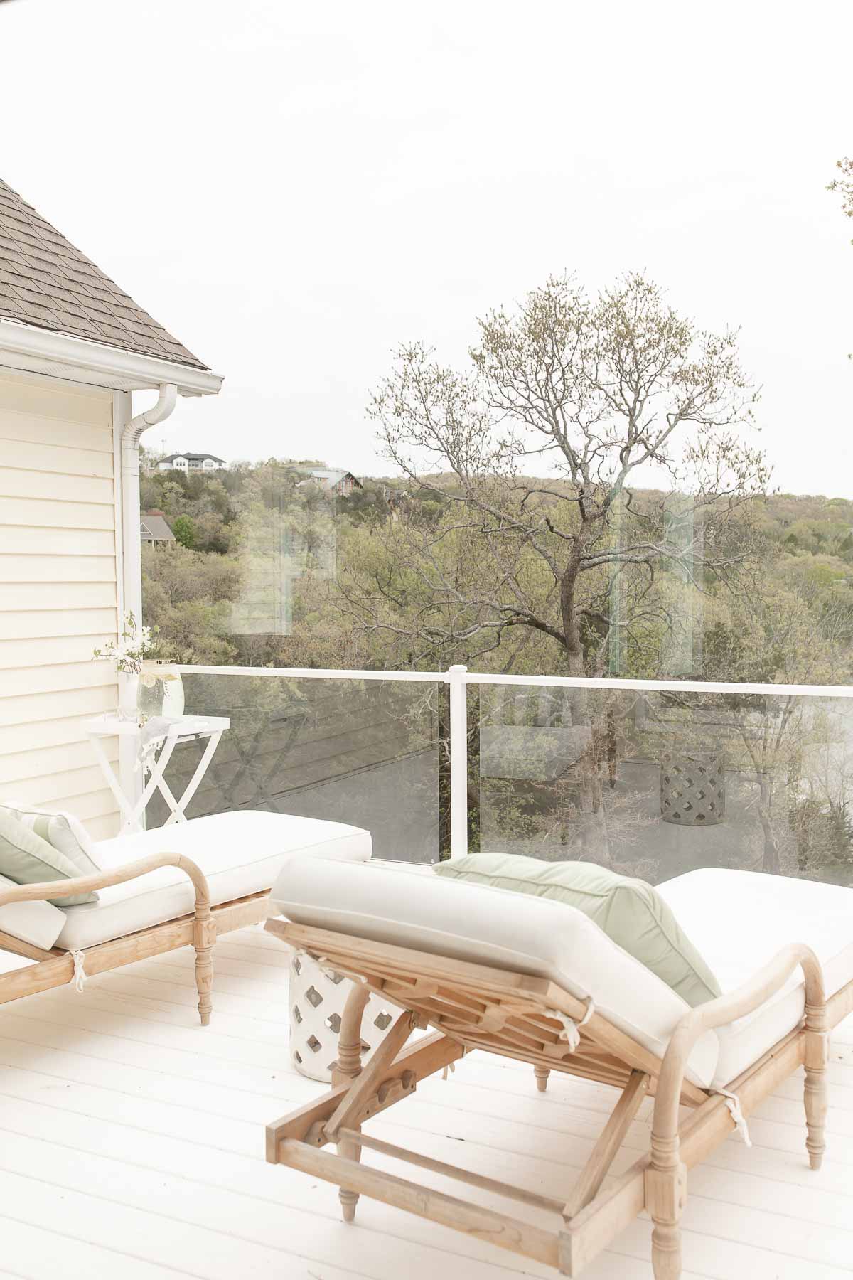
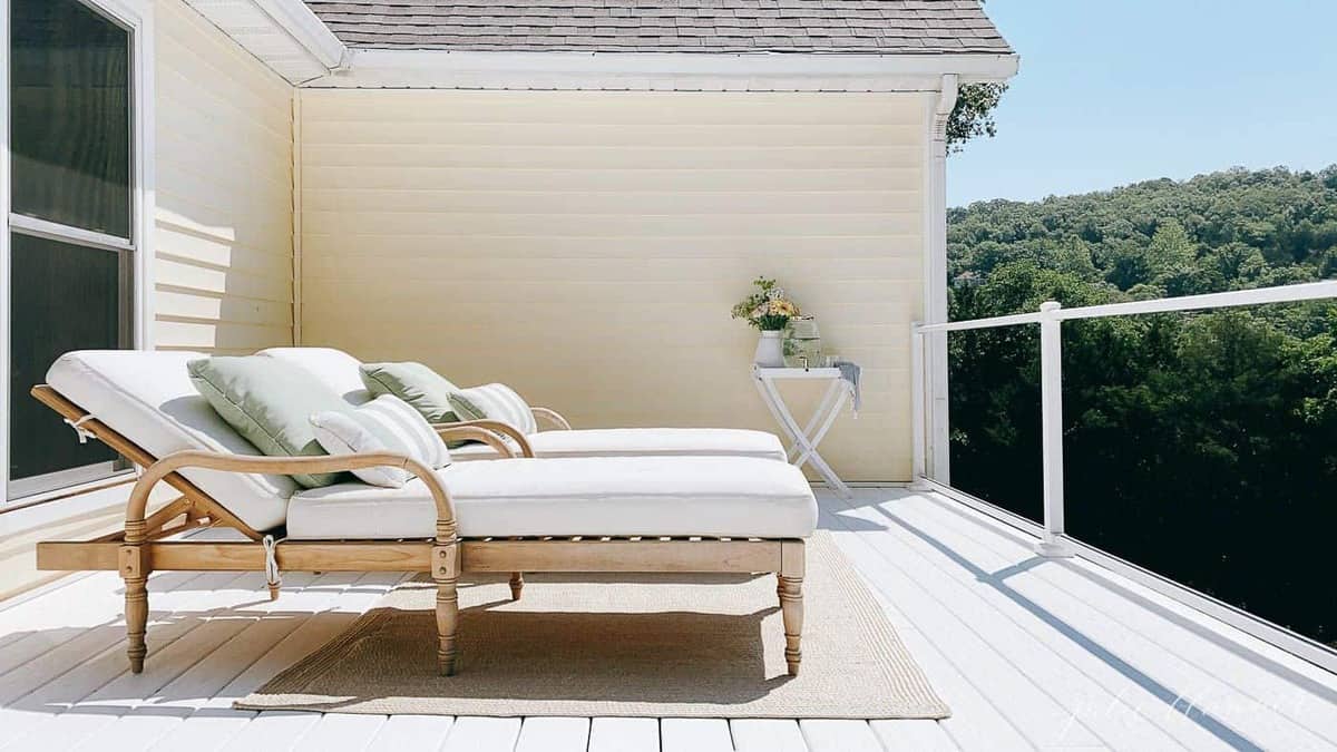
Glass panels offer better views both from the deck, kitchen and living room. We spend a lot of time on the deck enjoy breakfast, lunch and dinner when we’re not on the water, but I love stargazing with Chris on Friday nights on the chaise lounges the most!
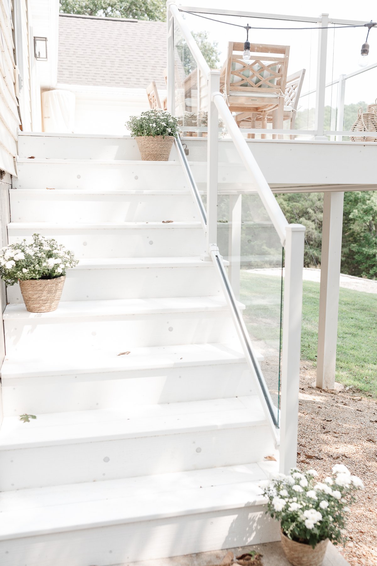
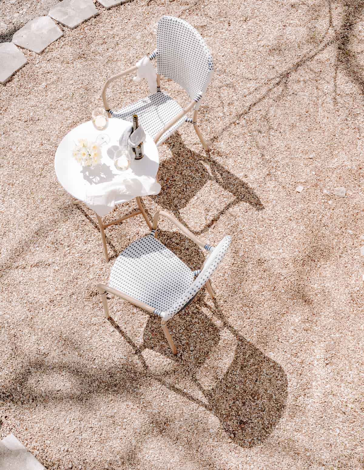
At the bottom of these stairs we added a little bistro set to take in the lake view and enjoy a cup of coffee.
Overhead string lights add ambiance! Learn more about deck lighting here.
Outdoor Living Room
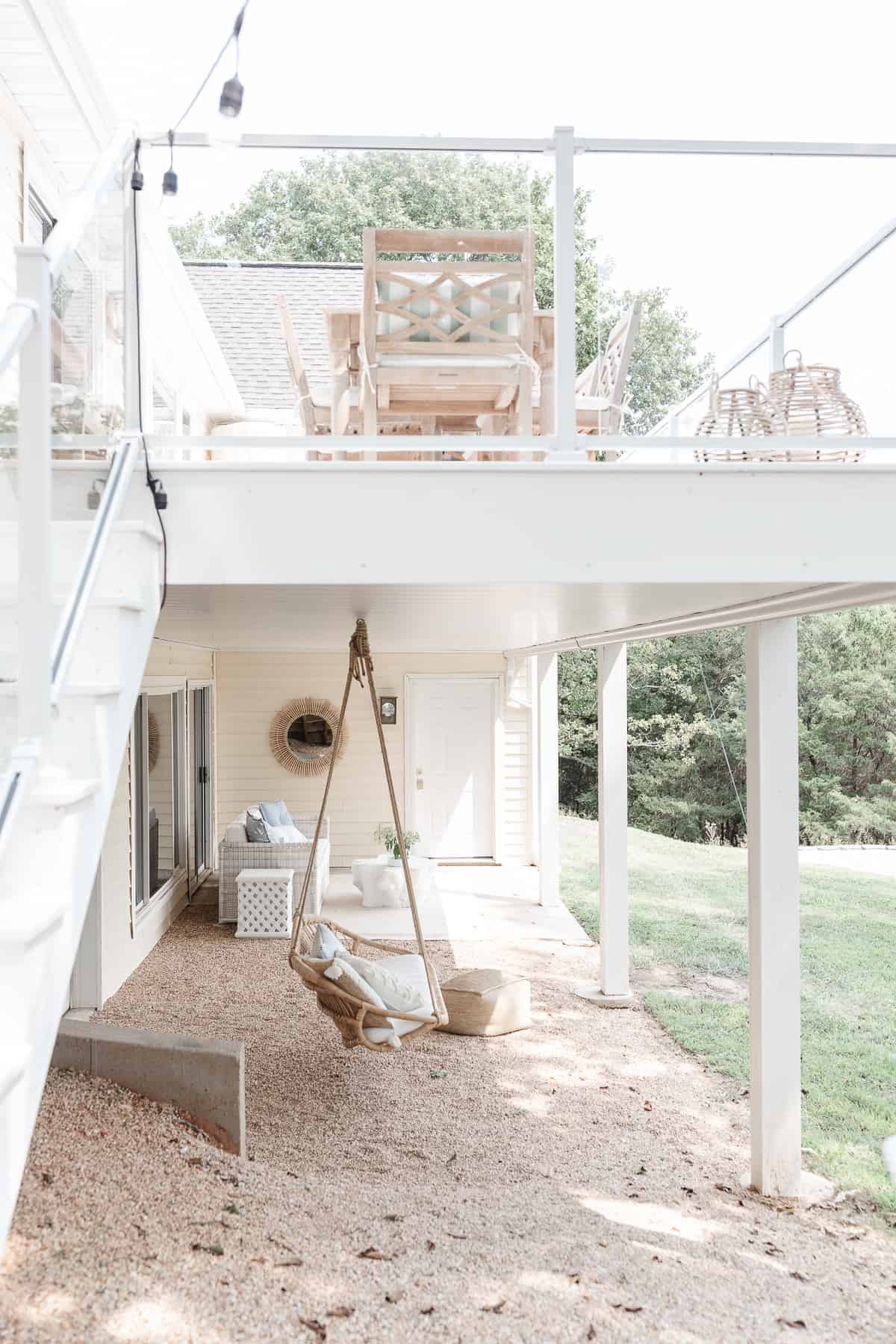
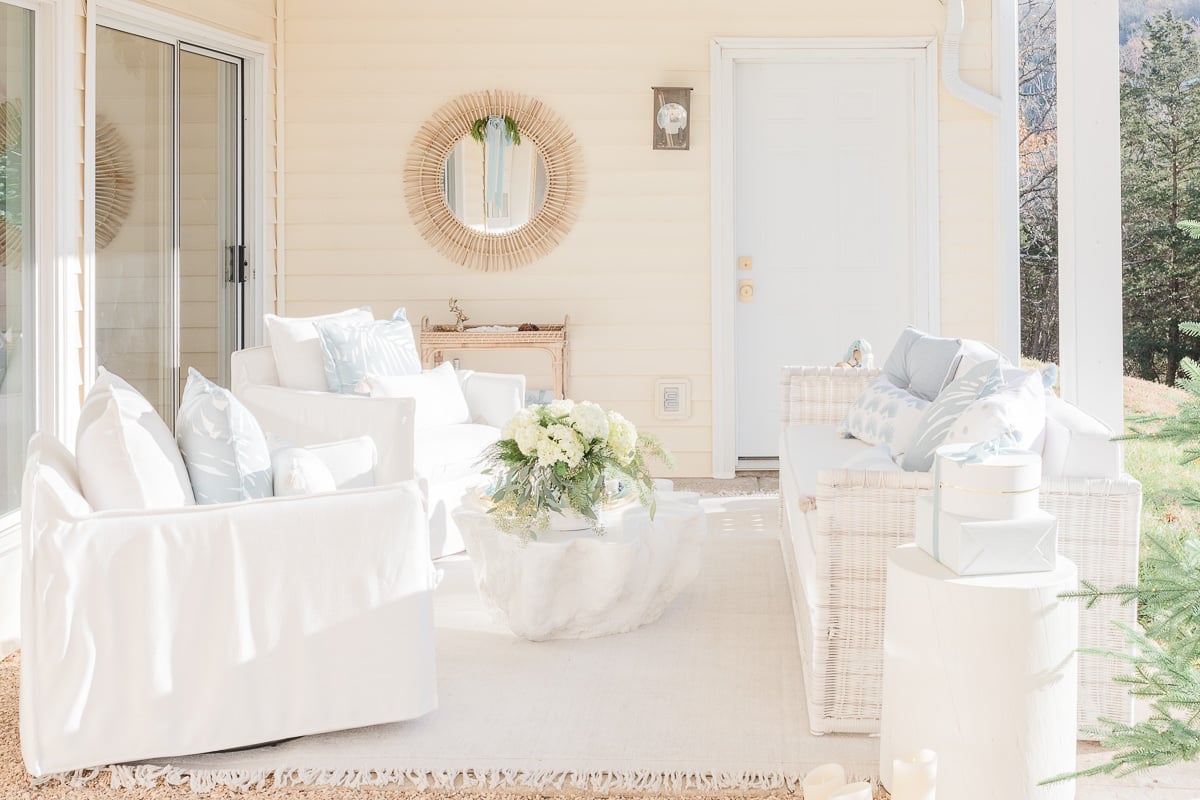
We also added under decking to create another outdoor living space beneath the deck, while preventing water from entering the home.
Dock
Of course my favorite place at the lake is on the water!
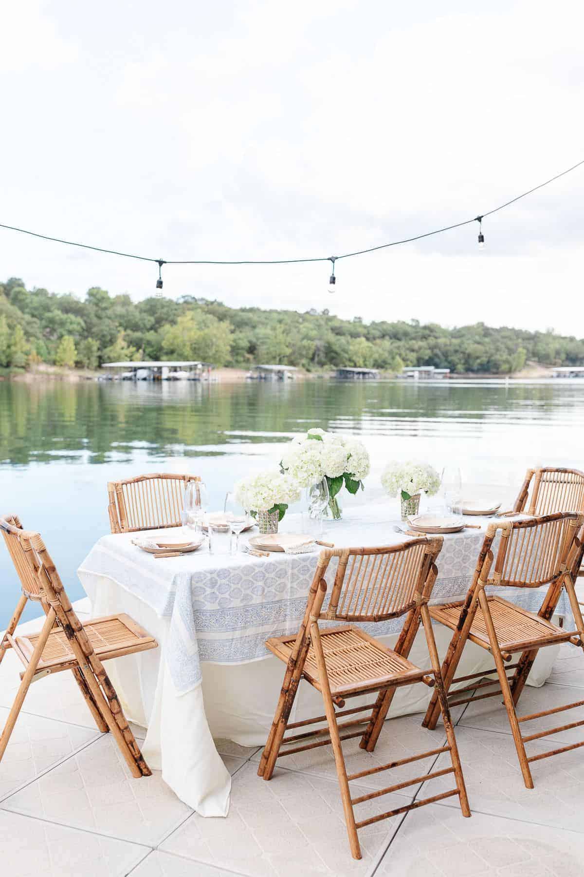
We enjoy the dock as an extension of our home. We previous shared a dock with 4 neighbors and this Spring, we secured a new private dock just below our home, making it even easier to relax and entertain.
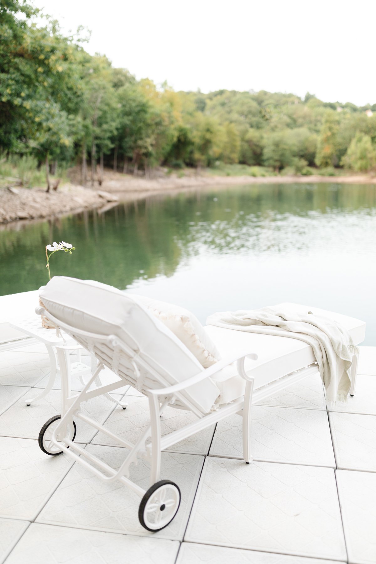
Nestled in the back of a cove, it’s the ultimate place to kick back and relax while nibbling on snackle boxes. I love laying on a chaise lounge watching the girls paddle board and play before we go boating for the day.
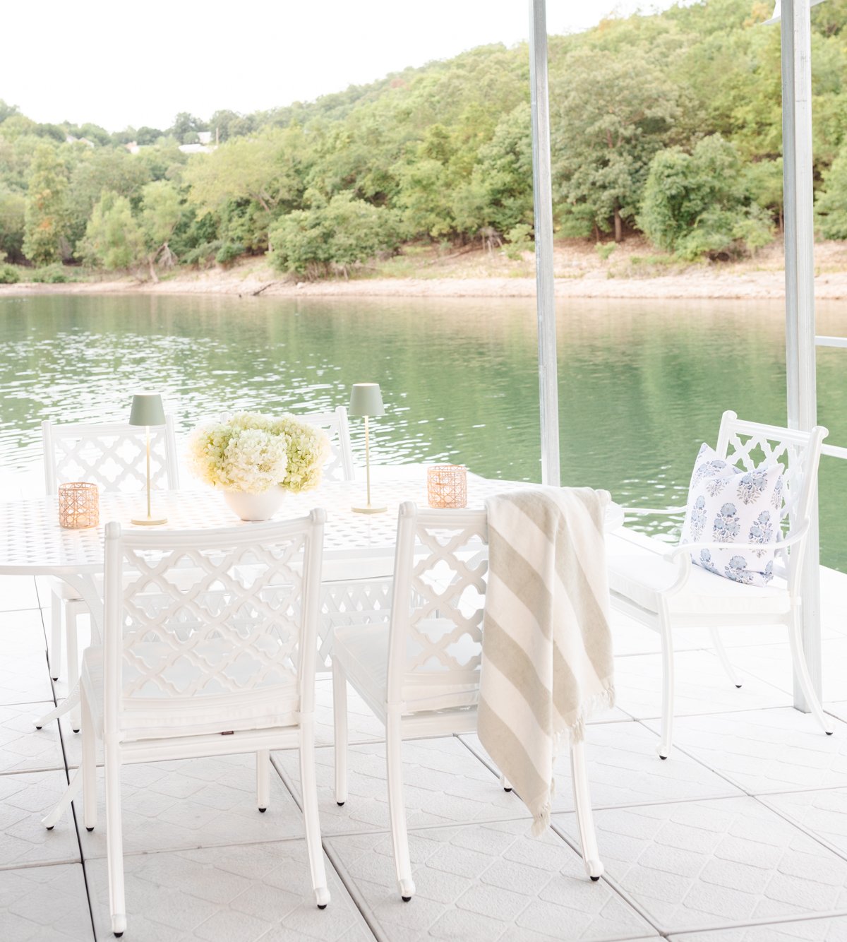
The dining table is a great place to soak up some shade while playing games or eating our favorite picnic sandwiches. Dining al fresco is one of our favorite things to do and the dock is no exception. It’s the perfect way to end the day!

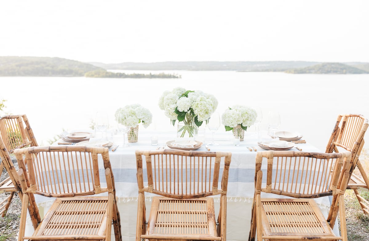
We are so grateful for the previous owners of this home (they custom built this home and we now count them as friends). They made the dream of lake life come true for us! We adore all of our lake neighbors and the friends and family we get to share our home with!
Thanks so much for joining me on this before and after tour of our modern lake house. I hope to see you again soon!



There are so many pop up ads on your blog it is almost impossible to read. Too bad, the content looks very interesting.
Hello,
While my content is free for readers, it’s not for me to produce. In addition to equipment, costs of creating, hosting, tech, etc, the management company who runs ads takes a significant percentage. We provide free content for you, and in turn we provide for our family with those ads, so I appreciate your kindness.
Have a wonderful week,
Julie
Lovely re-do. Thank you for having the vision to transform so gloomy a space into something so bright, fresh and beautiful. And thank you particularly for NOT being afraid of the color white!
Hello!
Thanks so much for your kind words! I really appreciate them more than you know.
Julie
Julie, I love your style and I truly enjoyed reading this post on the cottage transformation.
Thank you, Terri! It’s been so much fun!
Hello,
Where is the wallpaper purchased from that was used in the guest suite?
Hello!
That wallpaper is actually original to the home, 90s era! We love it!
Have a wonderful week,
Julie
Hi i have a homey oak kitchen and i need to alter half the kitchen and now i was thinking to use soft cream for half of the cabinets. And i have matt silver fridge and freezer , what knobs i shall use with all cream and oak cabinets to update the look brushed silver or brushed gold pls