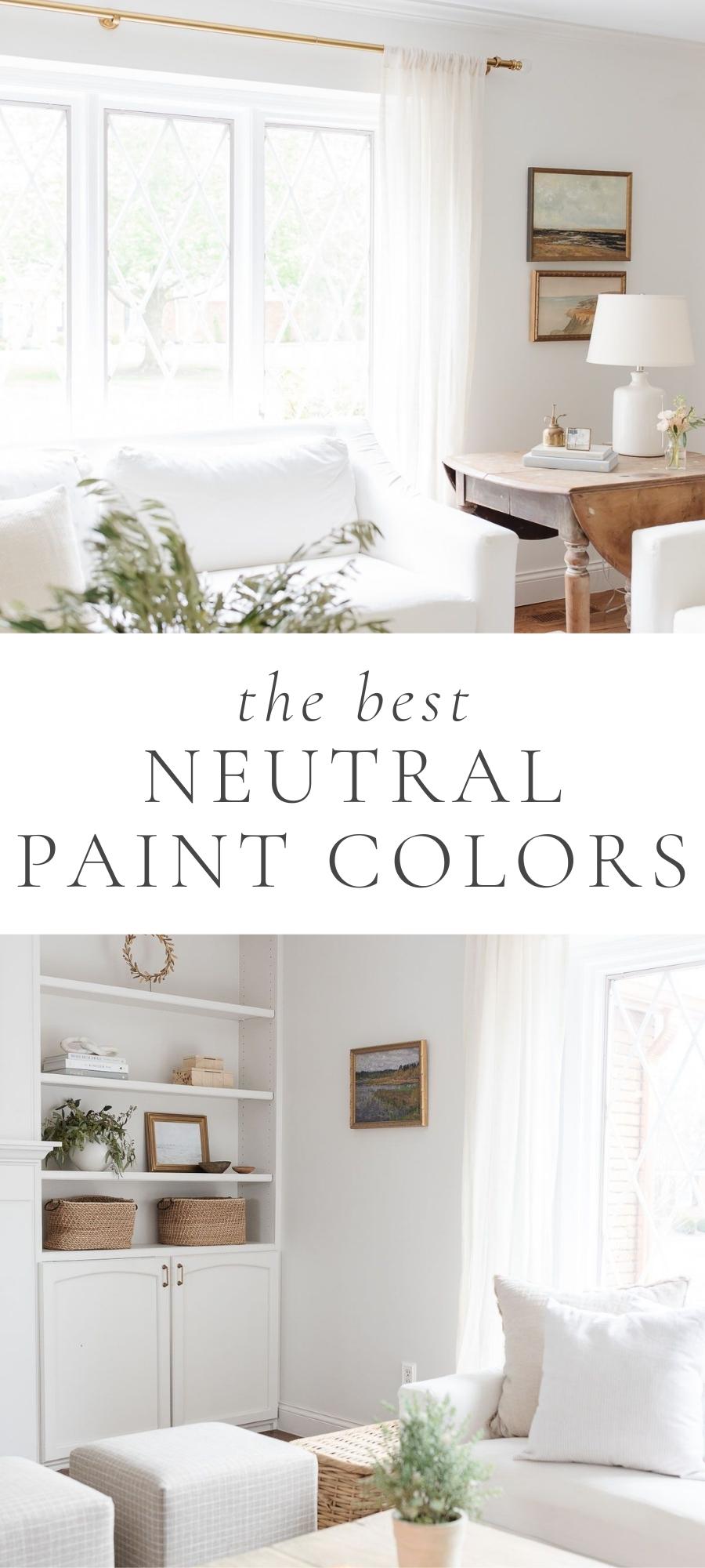
Get all the details (and photos of actual rooms!) for some of the BEST tried and true neutral paint colors. Varying undertones and lighting situations can make choosing paint difficult – but no longer with this complete guide!
If you’re looking for fresh and fabulous neutral paint colors for 2022 and beyond, this round-up of 16 amazing neutral paint colors is for you! Find all the prettiest neutral paint colors we’ve used in our homes – from whites and creams to beige and greige, there’s something for everyone.
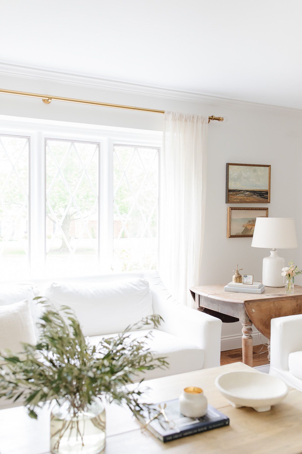
The most frequently asked question about our home on my blog and social media is “what paint color did you use for x room?”
I’ve been sharing a variety of paint guides with you of late, in an attempt to help make your paint decisions so much easier! You can see the some of the Cream colors we’ve used for our current home, as well as my favorite Greige Paint Colors, Blue Gray Paint Colors and Warm Whites.
I’ve also discussed exterior colors for our Tudor and the Colonial, but we’ve since added several new neutral paint colors to our Tudor home (click through for the full before and after). I wanted one cohesive place for you to see them all and how they look in various lighting situations and rooms.
Everyone says if you don’t love a color or tire of it, just paint over it. I disagree. I find paint to be very exhausting.
I’m the girl that tries 20 swatches, watches how they change from morning to noon and night, asks a friend or two and then gets nauseous as I spend a hundred dollars on paint hoping I’ll love it. So, you can rest assured that these colors are tried and true!
Use the drop down Table of Contents menu for ease of navigation throughout this post. I hope you enjoy my 16 favorite neutral paint colors for 2022 and beyond!
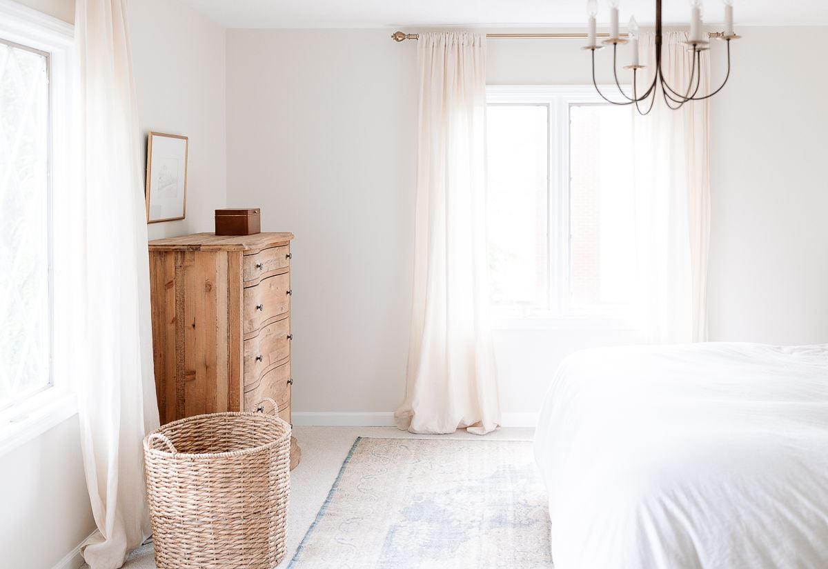
Neutral Paint Colors
This post lists my favorite colors that we’ve used in our home, from cabinetry to walls and more. For a comprehensive list of each wall color and where it’s used, check our this comprehensive resource: Our Paint Colors By Room.
The trick to choosing a neutral paint palette for your home is ensuring that each space flows beautifully from one to the next. It’s easy to do with these pretty neutral paint colors!
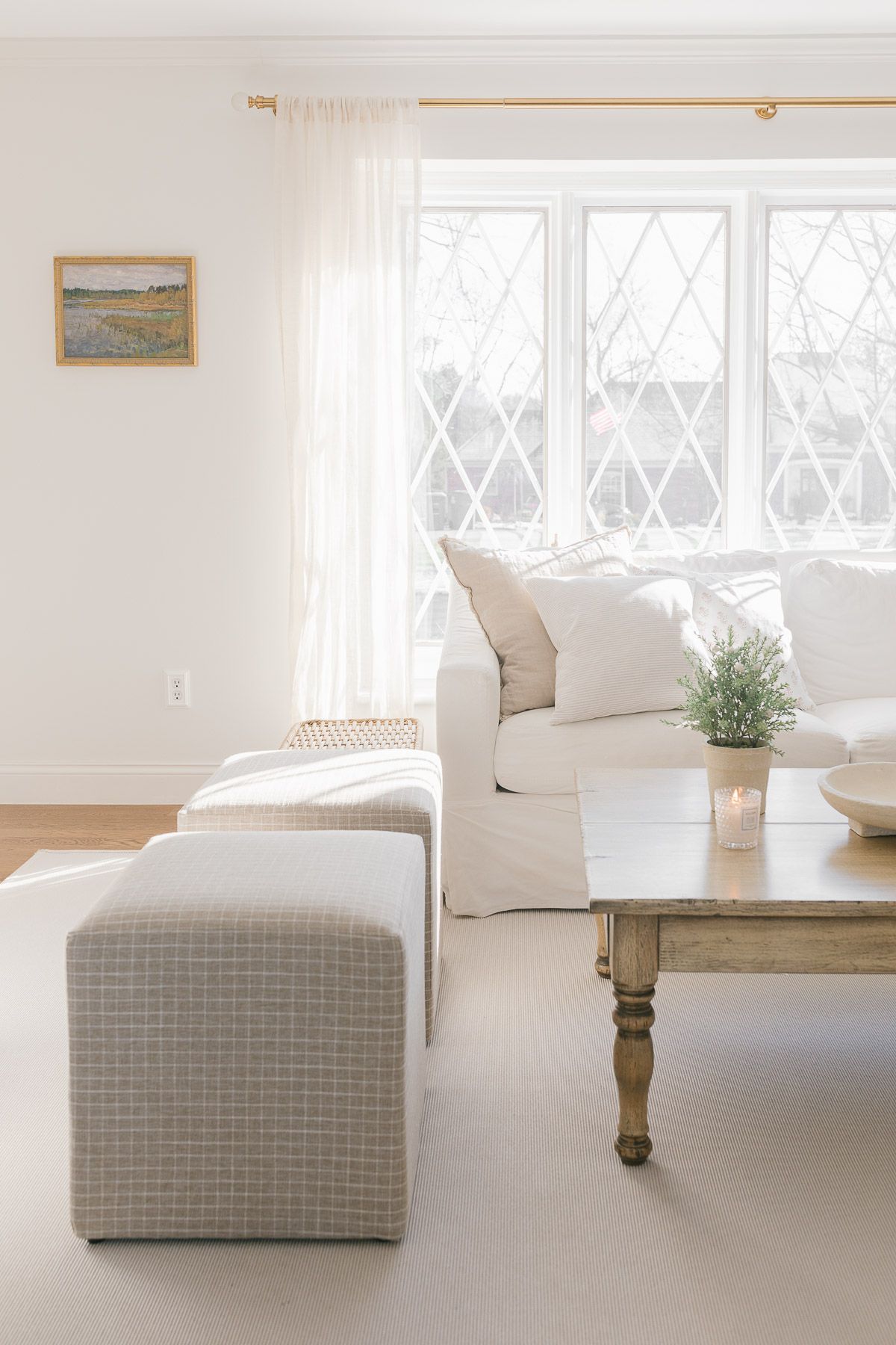
Learn all my best tips for creating a Neutral Living Room here, and find a complete guide to Neutral Rugs, too!
Sherwin Williams Zurich White
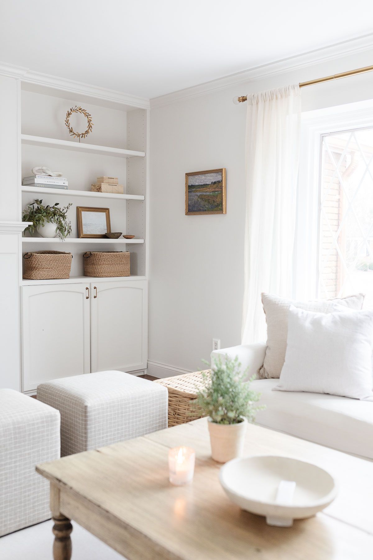
Pros: works well with adjoining cream or gray spaces
Cons: reads slightly gray without a lot of natural light
I used this color in our previous and current homes because I love it so much. Previously, it was used for the entire second level (excluding bathrooms).
In our current home I used it for walls, trim and bookcases in the living room and on the walls for the family room, dining room, kitchen, office, and foyer. Learn more about how to use the same color for trim and walls!
Sherwin Williams Agreeable Gray
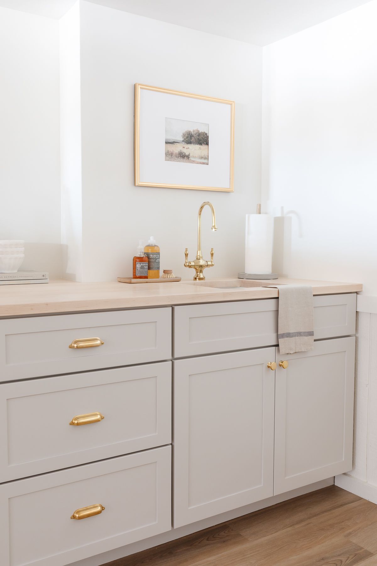
This is a color we’ve just added to our home – we used it on the cabinetry of our basement bar, and I couldn’t love it more!
Pros: It’s a perfect, warm greige. Works beautifully with other colors that lean more towards brown or gray.
Cons: It’s a darker color with an LRV of 60, so be sure to use it minimally if you want your home to stay light and bright.
Benjamin Moore Cloud White
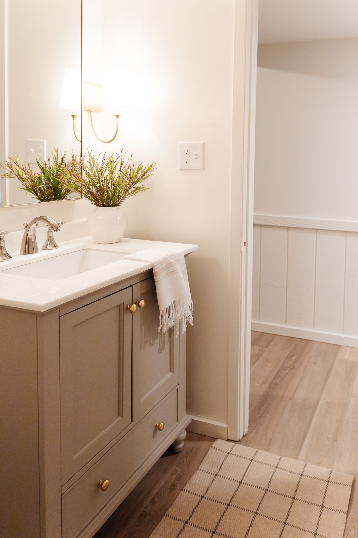
This color is a creamy white that we used on the walls of our basement bathroom. As you can see, it’s a lovely neutral paint color and pairs beautifully with the greige vanity!
Pros: It’s warm, soft and cozy. It’s a bright neutral paint color, too, with an LRV of 85.
Cons: Depending on your lighting, can appear yellow at times.
Benjamin Moore Soft Chamois
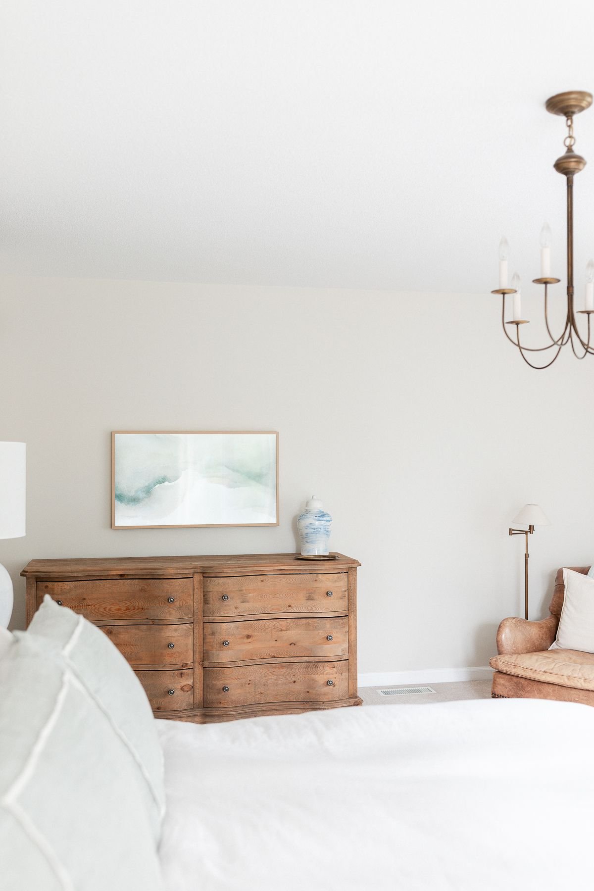
Pros: a soft, subtle cream that helps us create a Cozy Home.
Cons: Can occasionally show the slightest green undertone.
I tried this color because it was recommended by one of my favorite designers, Phoebe Howard. We used this paint color for the second level of our current home and I loved it so much that we also used it for our recently renovated powder room off the entry of our home.
Benjamin Moore Navajo White
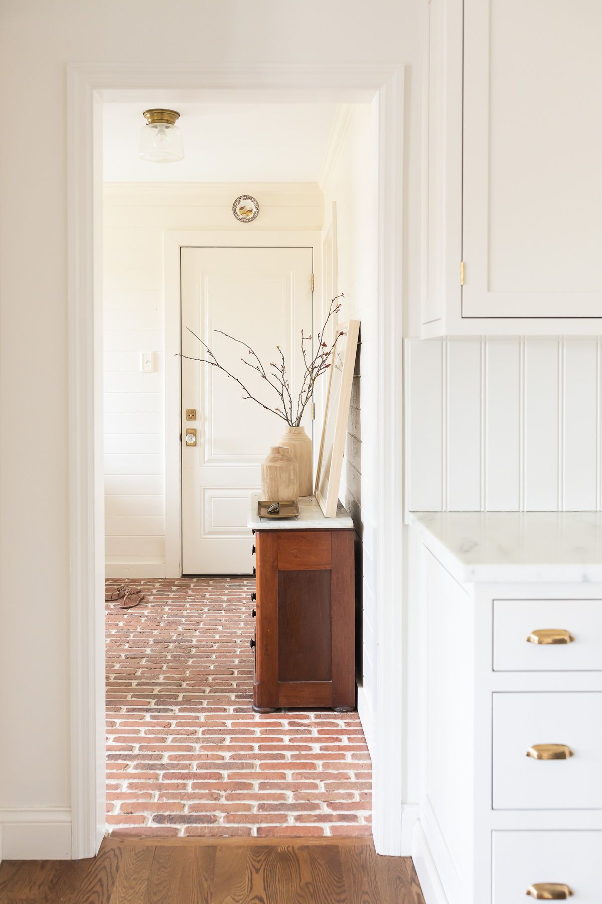
Pros: a beautiful cream for well lit spaces
Cons: reads yellow without natural light, and tends to read yellow at night
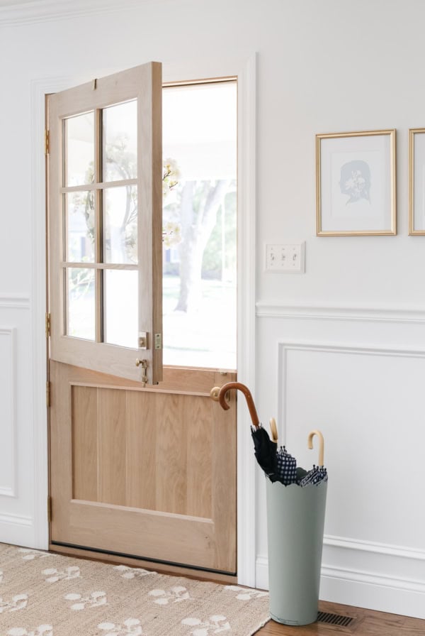
This cream paint color was another recommendation from fabulous interior designer Phoebe Howard. I’ve used it in our mudroom, adjoining powder room and breakfast nook.
Benjamin Moore Chantilly Lace
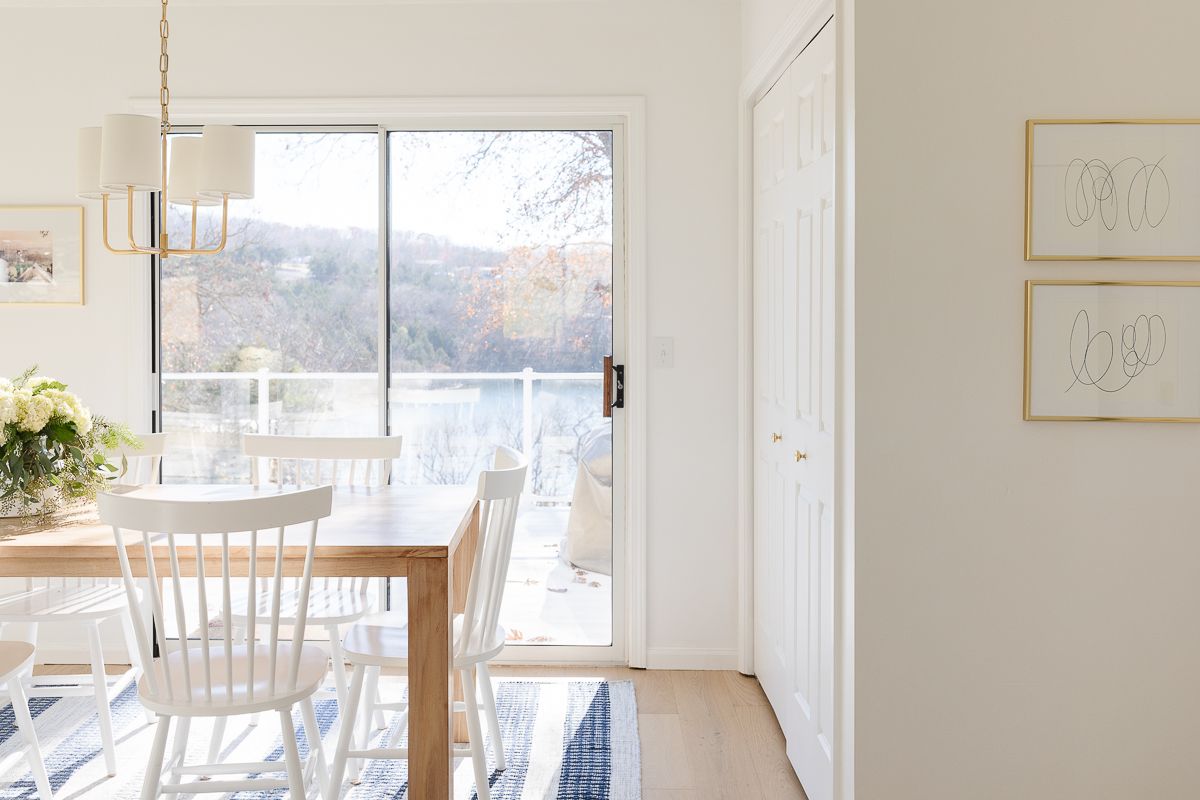
Chantilly Lace is the brightest white of any paint color we’ve used in our homes, and I love it so much!
Pros: This is a very bright white, with a high LRV. Very little yellow, gray or blue undertones.
Cons: Again… it’s a very bright white, so that can be good or bad depending on what you’re looking for!
Benjamin Moore Swiss Coffee
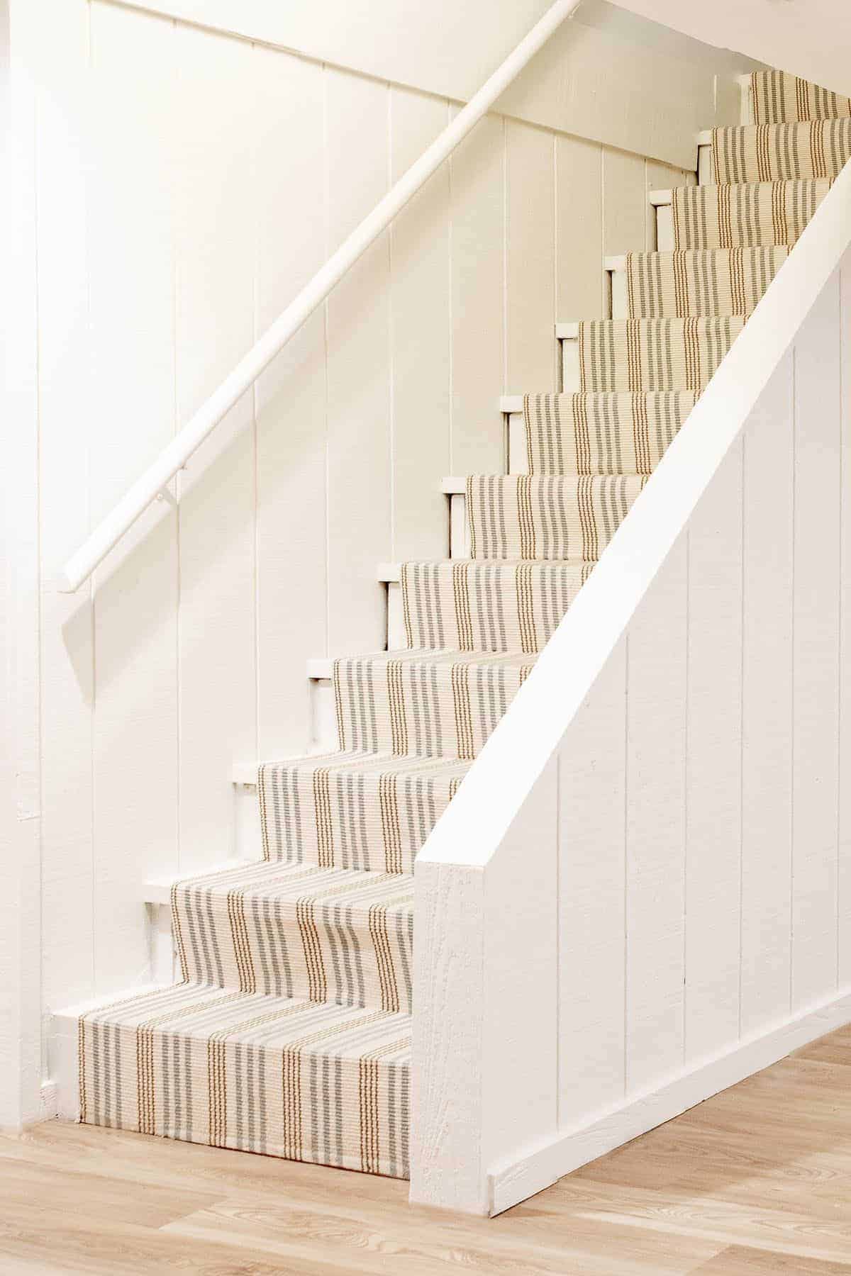
Pros: warm
Cons: can feel yellow in certain lighting
I chose this color for our newly refurbished basement because it’s soft and warm. It’s a great neutral with pretty undertones. We also recently painted our exterior in this color, and I couldn’t love it more! See it here where we discuss our new Copper Gutters.
Sherwin Williams Accessible Beige
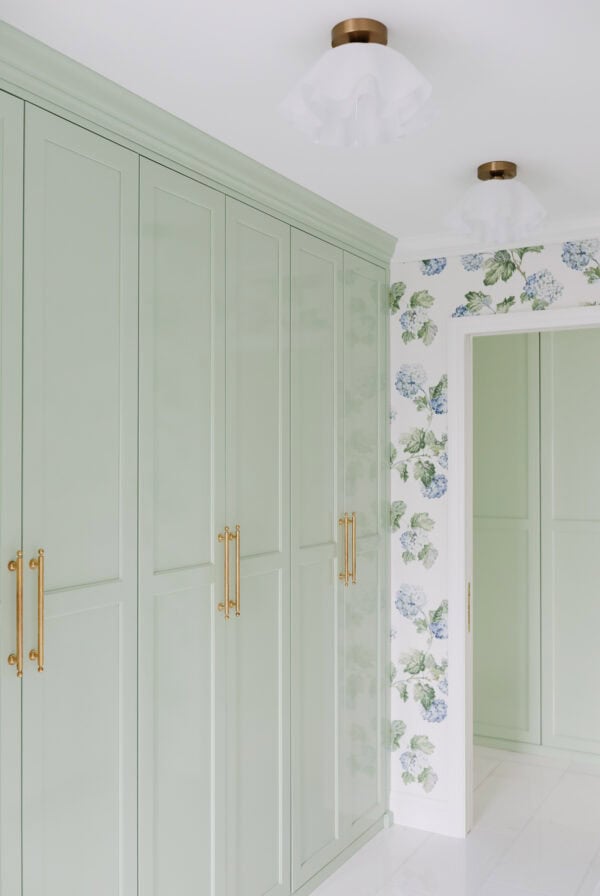
While we haven’t used this color in our current home, it’s a longtime favorite that I am always considering bringing back. I’m loving the contrast of greige cabinetry next to my favorite creamy, warm white walls of late – see another great example of this look in our Modern Laundry Room renovation.
Pros: Accessible Beige is a beautiful neutral paint color that is a flexible chameleon, changing with various light sources.
Cons: Can read a little dirty/gray when paired with cream colors, too, as the yellow undertones in the cream colors make the greige seem more gray.
Benjamin Moore White Dove
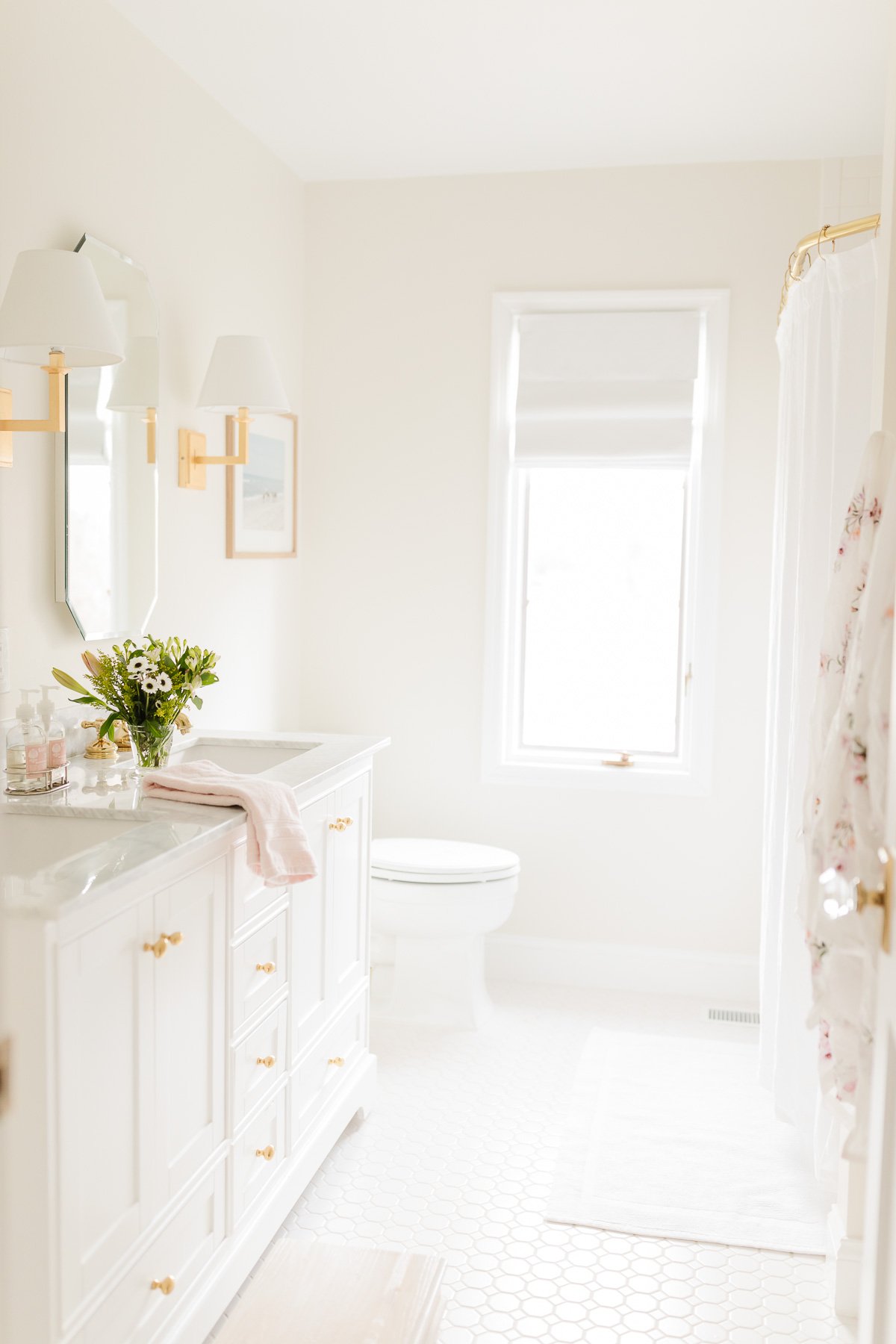
White Dove is a designer favorite white! It’s a wonderful neutral white and very popular, with good reason. For comparison purposes, White Dove has an LRV of 85 and Simply White is 91.7.
Pros: Hints of a greige background instead of yellow, like many off-whites tend to feature.
Cons: Can feel a little too dingy for trim color when paired with certain wall colors!
Sherwin Williams Creamy
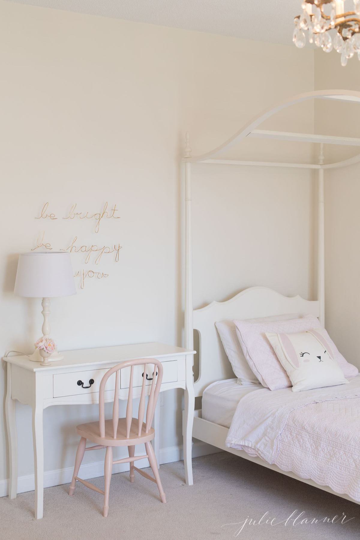
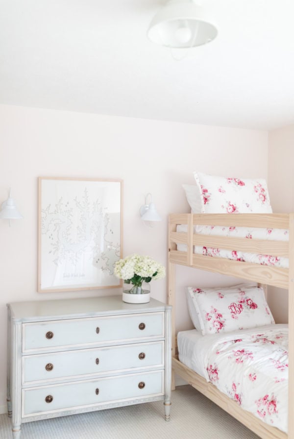
This is a beautiful, neutral paint color that we’ve used on a variety of our children’s furniture pieces over the years. It’s a warm, creamy color that perfectly matches the white furniture from Pottery Barn Kids!
Pros: It’s a soft, cream color that translates well as an off white, warm white or antique white.
Cons: Can have a touch of a yellow undertone in certain lighting situations.
Farrow and Ball White Tie
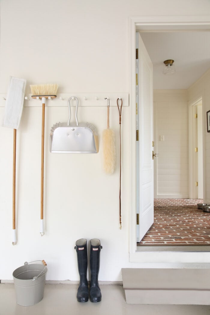
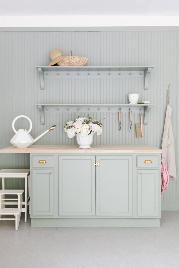
This pretty cream creates a light, bright background for our garage.
We used this color in our garage in St. Louis and then went on to paint the lake house with it! While it’s a beautiful warm white in most lighting, at the lake it had a little too much of a yellow undertone for my liking.
Pros: a soft cream
Cons: can read a little yellow in some lighting situations
Benjamin Moore Simply White
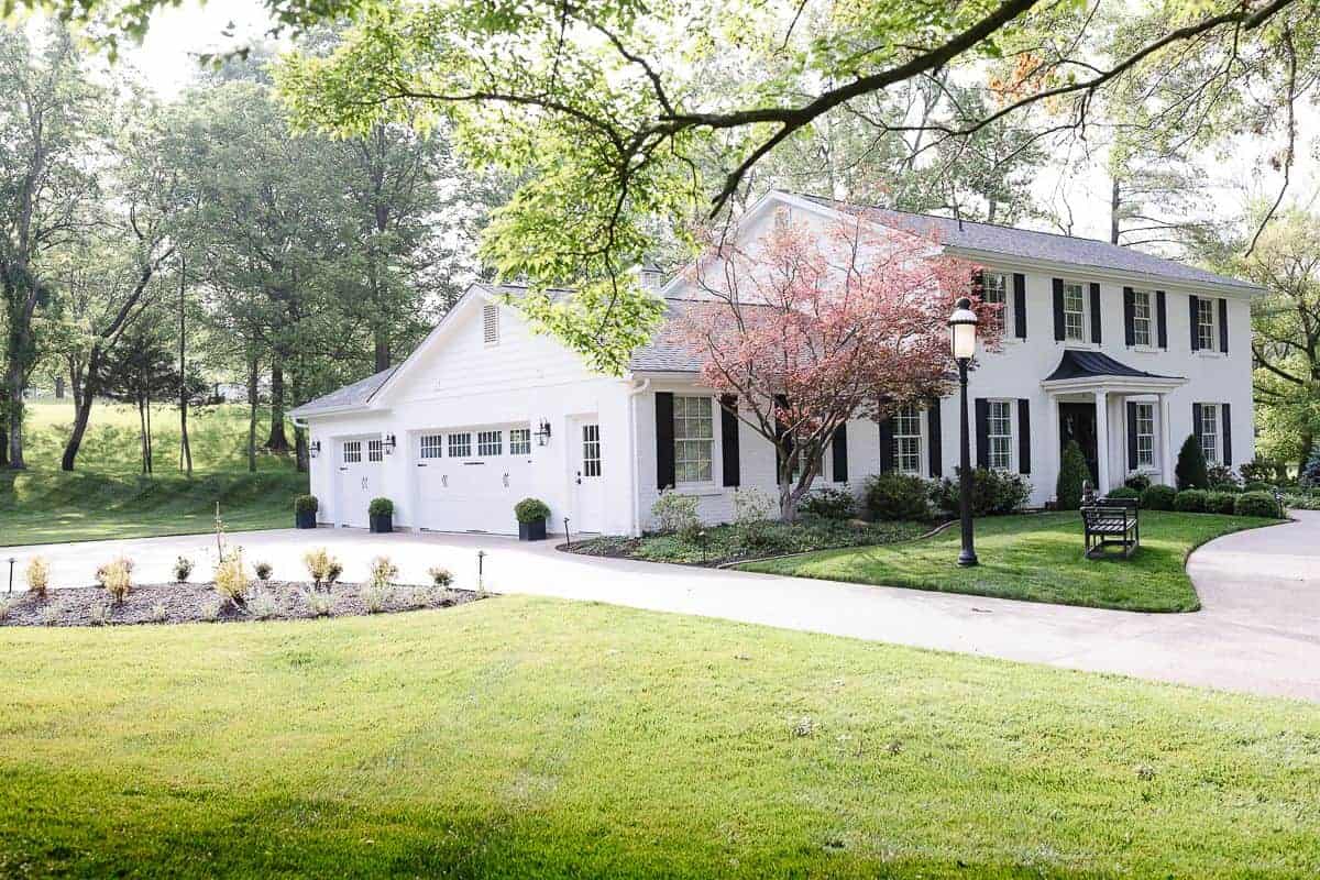
While Benjamin Moore Simply White appears very white on this White Brick House, it’s actually a lovely, rich creamy off-white that is a gorgeous neutral paint color.
Pros: It’s bright, yet warm and soft with a high LRV.
Cons: The slightest hint of yellow undertone, so be wary of your lighting situations.
Benjamin Moore Revere Pewter
Another color that is in the greige family and is an incredible success story! Much like Agreeable Gray, this is one of the most popular neutral paint colors on the market today.
Pros: It’s a great mid-tone greige that works beautifully with other colors.
Cons: It’s a little dark, coming in at a 55 LRV – so be sure to use it sparingly.
Benjamin Moore Pale Oak
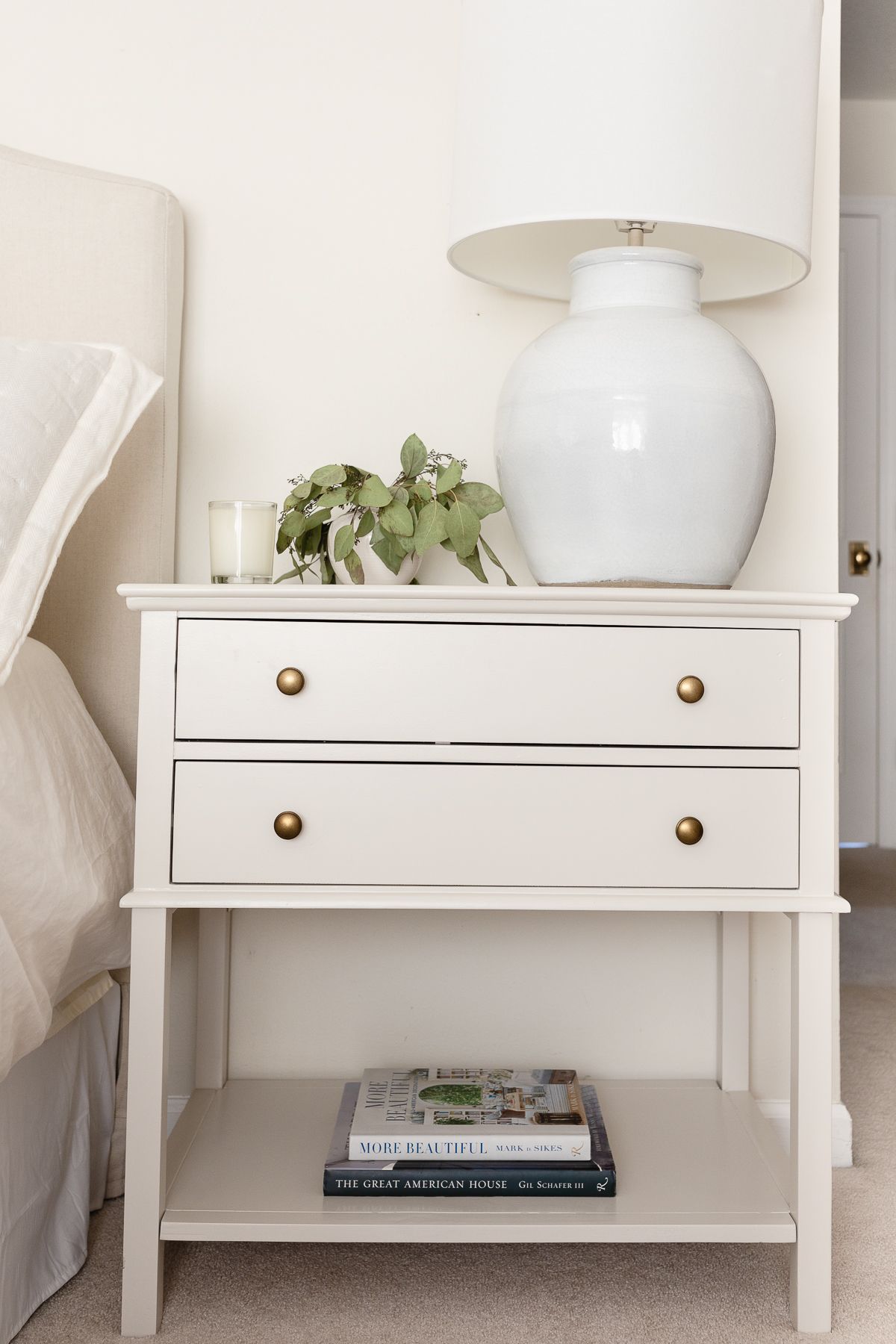
Pale Oak by Benjamin Moore is a soft neutral greige paint that can work beautifully in a variety of spaces and lighting situations. It’s a warm, balanced color that reads as an off-white in some rooms and a true greige in others.
We used this color to paint our new nightstands and I can’t get over what a perfect greige color this is! It really brought the whole room together, making it feel so polished.
Pros: A great neutral greige or warm white with perfect undertones.
Cons: Can read a touch more gray at night, so watch your lighting if you’re trying to avoid gray.
Sherwin Williams Realist Beige
Pros: warm
Cons: best for outdoors or well-lit rooms
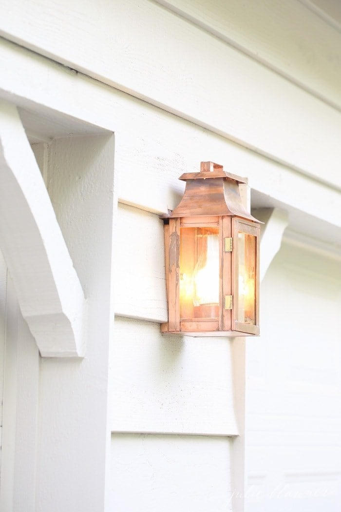
After trying an array of colors on the exterior of our Tudor, we chose Realist Beige and I love it! It’s warm, soft and provides just enough contrast. We used it on the deck as well.
Sherwin Williams Everyday White
Pros: Really warm.
Cons: I prefer this color for exterior as well.
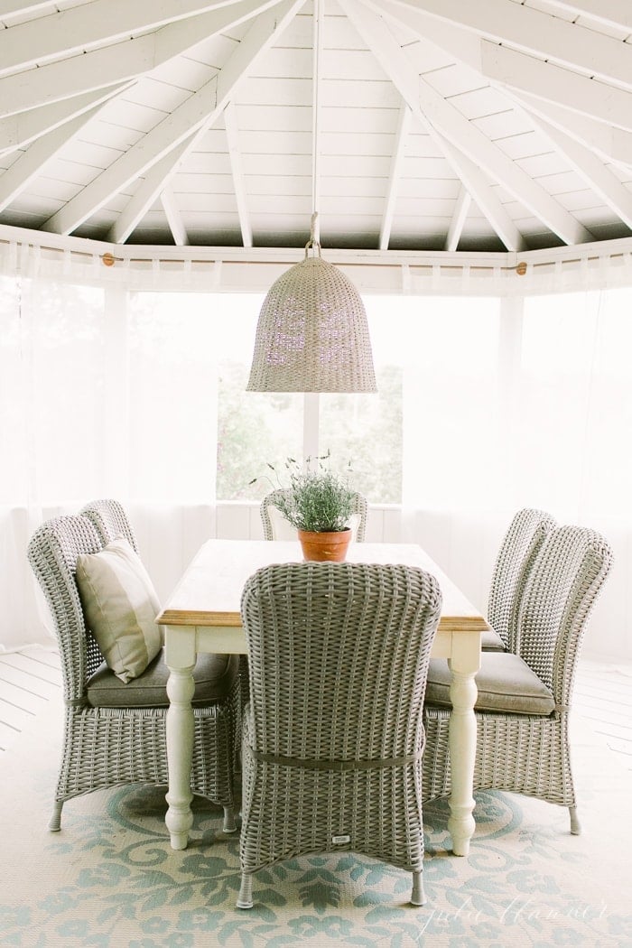
We used this as the base color for the exterior of our home as well as the walls and ceiling of our screened in porch. It reads so much lighter outside, but indoors, reminds me of an early 2000’s new build.
More Paint Resources
What are your favorite neutral paint colors? I’m looking forward to trying a few new ones in our lake cottage! You can find my complimentary paint color chart here to keep them all organized!
Need ideas for things to hang on those freshly painted walls? Don’t miss miss 17 Easy Wall Decor Ideas!
You can learn about my favorite Furniture Paint color, Sherwin Williams Creamy, too!


The exterior paint is listed as Accessible Beige and Realist Beige? Is that correct?
I just joined your site and LOVE your taste!
I especially love the wicker chairs in the section where you are discussing paint colors. I think the chairs are on your screened porch? Would you be willing to share where you purchased them? I have never seen any that shape….
Thank you in advance! 🙂
Gosh you’re sweet! It’s so nice to meet you! Those are Martha Stewart. You can find them here.
Where are the wicker chairs ? I also love them lol
Hi Lisa!
Those aren’t made anymore, unfortunately! I loved them too and they held up well for a long time. I believe they were part of a Martha Stewart outdoor furniture line, but we bought them almost 10 years ago now.
Good luck on your hunt!
Julie
Really lovely paint colours and ideas!
Thank you, Kerry!
Just a comment about your site. I have just joined and you have some great information. However I cannot read some of your text because the blue text is so light. The tan is better but I have no idea what the blue says,
Thank you SO much for your patience as I update my site. I’m hoping to have the font color adjusted this week. I truly appreciate you taking the time to share with me.
I am looking to paint the interior of my house white.. you’ve shared some beautiful options. Picking a white paint certainly isn’t easy! I hope you will share these ideas at my new link party called The Crafty Corner 🙂
Love the neutral colors!!
https://memoriesandmacchiatos.wordpress.com