Benjamin Moore Cloud White is one of my favorite Benjamin Moore white colors! Thanks to its creamy undertones, it is a warm and cozy white color with a classic feel.
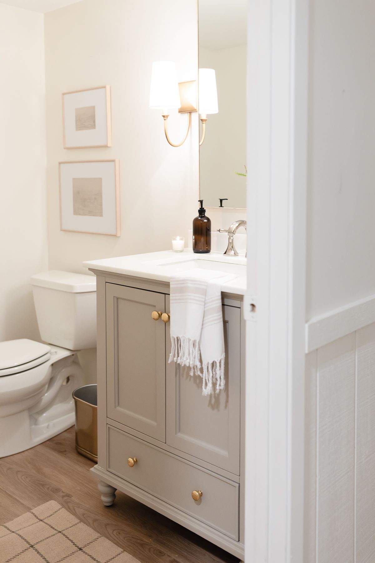
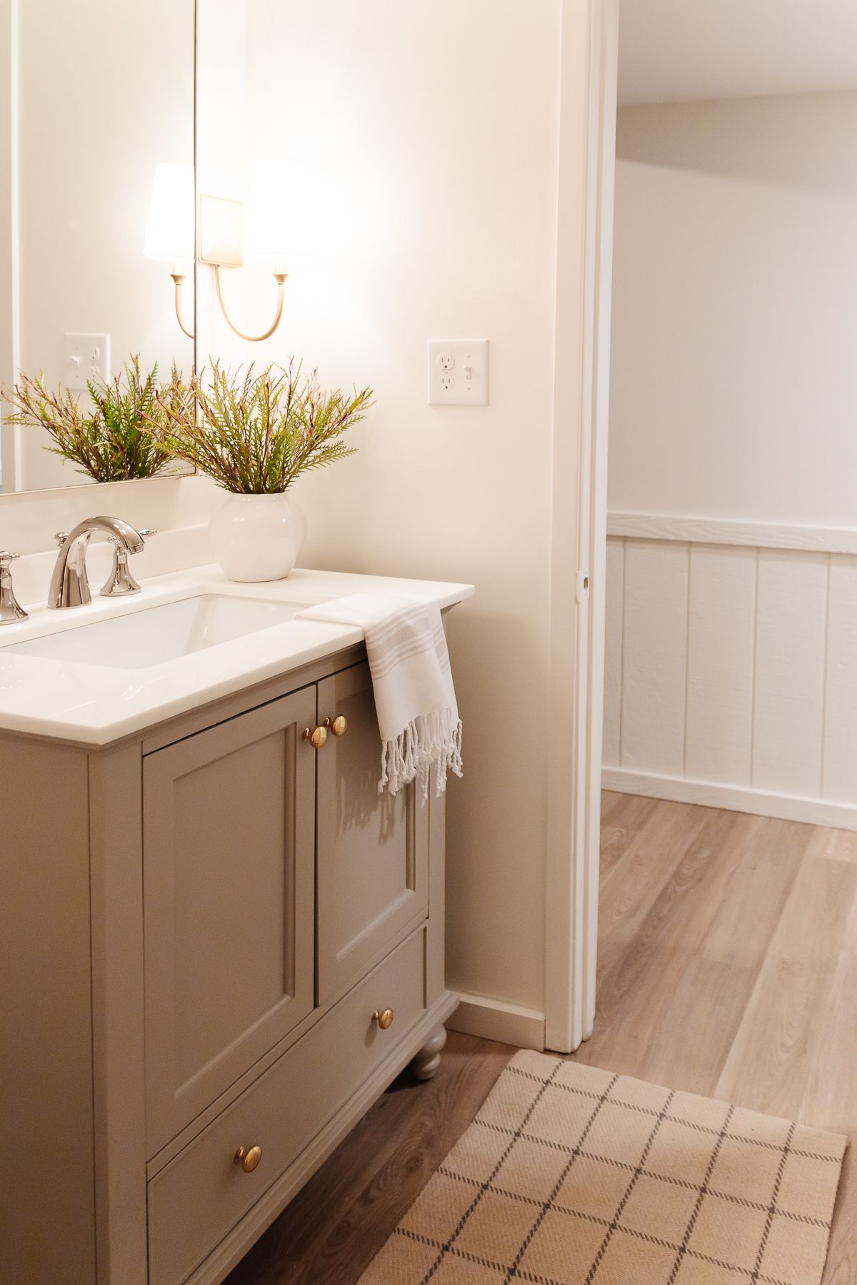
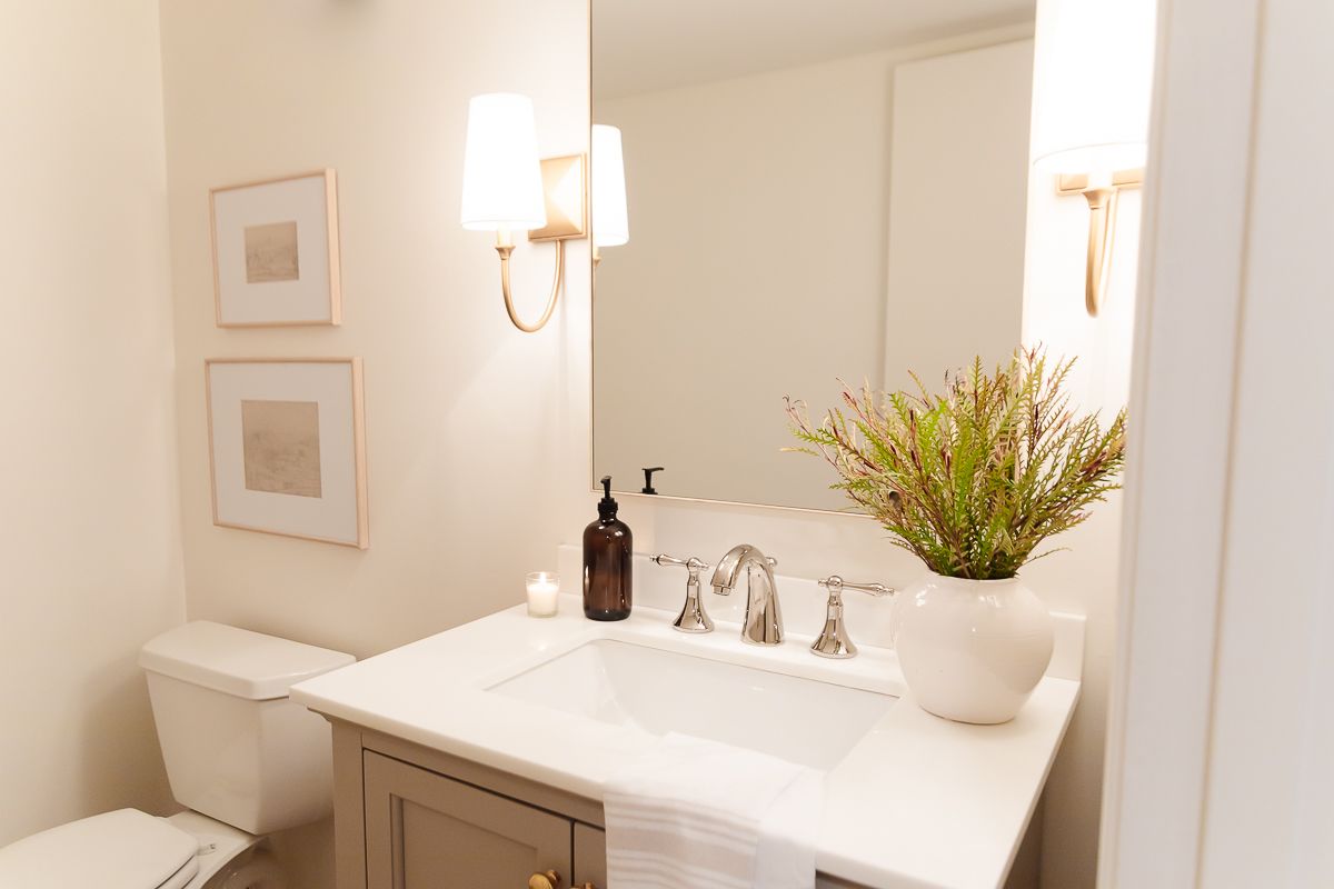
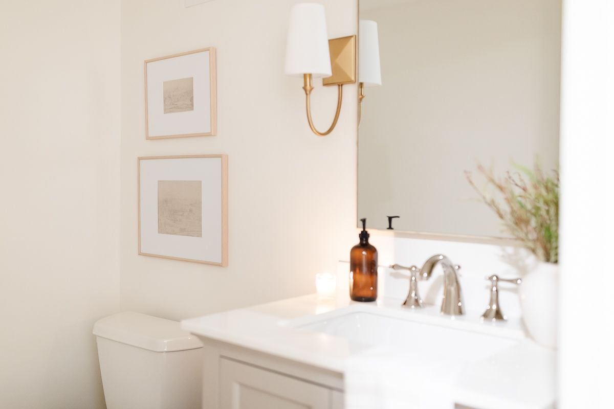
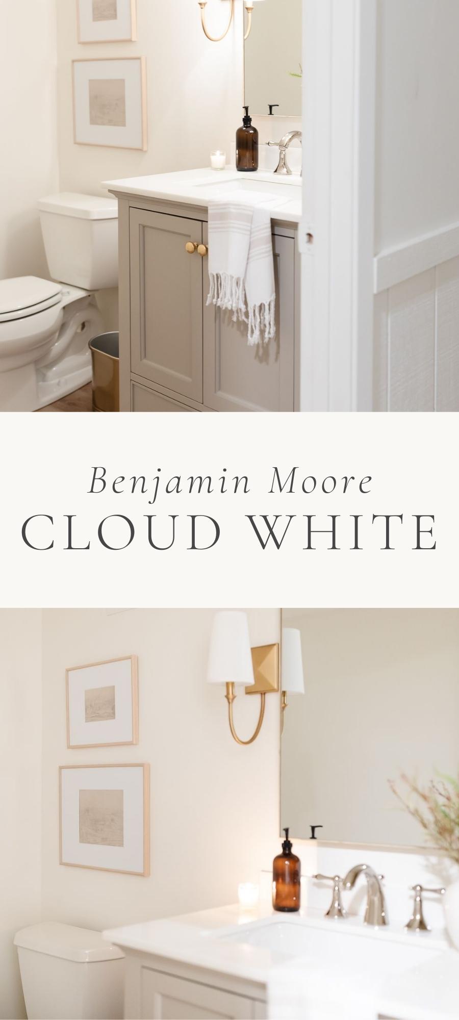
Cloud White is a classic, timeless color that has been popular for many years. Read on to find out why with this photo tour of our new basement bathroom painted in Cloud White.
You’ll see the color in our home with lights on and off to show the nuances, along with images of other homes that feature this gorgeous color!
Everyone knows that I love soft, creamy whites. I think they’re the perfect neutral backdrop for creating warm and welcoming spaces in our home. In my opinion, the perfect creamy color is one that isn’t too stark or too yellow.
Benjamin Moore Cloud White is exactly that kind of color. It is a subtle off-white that gives any space just the softest glow. But be careful not to confuse it with BM White Cloud (2159-70), which is a different color with a very similar name.
I love my cream kitchen cabinets and matching beadboard backsplash. Now, to be fair, my cabinetry is a custom color. I had it mixed to go with the different whites in our breakfast nook and living room. But the idea is the same – a creamy off white was the perfect fit.
Don’t forget to keep track of your home’s colors on this printable Paint Color Chart for Your Home.
About Benjamin Moore Cloud White
- Subtle off-white
- Creamy undertones
- Gives off the softest glow
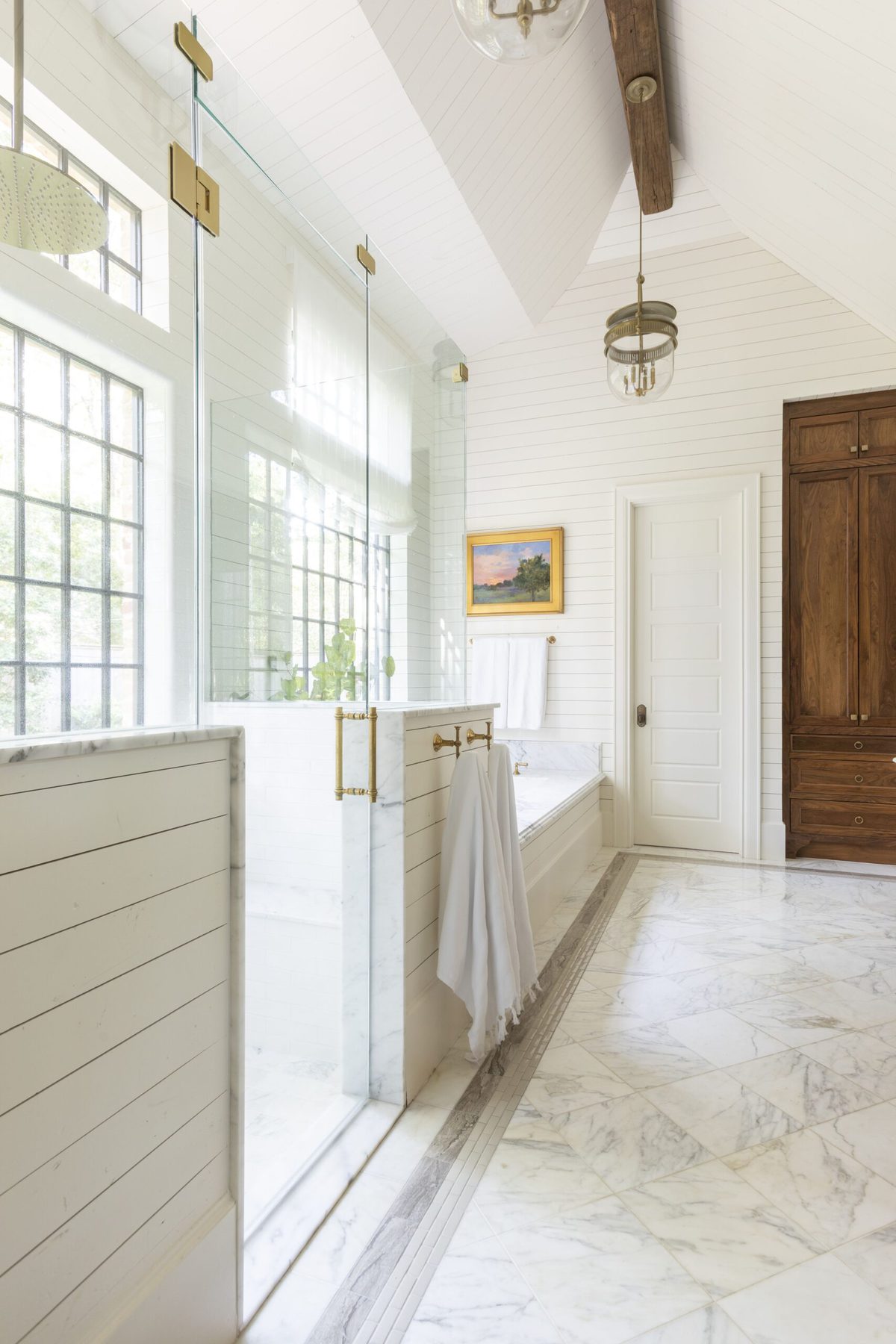
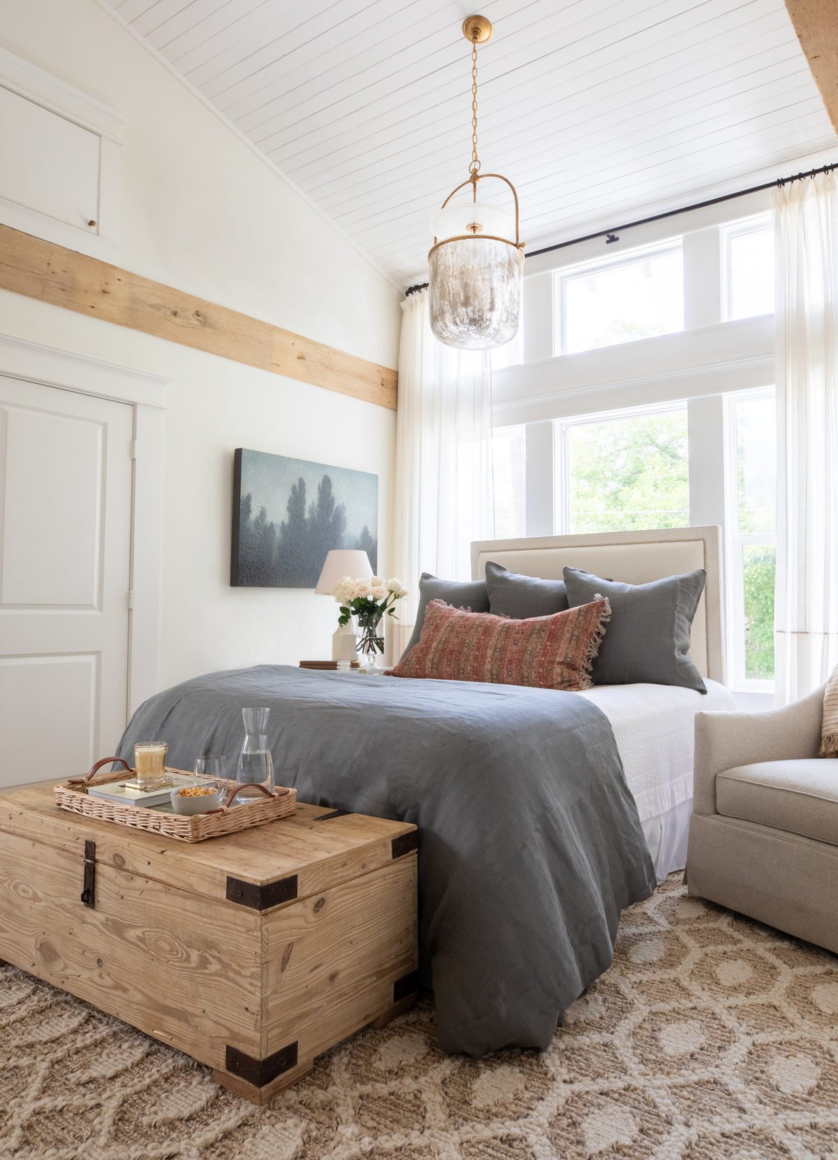
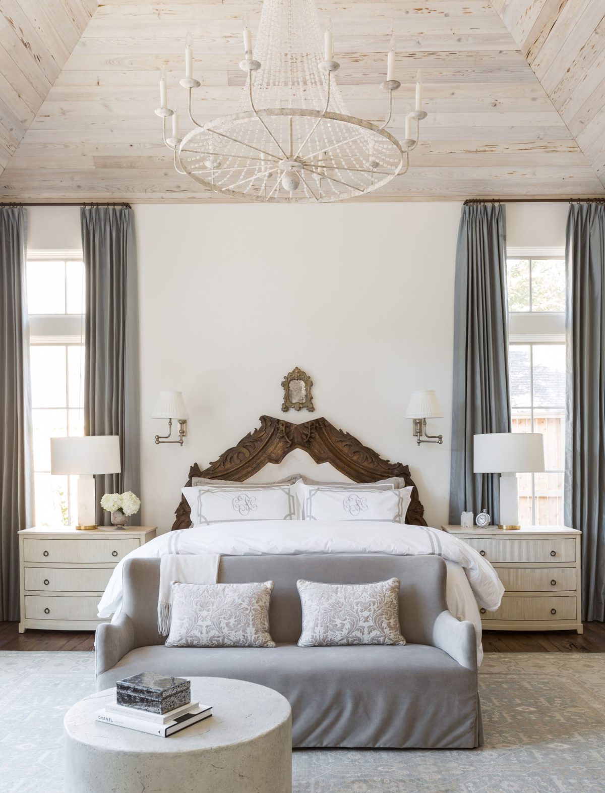
One of my longtime favorite interior designers, Marie Flanigan Interiors, has often used Cloud White in her work. That’s how I first discovered this gorgeous color, so I’m sharing a few of her incredible spaces here as well!
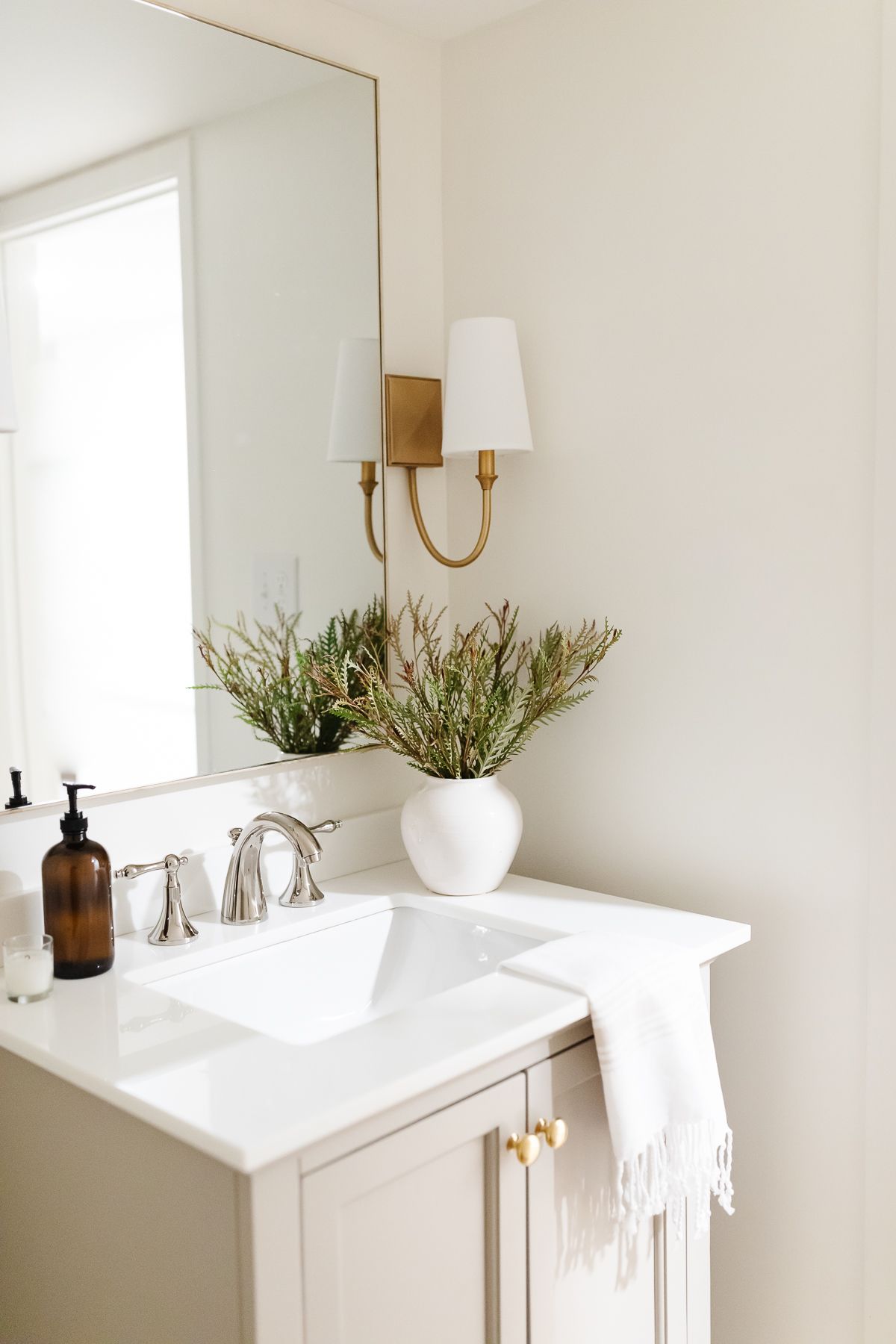
You’ll love the depth that Cloud White adds to your space. It will make your home feel warm and cozy and bright and airy – all at the same time. We just used this color on the walls of our new Basement Bathroom and we are in love with the subtle warmth!
LRV
Benjamin Moore Cloud White has an LRV (light reflectance value) of about 85. The LRV is the percentage of light that a color reflects. On a scale of 0-100, 0 is black and 100 is a true white. In other words, the higher the LRV, the brighter the color.
An LRV of 85 means that Cloud White is definitely a light and bright color. It will help bounce plenty of light around a room. Personally, I love to use colors in this LRV range, because they help to add light to a room and make a small room look bigger.
Cloud White Undertones
Cloud White is a warm white, meaning it has creamy undertones. Depending on your light, it can appear a bit more yellow at times.
For example, Cloud White will look warmer in rooms with south-facing natural light. On the other hand, in cooler north-facing light, the extra touch of warmth in Cloud White will keep the color from leaning too cool.
It all comes down to your preference – do you love a warm, creamy white? Or do you want one that is a bit more clean and crisp?
Trim Colors to Pair With Benjamin Moore Cloud White
There are a couple ways to approach trim paint with a creamy color like Cloud White. First, you can paint your trim a brighter white so that it stands out against the creamier walls.
For Cloud White, try a color like Sherwin Williams Everyday White or Benjamin Moore White Dove. They’re both warm whites but are a touch more crisp than Cloud White, so they’d provide a nice contrast.
You can also paint your trim Cloud White! Yes, painting walls and trim the same color is a big trend right now. I’ve done it, and I love how it really opens up a space and makes it feel more cohesive.
Read more about The Best Trim Paint and Painting Trim White.
Colors to Pair With Cloud White
Benjamin Moore Cloud White is one of those versatile colors that looks great with almost anything. Since it is a warm neutral, it looks especially stunning up against other warm colors and earth tones.
Try it with colors like SW Accessible Beige, SW Agreeable Gray, Chantilly Lace and BM Revere Pewter. They’re all warm enough to pair well with a creamy white. Or if you want more color, look at some earthy greens or blues.
Benjamin Moore’s Cloud White OC-130 is also excellent with dark navy tones like Benjamin Moore Hale Navy.
Where to Use BM Cloud White
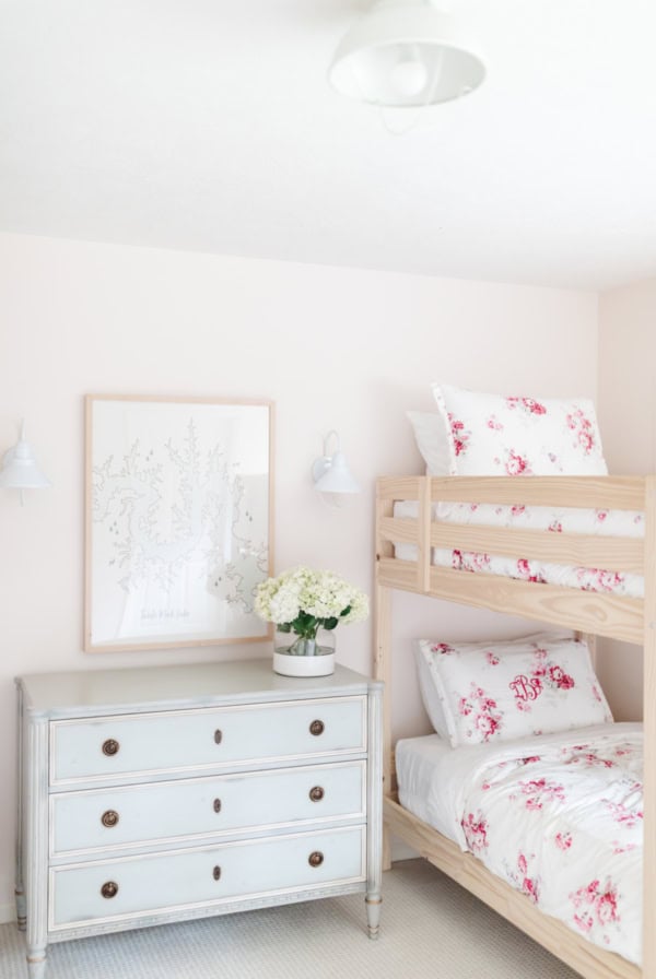
- Bedrooms – Perfect for making bedrooms feel light and airy, plus it’s a neutral backdrop for layering bedding, rugs, and artwork. Read about choosing the right white for bedrooms.
- Living areas – A warm and inviting neutral for layering textures, metals, and accent colors.
- Walls, trim, and ceilings – To make rooms feel larger and ceilings feel higher. Get my tips for choosing the best ceiling paint.
- With wood tones – Gorgeous up against wood tones such as wood floors and cabinetry. If you have oak cabinets, consider painting your walls Cloud White! Go here for more paint colors that go with oak cabinets.
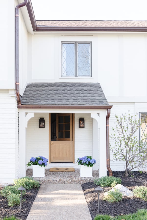
- Exterior – A tried-and-true neutral for painting your whole house or just a small outdoor room.
- Furniture – To freshen any piece of furniture or cabinetry. Read about the best paint for furniture and how to paint without sanding!
Benjamin Moore Cloud White Tips
- Get Samples – Before you commit to a color, order samples of your favorites. Paint swatches on your walls or onto a board that you can move from room to room.
- Go to the Edges – If you’re painting a sample board, paint it all the way to its edges. Leaving a white border exposed will make the cream undertone in Cloud White look even more yellow than it really is.
- Lighting – Try your samples on different walls throughout the day. Pay attention to what the changes in lighting do to the color.
- Use Primer – Use a good stain-blocking primer like Kilz if you need the extra coverage. Definitely use a primer if you’re painting over a darker color. It will help coverage and adhesion.
- Two Coats – Even with a good quality paint, you’ll likely need a couple of coats of Cloud White to ensure that the previous color is all the way covered.
Frequently Asked Questions
Cloud White is a warm white, soft and subtle. It gives off just a touch of of glow, especially in warm south-facing light. Its warm undertones make it a cozy and inviting color.
Cloud White has a soft cream undertone. It isn’t stark like some whites and it isn’t too yellow like some creams. It falls somewhere in the middle, making it a perfect choice for so many spaces!


Hi there,
I love your style! Do you think simply white trim would go with Cloud white walls? Thank you in advance!
Hi Julie!
Love your bathroom! Do you know what color/brand your floor is? I would love some similar in my bathroom. Thank you!
Yes…you can get all the details on or LVP here
Hi!
I have cloud white trim and I want to retire my bathroom floor. Would white tile go with it? I’m worried it might make the trim look yellow?
Hi Leanne!
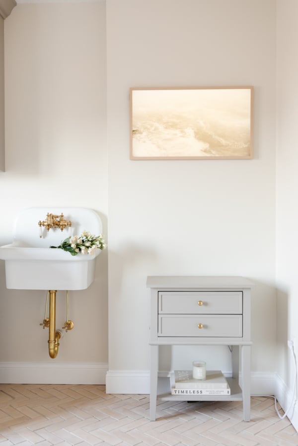
Sorry I’m just now seeing your comment. Cloud White is definitely a warmer cream. Maybe look for an off white or ivory tile to ensure it’s a bit warmer, too? However, I do think that whites and creams can work beautifully together, too. Check out our spa bathroom for an example of creamier paint on the walls and then brighter white tile.
Good luck!
Julie
I love the cloud white color with your vanity. Do you know what color the vanity is? It looks kind of olive in the picture. Thank you
Hi jane!
It does look a little bit “griege” in the photos. I don’t know the color because we bought it in this paint finish – you can see the product photos at the link under sources. It’s definitely lighter in person than the listing photos show. I hope that helps!
Julie
Hello Julie. I was also going to ask you the color of the vanity. Are there any greiges that you would recommend for painting bathroom cabinets?
I get so much pleasure from your blog. Everything you do is so soothing and cleanly edited.
Thank you!
Hi Kelly!
I apologize that I missed your comment! We bought this cabinet in this color, you can find it in our Basement Bathroom post!
We did recently paint our nightstands in a pretty greige (Pale Oak) and we love them!
Thanks so much,
Julie
We did our whole house in cloud white, trim too, all eggshell. It’s a warm white, with a nice glow in some light, and has just a touch of elegant neutral grey in evening conditions with warm bulbs. In our kitchen it looks very white but with a great glow. Painting everything cloud white takes away the yellow that can pop up if places next to very white trim like Chantilly Lace.
Thanks for sharing, David! It’s always helpful to hear other’s experiences with the color.
Hi Julie- How do you define your decorating style. I find I love everything you do and have decorated my home in a similar style. Would love to share pictures at some point.
Thanks- Indiana
Hi Indiana! You are too kind! Unfortunately I don’t know what my style is – it’s always evolving, but I consider it traditional, minimal and sometimes coastal and utilitarian. You can always share photos in the Facebook group Celebrating Simple – I’d love to see!