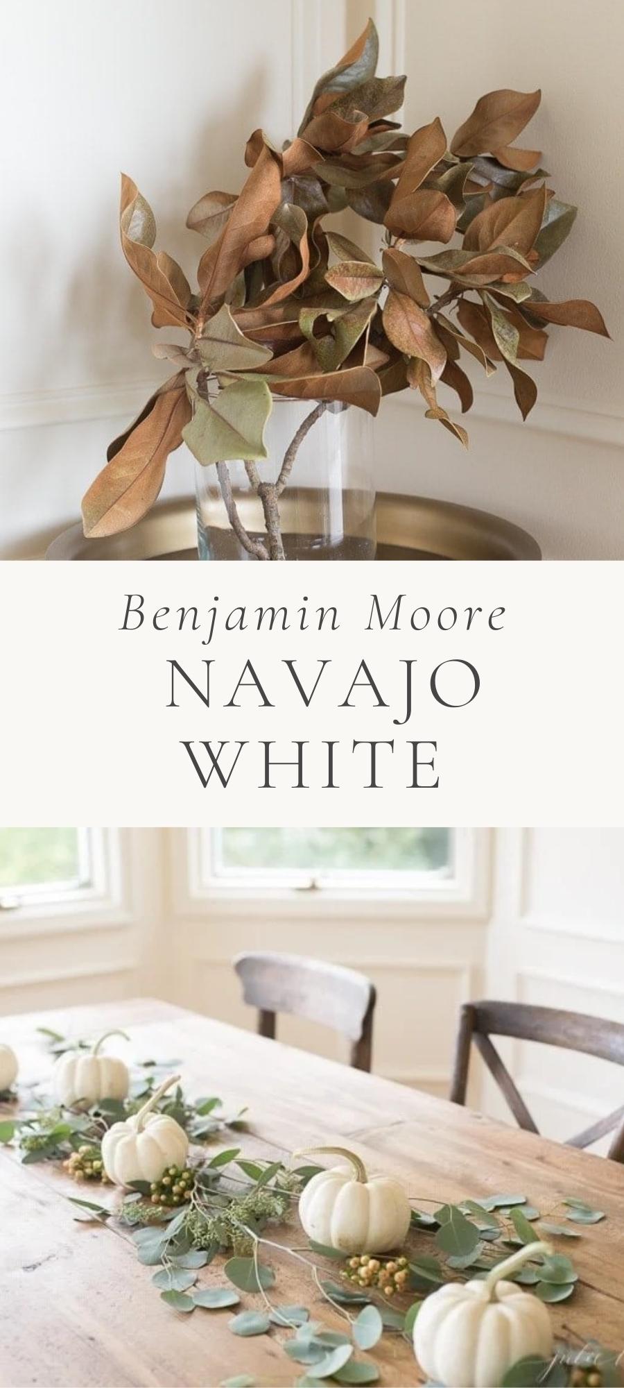
Get all the details about one of my favorite paint colors, Benjamin Moore Navajo White (not to be confused with the Sherwin Williams color of the same name).
We’ll show you this color used in our home, at various times of the day, for a complete review that will make your paint color decision oh-so-easy!
Navajo White is a beautiful and rich creamy white that is timeless and fresh.
This color feels a little tricky because Benjamin Moore changed the color code of it a couple times through the years, so you’ll see it noted as OC-95 or 947. Rest assured, it’s the same color.
Another reason this color feels a little tricky is because it changes so much throughout the day. I love it as a rich cream, as well as a more bleached out warm white.
With that in mind, you’ll see the color in varying lighting throughout this post. It’s rich and creamy, with strong yellow undertones – though it never feels like an actual yellow. Want to learn more? Keep reading!
Why You’ll Love this Paint Color
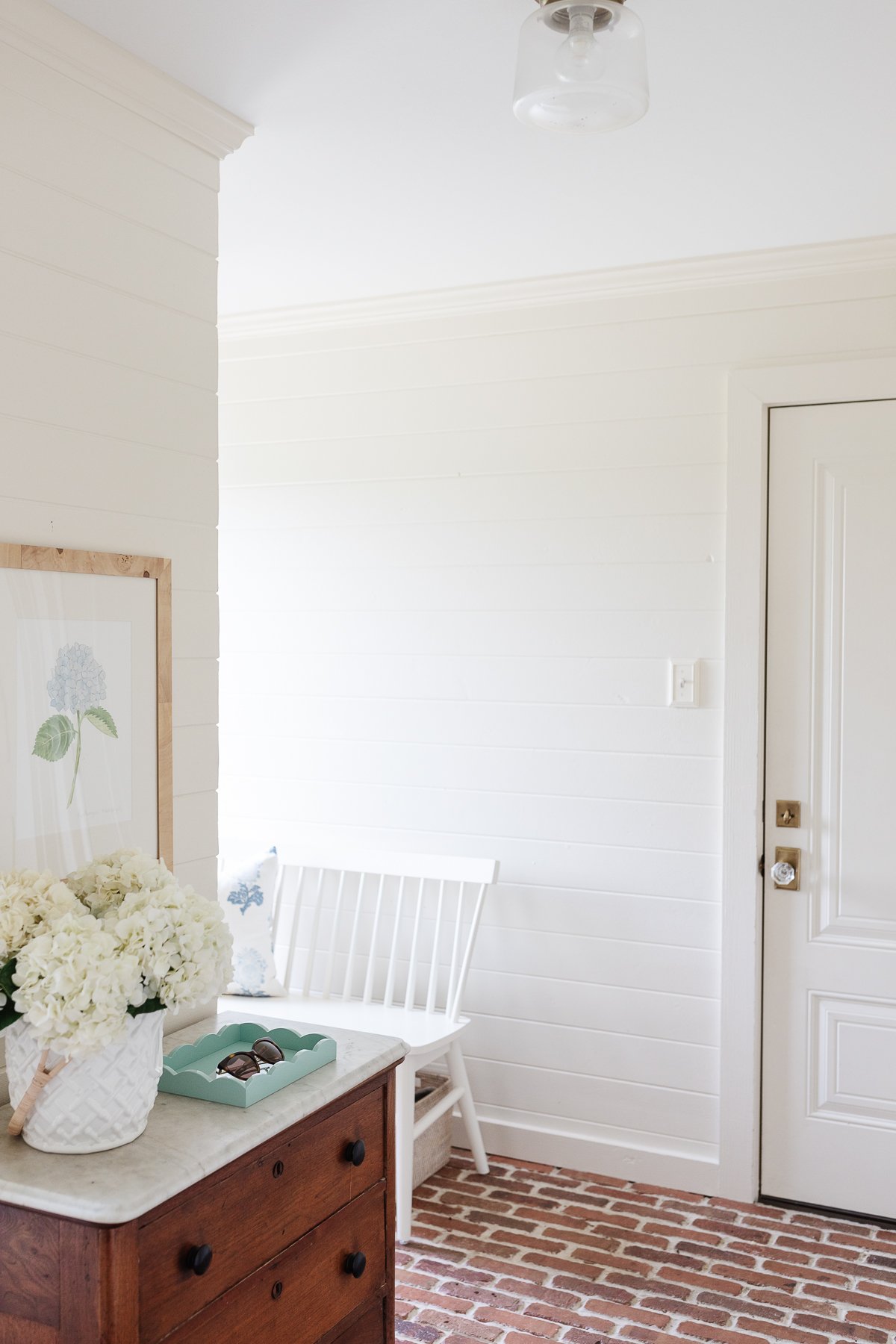
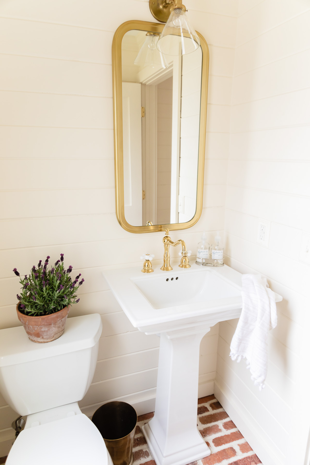
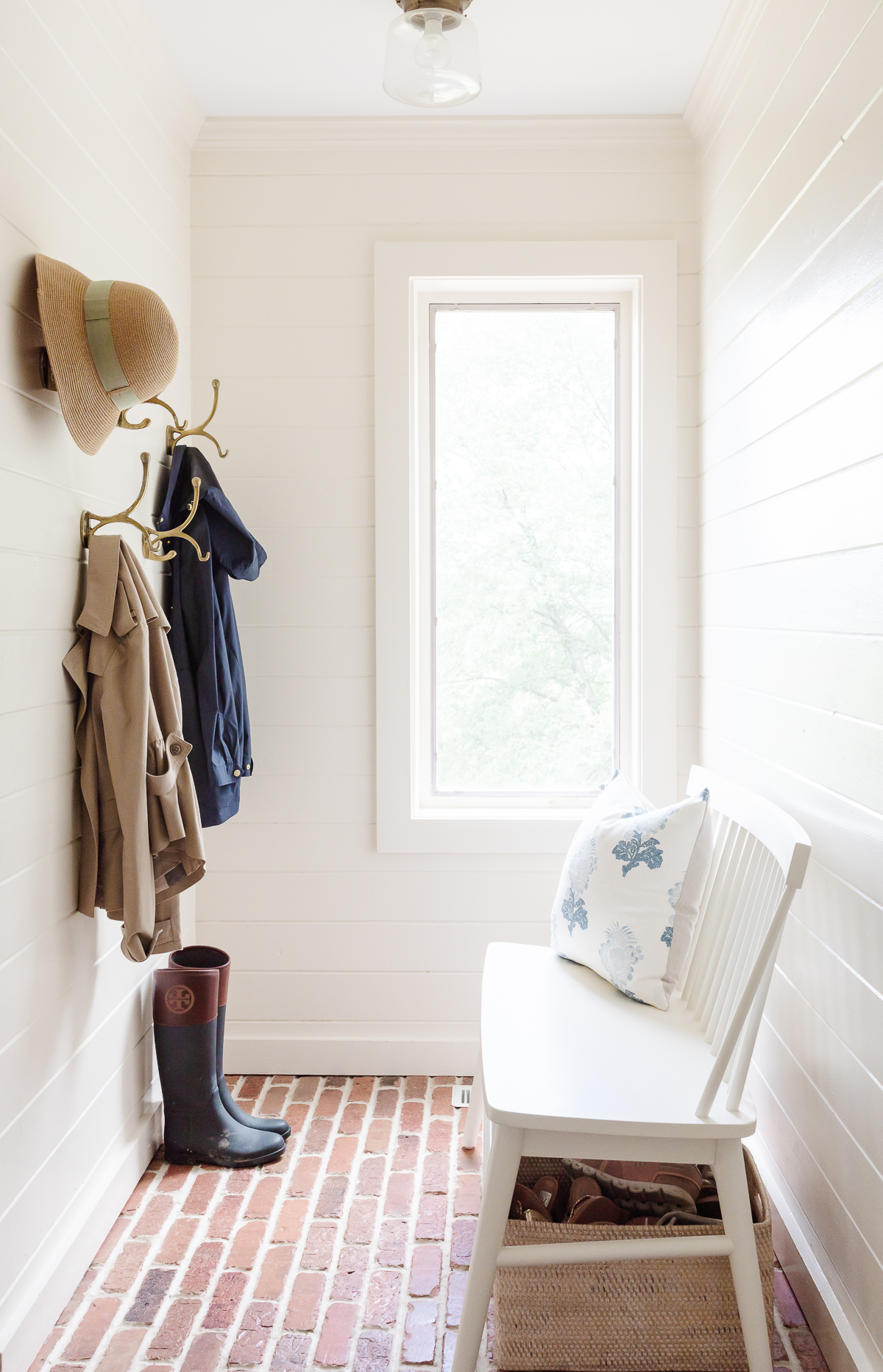
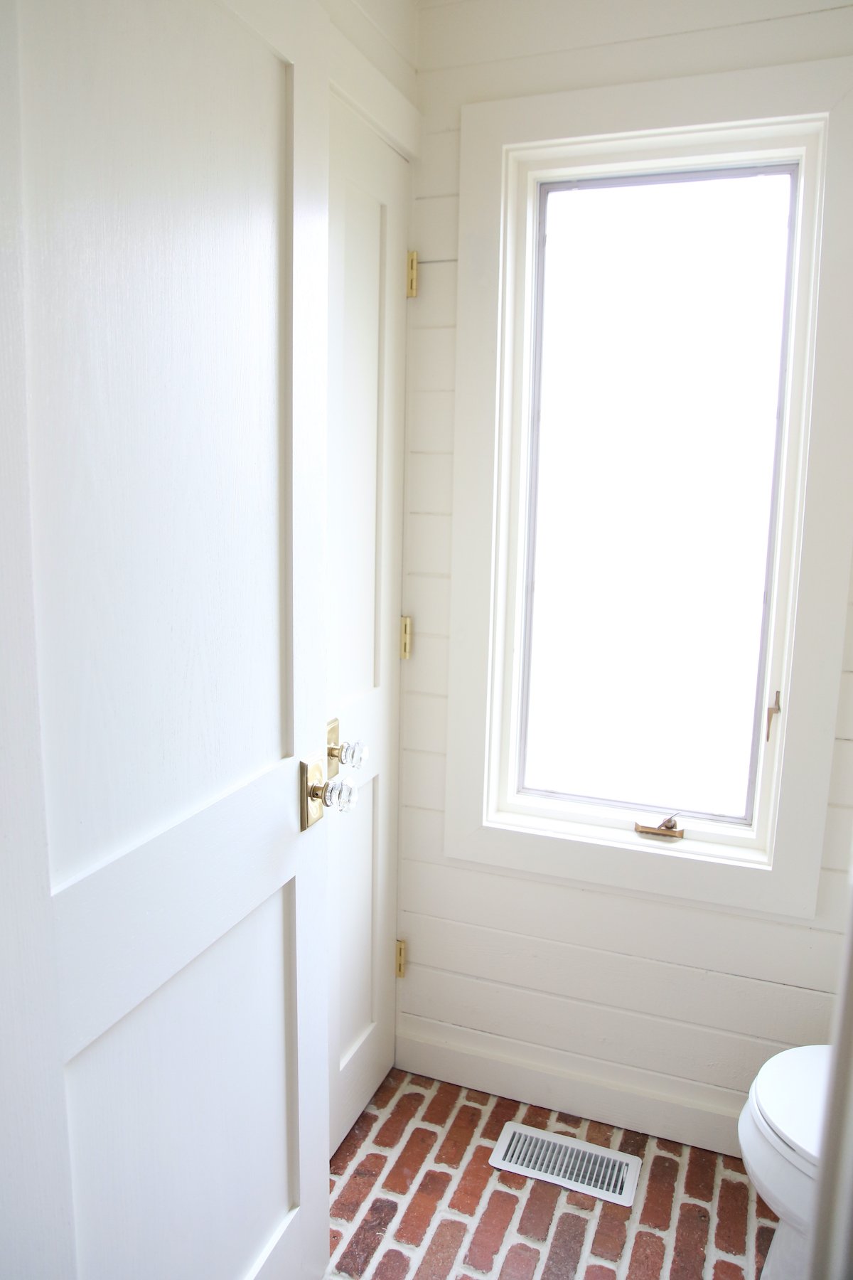
We first used Benjamin Moore Navajo White in the North facing mudroom and mudroom bath. This paint color is frequently used by one of my favorite designers, Phoebe Howard. Don’t miss my favorite Warm Whites!
I studied the spaces she used it in and felt it would be a great fit for all the newfound natural light we had in those spaces. I was right! It’s a stunning color – day and night.
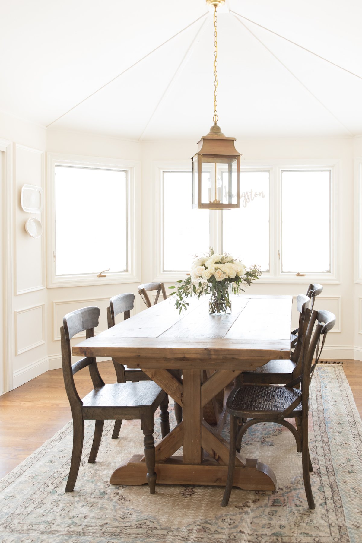
It was our hope when we purchased our current home we would use just 1-2 paint colors for the entire home. However, the lighting is vastly different in different areas of our home, so I used several different shades of cream to best fit each space.
Our sizable well-lit breakfast room needed something a bit warmer than the Sherwin Williams Zurich White we had initially painted it. After the roof leaked not once, twice, but three times (after being replaced!), we decided to finish the room to our initial vision.
Having loved it in the mudroom, we decided to use it in the North-facing breakfast room. It was very pretty in that room, though I liked it best it in daytime rather than evening, where it felt significantly more yellow.
While we’ve since painted that room in a brighter white with less yellow undertones, we’ve kept this color in other spaces, because it’s just right!
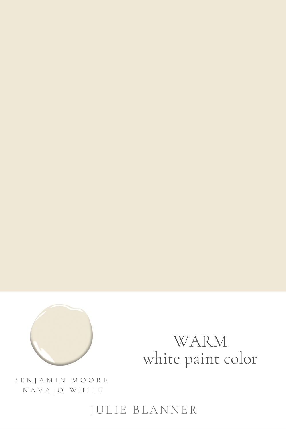
Benjamin Moore Navajo White OC-95
You can learn more about our favorite cream color paints here.
Spaces it Works Well In
- Open concept spaces
- Rooms with a significant amount of natural lighting
- North-facing rooms
- This can also be a good color for rooms with that face east in the afternoons (western morning sun).
Makes a Room Feel
- light
- warm
Undertones
- yellow (more so than many of my favorite cream paint colors)
Styles it Fits
- traditional
- country cottage
- farmhouse
Benjamin Moore Navajo White LRV 78.26
The LRV of a color is important, because it showcases how much light is reflected on a simplified scale. Learn more in our guide to What is LRV?
Knowing the LRV of a color can also help you make a more educated comparison!
With an LRV of 78, this color is comparable to Soft Chamois at 78.94, and Sherwin Williams Zurich White, which has an LRV of 76.

Tips
- Paint the ceiling in the same color (can use a different sheen). We learned this lesson the hard way – when we painted our ceiling with a traditional bright white ceiling paint, it made this color feel too yellow in our breakfast nook.
- Paint moulding (like our picture frame moulding or board and batten) in the same paint color, but one sheen higher.
- Want to pair Navajo White with a gray paint color? Just make sure it’s a deeper, more saturated shade for contrast.
Coordinating Colors
- Try this color with a mushroom paint color for some contrast.
- Pair it with Benjamin Moore Hale Navy for a striking style.
- I don’t recommend pairing this color with a sage green paint color, as greens can bring out the yellow in this shade.
- This color works well with dark grays and blacks, especially if you’re updating a cream kitchen, as shown in the Instagram kitchen below.
Trim Colors
Careful with trim for this color, as going with a lighter warm white can easily make Navajo White look more yellow in comparison.
- For trim, try using this same color, just in the same sheen or one sheen higher. I first discovered this color being used as a trim. I like to paint the ceiling the same color as well, otherwise BM Navajo White will read yellow against stark white ceilings.
- Another option is to do Navajo White on your trim, but just a percentage! Try lightening it to 75% or even 50% to ensure the trim coordinates, with just a slight change in depth.
- Or, use Navajo White on your walls, with a deeper color on the trim. Our favorite Greige Paint Colors will coordinate beautifully as a trim color.
- Sherwin Williams Extra White or Benjamin Moore Simply White would give you more contrast. Because they both have a slight hint of yellow undertones, they will coordinate well but showcase the rich depth of cream in Navajo White.
Painting indoors? You can learn all about choosing ceiling paint and trim paint here! You will also find detailed information about using this color in tile paint and furniture paint.
Find all of our paint colors in our paint palette here and keep track of all of yours here. If you use any of them, please return to share your thoughts!


Want to modernize sun filled kitchen/family room. Terra-cotta floors throughout. deep teak stained window frames…lots. Kitchen cabinets light tan, cream tumbled stone tile above black/brown/tan granite. Ben Moore Navajo white too yellow in shade. White dove a little too white. Want to do some sort of cream color cuz we are sick of yellow! Any suggestions?
I’d sample this or this.
The Navajo White I think is too yellow for what I want right now. I have an open floor plan townhouse with travertine tile in the dining and kitchen areas (North and West) and honey colored maple wood floors in the living room (Faces East). Our fireplace surround is BM Dove White. It gets very dark in the mid to late afternoon. Right now it is painted BM Macadamia Nut and Key West Ivory and we are tired of it, but love the White Dove on our crown molding and baseboards and fireplace surround. We want something light and bright, but warm and are not fond of the popular grey and griege colors that are so popular today. We like the classic and the french country style. Can you suggest anything? Thank you so much.
I really love Soft Chamois for a warm white!
Painted the walls and ceilings Navaho white, what would go good on the door frames
I personally love using the same color in a higher sheen.
Hi – We just bought a house that almost the whole trim in it is painted Navajo White. The issue we’re having is the whole house is shades of yellow. We’re looking to update some of the colors and we like greys. Will this color look silly with grey? We have a significant amount of trim, columns, crown moulding, so changing the color is an undertaking. Any suggestions for either making a transition or pairing with a color?
I personally wouldn’t pair it with grey. If you wanted to retain the trim, I’d paint the walls in the same shade, just eggshell or repaint the trim with your favorite grey. Navajo White is a warm color while grey is cool.
Navajo white will be yellow if matched into another manf paint. BM Uses different colorants and gray many times instead of black in their off-white colors. The gray colorant is what gives them that luminous quality…reflecting more light than absorbing it. SW, PPG, Valspar, etc., do not have a gray colorant in their system – they use black–therefore unable to get to that same luminous quality and match the color correctly. Just like cooking w/ butter or margarine. Won’t get the same tasting cookies!
Ps I’m a color & design rep for BM 🙂
I purchased from Benjamin Moore, but thank you for weighing in, I appreciate it!
LJ, I have a home with the original (18 yr) BM Navajo White paint on all of my walls. I have to repaint the ceiling and walls in my dining and living room due to repairs (East facing large room with vaulted ceilings and a good amount of natural light). I wanted it brighter, more fresh, and less yellow, but want to keep it mildly warm. Should I move to a 50% tint of the Navajo White? Or even 25% or 33%? I’ve tried samples of each of these but I’m having trouble deciding. Is the 25% tint going too far? I would love (need) your advice.