Get all the details on Sherwin Williams Rhinestone – one of our favorite light and bright neutral paint colors! It’s a soft, very pale gray color with the slightest blue undertone, and it works beautifully for brightening your home.
Paint can be such a difficult decision. It’s always touted as an easy, inexpensive change in your home, but I completely disagree! It can be stressful to make a choice you know you have to live with for a long time.
It’s a big undertaking whether you are taking on a project yourself or hiring it out to professionals. It can be expensive and you don’t want to make any mistakes!
That’s why I am back with another great wall color resource for you! I love sharing our adventures with paint over the years- because while a white paint color might seem simple, it’s anything but.
Be sure to check out my posts on our neutral paint palette in our current home, the best cream paint colors, as well as a variety of detailed posts about specific colors we love. You can even find information about ceiling paint and painting trim white – I’ve covered it all!
Sherwin Williams Rhinestone
Today I wanted to share about a very pretty, pale gray (almost white) color that we used in the colonial with great success.
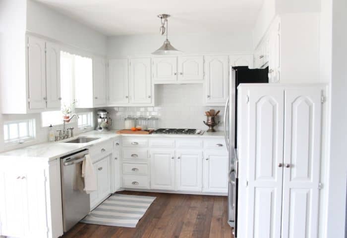
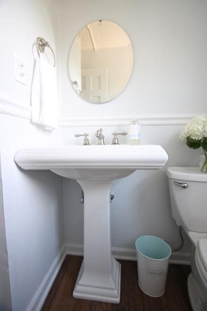
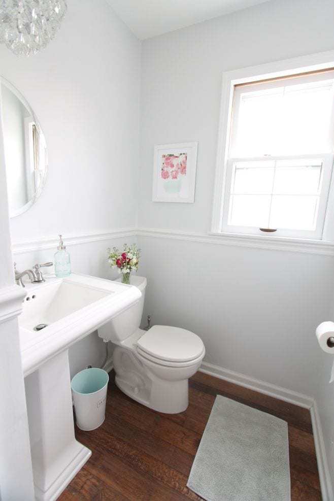
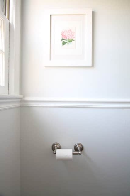
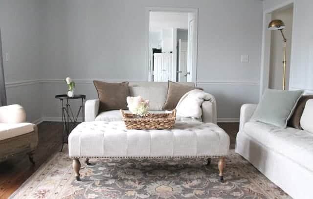
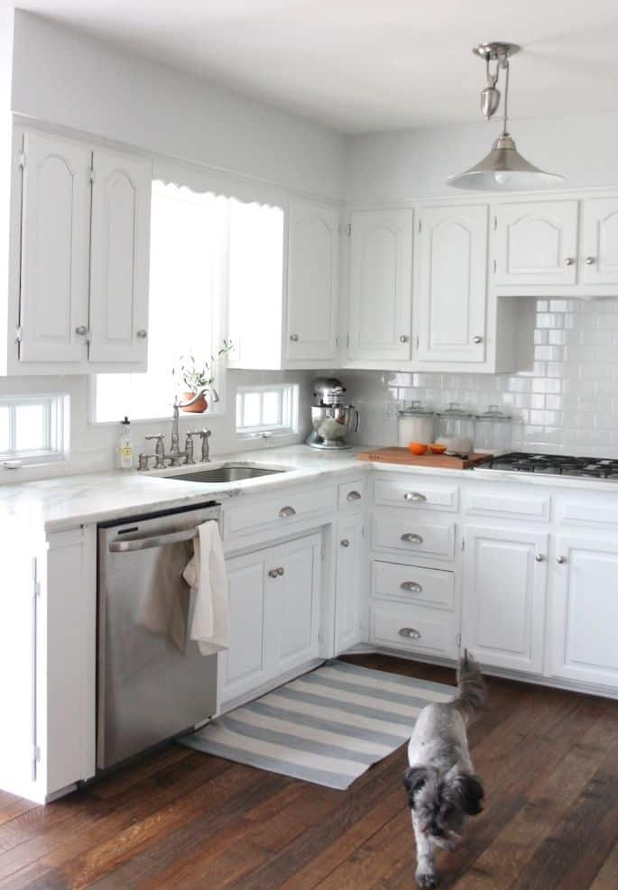
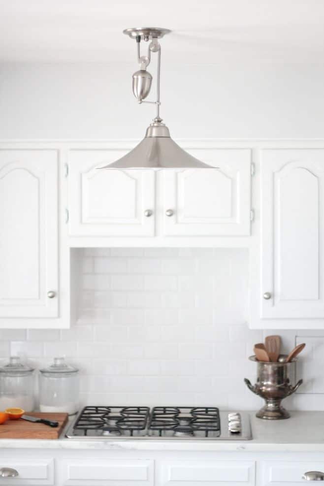
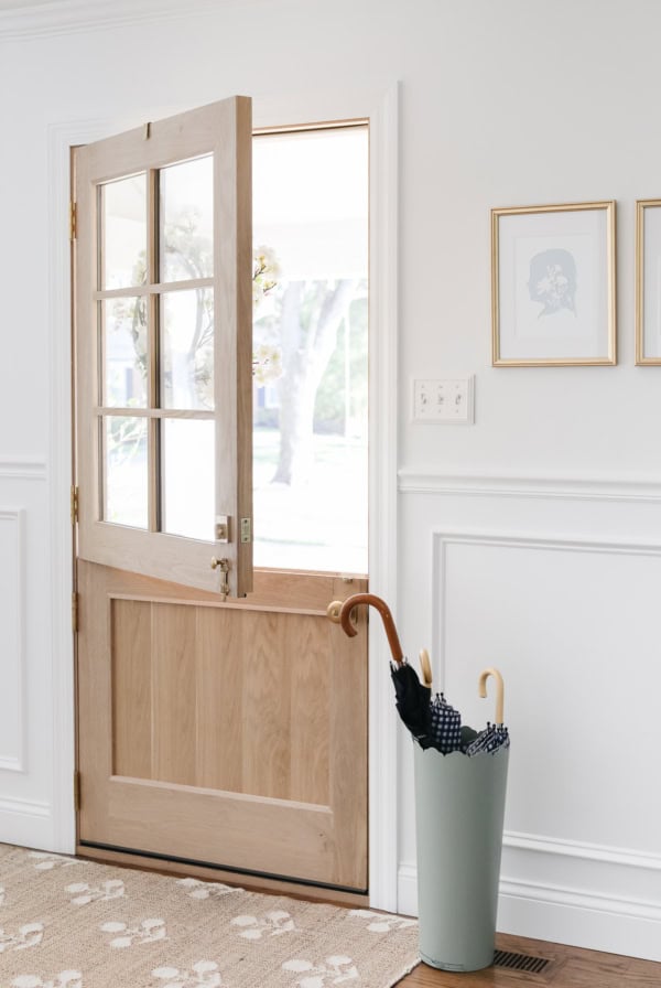
In our kitchen, living room, half bath, and mudroom we used Sherwin Williams Rhinestone. It’s a soft gray, light and bright.
In fact, Rhinestone has a very slight blue undertone, which works for the clean, fresh feel I wanted for those spaces. It’s not a pure white, more of the softest possible gray.
In some lights it reads a little gray, in others a little blue, and many times it looks like a solid white! It’s so fresh and clean.
I loved how it felt in different rooms of our home. In fact, it looked more white in our bathroom, but slightly more gray in our kitchen because we used a pure white paint for the cabinets there.
In our living room, it felt like more of a silvery gray. In the image below, you can see the slight contrast between trim and walls!
Details on Sherwin Williams Rhinestone
- Rhinestone is on the paint charts as SW 7656.
- Feels fresh and clean and often reads as a white, depending on lighting and trim.
- A great neutral for anyone wanting a white+gray combo.
- Looks great in West or East facing rooms especially – tends to read a little blue (and colder) in North and South lighting.
Looking for more soft white and creamy paint colors? Don’t miss my detailed discussions on the following options:
I’d love to hear from you! Have you used Sherwin Williams Rhinestone anywhere in your home, or are you considering it as an option? Be sure to leave a comment, it helps me and other readers, too!
More of the BEST Neutral Paint Colors
Don’t forget to check out my list of the BEST cream paint colors and this great selection of neutral paints.
- Zurich White (Used in many of the rooms in our current home, including our family room and living room.)
- Sherwin Williams Creamy
- Benjamin Moore Hale Navy
- Soft Chamois
- Benjamin Moore Swiss Coffee
- Everyday White
- Benjamin Moore Simply White
- Farrow and Ball Clunch
- Farrow & Ball White Tie
- Sherwin Williams Knitting Needles


I used SW Rhinestone on my current home’s living room & love it!! It does look very different in lighted areas/by windows but it’s so soothing & clean & pairs so well with black & white, green & wooden farmhouse decor. I love it so much that we will be using in on most areas of our new build! I highly recommend it to anyone searching for the perfect light gray paint.
Looking for a light gray/white combo. Sold on SW rhinestone. Which white will you recommend to contrast the rhinestone color. Keeping it light and fresh.
Untinted white trim paint
I am so glad I happened upon this post! We painted our cabinets Rhinestone to rid them of the 80s oak vibe. However, our mistake was painting the walls Repose Grey; it is a horrible clash for me. A few people have suggested painting the walls a more neutral white to pop the cabinets. Now I’m beginning to like this idea more and more! What do you think? Any color ideas? Our counter tops are a deep green granite with hues of gold and our floor is a light blend of tan/brown/ivory tiles.
A white is a much better fit.
Help! I want to use rhinestone in a dim living room and dining room. My current trim is very creamy- touch of gold even maybe. Do I need to change the trim to a brighter white? To complicate things- there’s cream trim in the kitchen where we will soon install white cabinets- so I’m concerned maybe changing out the trim to more white (IF that would be the recommendation) would mess us up in the kitchen plan …
No, they should work well together as long as it’s not overly “yellow”.
I am struggling with paint color for kitchen – west facing. Counters are black, cabinets, depending on lighting, are a pinkish whitewash and backsplash is small black and creamish color. Cabinets are kind of SW Cultured Pearl color. Walls are currently yellow, not my color!!
Would love some direction.