Sherwin Williams Creamy is exactly what it sounds like… a delightful, warm, rich cream paint color that works beautifully in a variety of spaces in your home. Get all the details in this deep dive into SW 7012!
Bonus! This color is a perfect match to Pottery Barn Kid’s white furniture lines. That means it’s a great way to save you money – use it for a furniture revamp to get the look for less!
For those of you who follow along, you know how passionate I am about finding the right white for every room. But I also love pretty white furniture! Finding the right white can be difficult, so I’m breaking them all down for you here.
Years ago, I requested a Pottery Barn Kids white furniture sample to have it color matched at Sherwin Williams. It has always felt like the perfect white furniture paint, even though we couldn’t afford the large pieces.
It turned out there was no need, there was nearly an identical match which would become one of my favorite cream color paints!
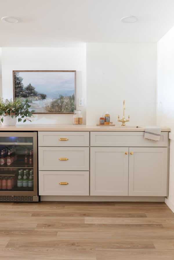
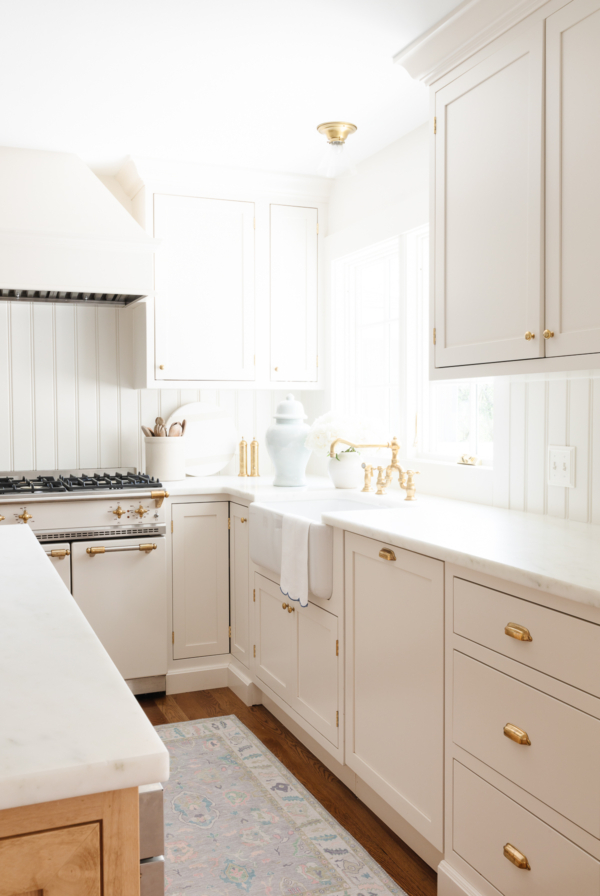
Sherwin Williams Creamy
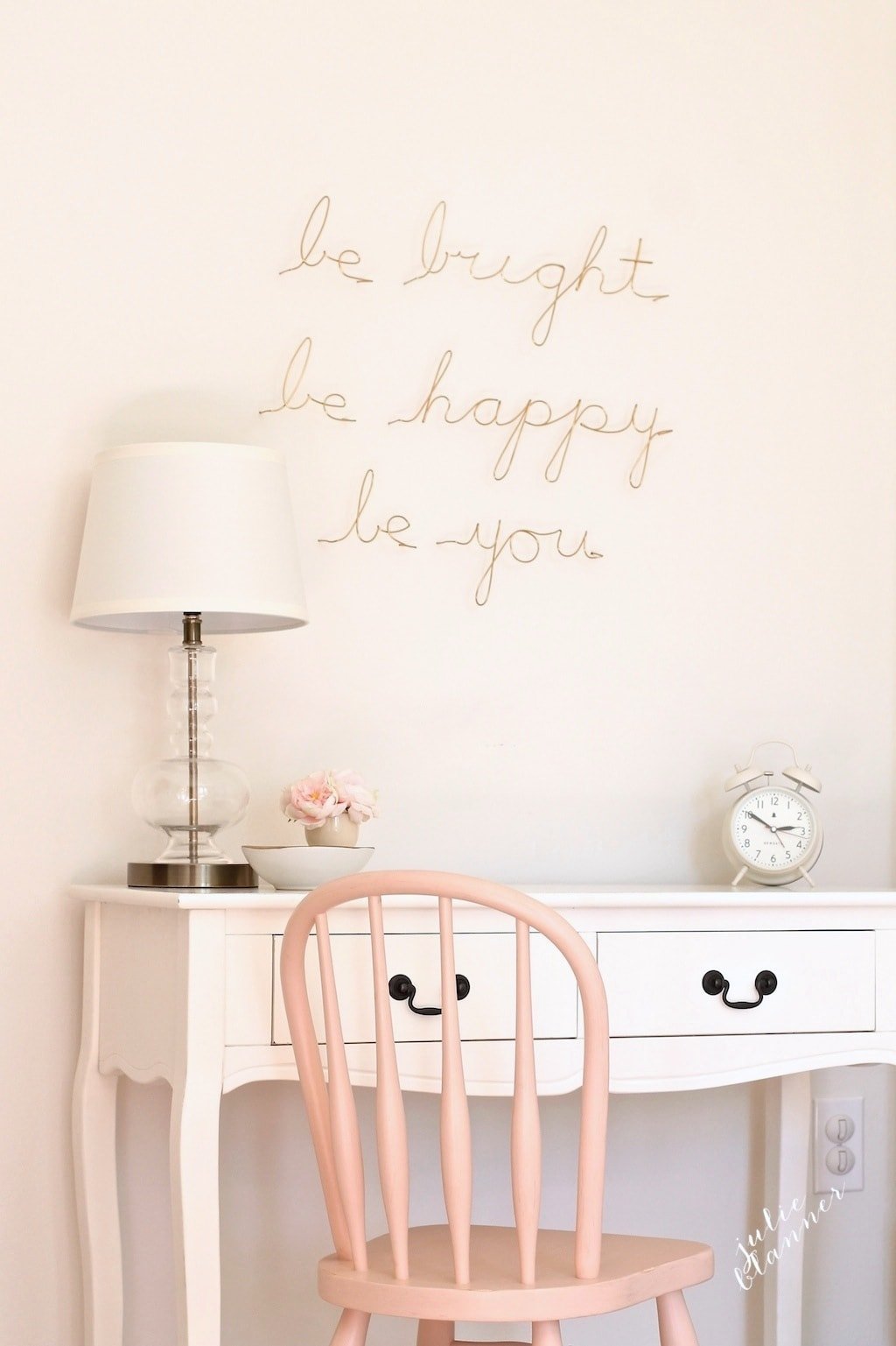
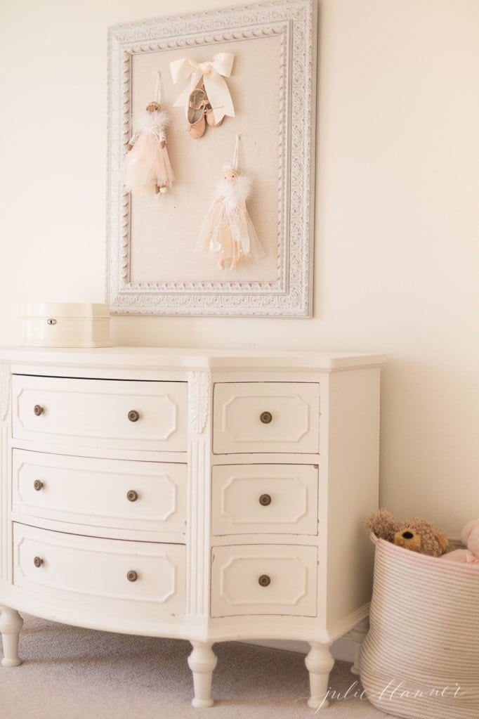
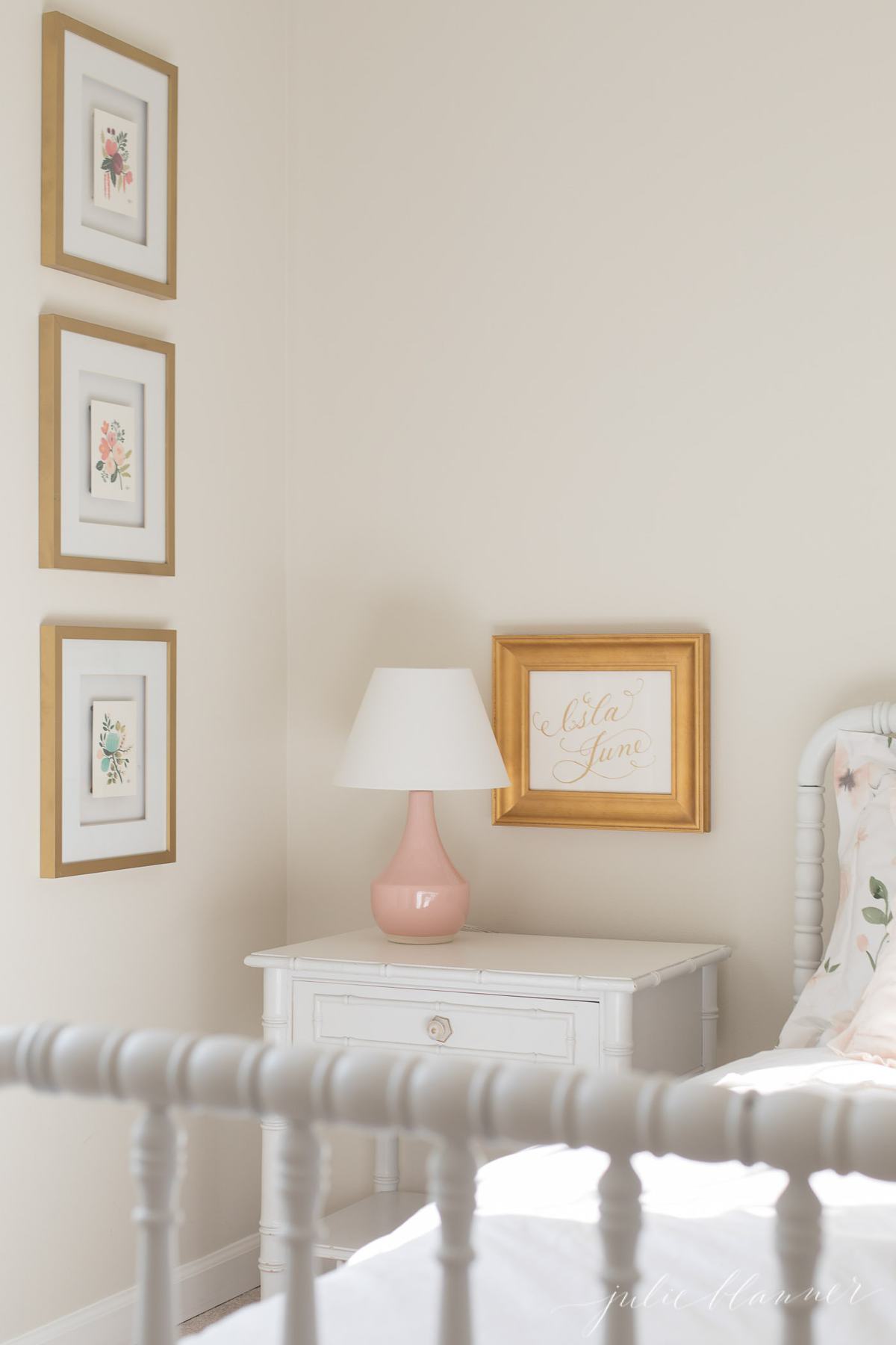
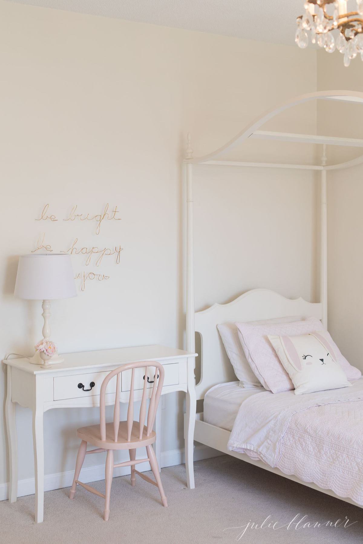
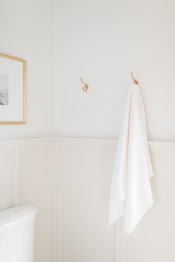
We have painted so many vintage furniture pieces with Sherwin Williams Creamy through the years including Adalyn and Ani’s beds, Adalyn’s dresser, Ani’s desk and so much more!
It’s a soft, warm white that is classic, but not stark. It’s one of my favorite Warm Whites and I just know you’re going to love it, too!
Installations
- Warm white paint for walls
- Painting trim white
- Warm white furniture paint
- Painting cabinets
- Exteriors
Feels
- Bright
- Warm
- Soft
Undertones
Creamy is a warm color with a touch of yellow undertone.
Creamy LRV
The LRV of Sherwin Williams Creamy is 81, making it a little brighter and more reflective than Zurich White which is a 76.
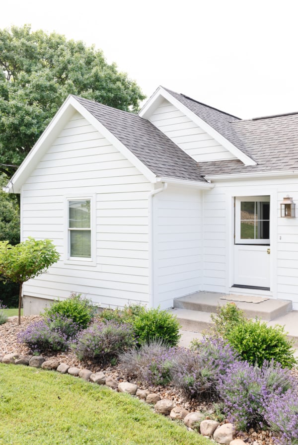
The house pictured above reminds me so much of my favorite White Brick House, which is painted in Benjamin Moore Simply White – another great option to check out!
Recommended Sheens
SW 7012 is excellent for walls, trim, cabinetry and of course, furniture. With that said, I tend to choose an eggshell paint for walls, flat for ceilings, and then a semi-gloss for cabinetry, trim and furniture.
Get all the details about Paint Sheens here, and dig deeper into them with these guides:
Styles
- traditional
- transitional
- country
- cottage
Colors to Pair SW 7012 With
- Try it with my favorite navy paint, BM Hale Navy
- For subtle contrast, pair it with BM Pale Oak
Trim Paint to Pair SW 7012 With
- Pair Creamy with SW Pure White on the trim for a distinct contrast.
- Or, lighten SW Creamy by 50% for less of a contrast.
- Learn about Painting Trim White
- Paint trim and walls the same color
Ceiling Paint to Pair SW 7012 With
I like a flat, bright white ceiling paint sometimes, and other times I like to use the same color we have on the walls. It often depends on lighting and how much yellow undertone shows in our cream paint.
- Paint your ceiling in Creamy, too, if you’d like!
- Learn more about Ceiling Paint here.

Tips
- Sample – I recommend starting with removable paint samples and then testing your favorites prior to committing.
- Test near your finishes like flooring and cabinetry. Look at paint color morning, afternoon and evening.
- Learn about LRV before choosing your paint – it really is one of the most significant tools we have to understand the light and bright details of a color.
Print this complimentary paint color chart to keep our paint colors organized for quick touch-ups!
Frequently Asked Questions
No, it’s a warm white. Not dirty, not yellow, not blue. A great in between for any lighting situation!
Beige tends to have more of mixture of yellow, green and gray undertones, whereas cream will generally have more of a yellow undertone.
Cream is generally lighter than beige. It’s technically more of an off-white, whereas beige runs the gamut of deeper to lighter neutral shades darker than whites and creams.
Color Comparisons
SW Dover White vs SW Creamy
Creamy is truly more of a creamy white, while Dover White has stronger yellow undertones. Dover White can read as significantly more yellow in certain lighting situations, although it has a slightly higher LRV at 83 vs the Creamy LRV of 81.
BM White Dove vs SW Creamy
White Dove and Creamy are very similar colors, with White Dove coming in with a slightly higher LRV, reading as more a touch brighter in comparison. The LRV of White Dove is 85 and the background is just a little more greige instead of yellow.
BM Swiss Coffee vs SW Creamy
Swiss Coffee is an incredibly popular color, and with good reason. Shae McGee uses Swiss Coffee (at 75%) and it’s got a very comparable LRV to Creamy, at 83 vs 81. Swiss Coffee has a touch more of a green undertone than Creamy.
Benjamin Moore Equivalent to Creamy
Check out Benjamin Moore Marble White for a very similar color to SW Creamy.
What do you think? Are you a fan of this color? I’d love to hear from you!
Join Our Community
Let’s keep in touch! Receive exclusive content, including never-seen-before photos, our favorite home decor DIYs and more!


We built cabinets and are ready to paint them the same color as the PBK Ava Regency bed. I’m wondering what the PBK Color was that you were able to match up this creamy white and if it is the same color as the Ava Regency?
We have that dresser and desk as well. I’d say it’s pretty close, but you can do a swatch. If the color has changed through the year you can also purchase a sample at PB Kids and take it to the store to be color matched.
My kitchen cabinets and Trim are are antique white. My house was built in 2005 and was very brown. I recently painted my walls to lighten it up and we chose sw creamy. It made all the difference! I am now wanting to replace my outdated granite. Any suggestions on what would look good with the color scheme? My floors are a medium tone white oak. Thanks! Love your home!
Hi Amy,
Just now seeing your comment. I always love my timeless Danby Marble, but we are using a quartz for our lake cottage kitchen update and I’ll be writing about that soon!
Thanks so much for the kind words,
Julie
Good morning, I hope you can help me. When I bought my kitchen cabinets 15ish years ago they were a light cherry called nutmeg. They have darkened to a medium/dark redish orange color. I have a dark green granite counter top that has some grey in it. And a very light beigey floor with hints of grey. My backsplash is multiple colors of beige, orange, greyish blue etc stone. Here is my dilemma, the cabinets pop. I want to tone it down without having the walls glow blue or peach/pink. Revere Pewter and Agreeable gray look blue next to the cabinets at certain times of the day. Accessible beige looked peachy. A couple of whites I tried just looked too white. I don’t think I want a green kitchen. I’m looking for a creamy off white that won’t change color next to my redish cabinets. And I want to tone down the red. Help. Any suggestions would be greatly appreciated!
Hi Julie,
I’m wondering if you have color matched ‘Creamy’ in any other brand? I want to use BM or possibly Valspar brand paint and I’m afraid if I take the SW paint chip in and have them color match it, that it won’t be exact. However, I’ve also seen where the computer code color match doesn’t come out well because of the differences in the untinted base etc. Lol, I just don’t want to get it wrong! I’m planning on doing ‘Creamy’ kitchen cabinets, Soft chamois on the walls, and untainted white on all trim. It’s a west facing kitchen that doesn’t get a ton of light other than at sunset. Thoughts? I’ve also considered just doing everything Soft Chamois -cabinets, trim, wall etc. You’ve inspired me to do an all cream kitchen! Would appreciate any thoughts or feedback!
I haven’t for this particular color. I highly recommend their cabinet paint – you can read about how to paint furniture and cabinets here.
I wasn’t looking for a white paint, but happened upon SW Creamy as a warm neutral suggestion by another blog. I liked all the real photo examples where I could detect the yellow undertone. But when I opened the can of paint it struck me as very white. I’m nervous to use it, but have a short timeline to decide. If I bring it back to Lowes, can they strengthen the undertone?
I liken creamy to an off-white. If you want an even warmer cream, I recommend Benjamin Moore Soft Chamois