The best classic white paint color for furniture.
I absolutely love a lot of Pottery Barn Kids & Restoration Hardware Baby & Child furniture, but I’m not at all in love with the prices. It’s difficult for me to invest in pieces where they grow and transition so rapidly, but there’s more than one way to achieve the same aesthetic!
The previous owners of our Colonial were incredibly kind to gift us with a beautiful canopy bed, which is now Adalyn’s. I found a great dresser that mimicked the pattern with gorgeous brass hardware & have blended it with a Pottery Barn Kids table & chairs set.
Blending old and new not only feels more interesting, but it also elevates older pieces. Take a look at this Bedside Desk from a console table, for example!

We’re now doing the same for Ani’s room – I purchased a bed on Craigslist, am repurposing a vanity that was in the guest bedroom {a thrift store find} & am awaiting the right dresser to come along.
To make it feel cohesive, I’m painting it all in the same color we painted Adalyn’s furniture. Finding the right white paint color isn’t always easy. Some are too bright & harsh & others just have too much blue or yellow undertones.
Pottery Barn Kids’ simply white furniture paint color is a soft, not-too-creamy off white. I borrowed a sample to take to Sherwin Williams and found that Sherwin Williams 7012 Creamy in satin is a nearly perfect match!
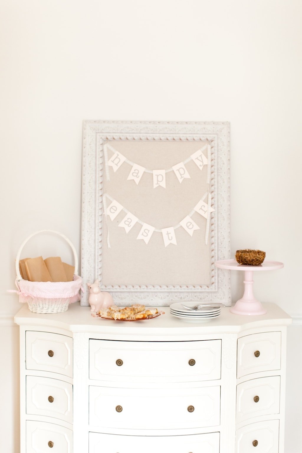
We’ve been using it for the past few years for Adalyn & Isla’s furniture. If it were up to me, I’d call it right white. It’s just the right white paint color for furniture.
Learn more about Sherwin Williams Creamy here. If you’re looking for the best primer for furniture, we’ve had great luck with this one! Don’t miss this round-up of my favorite Warm Whites for more soft white inspiration!
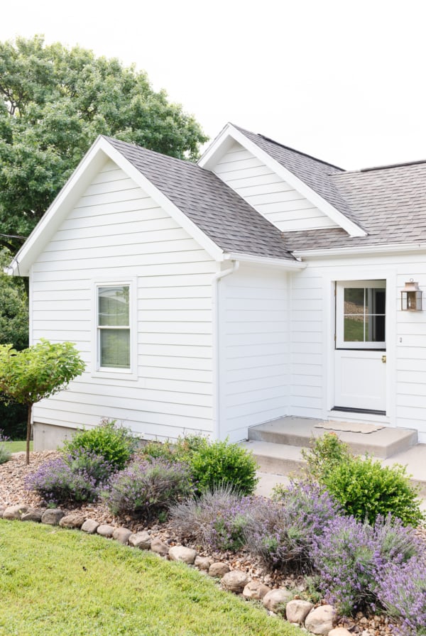
Photography: Alea Lovely
You can learn all about choosing ceiling paint and here! You will also find detailed information about using this color in tile paint and how to paint furniture.
More Paint Tips and Colors
- Create a cohesive Paint Palette
- The Best Cream Color Paint
- Our Neutral Paint Colors
- Flat Paint
- The Ultimate Guide to Trim Paint
- Paint Sheens
- Painting Trim White


Hi! What kind of primer do you use and also do you know where the knobs are from on the dresser pictured?
Hi Alyssa!
We’ve had great luck with this primer, I’ll add that to the post. https://rstyle.me/+B5Yi-H2v_cAjkOQ9SqSk2A
Unfortunately, the knobs are vintage! Good luck to you with your painting project!
Julie
Want to provide you an update since I found this post so helpful.
My new home office is nearly done – just waiting for the second bookcase to come in (it was damaged in transit, and the replacement was back-ordered.) We installed the ca. ~2005 Antique White bench seat under a window, and placed the brand new Dutch White “Aubrey” bookcase (both items from Pottery Barn) right next to it.
Walls and ceiling in the office are SW “Tres Naturale”, and we’ve created accent pieces for the wall and bookcases in SW “Dard Hunter Green.” Floor is a medium, natural Acacia engineered hardwood. Complemented with an ivory and sage gray area rug. I love, love, love the look.
Our home is completely trimmed in Sherwin Williams Alabaster semi-gloss.
I affixed baseboard molding in Alabaster to both the bookcase and the bench. On the bookcase, it looks like an extension of the built-it molding. Flows right in, and I can’t even tell the difference in color. Perfect. The (very few) close friends we’ve had over to look were amazed that the bookcase came with molding that matched the baseboards!
For the bench, I had to cut the top of the molding off because it was a hair too tall. There’s a strip of wood between the open cubbies and the molding, so I experimented and painted that in Creamy. SW Creamy is MUCH more “bright white” than the old-school PB Antique White. It is just slightly less “pure” than the adjacent alabaster trim.
Before we began, I was concerned about the white-shade-mismatch between the bench and the bookcase. Wife said she’d paint it if it’s a problem, but let’s try it first. Frankly, between the gaps between the pieces, the deep green cushion, and the fact that they ARE separate, adjacent pieces with a different style – they complement each other very nicely, and it does not look jarring or like we made a mistake mixing the two different whites. (Once the 2nd bookcase comes in and I do some more touch-ups, I’ll go over the Creamy with a coat of Alabaster to even that out.)
Long story short – creamy goes dreamily with Antique White, but does not match it by any stretch. Alabaster is so close to Dutch White that sitting next to each other they look the same, but I don’t think Alabaster could seamlessly blend for repairs in the Dutch.
Hi Tom!
Thank you so much for such a detailed and helpful comment! It’s so great for other readers to be able to find this information and I know it’s so helpful to others taking on painting projects.
I really appreciate it, thanks so much!
Julie
Thank you for the detailed write-up! My kids have since outgrown their Simply White PB Kids furniture. We have a piece from the regular collection in Antique White. Other online sources have expressed that SW 7012 Creamy in Satin is a match for that, as well. It looks to be, by the swatch I have in hand. I have a sample, but have yet to test it out.
My question, though, is PB seem to have discontinued the Antique white, and much of their furniture is now a “Dutch” white. I haven’t seen any discussion on a color match to that, or any reference on the Sherwin Williams site. Any experience? If I’m able to find anything once my new piece comes in, would you like to no about it?
Hi Tom! I’m not aware of that, but I can tell you we have purchased both Pottery Barn Kids and Pottery Barn Teen furniture this year and it looks wonderful with Creamy. Hope that helps!
We color matched our kids Pottery Barn Simply White Catalina furniture to paint a wall the same color and the girl that did the match did an awesome job, it’s almost perfect. If you’d like, I’m happy to get the recipe she made up and post it. When I say it’s almost perfect, there were some dings on some of the furniture and we took the trim paint (same color match used) and used it and you couldn’t tell the difference.
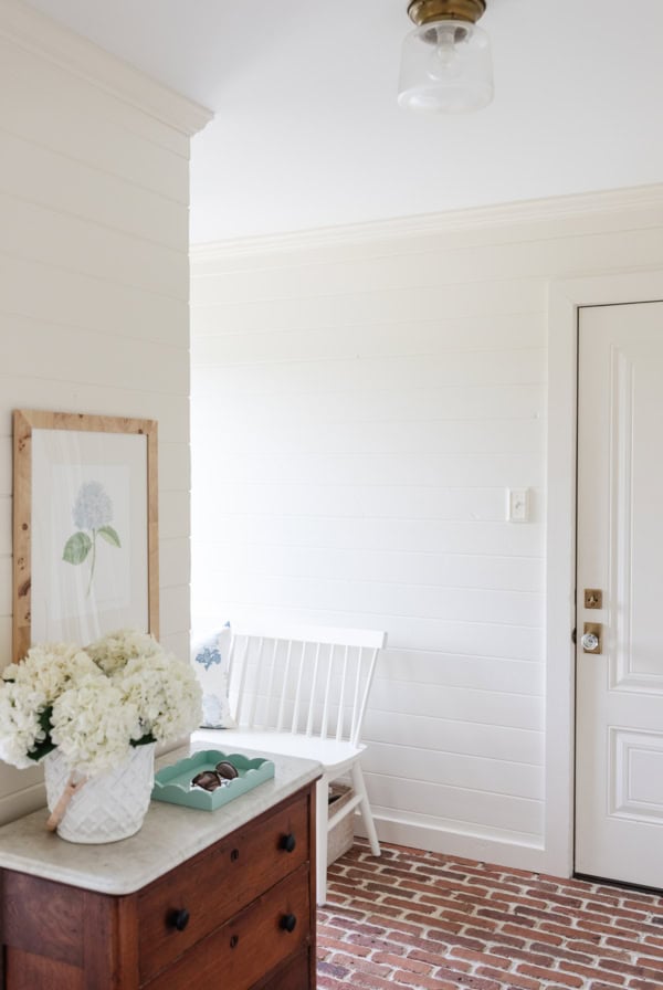
Hi! We are desperately trying to find a shade of white to paint our bedroom. We do have a crib and dresser in our son’s room in the PBK simply white and I was looking for the paint match bc I like that shade! But then I saw the wall in the 1st pic with the dresser in front of it and wondered….what is the color of your wall?! Thanks!
It’s Soft Chamois – it’s so versatile, I highly recommend it.