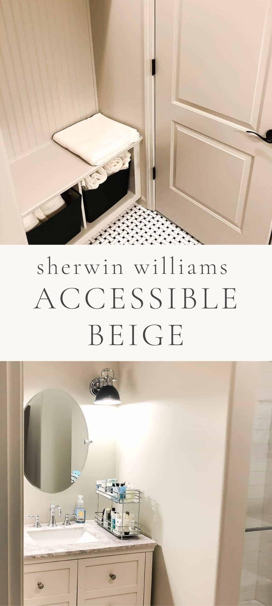
Find all the details about Sherwin Williams Accessible Beige, including spaces it can be used in, how it looks in various lighting, colors to pair it with and more!
Take a photo tour of this paint color used in more than one real home! You’ll see it in a variety of lighting situations, used on walls, trim and more. It’s no wonder this is one of the most popular paint colors right now!

Originally published June 2, 2014 and updated with new content and photos March 31, 2021.
Choosing paint colors is a big decision that takes a lot of consideration. Whether it’s a room or entire home, you only want to do it once.
I don’t take paint color decisions lightly, but fortunately for you, you can! I am taking the guesswork out of selecting paint colors. By detailing pros, cons, features, styles, where to use it, colors to pair, sheens and more – all you’ll have to do is sample to confirm.
Sherwin Williams Accessible Beige is a warm neutral paint color that is universally loved. In fact, even Joanna Gaines recreated it for Ace Hardware (see Soft Linen for reference).
However, this color can be confusing. In fact, if you look at the color on the Sherwin Williams website, the images shared there read as much more of a taupe or stronger brown than it looks in our spaces (as pictured here).
That’s why it’s so important to see paint colors in a real life situation, or at least as close to it as possible! I’m here to show you what this color looks like in real homes! I love chatting paint with you – don’t miss my favorite Warm Whites and Greige Paint Colors!
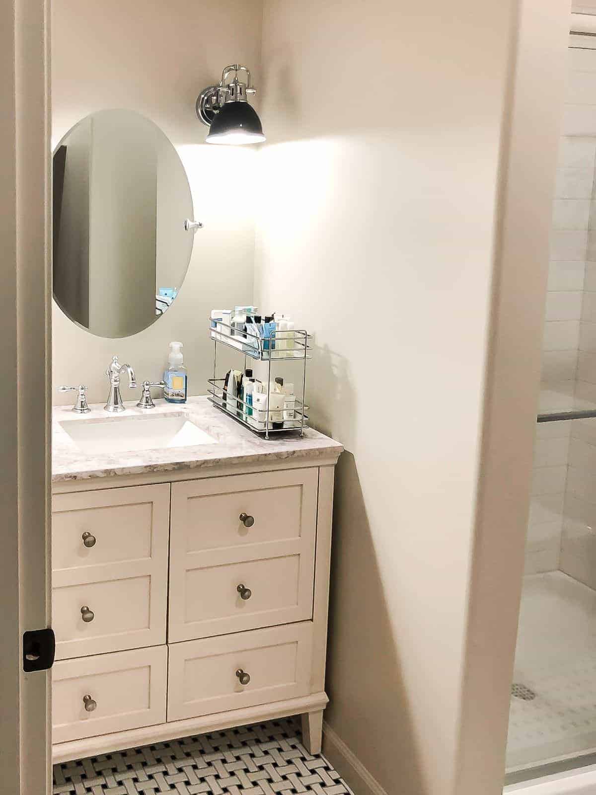
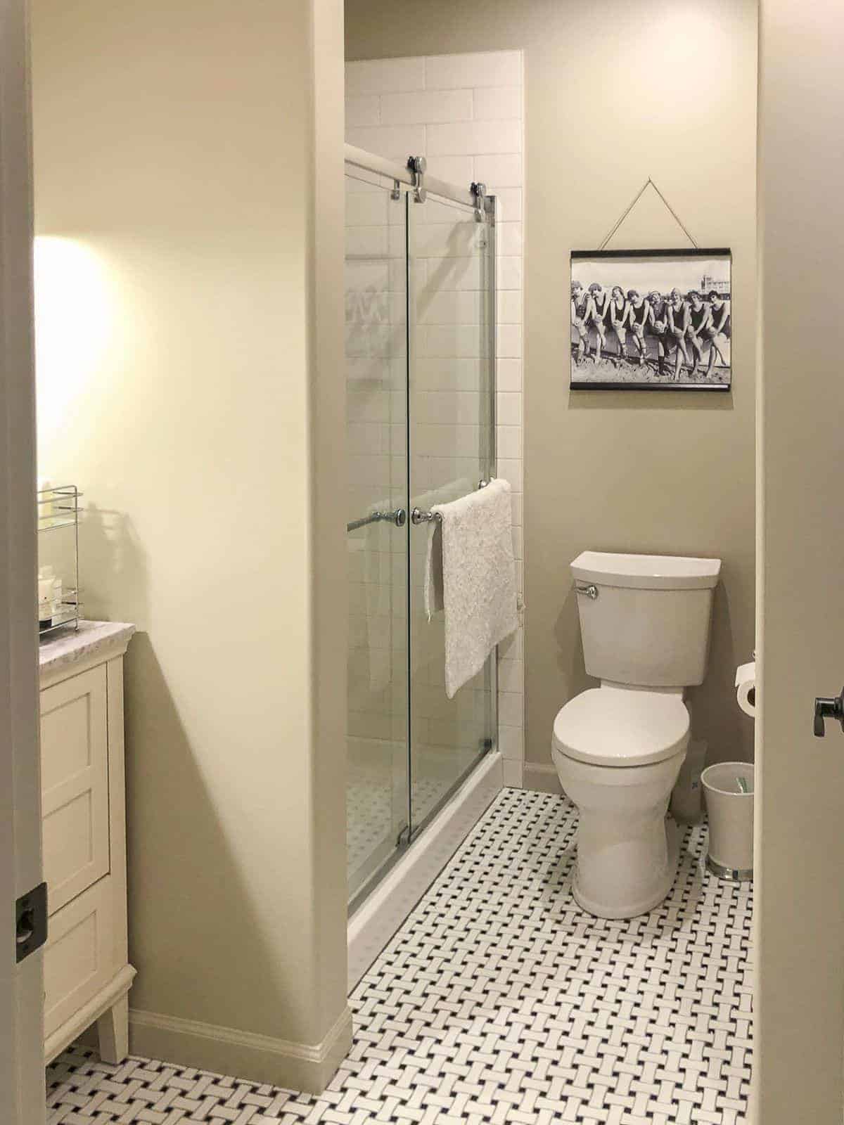
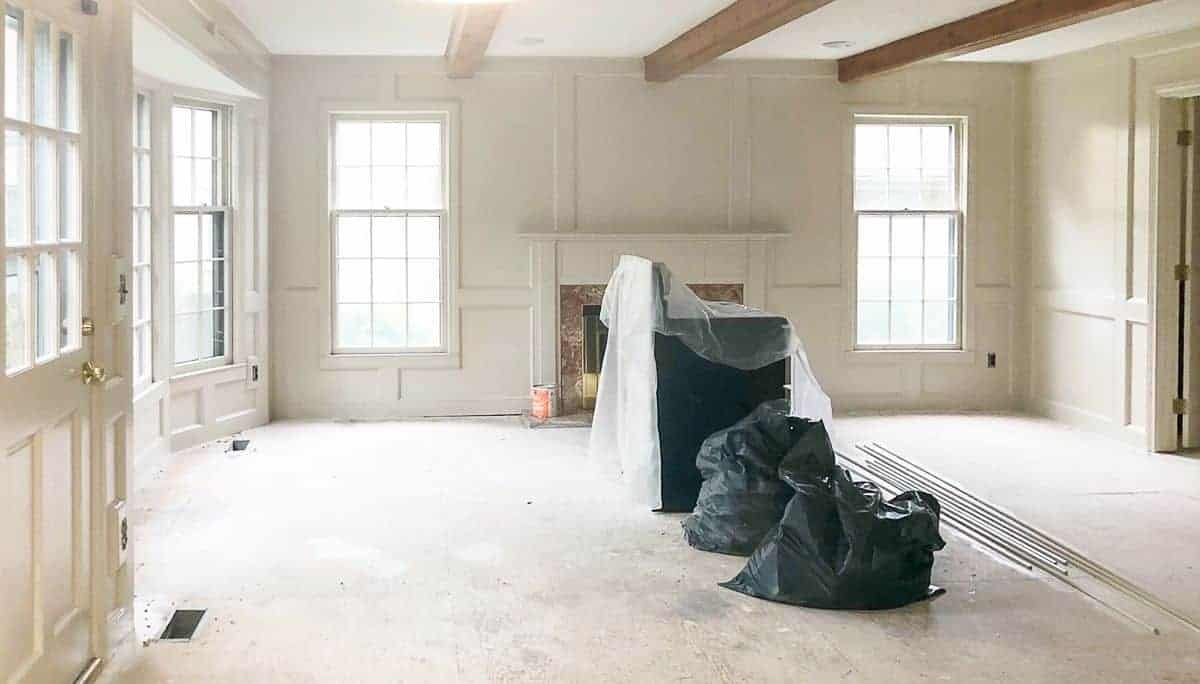
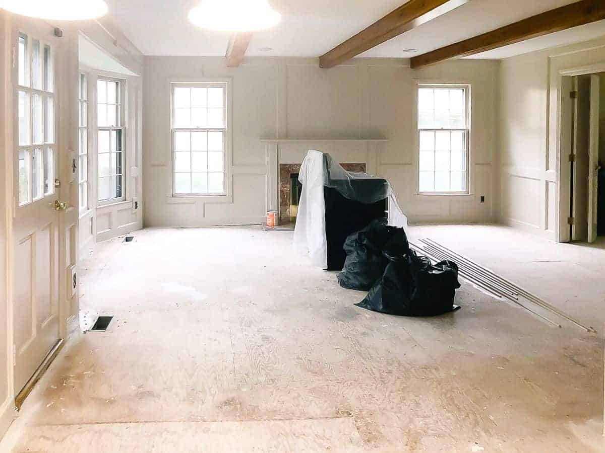
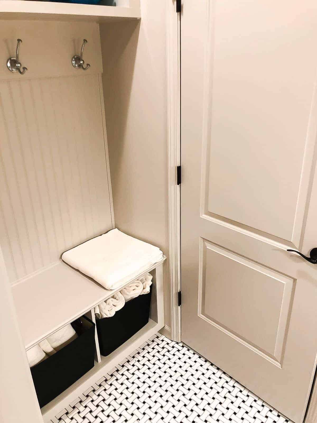
Throughout this post, you’ll see Sherwin Williams Accessible beige used in a variety of lighting situations. There’s a brightly lit dining room, a basement bathroom, a large living room mid-renovation, and even trim! I think you’ll be surprised at how different it looks in each space.
Why You’ll Love SW 7036
I love discussing paint colors with you! You’ll find an incredible variety of information about paint here on the blog, including amazing DIY paint projects (like painting without sanding), specific paint color analysis, and details on my paint palettes. I’ve even got printable paint charts to help you keep track of your colors!
Accessible Beige has a lot of the same attributes as Benjamin Moore Pale Oak, Agreeable Gray, and Benjamin Moore Revere Pewter, yet it’s a little warmer and less gray… while some might call it a greige, I think it’s more of a true warm neutral beige!
This is a balanced beige paint with a dusty feeling, which works well with whites and shades of blues. It’s incredibly versatile.
- The perfect neutral
- Soft, but not white
- So flexible, works in a variety of lighting situations
- Works on trim, walls and exterior
- Beautiful with dark wood floors, oak floors, and even neutral carpeting
Spaces SW Accessible Beige is the Best Fit For
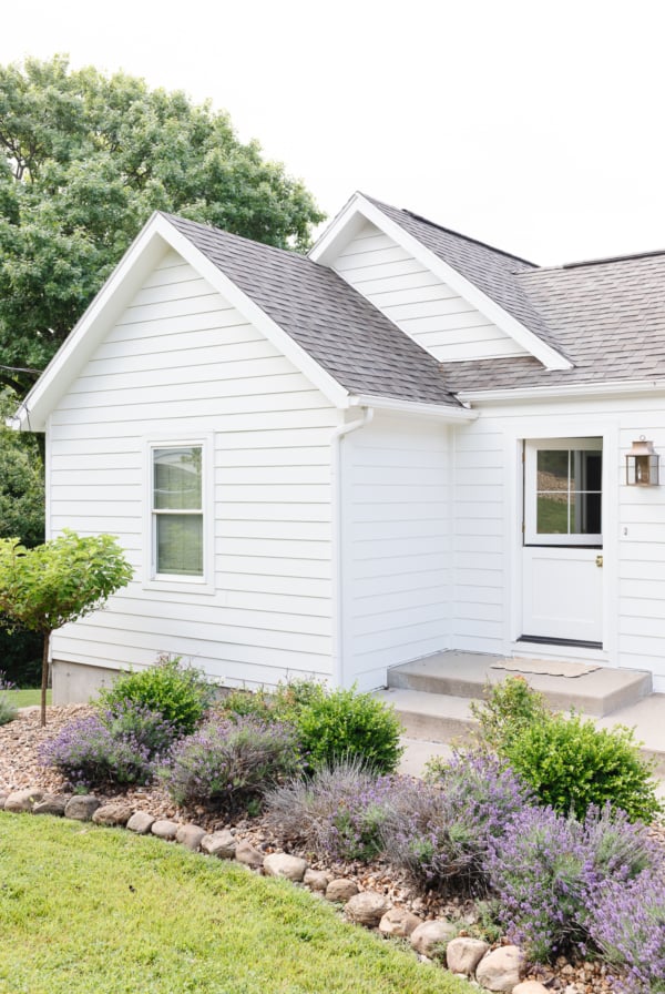
- exterior
- deck
- patio
- suitable for East, West, North, or South facing interior rooms that receive ample light
How Sherwin Williams Accessible Beige Feels
- day – warm and soft
- evening – warm
Sherwin Williams Accessible Beige Undertones
- a touch of beige
- slight undertone of green
- a touch of gray
- hint of red
Accessible Beige works best in natural light. It is a bit darker than many of my favorite cream paint colors, which lends itself to well lit spaces.
It’s perfect for North facing and South facing spaces that can tend to read a little blue.
SW Accessible Beige
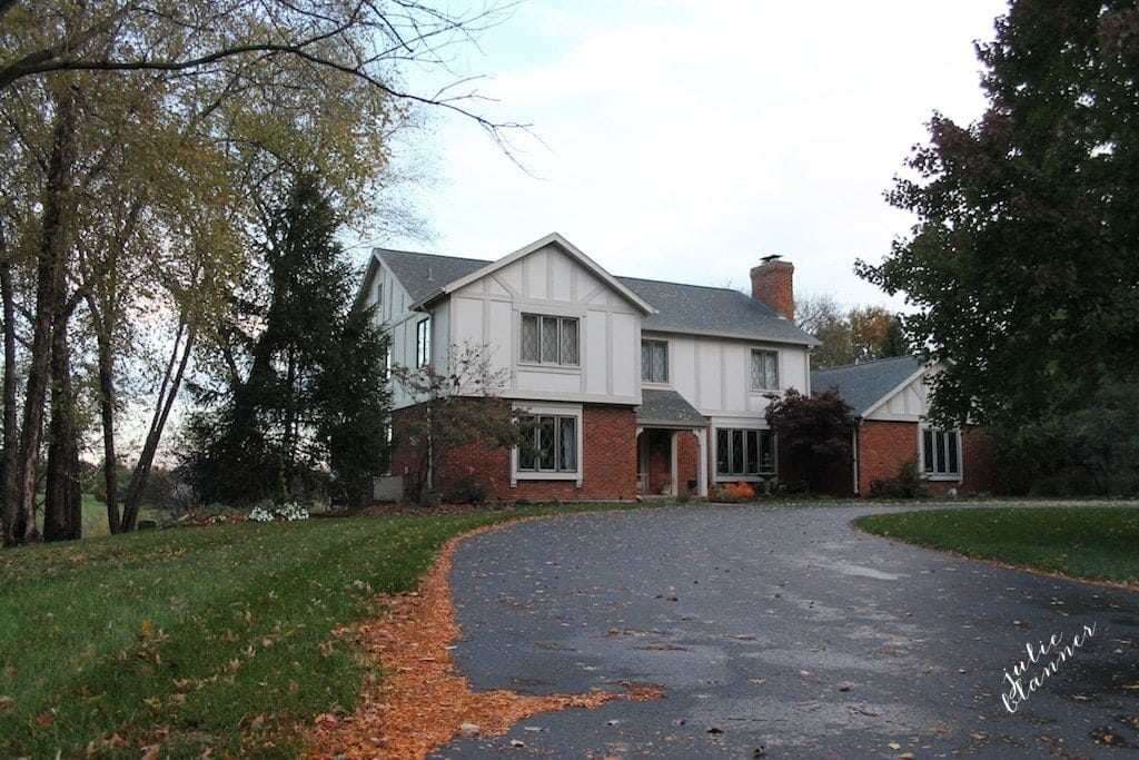
This colonial home in Kansas was painted just before we moved in so we needed to make safe decisions quickly. We selected just three colors, to keep the color palette simple, neutral and provide a great flow from room to room. (Four paint colors in total once we also used Accessible Beige!)

I LOVED the paint color we chose for the main level for the kitchen and family room, but remained anxious to repaint the dining room.
However, we wanted the space to feel warmer and more intimate. I love mixing tans and grays, but the gray I selected just wasn’t warm enough to provide the feel I was looking for.
Two and a half years later, I finally convinced Chris that it was time to repaint the space! We sought the best neutral paint color that would transition from season to season, since I often host parties and holidays.
My general rule of thumb is to use no more than 3-5 paint colors throughout your home, regardless of maintaining a neutral or colorful home.
Having just three other colors overall, I knew I could mix it up with success for the dining room. Because this was long before this became such a popular shade, I simply used Sherwin-Williams tools (such as an old fashioned paint sample) to select my color.

Painting indoors? You can learn all about choosing ceiling paint and trim paint here! You will also find detailed information about using this color in tile paint and furniture paint.
Accessible Beige LRV
It has a lower LRV (light reflective value) of 58, which means that it can make a room feel softer and cozier.
The hex code is #d1c7b8 which can help you see how it would look in your space using this how to design a room when you’re not a designer trick.

Trim Color to Pair with Sherwin Williams Accessible Beige
Accessible Beige works really well with untinted white trim. However, you can also paint the trim the same color as the walls in a higher sheen.
For example, if you paint the walls in eggshell, use semi-gloss for the trim in the same color. It looks and feels rich! You can learn more about trim paint here.

Accessible Beige makes a beautiful trim color as well! This color is a gorgeous trim that either works beautifully with more of a true white on the walls (giving the trim an authentic beige contrast) or you can use it with a darker paint tone so the trim reads almost white – see below!
In the image above, SW 7036 is on the trim of a south-facing window, so it appears here as a classic antique white when paired with a deeper wall paint.
As previously mentioned, it works so well with un-tinted white, you can paint a kitchen wall Accessible Beige to offer contrast to white kitchen cabinets.
Sherwin-Williams SW 7306 Accessible Beige is the perfect neutral that allows the things – and people you love, to shine.
What Colors go with Accessible Beige?
Truthfully, we tend to treat the dining room like our living room, attempting to make the space comfortable and welcoming. We often could (and do) sit in our chairs for hours. I accessorized our Accessible Beige dining room just like another living room… in the coziest possible Way!
We added a soft, subtle blue throw for a hint of color and added comfort, with works beautifully with this color. Originally, I considered using coral, but with a beautiful neutral paint color, I can just change out the throw from one season to the next, creating a completely different aesthetic!

We also accessorized with warm metallics like a gold bar cart, silver platters on the wall and pewter serving pieces. Green botanical art on the walls and pops of green throughout the room worked beautifully too.
The Sherwin Williams website lists three coordinating paints for a color scheme and I happen to agree that these would all be great options! Another popular color for coordinating trim is SW Pure White.
- 7513 Sanderling
- 9143 Cadet
- 7035 Aesthetic White
I love that with Accessible Beige on the walls, I don’t have to commit to just one accent color.

More Questions About Accessible Beige Paint
Accessible beige has zero pink undertones! While many beige colors can read a little pink, this one does not.
Accessible beige is known for a slight gray undertone, but is very warm despite many people labeling it as a greige. The lighting in your home will make an incredible impact on the way this color reads in every space!
If there are any true undertones of this color, they aren’t yellow or pink. You might catch a little green undertone in certain lighting situations, though, if any other color at all!
This Sherwin Williams paint color is a true beige color, so it reads quite warm. However, with a hint of gray in this color, it’s a great neutral that is incredibly versatile to use in a variety of situations.
Because it has undertones of gray, it can technically be considered a greige. However, in many lighting situations you won’t see gray at all, so it’s barely on the greige spectrum.
Yes, you can lighten this paint color by 25% or 50%! It simply holds the same tones while creating an even softer look. Kitchen cabinets painted in Accessible Beige (at 50%) will read as a true cream in most lighting.
I hope it helps seeing our cream paint colors in various rooms and lighting situations.
Read more here about my favorite interior paint colors and exterior paint colors on our new house, exterior paint colors on our old house and take a tour of our home here.
You can also find my complimentary paint color chart here to keep them all organized!


Love the dining room. Looks very clean and crisp. Love things that have that open feeling!
We have a tiny half bath that the previous owners painted maroon with a brown ceiling! I’d love to lighten that space!
https://twitter.com/sweetums82/status/473530774117810176
I would makeover my living room
Your space turned out amazing! Accessible beige is fabulous neutral.